
 Having knowledge on how to create an effective landing page can increase the number of site visitors that take the desired action of the web page. Lets discuss factors and considerations that can lead to a better landing page design.
What is a Landing Page?
Before we begin our discussion, it’s worth quickly defining what a landing page is.
- From a web development/technical standpoint: A landing page consists of the same basic elements as any other web page (HTML, CSS, content copy, images, videos, etc.)
- From a business standpoint: It’s a web page that asks users to perform a specific task such as purchasing something or subscribing to an email mailing list.
- From a user standpoint: It’s a page they see after clicking on a hyperlink on another site (Google searches, a URL contained in a tweet, banner ad, etc).
Three popular reasons for creating a landing page are:
- Get people to sign up (whether it’s for an account, a newsletter, etc.)
- Sell a specific product in a specific situation (like a sale or a promotion)
- Get people to download and install software
Guidelines to an Effective Landing Page Design
Let’s talk about important components and factors of a good landing page design.
Call to Action
A call to action clearly asks and compels the user to take a specific, desired action. An example of a call to action is “Subscribe to our mailing list”. Oftentimes the call to action requires the user to click on a web page element (such as a hyperlink or a button) or to fill out a web form. Tips:
- Be clear. Be direct by succinctly stating what action the user should take and what the result of the action will be.
- Limit the number of call to actions. By only having a few call to actions, you can focus on getting the user to take the preferred action you want as quickly as possible.
- Use buttons for actions requiring a click. Buttons are conventional UI controls that users will know is clickable. Additionally, when designed well, it can draw attention to your call to action.
- Have supporting information ready and close by. Users need to be compelled to take action, make sure you have things on the landing page that encourage them to perform your desired action.
The landing page of Square is a perfect example of a good call to action. (The call to action is to sign up for a Square account.) They clearly state that they would like you to sign up and, as a reward, they will give you a free Square Card Reader. 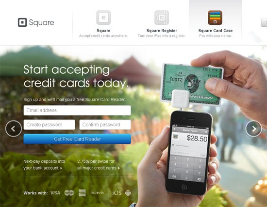
Headline
An effective landing page has to have a power headline.
The headline sends the main message of what to expect in the landing page and it lets the visitor know that they’re in the right place. Headlines have only one task: to entice the site visitor to stay on the landing page. That’s the main goal to have in mind.
When crafting your headline, ask yourself: Is this headline interesting enough and does it make the visitor want to keep reading? Tips:
- Keep your headline short and direct. Don’t waste the user’s time, give the user an idea of what they can achieve on the landing page as quickly as possible.
- Design to grab the viewer’s attention. Use a large font and place your headline prominently on the page. The headline should be at the top of the web page, where Internet users expect it to be.
- Consider using relevant keywords. Use keywords and phrases that a search engine user might use to find your page. Use an HTML heading element (such as
<h1>or<h2>) to help search engines index the content of the page better.
The Shopify landing page displays a good headline. The copy is short and gives the reader a quick overview of what the service is. It’s designed using a big font and is placed in a prominent location so that it quickly grabs the user’s attention.
The use of the key phrase “online store” in the headline may help in Shopify’s SEO efforts. 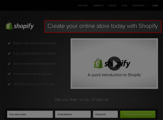
Simplicity
Landing pages should be simple. If the landing page is too complex, the site visitor might be discouraged to remain on the page.
The more complex landing pages are, the smaller the chance users will go through with the desired action. The message needs to be clear and only the essential stuff should be included. Tips:
- Every element on the page should encourage the user to take your desired action. Use the concept of Reductionism to help you eliminate needless items and copy.
- Have only one primary call to action. Keep your landing page’s objective simple. Pick a task you would like the user to take, such as downloading your software or signing up for your mailing list, and limit it to just that. Any additional call to action should reinforce your primary call to action.
- Use ample amounts of whitespace. If things are too cramped together, it might visually intimidate the site visitor.
The Dropbox landing page is very simple. It has a logo, a video and a call to action button. The primary call to action is to download the software.
The secondary call to action, “Watch a video”, supports the primary call to action by showing you some information on why you would want to download and use Dropbox. 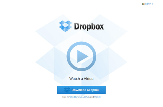
Eye Flow
To make sure that the visitor encounters all the landing page elements that will help them make a decision to take your desired call to action, the eye flow should be well-thought-out. Good eye flow makes the consumption of the information being shared in the page quicker for the site visitor and ensures that they end up seeing your desired call-to-action.
Tips:
- Arrange web page components in a logical visual hierarchy. Determine the order in which you want the viewer to look, and design your web page to support that order. To learn more about visual hierarchy, read the following guides: “Working with Visual Weight in Your Designs“, “Creating Focal Points in Your Web Design” and “Using Power Structure and Gestalt for Visual Hierarchy“.
- Use graphical elements to your advantage. Arrows, icons and attractive images can help direct the eyes of users towards an area of a web page.
- Use high-contrast foreground colors on certain web page components. If an element has a bright color relative to its background and surrounding elements, it’s likely to garner attention.
The Let’s Do This! website, which asks site visitors to donate to the Susan G. Komen for the Cure organization, presents a good example of how to direct users towards your call to action. The web page is laid out logically so that you can see the primary call to action right away.
Using arrows points your eyes to the call to the “Donate” button. The button and the surrounding arrows have high-contrast colors compared to the dark gray background, making sure it stands out. 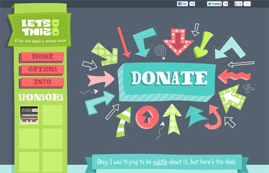
Relevance
Every visitor comes to your landing page from a specific source.
The landing page has to be relevant to that source. For example, if your ad says that by clicking on it, the user can buy iPads for half the price, then your landing page better be selling iPads for half the price. Relevance is key.
Tips:
- Consider creating landing pages for each marketing campaign. For example, if you have a Facebook marketing campaign, create a landing page that caters to Facebook users.
- Customize the landing page depending on the source. Add special content, discount codes and call to actions depending on what site the user is coming from.
Reduce the Risk for Taking Action
Internet users don’t like taking risk, that’s obvious. We are often concerned about security, privacy and of being scammed. Tips:
- Offer a compelling guarantee. For example, if you would like the user to buy a product, consider giving them a way to recover their money if they are unsatisfied with their purchase.
- Anticipate any concerns that the user may have and address them. Before taking an action, users may want to know more about the result of that action. These concerns are often related to cost, time and security.
- Offer a free trial (if possible). For example, if the landing page’s goal is to ask users to subscribe to one of your paid plans, consider allowing users to try it before they need to provide credit card information.
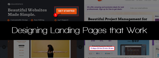
Squarespace displays good examples of reducing the risk to signing up and using their web service. By clearly telling users that no credit card is required, that the signup process only takes 30 seconds, and that there isn’t any permanent commitment, they have successfully addressed concerns related to cost, time and security. 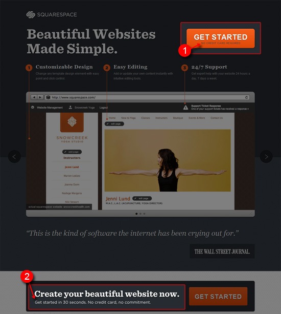
Scarcity
One way of designing landing pages that work is by creating a sense of scarcity.
If the user feels that the product might run out of stock or that the discounted price might end soon, they may be compelled not to procrastinate and take action now. Tips:
- Use convincing copy that conveys a sense of urgency. For example, clearly stating that the special discounted price will end soon might urge users to purchase your product now.
- Provide dynamic information that conveys scarcity. For instance, if you’re only selling 100 units, on your landing page, display how many units are left whenever someone purchases a unit.
On Mighty Deals, they display a countdown of how long until a deal expires. This may prompt site visitors to buy a deal immediately. 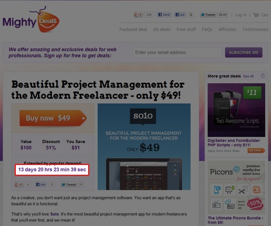
Trust Elements
There are many ways to provide users with reassurance that taking the action being solicited from your landing page is safe and secure.
One way is to provide social proof. Social proof can be in the form of displaying tweets about a product, testimonials from previous buyers, and positive reviews on third-party/non-affiliated sites such as review sites and blogs. Other ways include displaying certificates and badges from third-party companies.
Tips:
- Provide social proof data from reputable and well-known web services. For example, displaying the number of Facebook Likes is a good way to show social proof.
- Locate trust elements close to the call to action. It’s important that the user is able to see these trust elements around your call to action.
- Be honest. It goes without saying: Don’t publish fake testimonials and bloated social media follower counts.
On the FreshBooks landing page, you can see three trust elements: (1) The number of people using their web service, (2) quotes from reputable and well-known sites such as the New York Times and (3) their privacy certification. 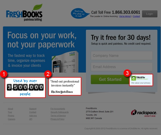
Conclusion
The design of landing pages is crucial in prompting users to take your desired action. By following the simple tips mentioned above, you’ll be well on your way to creating effective landing pages.
Related Content
-
 President of WebFX. Bill has over 25 years of experience in the Internet marketing industry specializing in SEO, UX, information architecture, marketing automation and more. William’s background in scientific computing and education from Shippensburg and MIT provided the foundation for MarketingCloudFX and other key research and development projects at WebFX.
 -

WebFX is a full-service marketing agency with 1,100+ client reviews and a 4.9-star rating on Clutch! Find out how our expert team and revenue-accelerating tech can drive results for you! Learn more
Make estimating web design costs easy
Website design costs can be tricky to nail down. Get an instant estimate for a custom web design with our free website design cost calculator!
Try Our Free Web Design Cost Calculator
Share this article


Web Design Calculator
Use our free tool to get a free, instant quote in under 60 seconds.
View Web Design CalculatorMake estimating web design costs easy
Website design costs can be tricky to nail down. Get an instant estimate for a custom web design with our free website design cost calculator!
Try Our Free Web Design Cost Calculator


