

 Continuing on with my previous article showing the power of CSS3 for web designers, I’m now going to share with you a method for making a slick call to action button using only CSS. Like the last article, I’m going to take a previous Photoshop tutorial called How to Create a Slick and Clean Button in Photoshop by Six Revisions Chief Editor, Jacob Gube, and try my best to recreate it without using a graphics editor. I think doing this is one of the best ways to highlight the fact that CSS3 can make our jobs as web designers much easier.
Check out that Photoshop tutorial and let me know how close I got to recreating its final product.
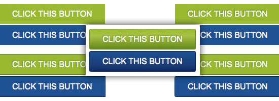
Live Demo of CSS3 Call to Action Button
Here’s what we’re going to make. It’s actually live, so feel free to hover over the button (clicking on it, though, will take you to the Six Revisions front page).
If you can’t see it right below, you may have iFrames disabled, or are using a browser that doesn’t yet support these CSS3 modules.
In-Page Demo
Screenshot of Call to Action Button
Here’s how the call to action button should look like (along with its hover state in blue). 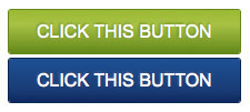
Basic HTML Markup
Okay, here we go: Let’s start with the HTML.
Very simple here, just a div to contain the button and a normal hyperlink element with a class of .btn (short for “button”) that will represent our call to action button. What a great reminder of what life was like before CSS! Note: The div around the hyperlink element is not really needed for this to work, but it’s always a good idea to have a container for flexibility.
<div id="linear"> <a href="http://www.sixrevisions.com" class="btn">CLICK THIS BUTTON</a> </div>

Basic CSS
Here we will add our first bit of CSS — just some basic styles for the normal and hover states of the button. Note: The background colors will be superseded by CSS3 gradients later on, but it’s always good practice to have a back-up plan in case the user is using a browser that doesn’t support CSS3.
a.btn { width: 250px; padding: 10px 25px 10px 25px; font-family: Arial; font-size: 16px; text-decoration: none; color: #ffffff; background-color: #98ba3f; } a.btn:hover { background-color: #245191; } 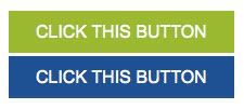
Give the Button a text-shadow CSS Attribute
In this step, we give our call to action button text a subtle text shadow. This actually isn’t CSS3, but it’s also not a highly used CSS attribute. We make the color of the text-shadow attribute different for the normal state and the hover state (using the :hover pseudo-class).
a.btn { text-shadow: -1px -1px 2px #618926; } a.btn:hover { text-shadow: -1px -1px 2px #465f97; } 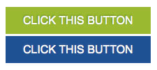
Give the Button a Thin Border
Let’s add a thin, 1px border to both button states to make the button a bit more interesting.
a.btn { border: 1px solid #618926; } a.btn:hover { border: 1px solid #0f2557; } Since up to this point we have only used CSS2 specs, this is how our call to action button will look like (degrade) in older web browsers. 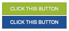
Round the Corners with CSS3
Alright, here’s where things get interesting.
We are going to use CSS3 to add a subtle rounded corner effect to the button. Using browser vendor prefixes (e.g. -moz- for Mozilla browsers), we can add a 3px border-radius attribute to the .btn class that will round the corners of the button.
Tip: To learn more about some CSS3 basics and why we have to use those crazy-looking vendor prefixes, check out my previous article called CSS3 Techniques You Should Know.
a.btn { border-radius: 3px; -moz-border-radius: 3px; -webkit-border-radius: 3px; } a.btn:hover { border-radius: 3px; -moz-border-radius: 3px; -webkit-border-radius: 3px; }It’s not a huge change, but it looks more interesting. Agree?

Add CSS3 Gradients
In this final step, we add in the styles that really make this button come to life. We implement the background gradients that give the button its characteristic slick/modern look. We need a starting and ending gradient color, as well as a stop color in between.
I’ll admit, the WebKit version (which affects Apple Safari and Google Chrome) looks pretty complicated. I’ve seen numerous ways of creating gradients for WebKit-based browsers, but none of them seem to be as simple as Mozilla browsers’ method.
a.btn { background: -moz-linear-gradient(#98ba40, #a6c250 35%, #618926); background: -webkit-gradient(linear,left top,left bottom,color-stop(0, #98ba40),color-stop(.35, #a6c250),color-stop(1, #618926)); } a.btn:hover { background: -moz-linear-gradient(#245192, #1e3b73 75%, #12295d); background: -webkit-gradient(linear,left top,left bottom,color-stop(0, #245192),color-stop(.75, #1e3b73),color-stop(1, #12295d)); }Here’s what it should look like (I’d say it’s pretty close to the original Photoshop tutorial that this is based off of).
All the CSS Together Now!
Here is our complete CSS for the .btn class.
a.btn { width: 250px; padding: 10px 25px 10px 25px; font-family: Arial; font-size: 16px; text-decoration: none; color: #ffffff; text-shadow: -1px -1px 2px #618926; background: -moz-linear-gradient(#98ba40, #a6c250 35%, #618926); background: -webkit-gradient(linear,left top,left bottom,color-stop(0, #98ba40),color-stop(.35, #a6c250),color-stop(1, #618926)); border: 1px solid #618926; border-radius: 3px; -moz-border-radius: 3px; -webkit-border-radius: 3px; } a.btn:hover { text-shadow: -1px -1px 2px #465f97; background: -moz-linear-gradient(#245192, #1e3b73 75%, #12295d); background: -webkit-gradient(linear,left top,left bottom,color-stop(0, #245192),color-stop(.75, #1e3b73),color-stop(1, #12295d)); border: 1px solid #0f2557; }Finished!
There you have it! With a relatively low number of styles, we get a button that looks quite similar to the Photoshop version.
If you weren’t already as excited as I am about CSS3, then hopefully this article will encourage you to explore and use this next iteration of CSS.
More CSS3 Reading
Read these other articles and tutorials to learn more about CSS3.
- CSS3 Techniques You Should Know
- Basic CSS3 Techniques That You Should Know
- Semantic CSS3 Lightboxes
- Examples of CSS3 in the Wild
- 20 Useful Resources for Learning about CSS3
Download Source Files
- css3-call-to-action-button-demo (ZIP, 0.1 KB)
Related Content
-
 President of WebFX. Bill has over 25 years of experience in the Internet marketing industry specializing in SEO, UX, information architecture, marketing automation and more. William’s background in scientific computing and education from Shippensburg and MIT provided the foundation for MarketingCloudFX and other key research and development projects at WebFX.
 -

WebFX is a full-service marketing agency with 1,100+ client reviews and a 4.9-star rating on Clutch! Find out how our expert team and revenue-accelerating tech can drive results for you! Learn more
Make estimating web design costs easy
Website design costs can be tricky to nail down. Get an instant estimate for a custom web design with our free website design cost calculator!
Try Our Free Web Design Cost Calculator
Share this article


Web Design Calculator
Use our free tool to get a free, instant quote in under 60 seconds.
View Web Design CalculatorMake estimating web design costs easy
Website design costs can be tricky to nail down. Get an instant estimate for a custom web design with our free website design cost calculator!
Try Our Free Web Design Cost Calculator


