
The CSS calc() property expression lets us perform simple calculations in our stylesheets.
Basics
Here is a rule set demonstrating the use of CSS calc():
.container { height: calc(100% - 50px); width: calc(100% - 40px); }As you can see in the example above, the CSS calc() property expression allows us to dynamically calculate the result between the subtraction of two CSS length values right in our stylesheet without using JavaScript, and even if length values don’t share the same unit.
We can only perform arithmetic calculations with CSS calc():
- Addition (
+) - Subtraction (
-) - Multiplication (
*) - Division (
/)
CSS calc() works on many types of numerical CSS values:
- Length
- Time
- Angle
- Frequency
- Unitless integers and numbers
CSS calc() can’t operate on CSS color values, and other types of CSS values.
Use Case
The value of CSS calc() can quickly be seen when we’re performing mathematical calculations on numerical values with differing CSS units. It becomes even more useful when the values are a mixture of relative and fixed units.
First, let’s talk about an instance where we shouldn’t use the calc() property expression.
Counterexample
/* Do not do this! */ div { width: calc(600px / 2); }In the style rule above, we’re performing a calculation that we can easily do ourselves.
So that our CSS is more readable, and to avoid unnecessary browser calculations that could slow down our web pages, it’s better if we pull out a real calculator and do the math ourselves:
div{ width: 300px; }Where to Use CSS calc()
CSS calc() becomes a great asset when one of the units is a relative unit while the other is a fixed unit. This ability to negotiate between different CSS units is especially wonderful in responsive web designs.
Here’s an example of a centered container that will always have 20px margins on its left and right, regardless of the screen size:
.container { margin: 0 auto; width: calc(100% - 40px); }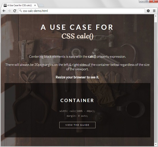
In this use case of CSS calc(), we are able to account for a vertical scrollbar and ensure readability comfort of our content regardless of what device is being used. And this method of centering a fluid container only requires minimal CSS and HTML.
Other responsive design techniques for achieving the same result require more code, and might entail things such as negative margins, media queries, and extraneous nesting of HTML container elements.
Specs Status
The specifications for CSS calc() is described in W3C CSS Values and Units Module 3. At the time of writing, this module is in W3C Candidate Recommendation (CR) status, meaning it is two levels away from being finalized.
Keep in mind that, right now, CSS calc() is one of the three CSS features singled out in the module’s specifications as being in danger of being dropped. This is what the CR says:
The following features are at-risk and may be dropped during the CR period: ‘calc()’, ‘toggle()’, ‘attr()’.
Browser Support
Currently, CSS calc() is supported in about 82% of the browsers being used on the Web, according to data from caniuse.com.
Internet Explorer 9 has partial support of CSS calc(), and subsequent versions of the browser have full feature support.
Related Content
-
 President of WebFX. Bill has over 25 years of experience in the Internet marketing industry specializing in SEO, UX, information architecture, marketing automation and more. William’s background in scientific computing and education from Shippensburg and MIT provided the foundation for MarketingCloudFX and other key research and development projects at WebFX.
 -

WebFX is a full-service marketing agency with 1,100+ client reviews and a 4.9-star rating on Clutch! Find out how our expert team and revenue-accelerating tech can drive results for you! Learn more
Make estimating web design costs easy
Website design costs can be tricky to nail down. Get an instant estimate for a custom web design with our free website design cost calculator!
Try Our Free Web Design Cost Calculator
Share this article


Web Design Calculator
Use our free tool to get a free, instant quote in under 60 seconds.
View Web Design CalculatorMake estimating web design costs easy
Website design costs can be tricky to nail down. Get an instant estimate for a custom web design with our free website design cost calculator!
Try Our Free Web Design Cost Calculator


