

 Typography is an essential component of a website’s design. This is for good reason: good typography is not only imperative for aesthetic appeal, but also improves site usability when text legibility and readability concepts are applied. Typography is all about proportions and spacing.
There are also font styles to consider. Typography has a huge affect on user experience and ultimately a business’ web reputation. How can we use CSS for great typography in our web designs?
This is a question we’ll try to answer. This is the first part of a three-part series of guides on CSS typography that will cover everything from basic syntax to best practices and tools related to CSS typography.
- CSS Typography: The Basics
- CSS Typography: Techniques and Best Practices
- CSS Typography: Examples and Tools
Typography CSS Properties
There are two main groups of CSS properties that control typography style: font and text. The font CSS property group dictates general font characteristics such as font-style and font-weight. Below you’ll see the p element given a font-style and a font-weight property.
p { font-style: oblique; font-weight: bold; } 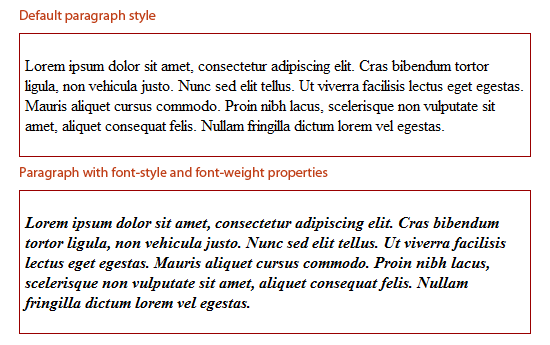 The text CSS property group deals with the characters, spaces, words and paragraphs. For example, the
 text-indent property indents the first line of a text block. The letter-spacing property controls the spaces between a text block.
Below, you’ll see the p element given a text-indent and a letter-spacing property.
p { text-indent: 50px; letter-spacing: 2px; } 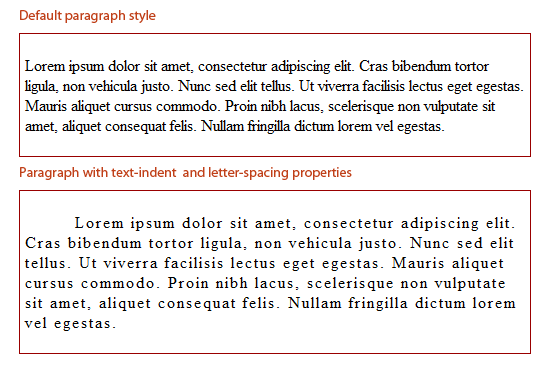 There are other CSS properties that can affect web typography outside of the fonts and text property groups. For example, the
 color property controls an HTML element’s foreground color, and can be used to change the color of text.
Below, you’ll see the p element given a red color.
p { color: red; } 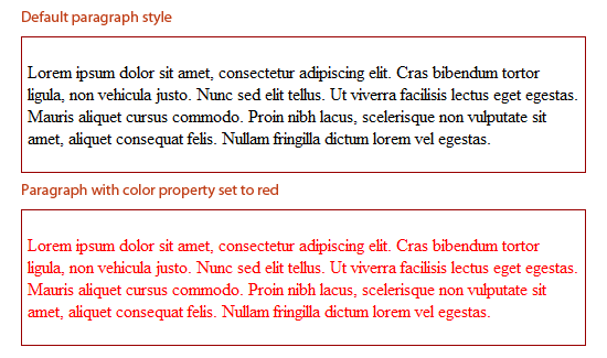
Font Sizing
Browser compatibility is a major issue in web design, even more so if you are attempting to make your web designs look the same in all browsers. Beginning web designers may mess around with a font’s size until it looks just right, only to find it has completely changed among other browsers and platforms.
Size fonts the correct way, and this problem can be minimized. A simple use of sizing text is as follows:
h6 { font-size: 12pt; } The above sets the heading level-6 element to 12pt. For font-size values, there are 4 types of units of measurement.
Absolute-size
Standard keywords whose values are defined by the user agent (e.g., web browser). Values in W3C CSS 2.1 specifications are xx-small, x-small, small, medium, large, x-large, xx-large.
Relative-size
Standard keywords that size fonts based on the parent element.
These are also defined by the user agent. Possible values are larger and smaller. Below you will see what a paragraph element looks like inside a parent element (<div>) that has a size of 12pt (in Firefox).
div { font-size: 12pt; } p { font-size: large; } 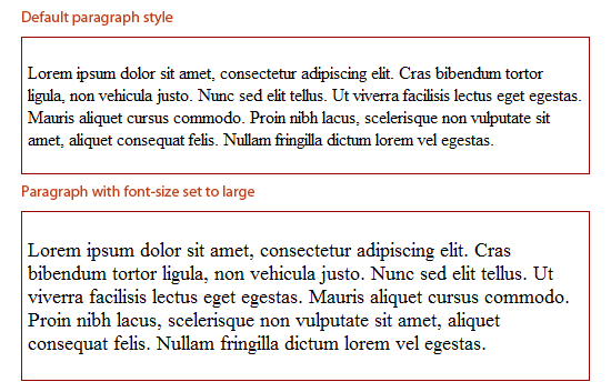 Both keyword value groups (absolute-size and relative-size) can vary greatly between different browsers, so if your aim is to be pixel perfect, they might not be a good option, and most web designers avoid them altogether. The
 smaller and larger keywords, however, can be great for convenient relative sizing when exact proportions don’t matter to the design. The larger and smaller values will inherit the parent element’s font-size and then relatively adjust the target element’s font-size accordingly.
So, for example, if a parent element’s value is set to small, the larger keyword will make the child element larger. For most browsers, the change from exact units is around 1.2 units, although that proportion is not consistent amongst all browsers. As an example, if text is set to 12pt, the larger keyword will resize the child element’s text to about 12pt x 1.2 (depending on the browser), which would equal 14.4pt.
Absolute Lengths
Absolute lengths are literal sizes.
For example, 12px is exactly 12 pixels and 2in is exactly 2 inches. Absolute lengths are often used by web designers. Possible units for absolute length units are pt, px, mm, cm, in, and pc.
Millimeters (mm), centimeters (cm), and inches (in) are more suitable to physical, real-world dimensions and are units of measurement often used in print design. They are not very suitable for screen-based measurements because of the high variance of screen resolutions. Points (pt) and picas (pc) — while better than mm, cm and in — can also vary visually based on the browser or device’s dpi.
Therefore, when using absolute lengths, pixels (px) are the least problematic. One issue with px, though, is that older versions of IE cannot resize them natively. If developing for an audience that will likely resize text manually through their web browser, the px unit of measurement may not be a good option.
Be sure when using px for font sizing that accessibility is not an issue.
Relative Lengths
The other type of length units are relative lengths. This means that their sizes are dependent on the font-size assigned to their parent element.
Possible units are em, % and ex. Not many web designers use ex — it is the height of the letter “x” in the current font. em and % values are far easier to work with.
em and % act identically, and it’s just a matter of syntax:
0.5emis equal to50%1emis equal to100%0.2emis equal to20%0.73emis equal to73%2.21emis equal to221%
html, body { font-size: 85%; /* = (.85em) */ } h1 { font-size: 110%; /* = (1.1em) */ } The proportions are all relative to the element’s parent font-size. So, if the base font size (in body or html) is set to 80%, a child with a font-size of 0.2em or 20% would be 20% in height of the original 80%.
Font Stacks
CSS font stacks are a list of fonts that include fonts that will work well in various operating systems and platforms, with the goal of making typography as consistent as possible.
Here is an example of a font stack:
body { font-family: Georgia, Times, "Times New Roman", serif; }In the above example, the web browser will go from left to right until it finds a font in the user’s computer. For example, it will search for the Georgia font, and if it doesn’t find it, it will move on to the Times font, and so on. There are many options for creating font stacks, and there are many popular premade font stacks available on blogs and in IDEs such as Dreamweaver.
The idea of a font stack is to provide ideal fonts that would be available on many computers, and then provide fallback fonts behind them to degrade to in case the preferred font is not available. A good goal to strive for is to create beautiful typography for a wide range of users, but also account for the situation that the preferred font is not available to all users. There are a few key items to keep in mind when creating custom font stacks:
- There should be a good amount of fallback fonts. Our above example only lists three, but it would be ideal if there were more.
- The fonts selected should be available on a number of platforms. For example, Arial is widely used on Windows, while its near equivalent, Helvetica, is on nearly all Macs.
- For font stacks that accomodate Linux users, check out A Web Designer’s Guide to Linux Fonts.
Best Practices for Developing Font Stacks
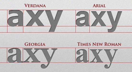
All fonts in the same font stack should have the same (or similar) aspect ratios. Some fonts are wider or taller per letter than others are, giving them larger aspect ratios. So, if we put Verdana (mostly Windows) with Helvetica (mostly Macs), we’ve met the above requirements.
However, since Verdana is much wider than Helvetica, the text will look dramatically different on most Macs compared to most Windows computers. The image below show the difference in aspect ratio among four common Windows fonts. As you can see, Verdana and Georgia are wider and taller than both Arial and Times.
 In larger blocks of text, the difference is more apparent. If we had a font stack with Verdana to accommodate Windows and Helvetica for Macs, the image below shows the significant difference.
 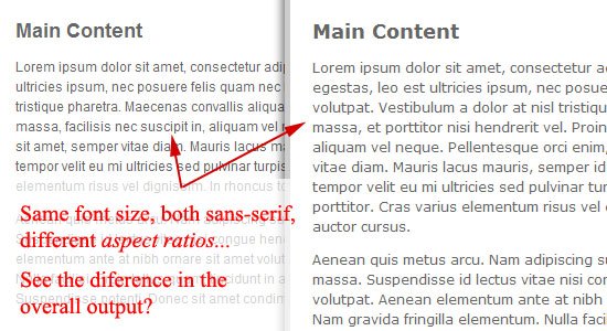 So when developing font stacks:
- Make sure you account for the different operating systems (Windows, Mac, and Linux).
- Make sure a font stack is all sans serif or is all serif (for consistency)
- Make sure the fonts in the stack have similar aspect ratios.
Here is a list of the most common fonts for various aspect ratio types:
- Wide sans serif: Verdana, Geneva
- Narrow sans serif: Tahoma, Arial, Helvetica
- Wide serif: Georgia, Utopia
- Narrow serif: Times, Times New Roman
- Monospace: Courier, Courier New, Lucida Console
If you need more help on font stacking, CodeStyle has created a very useful font stack builder that includes all fonts between Mac, Windows, and Linux.
CSS Typography Pseudo-classes and Pseudo-elements
CSS pseudo-classes and pseudo-elements are great for targeting certain types of elements. Pseudo-classes start with a colon (:) followed by the class/element name.
There are several CSS pseudo-classes/pseudo-elements related to typography, such as :hover and :first-letter. Let’s go over some that will help in styling our typography.
Links and Dynamic Pseudo-classes
The design of a website’s hyperlinks is very important.
Use anchor link pseudo-classes to create font styles for each link state. :hover is probably the most familiar, and it is good practice to create a separate (yet similar) style for it to provide a visual cue that a link element is interactive. Here are the link pseudo-classes:
a:link { color: #666666; text-decoration: none; } a:visited { color: #333333; } a:hover { text-decoration: underline; } a:active { color: #000000; }First, Last, and n-th Pseudo-elements
The following pseudo-elements all relate to the position of an element relative to the HTML document and the other HTML elements in it.
:first-letter allows you to target the first letter of an element. Here’s an example:
p:first-letter { font-size: 30pt; display: block; float: left; margin: 0 5px 5px 0; } 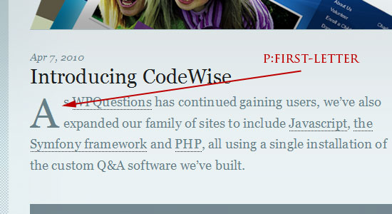 As you can see, this pseudo-element can be helpful for creating drop caps.
 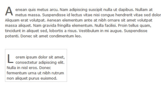 The
The ::first-line CSS pseudo-element allows you to select the first line of an HTML element containing text.
Here’s an example for bolding the first line of text and making its letters uppercased:
p::first-line { font-weight: bold; text-transform: uppercase; } 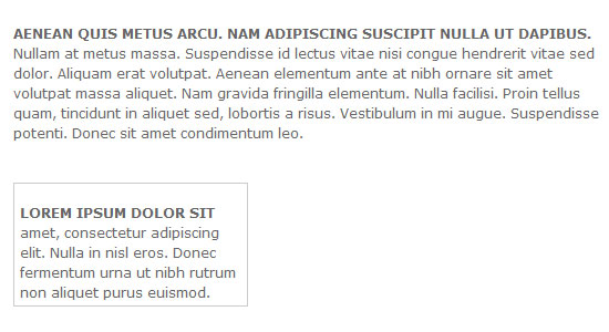 Note: As of Aug. 15, 2015 Google Chrome has a bug where the
 text-transform CSS property is ignored when using the ::first-line pseudo-element selector. :nth-child() is a CSS3 pseudo-element that will target that nth element in a page or parent element depending on the selector’s specificity.
In our example below, we target the second paragraph on the page.
p:nth-child(2) { background: #e7f0ce; padding: 10px; } 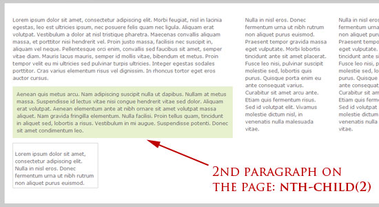 We could also target the second paragraph within a
 div or the second list item in a list as follows:
div p:nth-child(2) { background: #e7f0ce; padding: 10px; } ul li:nth-child(2) { background: #e7f0ce; padding: 10px; } Also play around with :nth-child(even) and :nth-child(odd) pseudo-classes to grab even and odd elements. There is also the :first-child pseudo-element (CSS2) and the :last-child (CSS3) pseudo-element that can select the first and last element in a set.
Conclusion
We have covered the basics of CSS typography. With a bit of creativity, typography can go in some beautiful and interesting directions with CSS. CSS is so important to understand because whether you are building a site for a local golf course or a fortune 5o0 company, you will run into it quite a bit.
In the next part, we will discuss some CSS techniques and best practices pertaining to CSS typography.
- CSS Typography: The Basics
- CSS Typography: Techniques and Best Practices
- CSS Typography: Examples and Tools
Related Content
- A Comprehensive Guide to CSS Resets
- 100 Exceedingly Useful CSS Tips and Tricks
- 10 Random CSS Tricks You Might Want to Know About
- Related categories: Web Design
About the Author
 Kayla Knight is a web designer and web developer who loves coding way too much for her own good. She does freelance design/development work and helps run the XHTML Shop. Connect with her by vis
-
 President of WebFX. Bill has over 25 years of experience in the Internet marketing industry specializing in SEO, UX, information architecture, marketing automation and more. William’s background in scientific computing and education from Shippensburg and MIT provided the foundation for MarketingCloudFX and other key research and development projects at WebFX.
 -

WebFX is a full-service marketing agency with 1,100+ client reviews and a 4.9-star rating on Clutch! Find out how our expert team and revenue-accelerating tech can drive results for you! Learn more
Make estimating web design costs easy
Website design costs can be tricky to nail down. Get an instant estimate for a custom web design with our free website design cost calculator!
Try Our Free Web Design Cost Calculator
Share this article


Web Design Calculator
Use our free tool to get a free, instant quote in under 60 seconds.
View Web Design CalculatorMake estimating web design costs easy
Website design costs can be tricky to nail down. Get an instant estimate for a custom web design with our free website design cost calculator!
Try Our Free Web Design Cost Calculator