
 CSS3 is truly amazing. It gives web designers the ability to create flexible and easily reusable design elements, and reduces our reliance on images and graphics editors. This is a guide shows you how to create stylish social media buttons using CSS3, HTML, and some freely available social media icons.
Inspiration
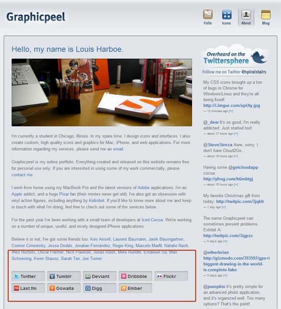
One day, I stumbled upon Louis Harboe’s personal website, Graphicpeel, and I noticed his simple yet nicely designed social media buttons at the bottom of the site’s About page. I thought to myself, these are nice but I bet I could do this using just CSS3. And off I went!
HTML
First off, we will set the foundations with some simple HTML. We want to create a div that will contain our buttons and that has a class name of inset. Then we want use an unordered list (<ul>), with each button being a list item (<li>).
Inside each <li> tag, we will have a link (<a>). Each link will have an <img> inside it that represents the social media icon, as well as a <span> to hold the text for the button (which will be “LinkedIn”, “Facebook”, and so forth). The social media icons I used are from Handycons 2 and 108 Free Matte White Square Social Networking Icons.
We can give the span elements a class name of site to be able to style them later on. Your HTML should look something like the following:
<div class="inset"> <ul> <li> <a href="mailto:[email protected]"> <img src="images/gmail_16.png" alt="gmail icon" /> <span class="site">E-Mail</span> </a> </li> <li> <a href="http://linkedin.com" title="My LinkedIn Page"> <img src="images/linkedin_16.png" alt="LinkedIn icon" /> <span class="site">LinkedIn</span> </a> </li> <li> <a href="http://facebook.com" title="My Facebook Page"> <img src="images/facebook_16.png" alt="Facebook icon" /> <span class="site">Facebook</span> </a> </li> <li> <a href="http://twitter.com" title="My Twitter Page"> <img src="images/twitter_16.png" alt="Twitter icon" /> <span class="site">Twitter</span> </a> </li> <li> <a href="http://flickr.com" title="My Flickr Page"> <img src="images/flickr_16.png" alt="Flickr icon" /> <span class="site">Flickr</span> </a> </li> </ul> </div>
CSS
The bulk of the code will be in CSS. We’ll go over the basic style rules first, and then progressively build up our buttons.
Basic CSS
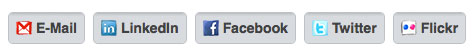
Let us give our buttons some basic styles. The following code block simply uses CSS2 specs, which will give us a good fallback for browsers that don’t have support for CSS3 specifications (progressive enhancement). The following is pretty self-explanatory: We just style the list items so that they appear to look like boxy buttons that are laid out side by side (using display:block and float:left).
.inset { font-family: Helvetica, Verdana, Arial, sans-serif; font-size: 14px; list-style-type: none; margin: 10px 0 0 10px; } .inset ul { list-style-type: none; display: block; } .inset li { float: left; height: 30px; margin: 0 8px 7px 0; } .inset li a { background-color: gray; color: #424242; float: left; font-size: 16px; font-weight: bold; height: 24px; padding-left: 27px; padding-top: 6px; position: relative; text-decoration: none; border: 1px solid #bfc1c6; } .inset li a:hover { border: 1px solid #b4b7bb; } .inset li a img { height: 16px; left: 7px; margin-right: 7px; position: absolute; top: 7px; width: 16px; border: none; } .inset li a span { display: block; height: 22px; padding-right: 7px; overflow: hidden; /* width: 70px; Uncomment this to add a fixed width */ } span.site { font-size: 14px; line-height: 20px; } What we have so far is pretty boring; but that’s to be expected since we haven’t used any CSS3 yet. 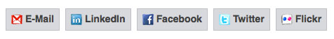
Rounded Corners with CSS3
To make these buttons look a bit more stylish, let’s give them some rounded corners using the border-radius property. Keep in mind that we must use vendor specific browser extensions for Mozilla (-moz- for browsers such as Firefox, SeaMonkey, and Flock) and WebKit (-webkit- for browsers such as Safari and Chrome).
Other browsers such as Opera and IE9 will recognize the border-radius property without vendor prefixes. Add these properties to the .inset li a selector:
/* Mozilla browsers that use Gecko layout engine */ -moz-border-radius: 5px; /* Safari and Chrome that use WebKit layout engine */ -webkit-border-radius: 5px; /* W3C CSS Level 3.0 specifications. For Opera and IE9 */ border-radius: 5px;

Color Gradients with CSS3
With CSS3 gradients, we can do some pretty cool stuff that otherwise would need to be done with CSS background images created in a graphics editor like Photoshop.
CSS3 gradients allow us to add color gradients to any HTML element that can result in many interesting things such as CSS3 design patterns and illustrative renderings such as Christmas baubles. To create the gradient on our buttons, we will use the gradient value syntax (i.e. linear-gradient() and gradient()) assigned to the background property.
The implementation for Mozilla browsers and WebKit browsers is different, so although we’re trying to do the same thing, the code will be different for each browser layout engine. Notice that for Mozilla (-moz-), I have used percentages, whereas for WebKit (-webkit-) I have to use decimals; 1% in Mozilla is .01 in WebKit, 10% in Mozilla is equivalent to .10 in WebKit, and so on. Add these styles to the .inset li a selector:
/* Mozilla browsers that use Gecko layout engine */ background: -moz-linear-gradient(#a5a7aa, #bec1c5 1%, #d8dbdf 10%, #d8dbdf); /* Safari and Chrome that use WebKit layout engine */ background: -webkit-gradient(linear,left top,left bottom,color-stop(0, #a5a7aa),color-stop(.01, #bec1c5),color-stop(.10, #d8dbdf),color-stop(1, #d8dbdf));
Styling the :hover Pseudo-class
Let’s go ahead and change the way the buttons look when the user hovers over them.
By changing up the gradient colors slightly when a user mouses over one of the buttons, we can give her a visual cue that it is clickable. If you wanted to make these even more visually-engaging, you may want to experiment with CSS3 transform functions. Add these styles to the .inset li a:hover selector:
background: -moz-linear-gradient(#9c9fa2, #b4b7bb 1%, #cdd0d5 10%, #cdd0d5); background: -webkit-gradient(linear,left top,left bottom,color-stop(0, #9c9fa2),color-stop(.01, #b4b7bb),color-stop(.10, #cdd0d5),color-stop(1, #cdd0d5));
In the image below, I’ve hovered over the E-mail button.
As you can see, it is slightly darker than the others. 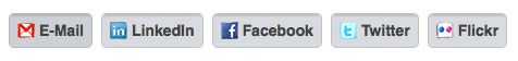
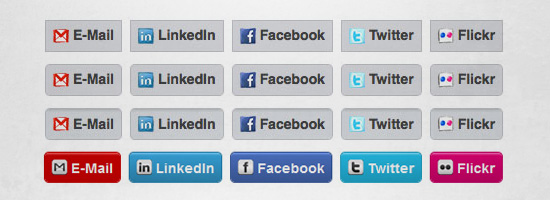
Alternative Result: “Outset” Buttons with Different Colors
To demonstrate the flexibility that CSS3 offers, let us create a different version of the buttons using the same HTML structure.
HTML
In this example, we need to change the class of the containing div from inset to outset-colored.
Additionally, since each button will be a different color, we must also give them a unique class. We can assign these classes to the <a> tags; for example, Facebook will have class="facebook". You’re probably wondering why I chose to use the class attribute versus the ID attribute: It’s because I want to account for the situation that multiple buttons of the same class can appear on the same page.
Here is the HTML:
<div class="outset-colored"> <ul> <li> <a href="mailto:[email protected]" title="My E-Mail" class="email"> <img src="images/gmail_white.png" alt="gmail icon" /> <span class="site">E-Mail</span> </a> </li> <li> <a href="http://linkedin.com" title="My LinkedIn Page" class="linkedin"> <img src="images/linkedin_white.png" alt="LinkedIn icon" /> <span class="site">LinkedIn</span> </a> </li> <li> <a href="http://facebook.com" title="My Facebook Page" class="facebook"> <img src="images/facebook_white.png" alt="Facebook icon" /> <span class="site">Facebook</span> </a> </li> <li> <a href="http://twitter.com" title="My Twitter Page" class="twitter"> <img src="images/twitter_white.png" alt="Twitter icon" /> <span class="site">Twitter</span> </a> </li> <li> <a href="http://flickr.com" title="My Flickr Page" class="flickr"> <img src="images/flickr_white.png" alt="Flickr icon" /> <span class="site">Flickr</span> </a> </li> </ul> </div>
CSS
The CSS is lengthier than the original, but that’s because each button has a different color. The CSS3 used is very similar; the alternative result just has different color values for the gradients. Here is the CSS for the alternative result:
/* COLORED OUTSET BUTTONS */ .outset-colored { font-family: Helvetica, Verdana, Arial, sans-serif; font-size: 14px; list-style-type: none; margin: 10px 0 0 10px; } .outset-colored ul { list-style-type: none; display: block; } .outset-colored li { float: left; height: 30px; margin: 0 8px 7px 0; } .outset-colored li a { color: #424242; float: left; font-size: 16px; font-weight: bold; height: 24px; padding-left: 27px; padding-top: 6px; position: relative; text-decoration: none; border: 1px solid #bfc1c6; border-radius: 5px; background-color: #D8D9DD; -moz-border-radius: 5px; -webkit-border-radius: 5px; } /* EMAIL */ .outset-colored li a.email { background: -moz-linear-gradient(#ff6666, #cc0000 10%, #c40202); background: -webkit-gradient(linear,left top,left bottom,color-stop(0, #ff6666),color-stop(.10, #cc0000),color-stop(1, #c40202)); color: #f3f3f3; border: 1px solid #c40202; } .outset-colored li a:hover.email { background: -moz-linear-gradient(#c40202, #cc0000 1%, #e03434 10%, #e03434); background: -webkit-gradient(linear,left top,left bottom,color-stop(0, #c40202),color-stop(.01, #cc0000),color-stop(.10, #e03434),color-stop(1, #e03434)); } /* LINKEDIN */ .outset-colored li a.linkedin { background: -moz-linear-gradient(#7cd0fb, #38a5dc 10%, #2c83ae); background: -webkit-gradient(linear,left top,left bottom,color-stop(0, #7cd0fb),color-stop(.10, #38a5dc),color-stop(1, #2c83ae)); color: #f3f3f3; border: 1px solid #2c83ae; } .outset-colored li a:hover.linkedin { background: -moz-linear-gradient(#2c83ae, #38a5dc 1%, #41b9f6 10%, #41b9f6); background: -webkit-gradient(linear,left top,left bottom,color-stop(0, #2c83ae),color-stop(.01, #38a5dc),color-stop(.10, #41b9f6),color-stop(1, #41b9f6)); } /* FACEBOOK */ .outset-colored li a.facebook { background: -moz-linear-gradient(#7aa3f7, #4c72c3 10%, #3b5998); background: -webkit-gradient(linear,left top,left bottom,color-stop(0, #7aa3f7),color-stop(.10, #4c72c3),color-stop(1, #3b5998)); color: #f3f3f3; border: 1px solid #3b5998; } .outset-colored li a:hover.facebook { background: -moz-linear-gradient(#3b5998, #4c72c3 1%, #5c8aea 10%, #5c8aea); background: -webkit-gradient(linear,left top,left bottom,color-stop(0, #3b5998),color-stop(.01, #4c72c3),color-stop(.10, #5c8aea),color-stop(1, #5c8aea)); } /* TWITTER */ .outset-colored li a.twitter { background: -moz-linear-gradient(#8ae0fd, #24bce6 10%, #1e9ec1); background: -webkit-gradient(linear,left top,left bottom,color-stop(0, #8ae0fd),color-stop(.10, #24bce6),color-stop(1, #1e9ec1)); color: #f3f3f3; border: 1px solid #1e9ec1; } .outset-colored li a:hover.twitter { background: -moz-linear-gradient(#1e9ec1, #24bce6 1%, #33ccff 10%, #33ccff); background: -webkit-gradient(linear,left top,left bottom,color-stop(0, #24bce6),color-stop(.01, #33ccff),color-stop(.10, #33ccff),color-stop(1, #33ccff)); } /* FLICKR */ .outset-colored li a.flickr { background: -moz-linear-gradient(#fc75ba, #e10374 10%, #c10263); background: -webkit-gradient(linear,left top,left bottom,color-stop(0, #fc75ba),color-stop(.10, #e10374),color-stop(1, #c10263)); color: #f3f3f3; border: 1px solid #c10263; } .outset-colored li a:hover.flickr { background: -moz-linear-gradient(#c10263, #e10374 1%, #ff0283 10%, #ff0283); background: -webkit-gradient(linear,left top,left bottom,color-stop(0, #c10263),color-stop(.01, #e10374),color-stop(.10, #ff0283),color-stop(1, #ff0283)); } .outset-colored li a img { height: 16px; left: 7px; margin-right: 7px; position: absolute; top: 7px; width: 16px; border: none; } .outset-colored li a span { display: block; height: 22px; padding-right: 7px; overflow: hidden; /*width: 70px; Add a width here if you want all the buttons to be the same size.*/ } span.site { font-size: 14px; line-height: 20px; } 
Related Content
-
 President of WebFX. Bill has over 25 years of experience in the Internet marketing industry specializing in SEO, UX, information architecture, marketing automation and more. William’s background in scientific computing and education from Shippensburg and MIT provided the foundation for MarketingCloudFX and other key research and development projects at WebFX.
 -

WebFX is a full-service marketing agency with 1,100+ client reviews and a 4.9-star rating on Clutch! Find out how our expert team and revenue-accelerating tech can drive results for you! Learn more
Make estimating web design costs easy
Website design costs can be tricky to nail down. Get an instant estimate for a custom web design with our free website design cost calculator!
Try Our Free Web Design Cost Calculator
Share this article


Web Design Calculator
Use our free tool to get a free, instant quote in under 60 seconds.
View Web Design CalculatorMake estimating web design costs easy
Website design costs can be tricky to nail down. Get an instant estimate for a custom web design with our free website design cost calculator!
Try Our Free Web Design Cost Calculator


