

In this tutorial, we’ll go over the simplest technique for making a background image fully stretch out to cover the entire browser viewport. We’ll use the CSS background-size property to make it happen; no JavaScript needed. 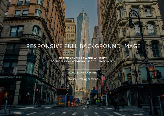 View Demo Download Source from GitHub
Examples of responsive full background images
Having a large photo that covers the entire background of a web page is currently quite popular.
Here are a few websites that have responsive full background images: 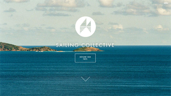 Sailing Collective
  Digital Telepathy
 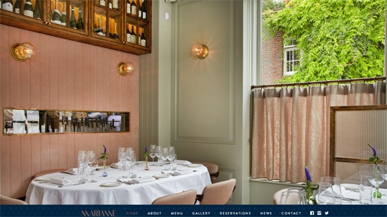 Marianne Restaurant If you’d like to achieve a similar look in your next web design project, you’re at the right spot.
Core concepts for creating responsive background images with CSS
This is our game plan.
Use background-size property to cover the entire viewport
The CSS background-size property can have the value of cover. The cover value tells the browser to automatically and proportionally scale the background image’s width and height so that they are always equal to, or greater than, the viewport’s width/height.
Use a media query to serve a smaller background image for mobile devices
To enhance the page load speed on small screens, we’ll use a media query to serve a scaled-down version of the background image file. This is optional.
The technique will work without this.
But why is serving a smaller background image for mobile devices a good idea? The image I’ve used in the demo is about 5500x3600px. This dimension will have us covered on most widescreen computer monitors currently being sold in the market, but at the expense of serving up a 1.7MB file.
That huge of a payload just for a background photo is never a good thing under any sort of situation, but it’s exceptionally bad on mobile internet connections.
And also, the image dimension is excessive on small-screen devices (more on this further down in this tutorial).
Let’s walk through the process.
HTML
This is all you need for the markup:
<!doctype html> <html> <body> ...Your content goes here... </body> </html>
We’re going to assign the background image to the body element so that the image will always cover the entire viewport of the browser. However, this technique will also work on any block-level element (such as a div or a form). If the width and height of your block-level container is fluid, then the background image will always scale to cover the container entirely.
CSS
We declare a style rule for the body element like so: body { /* Location of the image */ background-image: url(images/background-photo.jpg); /* Background image is centered vertically and horizontally at all times */ background-position: center center; /* Background image doesn’t tile */ background-repeat: no-repeat; /* Background image is fixed in the viewport so that it doesn’t move when the content’s height is greater than the image’s height */ background-attachment: fixed; /* This is what makes the background image rescale based on the container’s size */ background-size: cover; /* Set a background color that will be displayed while the background image is loading */ background-color: #464646; } The most essential property/value pair to pay attention to is:
background-size: cover;
That’s where the magic happens.
This property/value pair tells the browser to scale the background image proportionally so that its width and height are equal to, or greater than, the width/height of the element. (In our case, that’s body element.)
There’s an issue with this property/value pair though: If the background image is smaller than the body element’s dimensions — which will happen on high-resolution screens and/or when you’ve got a ton of content on the page — the browser will programmatically scale up the image. And, as we all know, when we scale up an image from its natural dimensions, the image quality degrades (in other words, pixelation occurs).
 When an image is scaled up above its natural dimensions, image quality is affected. Keep that in mind as you choose which image you’re going to use. The demo uses a huge 5500x3600px photo for larger screens so it’ll be a while before we run into trouble. Let’s move on.
So that the background image is always centered in the viewport, we declare:
background-position: center center;
The above sets the scaling axis at the center of the viewport. Next, we need to deal with the situation where the content’s height is greater than the visible viewport’s height. When this happens, a scroll bar will appear.
What we want to do is make sure that the background image stays put even when the user scrolls down, or else we’ll either run out of image at the bottom, or the background will move as the user is scrolling down (which can be very distracting). To do this, we set the background-attachment property to fixed.
background-attachment: fixed;
In the demo, I included a “load some content” feature so that you can see the scrolling behavior when background-attachment is fixed. One thing you could do is download the demo and then play around with the positional property values (e.g.
background-attachment and background-position) to see how it affects the behaviors of page-scrolling and the background image. The other property values are pretty self-explanatory.
Shorthand CSS notation
I wrote the background properties in full notation to make the CSS easier to describe.
The equivalent shorthand CSS notation for the above is: body { background: url(background-photo.jpg) center center cover no-repeat fixed; } All you have to do is change the url value to point to the location of your background image, and you’re good to go.
Optional: Media query for small screens
For small screens, I used Photoshop to proportionally resize the original background image down to 768x505px and I also ran it through Smush.it to cut out a few more bytes. Doing this reduced the file size down from 1741KB to 114KB. That’s a 93% reduction in file size.
Please don’t get me wrong, 114KB is still quite big for a purely aesthetic component of a design. For a 114KB payload, I would normally only subject users to it if the file had the potential to add a significant improvement in UX, because of the huge mobile web performance trade-off. Here’s the media query: @media only screen and (max-width: 767px) { body { /* The file size of this background image is 93% smaller to improve page load speed on mobile internet connections */ background-image: url(images/background-photo-mobile-devices.jpg); } } The media query is set at a max-width: 767px breakpoint, which in our case means that if the browser viewport is greater than 767px, it will serve the larger background image file.
The downside of using the media query above is that if you resize your browser window from, for example, 1200px width down to 640px width (or vice versa), you will momentarily see a flicker while the smaller or bigger background image loads up. In addition, because some small devices can render more pixels — for example, iPhone 5 with its retina display can render 1136x640px — the smaller background image will be pixelated.
Create your first responsive background image with CSS
You can get the most current source code of this tutorial from GitHub. If I can say just one cautionary thing about this technique, it’s this: Please use it with care because large files can severely affect UX, especially when our user is not on a fast or reliable Internet connection.
This is also the reason why you should set a good default background color so the user can read the content while the background image is loading. Optimizing your Web images before putting them up on production is never a bad idea either; we’ve got some articles to help with this:
- Guide to Saving Images for the Web
- Tools for Optimizing Your Images
- A Crash Course Guide on JPEG
- Advanced Image Optimization Tricks
License: Public Domain Dedication
No need to ask permission if you want to use the source code included in this tutorial; I’ve placed the tutorial’s code in the public domain under CC0 1.0 Universal. The source code in my GitHub repo is free of any copyright restrictions. You can use, sell, modify, and distribute the source code, all without asking permission, providing attribution, or any other requirement.
(I don’t own the background image though, it’s from Unsplash.)
Related Content
-
 President of WebFX. Bill has over 25 years of experience in the Internet marketing industry specializing in SEO, UX, information architecture, marketing automation and more. William’s background in scientific computing and education from Shippensburg and MIT provided the foundation for MarketingCloudFX and other key research and development projects at WebFX.
 -

WebFX is a full-service marketing agency with 1,100+ client reviews and a 4.9-star rating on Clutch! Find out how our expert team and revenue-accelerating tech can drive results for you! Learn more
Make estimating web design costs easy
Website design costs can be tricky to nail down. Get an instant estimate for a custom web design with our free website design cost calculator!
Try Our Free Web Design Cost Calculator
Share this article


Web Design Calculator
Use our free tool to get a free, instant quote in under 60 seconds.
View Web Design CalculatorMake estimating web design costs easy
Website design costs can be tricky to nail down. Get an instant estimate for a custom web design with our free website design cost calculator!
Try Our Free Web Design Cost Calculator