

Having a clean and well-structured website navigation is key in designing an effective user interface.
Drop-down menus are great for sites that have multiple levels of content hierarchy. The typical design pattern of a drop-down menu is that when a user hovers over the parent navigation item, a submenu of navigation items appears. In this collection are many different types of drop-down menus used in websites all over the web for your navigation design inspiration.
Here are some related collections regarding site navigation that you may also be interested in:
- 30 Exceptional CSS Navigation Techniques
- 50 Stylish Navigation Menus for Design Inspiration
- 20 Excellent JavaScript Navigation Techniques and Examples
1. Pure Grips
Pure Grips feature images in their drop-down menu to make it clear to the user which products are which. 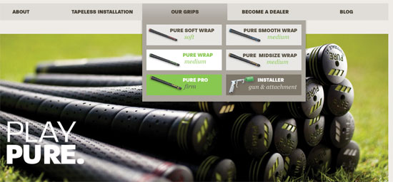
2. Porsche
As you hover over each car, the image on the right changes. It also looks stunning with the semitranspart background. 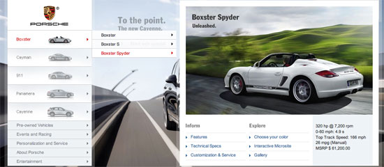
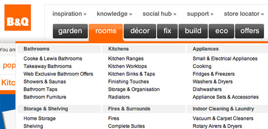
3. B&Q
B&Q has a clean and eye-catching drop-down menu that lists columns of products that customers are looking for.
4. Red Brick Health
This drop-down navigation menu fits perfectly into the site design, and the pink hover highlight is a great touch of detail.

5. Carreras Con Futuro
This drop-down menu’s design embodies the hand-drawn theme of the website. 
6. Galaico Folia
This drop-down submenu has a wonderful animation effect with the smaller pieces of wood folding down from the main menu item.

7. Callaway Golf
This is a masterfully neat drop-down navigation design that has an orange hover effect. 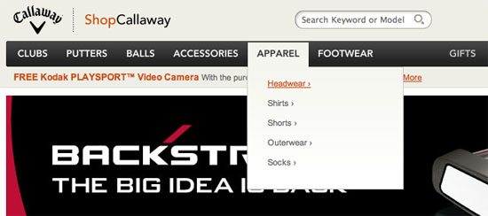
8. Converse
Converse has a grunge-styled drop-down menu that has a cloth-like texture with frizzy edges. 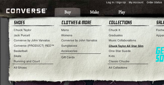
9. Puma
This dark drop-down menu really stands out from the rest of the site’s lighter colours. 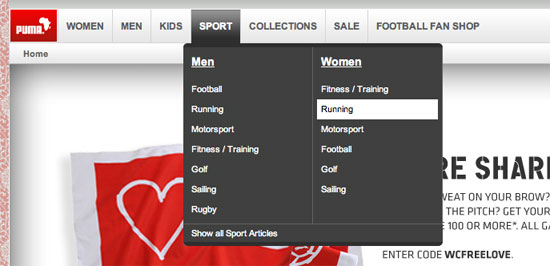
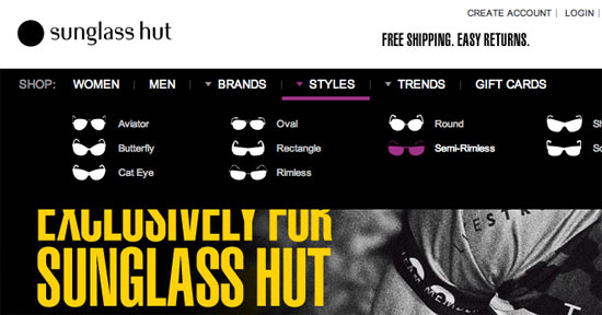
10. Sunglass Hut
This drop-down menu is functional in that it also serves as an illustrated visual of the various styles of sunglasses.
11. Nettuts+
Netttuts+ has a clean drop-down navigation menu that works well with their header colours. 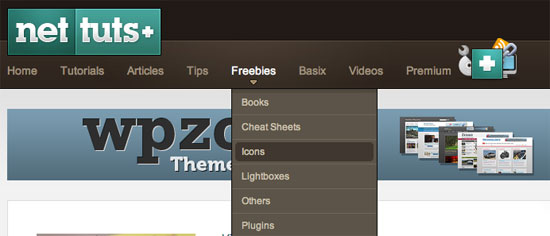
12. Tennessee Trails & Byways
This drop-down is unique because within the submenu, there’s also tabbed navigation. 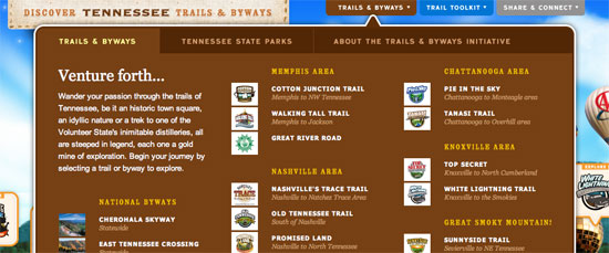
13. Gateway
The drop-down menu in this design has nice curves and beautiful visuals that serve to display images of the computer manufacturer’s products. 
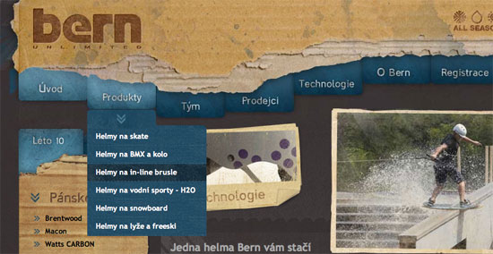
14. Bern
This rough grunge style website has an edgy drop-down menu that complement the look-and-feel of the website’s general aesthetics.
15. Ski Alpine
This drop-down menu highlights the attention to detail that the site designer has. 
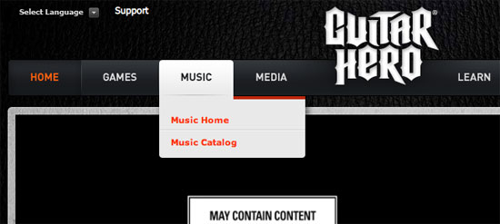
16. Guitar Hero
This simple drop-down menu is practical and doesn’t distract away from the main areas of the web page layout.
17. Mac Appstorm
Here’s a clean drop-down menu that fits perfectly with the overall landscape of the site design. 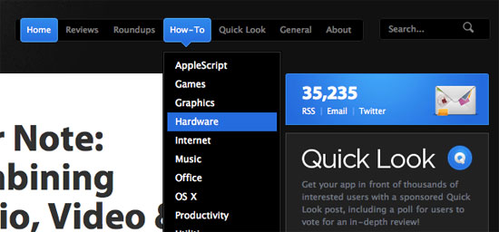
18. Noizi Kidz
This navigation is bright and shaped unconventionally. 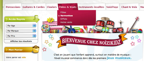
19. Audi
This drop-down menu contains thumbnails of the auto maker’s model of cars; when you hover over a car, it displays details about it along with relevant links to other pages. 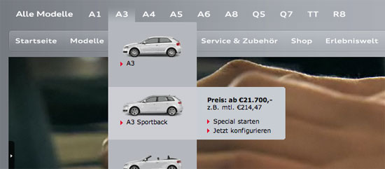
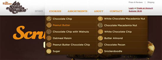
20. Famous Cookies
This drop-down navigation menu showcases the yummy cookies that the store makes available to its hungry patrons.
21. Duchy of Cornwall Nursery
This paper-styled website design has a nice, clean dropdown menu. 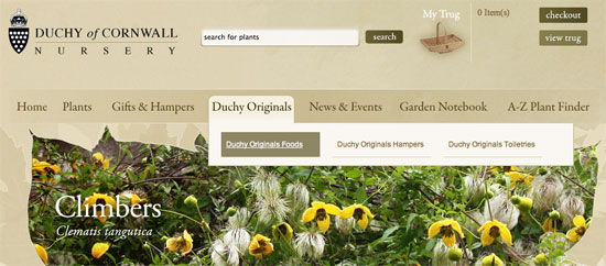
22. EA
Electronic Arts has a playfully styled drop-down menu. 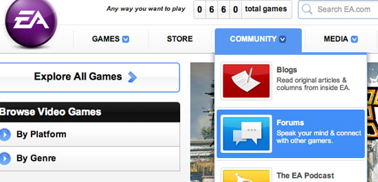
23. Bonfire Snowboarding
Bonfire Snowboarding has an awesome 3-column drop-down submenu on their “Products” main navigation item, placing their products within three categories. 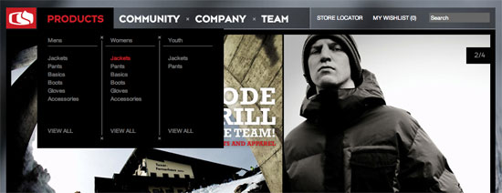
24. Facebook
Facebook has their simple drop-down menu on the site’s “Account” main menu link with relevant links for editing your Facebook account. 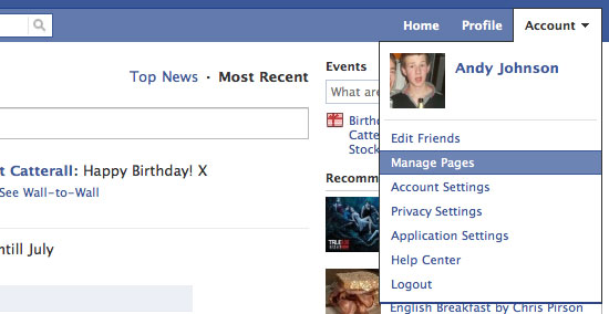
25. Nick Ad
You have to click-and-hold your mouse pointer for the submenu to appear. Then you move onto the link you want on each drop-down and release your mouse button to visit that page; it’s an interestingly unconventional interaction design. 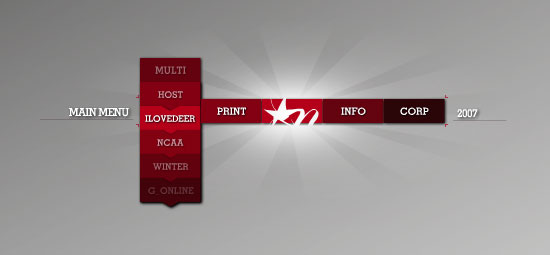
26. TN Vacation
This dark blue drop-down menu really stands out. 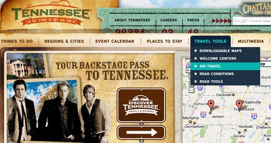
27. MTV UK
This site design features a clean and standard drop-down menu. 
28. DC Shoes
The red and white text on the semitransparent black background really works its charm. 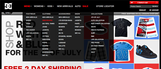
29. Envato Marketplaces
This is a really beautiful drop-down menu. 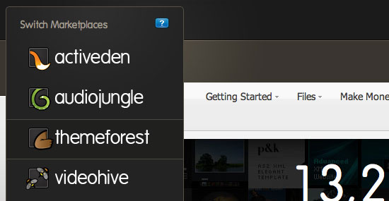
30. Tennessee Theatre
This navigation is special because it’s clean but creative at the same time. The brown really stands out from the rest of the site’s soft colours. 
31. Boden
Each menu item has a different font and the drop-down menu is very clean. 
32. White House
The white background, blue text, and red top and bottom borders utilizes the the USA flag’s colours. 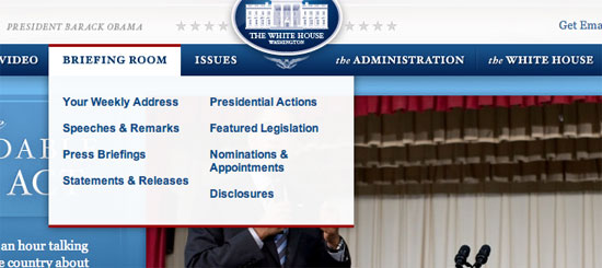
33. Navigant Consulting
The colours used on this site work together like players of a football team. 
34. Officers Club
Another clothing website with a drop-down; having a dropdown submenu makes it so much easier to find products. The Officers Club drop-down has a multi-column layout. 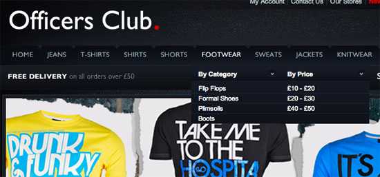
35. Fall For Tennessee
Fall for Tennessee has a horizontal drop-down menu that slides out to the right hand side. The menu items that have a drop-down submenu have a small arrow next to them to indicate that they can be expanded. 
36. Sony
Sony has a very wide and simple drop-down menu on their main UK site. 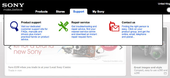
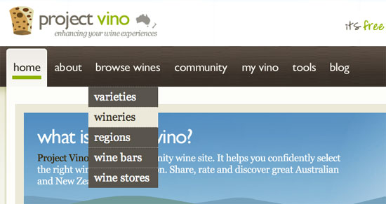
37. Project Vino
This drop-down menu uses colours that fit the rest of the site. The big font size and the overall design looks amazing.
38. Media Temple
Media Temple has by far one of the best drop-down menus out there, aesthetically. The small thumbnail of each hosting type next to the name of them looks great, along with excellent JavaScript-based animation transitions.

39. Mozilla
This is a simple yet sleek drop-down menu on the Mozilla. 
40. August
The semitransparency effect in this drop-down menu works will with the vivid background image. 
41. Henleys Clothing
The main navigation colour creeps down onto the drop-down submenu. 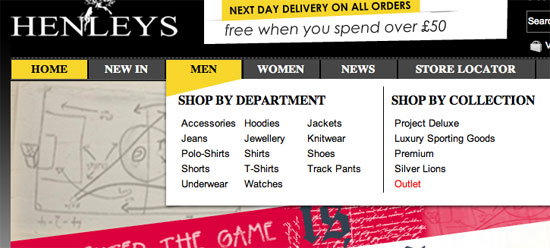
42. Digg
The classic Digg drop-down submenus work with their website’s overall design. 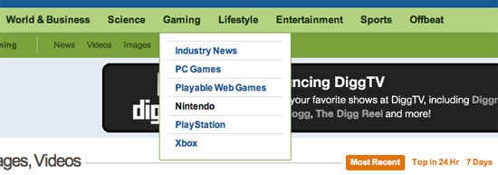
43. Action Envelope
This drop-down menu is special because it has a nice shadow effect that really brings the drop-down menu out of the page from the rest of the site. 
44. Very
Very, a new e-store, has a clean and structured drop-down navigation menu. 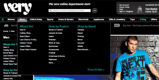
45. Incase
The Incase drop-down menu is slightly lighter in color shade than the navigation background, and works well with the site’s overall clean look-and-feel. 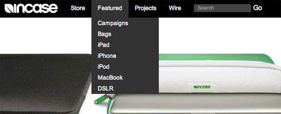
46. American Eagle
I really like the American Eagle drop-down menu because it fills the whole site’s width and also blends in with the clean paper-style look. 
47. Mayflower Brewing
The colours used in this drop-down (and the site, in general) are gorgeous. 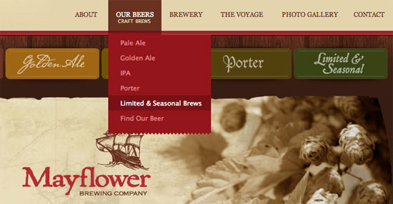
48. Select Clothing
Select Clothing’s drop-down menu has a dark background that stands out over the sliding images below. 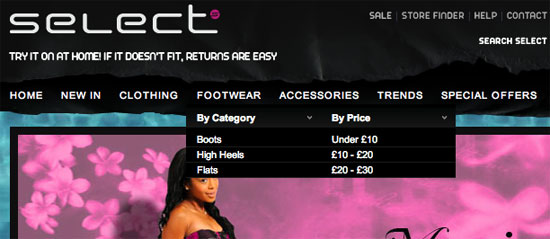
49. Bird Malaysia
This drop-down menu is special because the colours stand out from the rest of the website, and I quite like the subtle background image at the bottom of each drop-down menu. 
50. The Web Squeeze
The Web Squeeze has implemented jQuery into their drop-down menu to give it some nifty hover effects. 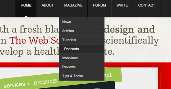
Related Content
-
 President of WebFX. Bill has over 25 years of experience in the Internet marketing industry specializing in SEO, UX, information architecture, marketing automation and more. William’s background in scientific computing and education from Shippensburg and MIT provided the foundation for MarketingCloudFX and other key research and development projects at WebFX.
 -

WebFX is a full-service marketing agency with 1,100+ client reviews and a 4.9-star rating on Clutch! Find out how our expert team and revenue-accelerating tech can drive results for you! Learn more
Make estimating web design costs easy
Website design costs can be tricky to nail down. Get an instant estimate for a custom web design with our free website design cost calculator!
Try Our Free Web Design Cost Calculator
Share this article


Web Design Calculator
Use our free tool to get a free, instant quote in under 60 seconds.
View Web Design CalculatorMake estimating web design costs easy
Website design costs can be tricky to nail down. Get an instant estimate for a custom web design with our free website design cost calculator!
Try Our Free Web Design Cost Calculator


