The Seven Deadly Sins represents vices and tendencies that were believed to be misdeeds in early Christian religion. The sins are as follows: envy, pride, wrath, sloth, lust, greed, gluttony. Each sin is said to be represented by a colour.
For example, envy is best represented by the colour green, which — in many cultures — is also the symbolic color of money. I thought it would be a fun experiment to compile a showcase of a few web designs based on the colours reflected by the seven deadly sins. Note: The web designs featured were used for aesthetic purposes only, not to imply that they characterize the sins.
Green – Envy
Envy is best described as a desire for something more and to covet other people’s belongings and status.
The opposite of envy is love. Bam Creative 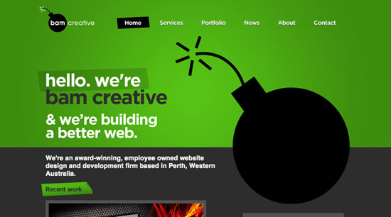 Free Gobbler
 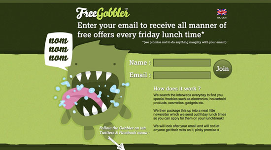 PSDChimp
Violet – Pride
Pride is when a person feels more special or important than others. At its worst, pride is narcissism.
The opposite of pride is humility. idt.net.cn 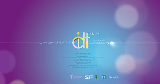 Newism
  shizixiu.com.cn
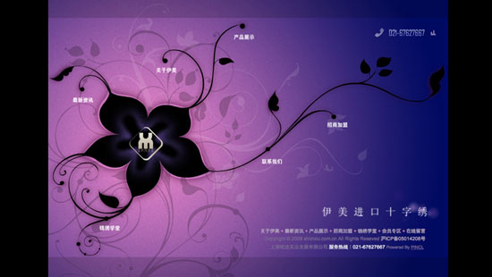
Red – Wrath
Wrath can be best described as anger or hatred. It is the polar opposite of kindness.
Carsonified 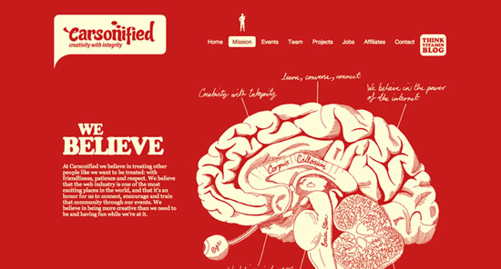 KMX Karts
 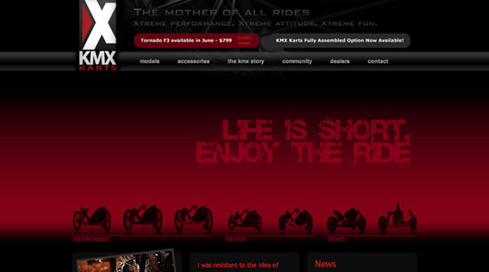 The Salon
Light Blue – Sloth
Sloth is the act of being lazy or idle. The opposite of sloth is zeal — or eagerness to achieve something good. philipp doms 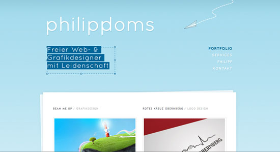 Iconjelly
 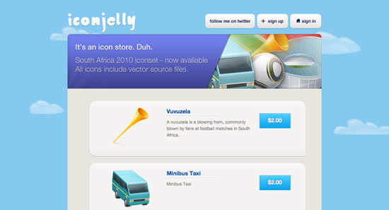 Narhir Design
Blue – Lust
Lust is the act of giving into desire.
The opposite of lust is self-control. Strutta  Blue Water Productions
 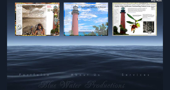 MediaCore
Yellow – Greed
Greed is the desire for wealth and status. The opposite of greed is generosity.
Nikon Festival  Booreiland
 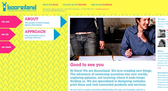 Champagne Warehouse
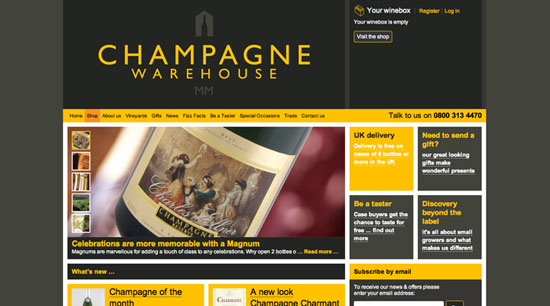
Orange – Gluttony
Gluttony is the act of consuming more than you need. The opposite of gluttony is temperance — being disciplined and wise with resources. Cubicle Ninjas 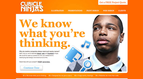 scorchlondon
  designedbynelleke
 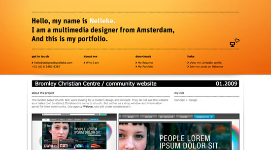 Why do you think these colours represent their respective sins?
What emotions do you feel when seeing these colours in web designs?
Related Content
-
 President of WebFX. Bill has over 25 years of experience in the Internet marketing industry specializing in SEO, UX, information architecture, marketing automation and more. William’s background in scientific computing and education from Shippensburg and MIT provided the foundation for MarketingCloudFX and other key research and development projects at WebFX.
 -

WebFX is a full-service marketing agency with 1,100+ client reviews and a 4.9-star rating on Clutch! Find out how our expert team and revenue-accelerating tech can drive results for you! Learn more
Make estimating web design costs easy
Website design costs can be tricky to nail down. Get an instant estimate for a custom web design with our free website design cost calculator!
Try Our Free Web Design Cost Calculator
Share this article


Web Design Calculator
Use our free tool to get a free, instant quote in under 60 seconds.
View Web Design CalculatorMake estimating web design costs easy
Website design costs can be tricky to nail down. Get an instant estimate for a custom web design with our free website design cost calculator!
Try Our Free Web Design Cost Calculator