
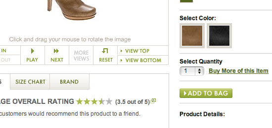
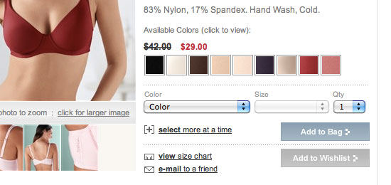
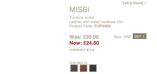
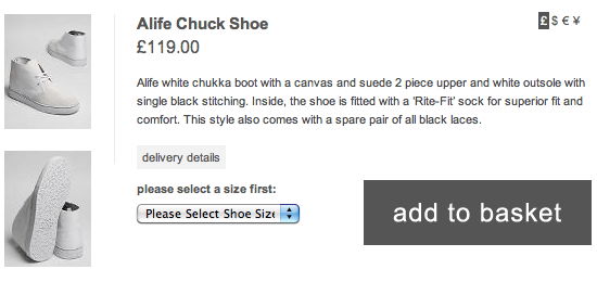
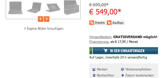
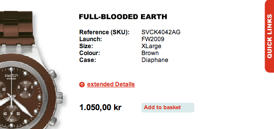
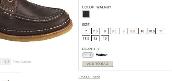
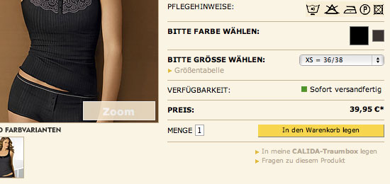
The primary task of an online shop is to get the user to purchase something. It is this reason why elements on their web pages such as descriptions, price information, and related products should be well thought out and must be purposeful. Among these page elements is the “add to Cart” or “add to basket” button, which is essential in its role as an important call to action.
In this collection, you will find some examples of good Add to Cart buttons from e-commerce websites around the world for your inspiration and reference.
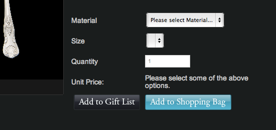
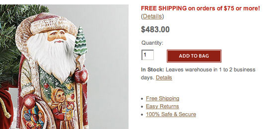
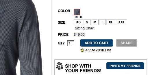
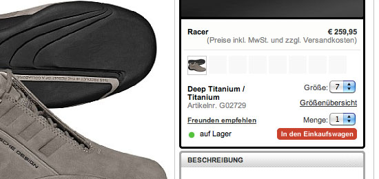
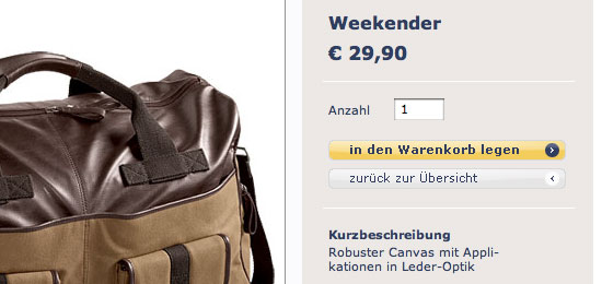
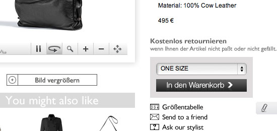
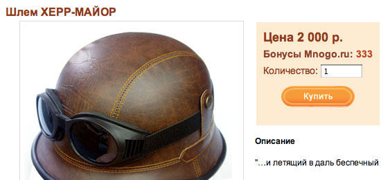
1. William Turner
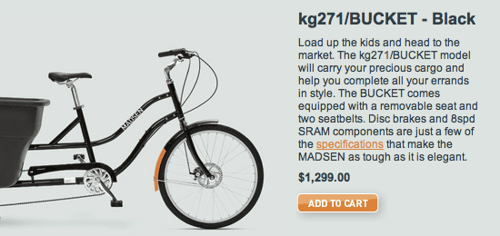
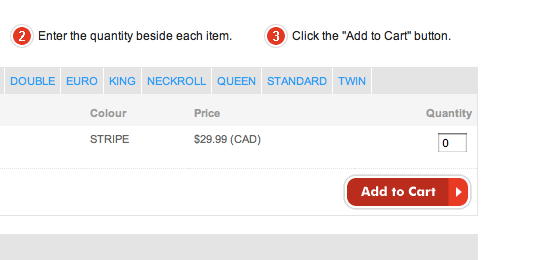
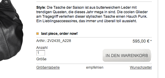
2. Madsen Cycles
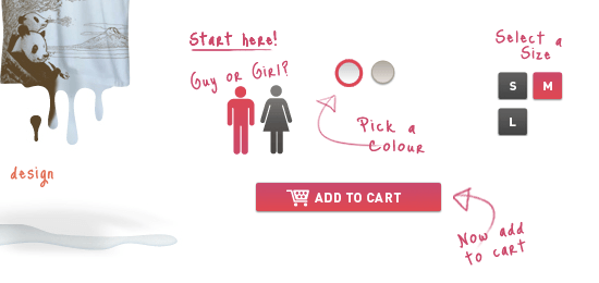
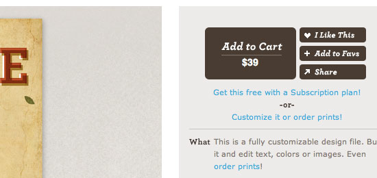
3. dripping in fat
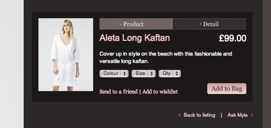
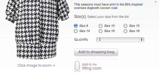
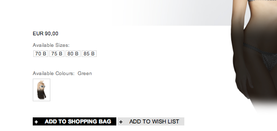
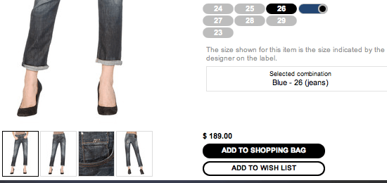
4. Myla
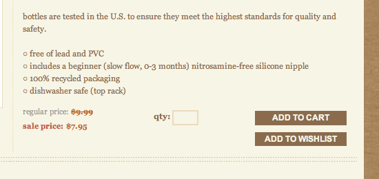
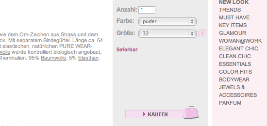
5. Pure and little organic baby
6. Behance Outfitter
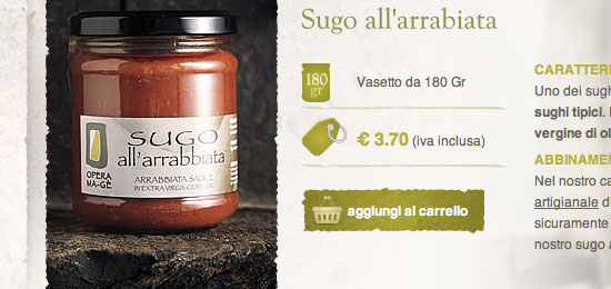
7. Opera Mage
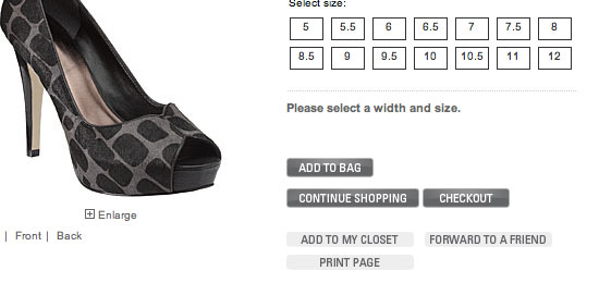
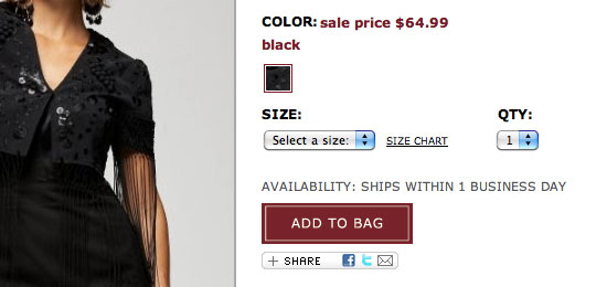
8. DSW
9. Soma Intimates
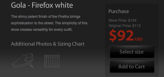
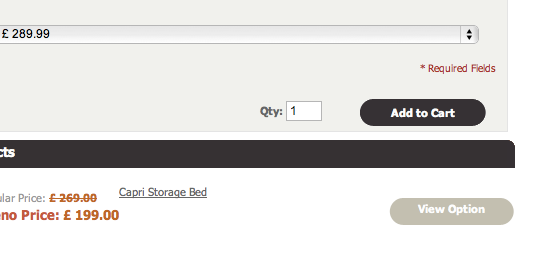
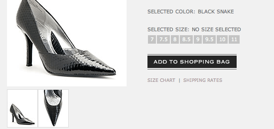
10. Dune Shoes
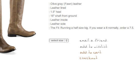
11. oki-ni
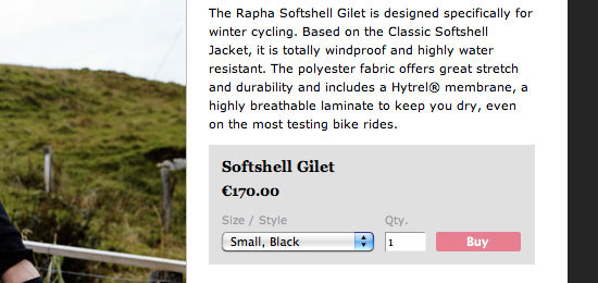
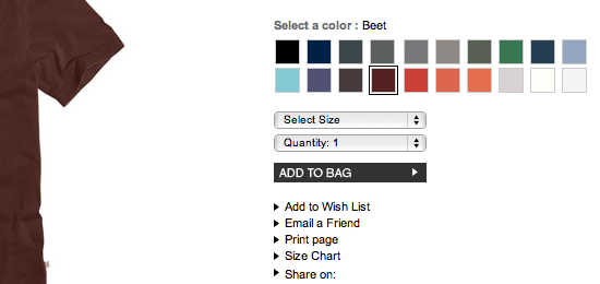
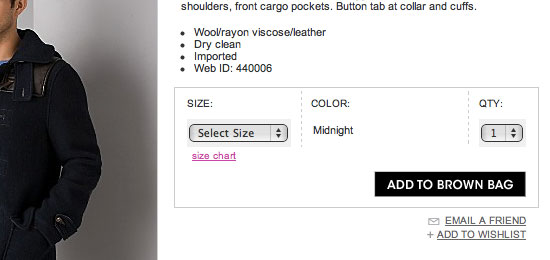
12. Rapha
13. fashionaire
14. Closed
15. Gortz
16. Melaleuca
17. Palmers
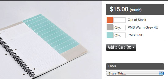
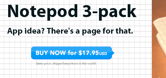
18. Notepod
19. UNGER Fashion
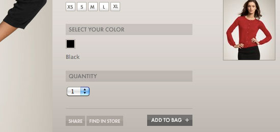
20. ANN TAYLOR
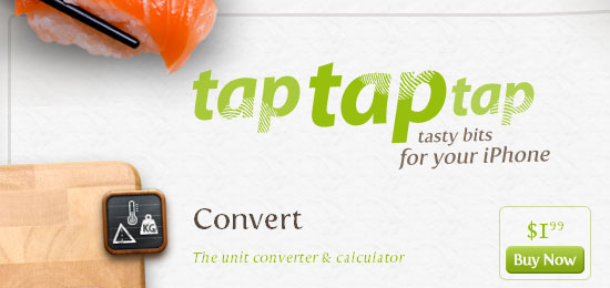
21. tap tap tap
22. ShoeGuru
23. Nine West
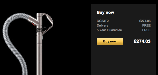
24. Dyson
25. nestliving
26. SHIRTCITY
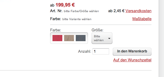
27. Vitradirect
28. The Russian Store
29. Inkd
30. Sueno
31. Habitat Shoes
32. Lucky Brand
33. beddington’s.com
34. laPatate
35. Archiduchesse
36. Matalan
37. adidas
38. Rampage
39. James Perse
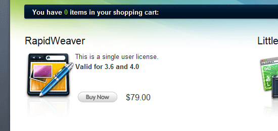
40. Agile Online Store
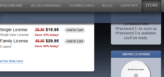
41. Realmac Store
42. Bloomingdales.com
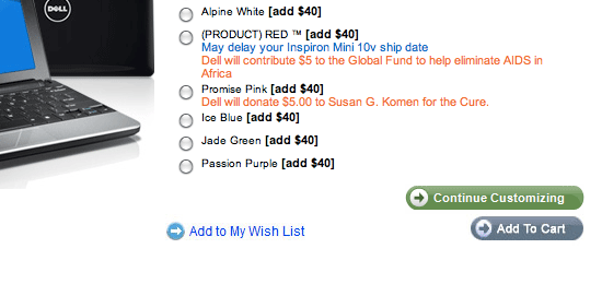
43. Dell
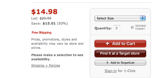
44. Target
45. Gravis
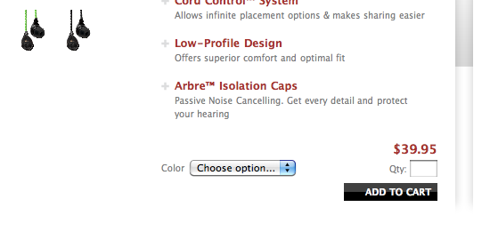
46. SIEGE Audio Company
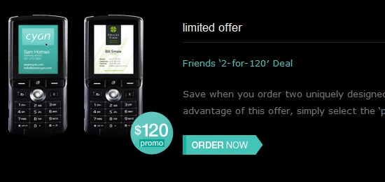
47. cyan
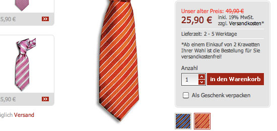
48. Krawattentrend.de
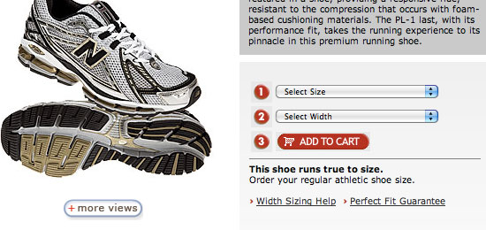
49. NB Web Express
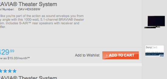
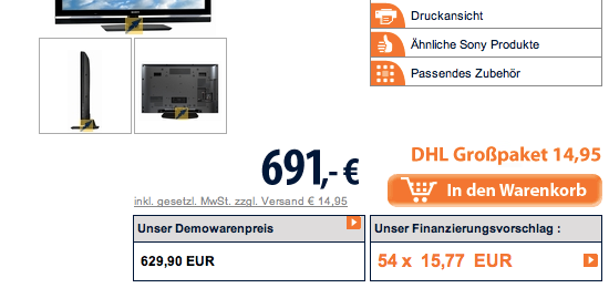
50. Sony
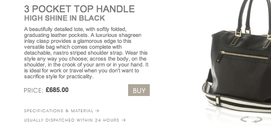
51. Anya Hindmarch
52. Tchibo
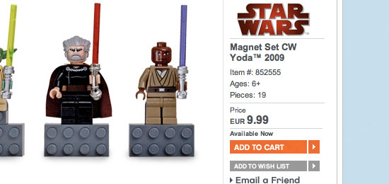
53. APART
54. LEGO
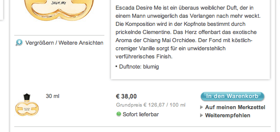
55. Stuart Weitzman
56. Parfumerie Douglas
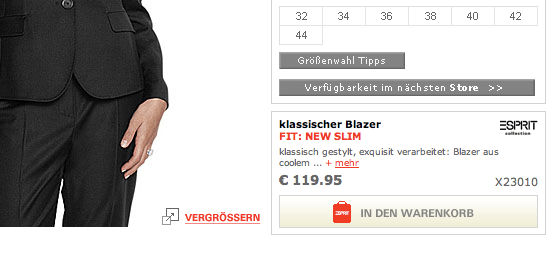
57. ESPRIT
58. s.Oliver
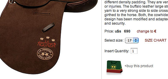
59. LA MARTINA
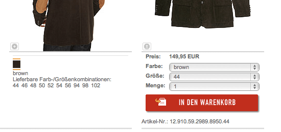
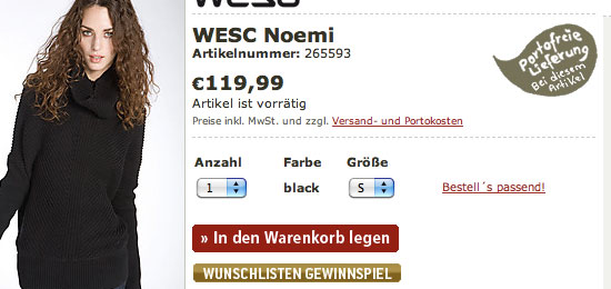
60. bebe
61. Jack Wolfskin
62. frontlineshop.com
63. TECHNIKdirekt
64. STYLEBOP.com
65. Mary & Paul
66. Lacoste
67. Emporio Armani
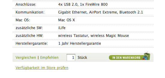
68. Cyberport
69. Swatch
70. FOSSIL
71. calida-shop.de
72. e-xpedition.ru
73. bonprix.de
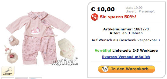
74. myToys
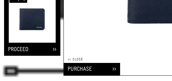
75. Conrad Electronic
76. Prada
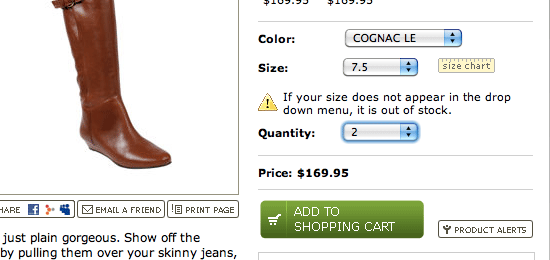
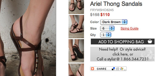
77. Steve Madden
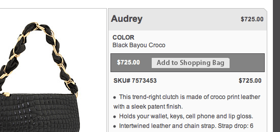
78. Tobi
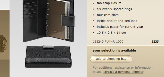
79. Gucci
80. Miss Sixty
 How important are Add to Cart buttons to an e-commerce site? What are some effective ways of designing Add to Cart buttons? Do you know of good research, findings, studies, and articles that cover Add to Cart buttons? Join the discussion in the comments.
Related Content
- 30 High-Quality Icon Sets for E-Commerce Designs
- How to Create a Slick and Clean Button in Photoshop
- Create a Clean Business Web Template Design in Photoshop
-
 President of WebFX. Bill has over 25 years of experience in the Internet marketing industry specializing in SEO, UX, information architecture, marketing automation and more. William’s background in scientific computing and education from Shippensburg and MIT provided the foundation for MarketingCloudFX and other key research and development projects at WebFX.
 -

WebFX is a full-service marketing agency with 1,100+ client reviews and a 4.9-star rating on Clutch! Find out how our expert team and revenue-accelerating tech can drive results for you! Learn more
Make estimating web design costs easy
Website design costs can be tricky to nail down. Get an instant estimate for a custom web design with our free website design cost calculator!
Try Our Free Web Design Cost Calculator
Share this article


Web Design Calculator
Use our free tool to get a free, instant quote in under 60 seconds.
View Web Design CalculatorMake estimating web design costs easy
Website design costs can be tricky to nail down. Get an instant estimate for a custom web design with our free website design cost calculator!
Try Our Free Web Design Cost Calculator


