
Using color gradients as a type treatment is a very popular technique for creating captivating text in a web design. They’re used in many situations: for site logos, introductory text, visual elements, and more. But be cautious: the only thing that separates stylish and tacky is a few mistakes in your Photoshop settings.
If you’re looking for inspiration and great examples of gradient text treatments in web designs, here are a few to check out.
1. Bainbridge Studios

2. aiAlex

3. Radium

4. Deagostini Bombers of World War II

5. Coda

6. Bird Malaysia

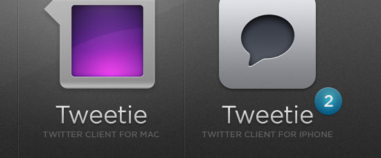
7. atebits
8. Macalicious

9. Idea Foundry

10. iceberg

11. Newism

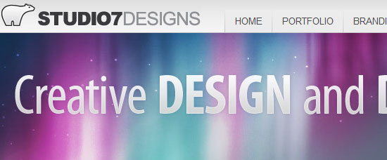
12. Studio 7 Designs Inc
13. Overture Technologies

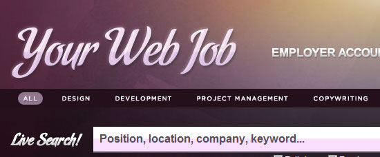
14. Your Web Job
15. WPCoder

16. Strutta

17. Hashrocket

18. Hugs

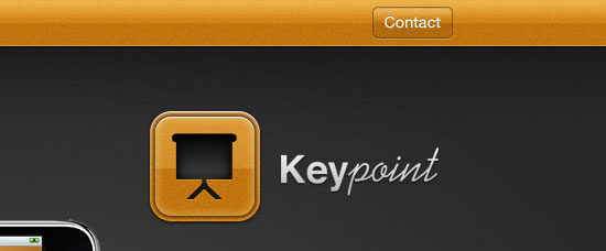
19. Keypoint
20. OnWired

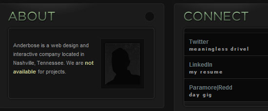
21. Anderbose
22. Uncover

23. Mein Brandenburg

24. Shopify

25. goinnovate

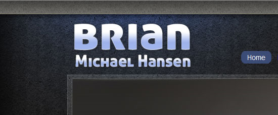
26. Brian Michael Hansen
Related Content
-
 President of WebFX. Bill has over 25 years of experience in the Internet marketing industry specializing in SEO, UX, information architecture, marketing automation and more. William’s background in scientific computing and education from Shippensburg and MIT provided the foundation for MarketingCloudFX and other key research and development projects at WebFX.
 -

WebFX is a full-service marketing agency with 1,100+ client reviews and a 4.9-star rating on Clutch! Find out how our expert team and revenue-accelerating tech can drive results for you! Learn more
Make estimating web design costs easy
Website design costs can be tricky to nail down. Get an instant estimate for a custom web design with our free website design cost calculator!
Try Our Free Web Design Cost Calculator
Share this article


Web Design Calculator
Use our free tool to get a free, instant quote in under 60 seconds.
View Web Design CalculatorMake estimating web design costs easy
Website design costs can be tricky to nail down. Get an instant estimate for a custom web design with our free website design cost calculator!
Try Our Free Web Design Cost Calculator


