
 Websites, logos, user interface components and icons can — and often do — get rejected by clients and bosses for various reasons. But that doesn’t mean they’re not great designs. In fact, I’d like to show my appreciation of some excellent designs on Dribbble (a community site for designers to show their work) that didn’t make the cut for reasons like “it doesn’t fit in our design” or “it’s not what we are looking for.” By the way, if you’re interested in seeing more rejected designs, check out Dribbble’s #rejected keyword tag.
The Rejected Designs
Graphic designer Ross A. Whelan made the awesome badge logo concept for a food TV show and says that he was “a little heartbroken” when he found out that it was rejected. The piece features great typography, creative use of a fork and knife referencing the nature of the show and has a nice vintage look.
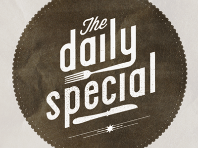 Image source The beautiful letterpress-style icons below by Joshua Taylor — who’s a web designer at the popular web app Evernote — shows that even accomplished designers can have their work rejected.
 ![]() Image source “This might have been the first time I overshot the clients expectations” says Kyle McConnell referring to his home page redesign mockup for rinsemymusic.com. The design was “too different” from the site’s current layout.
Image source “This might have been the first time I overshot the clients expectations” says Kyle McConnell referring to his home page redesign mockup for rinsemymusic.com. The design was “too different” from the site’s current layout.
Which is usually the point of a redesign. Oh well. 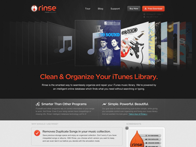 Image source Joshua Keay of the New-York-based product development studio Magnetism (they make iPhone apps, t-shirt designs and more) made the design below for the GORUCO conference.
The client chose to go with something obvious and easy (i.e. their logo slapped onto a t-shirt) instead of this creative piece.  Image source Kyle Ruane created this very clever logo for a company called 1Semester.com.
It features both elements of the company’s name: a semester (the book) and the number one. ![]() Image source This hummingbird logo by logo designer Jord Riekwel was for a WordPress themes company. Despite many other designers commenting positively about the design’s great curves, and with some of them even asking if he’s willing to sell the design, it didn’t meet the client’s fancy.
Image source This hummingbird logo by logo designer Jord Riekwel was for a WordPress themes company. Despite many other designers commenting positively about the design’s great curves, and with some of them even asking if he’s willing to sell the design, it didn’t meet the client’s fancy.
Riekwel explains that he’s very proud of this logo and that he hopes to use it in a future project. 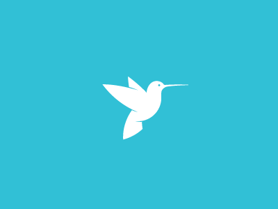 Image source Portland-based designer Chip Treux made this logo for a coffee consulting company. The logo creatively uses the “O” in the company’s name to represent an espresso portafilter (alluding to the nature of their business) as noticed by Josh Holloran, another member of Dribbble.
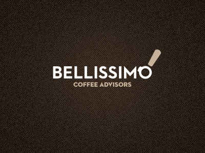 Image source This interesting slider interface made by iOS designer Stéphane Reverdy was rejected by a client (he didn’t say why).
 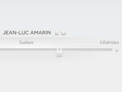 Image source This skeuomorphic flip counter is by web and graphic designer Kassie Wright. She says that “the project went in a different direction.”
 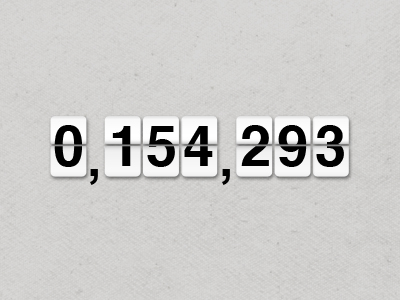 Image source The rejected navigation menu interface, made primarily for the iPad, is by designer Judson Collie.
 Image source Share some of your “rejected-but-still-awesome” designs by linking to them in the comments below.
Related Content
- 7 Things Web Designers Hate Hearing from Clients
- Are Dribbble Users Blurring the Line Between Art and Design?
- Reminding Yourself That You Love What You Do
-
 President of WebFX. Bill has over 25 years of experience in the Internet marketing industry specializing in SEO, UX, information architecture, marketing automation and more. William’s background in scientific computing and education from Shippensburg and MIT provided the foundation for MarketingCloudFX and other key research and development projects at WebFX.
 -

WebFX is a full-service marketing agency with 1,100+ client reviews and a 4.9-star rating on Clutch! Find out how our expert team and revenue-accelerating tech can drive results for you! Learn more
Make estimating web design costs easy
Website design costs can be tricky to nail down. Get an instant estimate for a custom web design with our free website design cost calculator!
Try Our Free Web Design Cost Calculator
Share this article


Web Design Calculator
Use our free tool to get a free, instant quote in under 60 seconds.
View Web Design CalculatorMake estimating web design costs easy
Website design costs can be tricky to nail down. Get an instant estimate for a custom web design with our free website design cost calculator!
Try Our Free Web Design Cost Calculator


