What Are Websites Made Of? (Infographic)
The Internet is such an integral part of our lives nowadays, yet how much do we know about what’s occurring under the hood?
From the proliferation of web programming languages such as PHP, to the matter of data expansion, storage size, rate of growth of the Internet, and the amount of bandwidth required to serve the world’s Internet users, this infographic looks at what websites are made of.
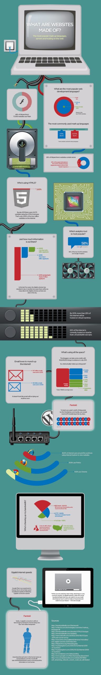
Infographic by Broadband Choices, offering comprehensive and impartial advice on broadband.


57 Comments
Salman Saeed
August 9th, 2011
Lol. True that.
Henry Louis
August 9th, 2011
It was confusing but informative. A textual explanation would have also helped.
Derek Erdmann
August 9th, 2011
I’m glad you think Ruby on Rails is a language. Thanks for confusing a few more people.
Michishige Kaito
August 9th, 2011
“Ruby on Rails” is not a language, but a framework. Ruby is the language. Also, I really don’t think 65% of the net is being served as proper XHTML, mainly because it requires the transfer to happen with an xml mime type that most people find way too troublesome.
Praharsh.RJ
August 9th, 2011
Interesting piece of information.
Donny Stiefel
August 9th, 2011
Surprised you used Kansas City for your gigabit referral when Chattanooga, TN already has gigabit, and was the first to offer it in the USA. Perhaps since it wasn’t Google it wasn’t noteworthy?
And I second Derek’s comment on Ruby on Rails.
Ron Pemberton
August 9th, 2011
I love beautiful infographics like this! Make more, please. Kudos!
Samiullah Khan
August 9th, 2011
Excellent piece of information but i’m going to look increase in the use of Google Chrome and Php in the future.
Sohail Amir
August 9th, 2011
Great infographic, think these are becoming really popular
Oliver Nagy
August 9th, 2011
It was informative, but some of the charts were confusing. For example, the development languages one, ASP.net seems larger than PHP (I know it technically isn’t), while having a smaller percentage. Also, the “Just how much information is out there” bar graph is not to scale, as far as I can tell. And then there are the factual errors that others mentioned.
I’m not trying to be rude, I’m just saying that aesthetics should be a bit less important than accuracy.
sanjay
August 9th, 2011
a better infographic will be easier to understand.
Andrew Margolin
August 9th, 2011
Very Cool.
Tom
August 9th, 2011
This a sampling of less than 17,000 sites,
BTW: look at the sites: http://httparchive.org/websites.php
- Browser – All tests are performed using Internet Explorer 8. Page load times can vary depending on browser.
- Most websites are comprised of many separate web pages. The landing page may not be representative of the overall site.
-Some websites, such as http://www.facebook.com/, require logging in to see typical content.
- HTML5: 24,175 sites are using HTML5. The sampling size is less than 17,000… umm that does not compute.
Young
August 9th, 2011
Haha who cares about semantics – everyone who matters, that is, everyone who tries to learn “Ruby on Rails” will see/know that Ruby is the language and Rails is the framework…
SR’s been pretty stale lately. Glad to see posts coming up again.
Kathy Dibling
August 9th, 2011
Eye-opening. Thank you.
David
August 9th, 2011
Tufte is spinning in his office chair…
bayukevin
August 9th, 2011
I love It
Daquan Wright
August 9th, 2011
I’d like this to see the comparison between JavaScript libraries. :)
Jacob Gube
August 9th, 2011
@Young: We had a bit of downtime, but we’re resuming (and eventually even increasing) normal operations. Glad you’re still around even though the last two months has been sort of slow, Young.
Philipp Menzel
August 10th, 2011
Nice infographic! Thanks for this!
Veerle_VH
August 10th, 2011
any info on how many mails are opened? I suspect a large percentage of the mails sent are never read, so would argue that e-mail is still growing.
Steve
August 10th, 2011
iMac without Safari?? Without best browser ever?
Jaco Pretorius
August 10th, 2011
Can’t believe all the negative comments… Great work – very informative!
Manuel
August 10th, 2011
Interesting info but with I wonder if the sample is enough representative to consider the results are reliable
Besides, some glaring mistakes like considering ASP.NET a language or a 503 header response means a website contains errors
Dan
August 10th, 2011
very iteresting. Thanks for sharing
Carlos Martinez
August 10th, 2011
It’s curious that not appears Java or C / c + + under development languages.
PayamRWD
August 10th, 2011
Great infographic. Thanks!
Oli
August 10th, 2011
What are the other 46.04% of popular development languages in the top 17,000 websites?
Rg Enzon
August 10th, 2011
I’m interested on the gigabit internet speed at home. Damn Google.
damian
August 10th, 2011
Sorry to nitpick, but use of the word “factoid” bothers me. It literally means, “a piece of unreliable information believed to be true because of the way it is presented or repeated in print”. As in “tabloid”.
Brandon Holliday
August 10th, 2011
Wow! When you combine the Firefox user with Chrome users, you see that nearly half of the market is using html5+css3 compliant browsers. Love it!
Pawel Poturalski
August 10th, 2011
I thought we are much more closer to Star Trek technology ;)
Robert Engman
August 10th, 2011
Some good information a little mis-information but overall an entertaining, interesting piece that I was happy to have an opportunity to view. Thanks for taking the time.
Juan Burgos
August 10th, 2011
The problem to me, seems to be that this, in my very personal way of see it, is not an infographic. It correspond more to a new adaptability to blogs, what I call an bloginfography. Real and effective infographies are space efficient, relate all the information and facilitate the reading of a context. This ones are information separated by characteristics of a format or a medium. Like individual parts that need at the end to be reorganized and categorized by the reader. In real infography, it is the designer who does that.
Using statistics is also not a real translation to the visual realm or language, thing that I consider primary to the effectiveness of an infogrophy.
Richard Schulte
August 10th, 2011
Yeah same as @donny – we had public (free) gigabit fiber on hessler street in cleveland (thanks to Case Western Reserve University) as of late 2009. What gives on the KC being first bit?
SDC
August 10th, 2011
No web sites are written in Java? And yeah, Ruby on Rails: not a language.
Dennis S.
August 10th, 2011
I think in this illustration the human body was not compressed before it was beamed?! :) This should reduce the needed information a lot. There a identical atoms surly…
Chris
August 10th, 2011
That post just blew my mind. Nice! Love the infographic.
Sasha
August 10th, 2011
Just let me know when I can actually use, “Beam me up Scotty” as a way to get to the supermarket.
Martin Scharm
August 10th, 2011
Wondering how much websites that are not broken (404/503) deliver valid content!? Is it more than 1% ? :-P
Do you have any statistics concerning this issue?
Victor
August 10th, 2011
Really nice!
Will help a lot lof Dev.
Avangelist
August 11th, 2011
Who’s chewing up my bandwidth?
28.40
18.08
11.93
- doesn’t amount to 100%
+
6.6
29.7
total = 94.17
still not 100%.
the last two are presented as comparisons but don’t really compare iPlayer is a pseudo free public service the other is subscription based.
The shapes used for the first section are misleading as they use shapes to represent the data but allude to being part of a whole.
I like the idea though.
also, what’s the broken cable about at the start?
Paige Henson
August 11th, 2011
I think it’s terrific! A friendly way to take in very dry info.
Angela
August 11th, 2011
Interesting, but I’m kind of wondering what those bits about email and internet speeds were doing in an infographic about websites. They distracted and detracted from it somewhat.
Vibrance
August 11th, 2011
A nice infographic but I can see how it might confuse anyone without knowledge about how websites work. Facts are kind of scattered among difference topic areas.
Irina
August 12th, 2011
Beautiful infographic – informative and clearly presented. Didn’t know nearly half of internet users around the world still use IE.
JP
August 12th, 2011
The first infographic doesn’t make sense to me in a couple of ways but the obvious is that the whole doesn’t make up 100%.
PHP – 31%
ASP.NET – 21%
Ruby ~ 2%
What happened to the other 46%?
Jean-Paul Gedeon
August 13th, 2011
We love the infographics!
Mark
August 13th, 2011
I echo damian above. “Factoid” refers to something that’s isn’t true, but people think is true. Was that the intended usage in this chart?
Stephan
August 14th, 2011
Gigabit speeds aside ,I sense a corelation if not a dividing line between The History of the Internet in a Nutshell , and The History of Web Browsers . somewhere in thhereIrest my case .
Stephan
August 14th, 2011
Leave it with you maestro
MadRabbit
August 16th, 2011
Great job. Really nice work.
dewara
September 3rd, 2011
“By 2015, more than 25% of the internet will be hosted on virtual machines”
What is virtual machines?
Stevy
September 27th, 2011
incredible stunning do more please!!!!!!
Володимир
October 12th, 2011
I like it. Awesome. Thanks.
Carlos Pagliari
October 30th, 2011
Good data. I Wonder, What’s Next?
Ram Kr Shukla
November 2nd, 2011
Calculation was based on the fixed/limited portion of Internet, however the information was interesting.
Leave a Comment