
What is a modal?
A modal is an element that displays in front of and deactivates other page content.
Web design comprises many elements that help your website stand out to users and keep their interest. Modals are an essential complement to many website structures, and you can use them for many purposes.
This page will break down the basics of web design modals in the following sections:
- What is a modal in web design?
- Benefits of using modals
- Modals vs. popups
- How to use modals in web design
Keep reading to learn more about modal windows and when to use them in web design. Or call 888-601-5359 to chat with a strategist about web design tactics!
Join 200,000 smart marketers and get the month’s hottest marketing news and insights delivered straight to your inbox! “*” indicates required fields (Don’t worry, we’ll never share your information!)Don’t miss our Marketing Manager Insider emails!
Enter your email below:
Inline Subscription Form – CTA 72
What is a modal in web design?
A modal is an element that displays in front of and deactivates other page content. Users must manually click out of the modal before returning to the page they were browsing.
Modals can take many forms, including:
- Contact forms
- Email signups
- Brief surveys
- Security checks
Benefits of using modals
Modals are popular for web design because they help you accomplish your marketing goals. The benefits of using modals in web design include the following:
- Boost session time: Modals can increase session time by encouraging users to give you their contact information. This step keeps them on the page and pushes them to engage with your business.
- Improve visibility: Your modals can help you earn email signups and boost your visibility. The modal will catch their attention as users come to your site, and the follow-up emails will keep them engaged.
- Give clear directions: A clear call to action (CTA) can help you get more conversions. Modals can tell your users the next step or give them one option for contacting you.
Your modals can also benefit your customers. They can enjoy discounts, gated information, and more when they engage with your modals.
Modals vs. popups
Modals and popups appear on your page and grab your reader’s attention. So, what’s the actual difference between a modal and a popup?
A popup is a small overlay that appears when triggered by an interactive element. In contrast, a modal is a larger overlay that blocks access to page content. A modal prompts the user for input or display important information that requires immediate attention.
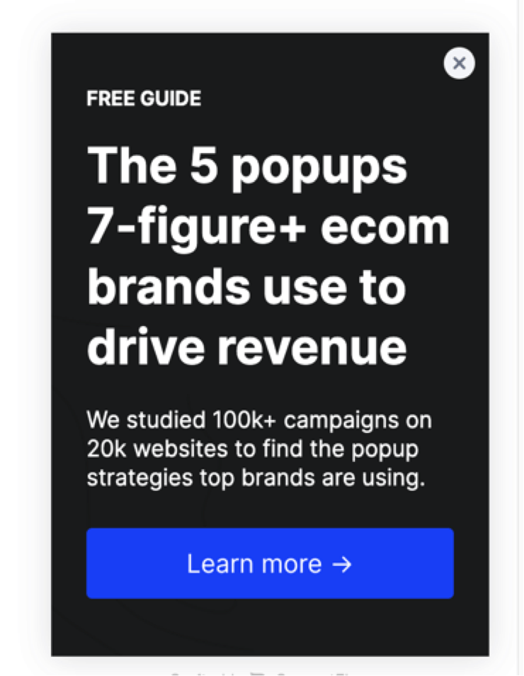
Here is a popup that appears on the side of the screen without interrupting the flow:
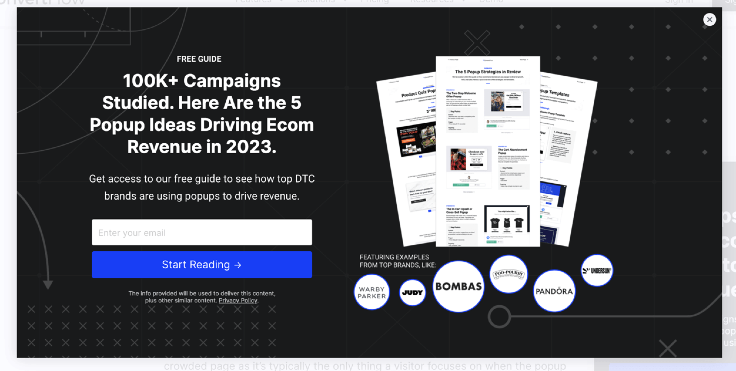
Here is a modal, which takes up much more space and limits on-page access:
The main difference is how users must interact with them. Popups usually let users continue working with the page content, while modals require action. Modals are more interrupting to the experience.
How to use modals in web design
Once you understand what a web design modal is, you can start thinking about how you want to use them on your website. Here are a few best practices for adding modal windows to your pages:
- Use them with purpose
- Make sure they’re the right size
- Enable users to close them
- Use clear instructions
- Create button text
- Don’t repeat them
Let’s read more about each tip below!
1. Use them with purpose
Your modals should always have a clear, specific purpose. If you interrupt a user’s session to show them something, it better be worthwhile.
For example, take this modal from Fine Wine and Good Spirits:
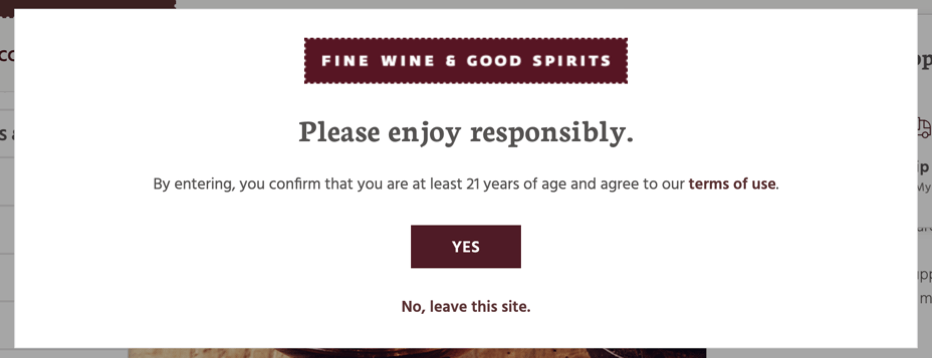
In this case, the modal helps the website comply with legal requirements and prevent liability. Since they can’t sell to users under 21, this checkpoint ensures that the user confirms their age.
2. Make sure they’re the right size
A modal should be big enough to catch their attention, but not so large that you’re overwhelming the user. They should be able to see the instructions while still viewing the content behind the modal.
Here is an example from Urban Outfitters:
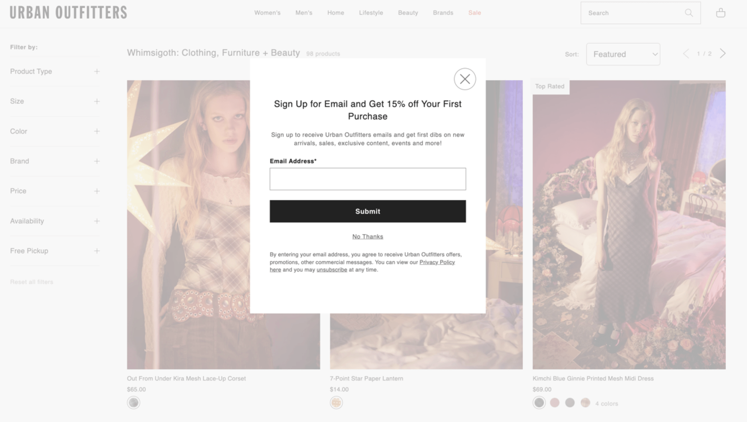
In this case, the modal appears as the user is shopping, giving them a chance to get a percentage off their order. They can still see the screen behind the modal, and it doesn’t take up too much of the page.
3. Enable users to close them
If you want to keep people on your website and lower your bounce rate, ensure users can close the modal. This example from Aerie has a convenient “X” in the corner that tells users how to close it:
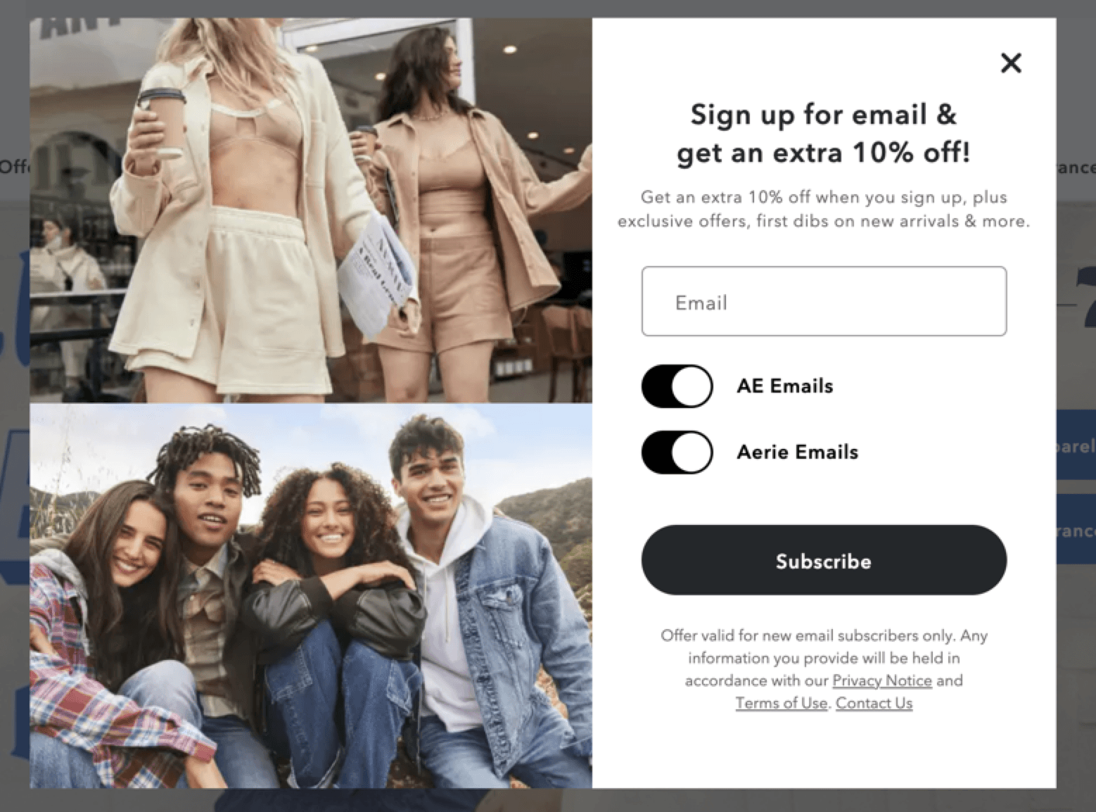
Imagine that someone comes to your website looking for something specific. If they get stuck with a modal and don’t want to interact, they will leave and not return. Give users the chance to skip it to keep them engaged.
4. Use clear instructions
Instructions should be clear and easy to follow if you want users to engage with the modal. Don’t overwhelm users with multiple options and blanks — keep it straightforward.
Check out this example from H&M:
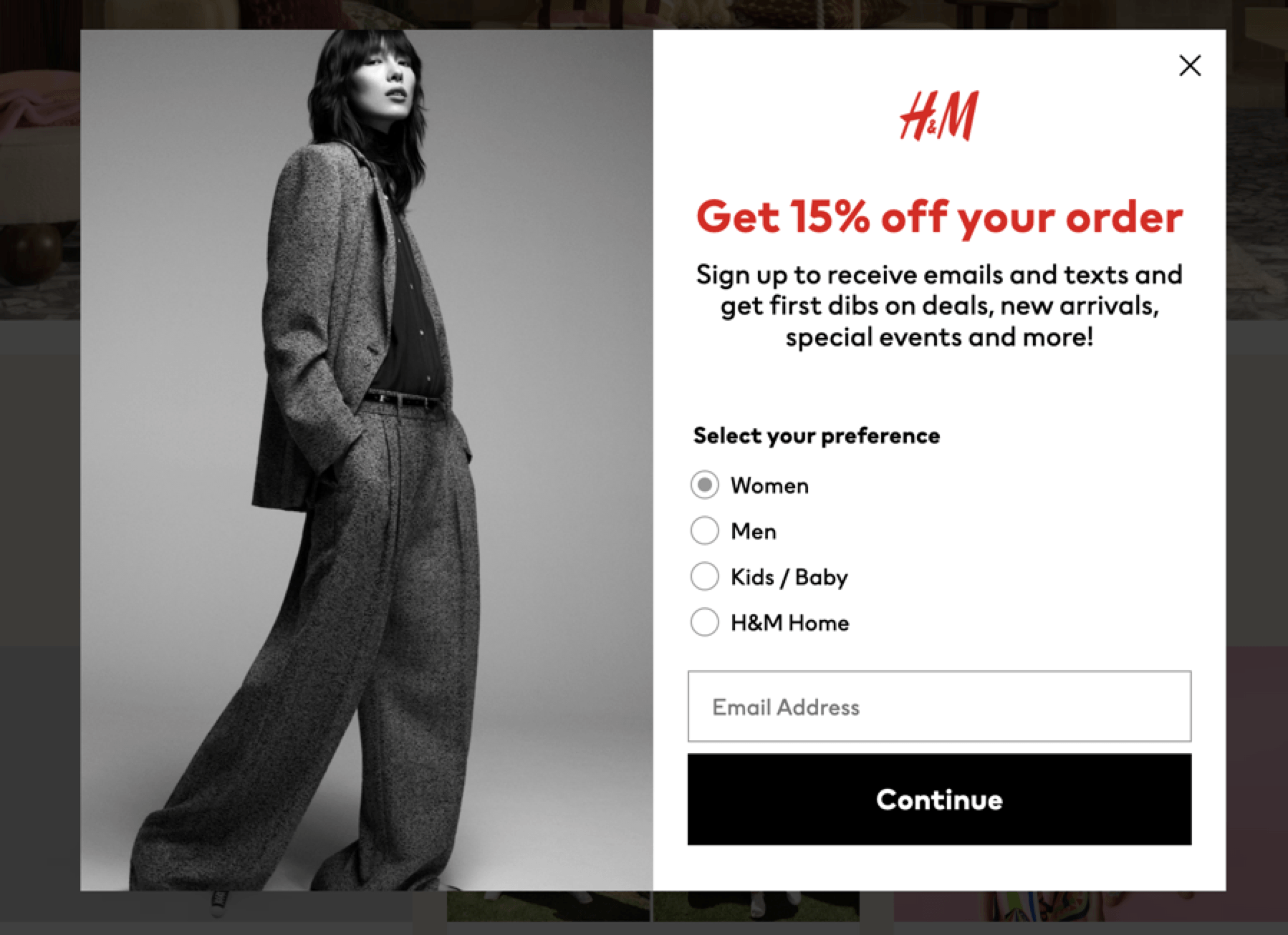
This modal does have multiple fields, but it is still succinct and helps the user get more out of the experience.
5. Create button text
Buttons make it easy to see what the next step is to move past the modal. With buttons, you can catch the reader’s eye and tell them what you expect.
Here is one example from the New York Times and their updated terms:
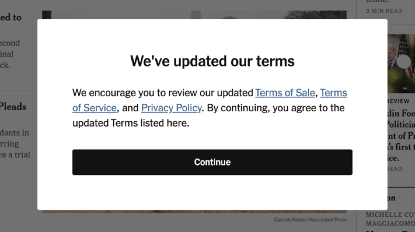
To move past the modal, the user must click the button and read the terms if they wish. This button makes it easy to transition back to the site and prevents the user from getting frustrated.
6. Don’t repeat them
You don’t want to push people away by forcing them to interact. Only use your modals once per site visit. Take this example from Rolling Stone:

If users don’t want to shop on the home page, they probably don’t want repeated inquiries as they browse the site. Only using your modals once will prevent frustration and encourage browsing.
Use our FREE website design cost calculator to get an idea!How much does it cost to build the website of your dreams?
![]()

Optimize your website modals with WebFX
A modal window can help you capture more leads and keep your audience moving through the sales funnel. How can you set up modals on your pages, and when should you start adding them?
A web design agency like WebFX can help you answer these questions and proceed with modals. If you want to simplify the web design process, we can help — we have launched over 1,600 websites so far, and we can incorporate modals effectively.
Contact us online today and see what we can do for your business!
-
 Abbey is a digital marketer, copywriter, and lead editor. She has worked on over 200 client campaigns and WebFX, and she specializes in marketing strategy analysis and industry-specific digital marketing plans. Outside of writing and editing, you’ll likely find her taking pictures of her cat, making a new playlist, or tending to her houseplants.
 -

WebFX is a full-service marketing agency with 1,100+ client reviews and a 4.9-star rating on Clutch! Find out how our expert team and revenue-accelerating tech can drive results for you! Learn more
Make estimating web design costs easy
Website design costs can be tricky to nail down. Get an instant estimate for a custom web design with our free website design cost calculator!
Try Our Free Web Design Cost Calculator
Share this article


Web Design Calculator
Use our free tool to get a free, instant quote in under 60 seconds.
View Web Design CalculatorMake estimating web design costs easy
Website design costs can be tricky to nail down. Get an instant estimate for a custom web design with our free website design cost calculator!
Try Our Free Web Design Cost Calculator