

Email marketing allows you to reach your target audience right in their inboxes. And it can earn your business an incredible ROI— up to $44 for every $1 you spend! But creating a campaign can be frustrating if you’re worried that a lack of design skills is preventing you from getting the results you want.
Fortunately, you don’t have to be a designer to create killer emails.
Most email marketing platforms, like EmailMarketingFX, allow you to choose from an array of pre-designed email templates. However, you’re probably still going to need to select some design elements like your colors, fonts, and images. In this post, we’ll cover nine tips to help you create emails that look great and earn your business more revenue online.
Image source
1. Add photos that support your message
Photos are a great way to grab readers’ attention and break up blocks of text in your emails. Stock photos are fine to use, but you can take your emails to the next level by adding custom photos or screenshots that back up your message. For example, the Girlboss email newsletter does a great job of incorporating original photos that highlight articles on their website.
When adding images to your emails, you’ll also want to add descriptive alt text to ensure that readers can grasp your message even if the images don’t load properly on their devices.
2. Include videos
Adding videos in your emails can increase click-through rates by 50! If your company already creates video, you may have some on hand that correspond to your email topics. And if not, videos are fairly easy to create with minimal equipment and resources. Unfortunately, email clients like Gmail and Outlook don’t support the requirements for videos to play directly inside emails.
But you can easily take a screenshot of your video and link the image to the hosted version of your video on YouTube, Vimeo, or your website.
You can even add play buttons on top of static images to let users know that the screenshot is for a video.
Adding videos in your emails is a great way to engage readers and provide them with important information about your products and services. At WebFX, we like to include videos in our marketing emails that give readers an inside look at our company.
3. Incorporate your logo
Next, it’s essential to include your logo at the top of your emails or in another prominent location. This lets recipients know exactly who is sending the message, and people will start to recognize your business. Even if they don’t immediately purchase, they will be more likely to remember your brand in the future or even recommend your company to friends and family members.
Including your logo in your emails can help you establish trust with readers, and it helps your messages appear more credible.
Kaleigh Moore’s Cup of Copy emails always feature her signature logo at the top, so readers can immediately identify the sender when viewing her emails.
4. Use colors that support branding
When choosing colors for your emails, it’s important to think about your branding. If your company’s signature colors are blue and green, for example, you should incorporate those hues in your emails. This is a great way to promote consistent branding, and it can help readers recognize your company.
It’s also important to remember that colors can be emotive, and certain colors can trigger specific feelings. So you can use color to highlight specific points in your emails.
If you aren’t sure which colors to choose for your email campaigns, check out our psychology of color infographic to learn more about the psychological cues triggered by different colors.
5. Limit your fonts
As a rule of thumb, stick with a max of two fonts in your emails— one for headlines and subtitles and another for body copy. This will give your emails a crisp finish and prevent them from looking confusing or overwhelming.
Standard fonts like Arial, Times New Roman, Tahoma, Verdana, Courier, and Georgia are great for readability. While you can experiment with other fonts, it’s important to remember that your recipients’ computers may not support lesser-used options.
You’ll also need to make sure that your font is readable. For body copy, size 14 to 16 point font is a generally accepted standard.
6. Keep it simple
While you might be tempted to pack your emails with visual elements, this can overwhelm readers and send them searching for the unsubscribe button. When it comes to email design, simplicity is key, and white space is your best friend.
Without white space, readers won’t know where to look. So make sure you include plenty of space between headlines, images, and the main email copy.
The Think with Google newsletter does a great job of incorporating white space to guide readers through the email and establish clean breaks between featured stories. 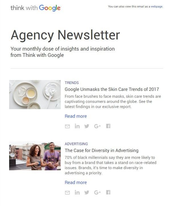 This makes it easier for readers to pick out the most important information and ensures that information isn’t lost in cramped design.
7. Don’t forget calls to action
By the time people finish reading your emails, they should know what you want them to do next. Do you want readers to visit your website? Subscribe to your blog?
Contact you for more information? Let them know! Calls to action serve as maps that direct readers to take action.
And including them in your emails can help you get the greatest possible ROI from your campaigns.
Branden Harvey’s Goodnewsletter contains colorful CTAs that make it easy for readers to take the next step and purchase a subscription to the Goodnewspaper. 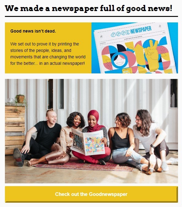 A well-designed CTA engages readers and makes it easy for them to take action. The more straightforward yours are, the better results you’ll get from your email campaigns.
8. Make your emails scannable
Many people access their email on the go, and they may not have time to fully read your emails. This means that you need to make your emails scannable, so readers can easily pick up on the most important tidbits. Using headers and bullet points can help emphasize key information and guide readers through your emails.
You’ll also want to keep your paragraphs short, so people don’t get stuck reading large blocks of text.
If you want to get the most out of your email strategy, you need to make your emails as easy for readers to digest as possible.
9. Make sure your design looks good on mobile
Finally, you’ll want to make sure that your email designs look great on mobile devices. This is extremely important since more than half of emails are opened on mobile devices. Sometimes, designs that look great on desktop end up appearing smooshed and sloppy on mobile devices.
I have definitely created a few email designs that looked incredible on desktop only to discover that the buttons were crammed together on mobile.
Email marketing platforms like EmailMarketingFX let you preview your designs on both desktop and mobile devices, so you can be sure that your emails look great best no matter what recipients use to view them.
Want to create custom email campaigns?
If you’re ready to start incorporating these email design tips in your own email campaigns, WebFX can help! We offer email marketing services to help you reach your target audience with relevant messages that encourage them to purchase. Contact us today to learn more!
-
 Emily is WebFX’s Content Delivery Lead. She holds an M.S. in digital marketing and leads the FX content team, along with strategy, implementation, and evaluation for WebFX’s key revenue channels. Her work has been featured by Social Media Today, Campaign Monitor, Reader’s Digest, Yahoo, and more. In her free time, she enjoys hiking, road trips, and exploring new cities. Follow her on Twitter @emcarter16 or connect on LinkedIn.@emcarter16
 -

WebFX is a full-service marketing agency with 1,100+ client reviews and a 4.9-star rating on Clutch! Find out how our expert team and revenue-accelerating tech can drive results for you! Learn more
Try our free Marketing Calculator
Craft a tailored online marketing strategy! Utilize our free Internet marketing calculator for a custom plan based on your location, reach, timeframe, and budget.
Plan Your Marketing Budget
Table of Contents
- 1. Add Photos That Support Your Message
- 2. Include Videos
- 3. Incorporate Your Logo
- 4. Use Colors That Support Branding
- 5. Limit Your Fonts
- 6. Keep It Simple
- 7. Don’t Forget Calls to Action
- 8. Make Your Emails Scannable
- 9. Make Sure Your Design Looks Good on Mobile
- Want to Create Custom Email Campaigns?
Share this article

Maximize Your Marketing ROI
Claim your free eBook packed with proven strategies to boost your marketing efforts.
Get the GuideTry our free Marketing Calculator
Craft a tailored online marketing strategy! Utilize our free Internet marketing calculator for a custom plan based on your location, reach, timeframe, and budget.
Plan Your Marketing Budget


