

The use of graphics as a tool for educating viewers is a great approach to sharing information. It’s an effective way of composing otherwise boring information and data into an easy-to-consume and fascinating way. In this article, you’ll discover a variety of infographics and visualizations associated with the internet.
You might just learn a thing or two about the web by looking at these awesome artworks! Click on the image to go to the larger version of each graphic. 1. Web Trend Map is a graphical representation of the top domains and personalities on the web. It maps websites and notable persons onto the Tokyo subway system as train stations with their popularity and success represented by their position and size. 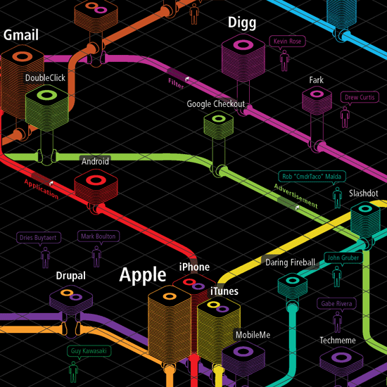 2. Who Participates and What People Are Doing Online is an infographic by BusinessWeek that shows who’s online and what they’re doing. The graphic reveals that the most popular demographic on the internet include persons between the ages of 18-26.
 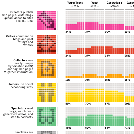 3. Internet Traffic shows the sources of internet activity in 2008. It illustrates that China, constituting 17% of the world’s web users, is the largest source of traffic, with the United States as the second (this may change in 2012 based on growth projections).
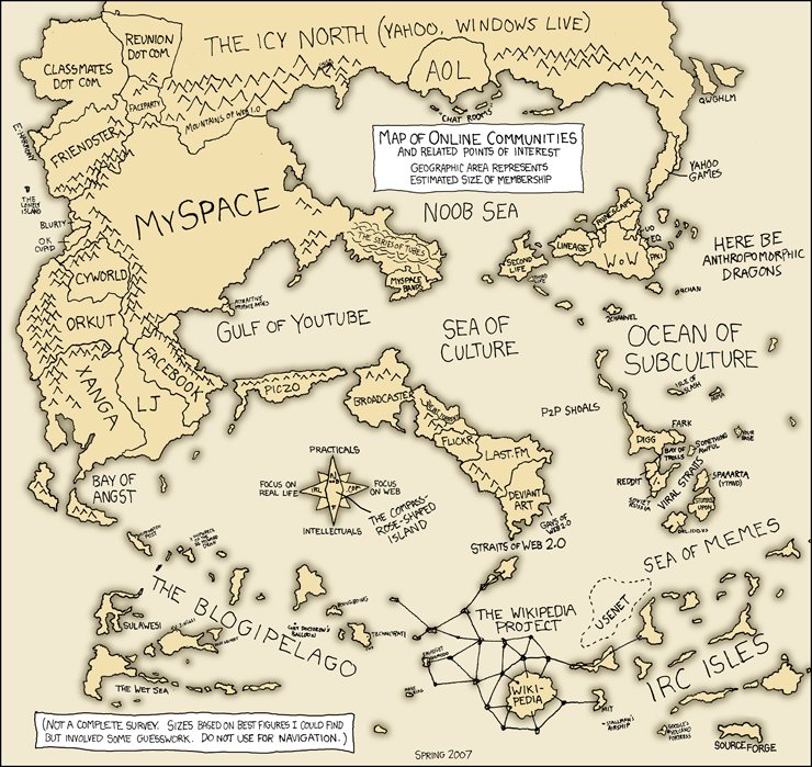
 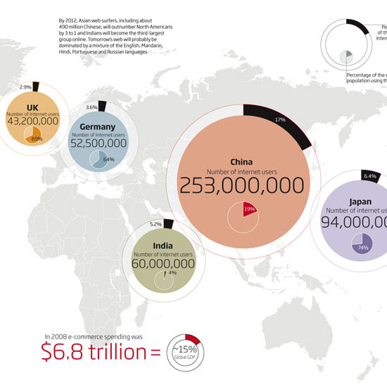 4. Online Communities is a satirical portrayal of the communities you can find online, published in xkcd. Communities are represented as countries, with their membership size denoted by how big its country is. Take this information with a grain of salt!
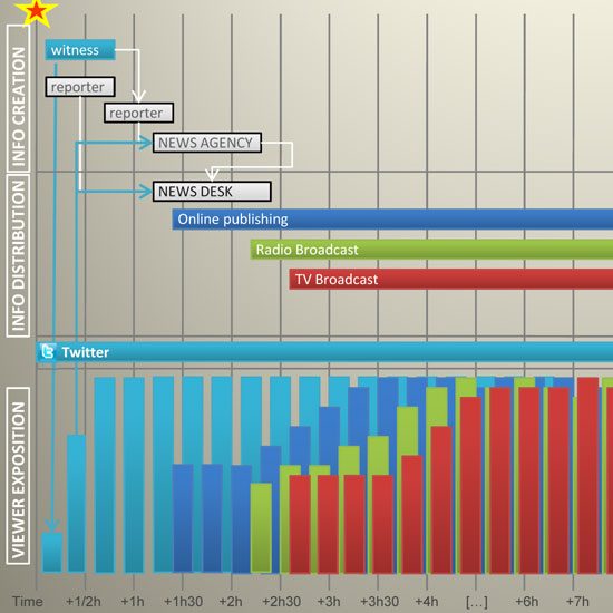
 5. Information creation and circulation before and after Twitter reveals how information dissemination is changing with the advent of Twitter, which breaks news and events almost instantaneously, versus up to 2 hours for more conventional news sources.
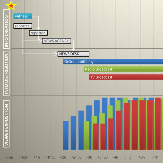
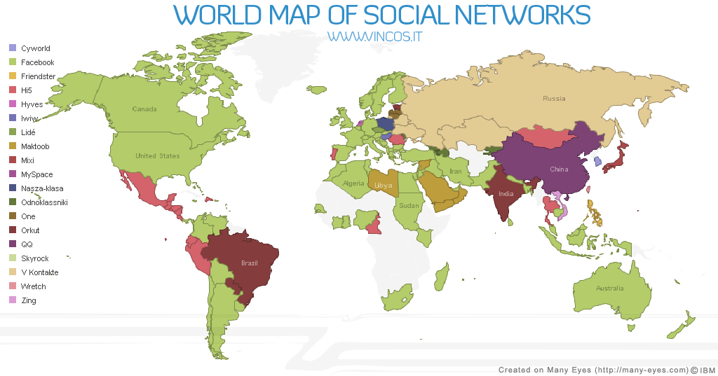
 6. World Map of Social Networks depicts the most used social networking site of each country based on data gathered from Alexa and Google Trends. Facebook is the most popular in the U.S. while Orkut (by Google) is the most prevalent in Brazil.
 7. The Life Cycle of a Blog Post is an interactive graphical flowchart on Wired that demonstrates the pathways of how a blog post makes its way from the blogger to the reader, and the intermediary stops along the way.
 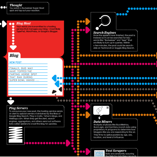 8. Repetitive Website Intros Examined exposes how the design industry tends to stick to prevailing trends by presenting data on overused keywords, readability and other tidbits of incriminating numbers in website introductions based on the sites on this article.
  9. Mobile Web 2.0 is a PDF on Stanford’s site that charts development and usage trends concerning the convergence of Web 2.0 applications and mobile devices, showing a timeline between 1980 to 2010 and important events in the Mobile Web 2.0 evolution.
 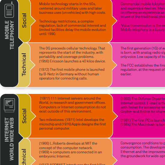 10. Submarine cables is a map of underwater cable systems around the world, uncovering how much the internet has grown to the point that it warrants a vast quantity of cable systems (98 of them to be exact), and expansion of 28 more of such systems by 2011.
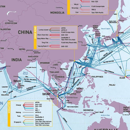
Related Content
-
 President of WebFX. Bill has over 25 years of experience in the Internet marketing industry specializing in SEO, UX, information architecture, marketing automation and more. William’s background in scientific computing and education from Shippensburg and MIT provided the foundation for MarketingCloudFX and other key research and development projects at WebFX.
 -

WebFX is a full-service marketing agency with 1,100+ client reviews and a 4.9-star rating on Clutch! Find out how our expert team and revenue-accelerating tech can drive results for you! Learn more
Make estimating web design costs easy
Website design costs can be tricky to nail down. Get an instant estimate for a custom web design with our free website design cost calculator!
Try Our Free Web Design Cost Calculator
Share this article


Web Design Calculator
Use our free tool to get a free, instant quote in under 60 seconds.
View Web Design CalculatorMake estimating web design costs easy
Website design costs can be tricky to nail down. Get an instant estimate for a custom web design with our free website design cost calculator!
Try Our Free Web Design Cost Calculator


