

With the ever-increasing sales of smartphones and the burgeoning tablet market starting to skyrocket, coupled with far greater access to more robust mobile data networks, the internet is now being accessed by our users in a multitude of new ways. The huge range of mobile devices used to browse the web now means you really have to consider making your site mobile-compatible when designing your responsive website. But how do you go about it?
Testing your site on mobile devices can be time-consuming and expensive due to the vast number of different mobile devices. Fear not, because there are some handy tools available at your disposal for making sure that your website renders appropriately on the Mobile Web. This article shares and discusses 10 such tools.
1. iPhoney
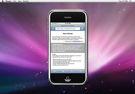 An excellent free iPhone tester, iPhoney isn’t exactly an emulator, but allows developers to create 320x480px websites for use on the iPhone. It allows you to test images and code in a pixel-perfect Apple-Safari-powered environment, with all the normal features including Portrait and Landscape modes, fullscreen, zoom and plugins.
2. W3C mobileOK Checker
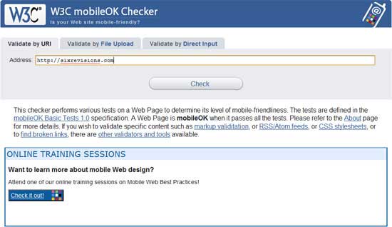 This checker is a web-based automated validation tool that checks to see how mobile-device-friendly your website is. The tests are checked against the W3C mobileOK Basic Tests specification developed by W3C.
3. iPad Peek
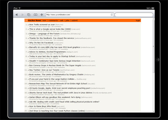 This handy web-based tool allows you to see how your websites look when rendered on the iPad. It’s recommended that you use a WebKit-based browser such as Apple Safari or Google Chrome to have as accurate a simulation as possible — or at the very least, a CSS3-capable browser that supports
 transformation properties (like Opera) because it uses them to render the page in Portrait mode.
4. Modify Headers Add-on for Firefox
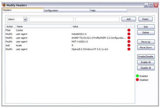 There are add-ons for Firefox that can manipulate the data sent to servers to make it seem as if the user agent is browsing on a mobile device, even when they’re not. To do this, you need an add-on called Modify Headers (for Firefox). Once you have downloaded and installed this add-on, the new options, Tools > Default User Agent and Tools > Modify Headers should appear in your browser.
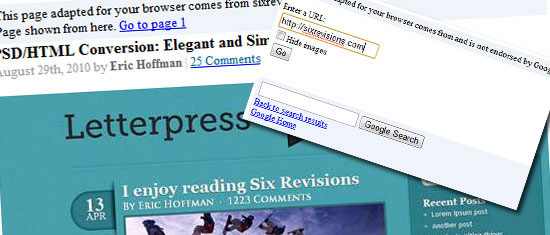
To emulate browsing on a mobile device, you need to find the User Agent Profile (UAProf) value of your mobile device, which can be found with a quick search on Google for “user agent” followed by the model of your phone (e.g. see Google results for “user agent ipad“). Alternatively, check out this list of UAProf values.
Once you have located the UA Profile value for the phone you want, enter it into the Modify Header dialog box, and bingo, you will see how it’s like to browse from that device. For Google Chrome, you can try out the User-Agent Switcher extension. For a browser-independent desktop application that works on virtually any internet-enabled app, try out Fiddler Web Debugger that lets you modify HTTP requests, among other things.
5. Adobe Device Central CS5
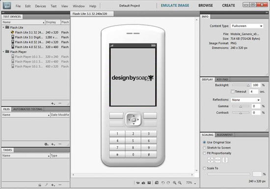 As part of the latest Adobe Creative Suite, Device Central emulates the operation of mobile devices on your desktop allowing you to test HTML and Flash from the comfort of your desktop. To open a page or site, select Device Profiles > Browse Devices, then right-click and choose Add To Test Devices. Now that you’ve added a device, simply go to File > Open (for local testing) or File > Open URL (for remote testing).
Though far from being free, if you’re a professional designer or developer, you’ll have a high chance of being able to access Adobe’s creative suite of applications.
6. Google Mobilizer
 Google Mobilizer is a simple web tool that lets you input a web page address and then makes the page mobile-web-friendly by trimming the content down to its bare essentials. This is an excellent tool for seeing where you can make performance optimizations on your site.
7. Gomez
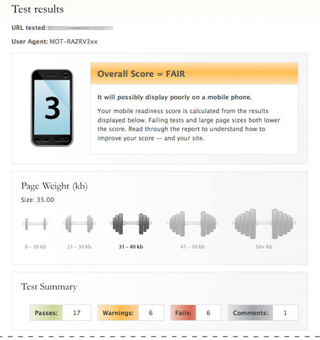 Gomez mobile readiness test gives you a score between 1 and 5 based on an analysis of over 30 proven mobile web development techniques, ranging from stylesheet use (e.g. media queries) to caching techniques and standards-compliant code. The results are displayed in an easy-to-understand document that offers advice on how to make your site better.
Unfortunately, to be able to test your site, you must enter in a bunch of information including your email address, country, zip code, and phone number.
8. MobiReady
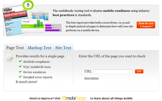 In the same vein as Gomez, MobiReady is another online testing site that allows you to enter a URL so that it can perform a set of evaluations, including Page Test, Markup Test and Site Test of the web page. This is a slightly more detailed version of Gomez above and provides a comprehensive test result page including dotMobi compliance, W3C mobileOk tests, device emulators, detailed error reports, HTTP tests and a code checker. However, the results aren’t as succinct as Gomez’s results, a disadvantage when it comes to presenting your information to your less technically astute clients/employers.
9. DotMobi Emulator
 The dotMobi emulator gives you a live preview of your site from a (fairly small, to be honest) range of different mobile phones. This mobile testing tool is great if you need to test your page on older mobile devices. What can be annoying to potential users of this tool is that it requires the Java browser plugin for it to work.
10. Opera Mini Simulator
 With over 120 million smartphones sold that has Opera pre-installed[1] and an edition available for almost any OS, making sure that your site works on Opera Mini (the mobile version of the Opera web browser) is a good practice to include in your testing workflow. Thankfully, Opera has obliged us by offering a free web-based emulator for testing and evaluating your web design on a mobile device that uses Opera Mini. This tool requires the Java browser plugin to function.
With many industries now having the majority of their traffic coming from mobile devices rather than desktop, you must have a mobile friendly site. Think about a college campus for example. The vast majority, if not all students have a cell phone and will be visiting the campus’s website on that phone probably a lot of the time.
This is a key to keep in mind when designing a college’s website. If it’s not mobile friendly, it will leave for a bad user experience.
Further Reading
- Mobile Web Design: Best Practices: This article has a list of 20 mobile phone emulators.
- Designing Web Apps for the iPad: Tips and design considerations when you’re designing an iPad site.
- 10 iPhone Apps Every Web Designer Should Know About: This is a collection of mobile apps for designers.
- Getting Started with the iPhone SDK: Want to learn about creating iPhone apps? Read this introductory guide.
References
- Opera: State of the Mobile Web report. www.opera.com
Related Content
- A Quick Look at Mobile Web Designs
- Mobile Web Design: Best Practices
- Mobile Web Design: Is it Worth It?
- Related categories: Tools and Web Development
-
 President of WebFX. Bill has over 25 years of experience in the Internet marketing industry specializing in SEO, UX, information architecture, marketing automation and more. William’s background in scientific computing and education from Shippensburg and MIT provided the foundation for MarketingCloudFX and other key research and development projects at WebFX.
 -

WebFX is a full-service marketing agency with 1,100+ client reviews and a 4.9-star rating on Clutch! Find out how our expert team and revenue-accelerating tech can drive results for you! Learn more
Make estimating web design costs easy
Website design costs can be tricky to nail down. Get an instant estimate for a custom web design with our free website design cost calculator!
Try Our Free Web Design Cost Calculator
Share this article


Web Design Calculator
Use our free tool to get a free, instant quote in under 60 seconds.
View Web Design CalculatorMake estimating web design costs easy
Website design costs can be tricky to nail down. Get an instant estimate for a custom web design with our free website design cost calculator!
Try Our Free Web Design Cost Calculator