
 In this Photoshop web design tutorial, we are going to design a smashing, clean, and professional website layout in Photoshop. The layout we are doing in this tutorial can be used as personal or corporate website design. This design is pretty user-friendly, so it should be great for your site’s reputation. Update: This is the first part of a two-part series that will teach you how to create the layout in Photoshop, and then how to convert it to a standards-compliant (X)HTML web design.
The “Clean and Professional Web Design” Series
- Part 1: Create a Clean and Professional Web Design in Photoshop
- Part 2: Coding a Clean and Professional Web Design
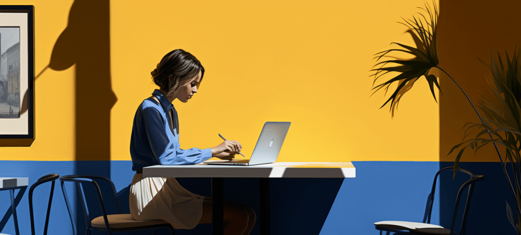
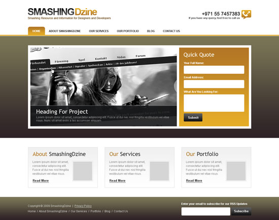
Final Preview
Have a look at the layout that we’ll be creating in this tutorial. You can see the final preview of the image below or click here for a full size version. 
Prepare your Photoshop document
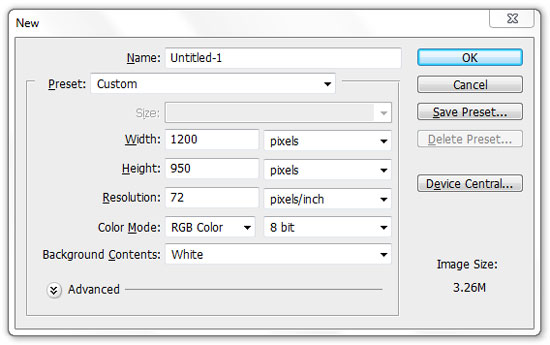
1 Create a new document in Photoshop (Ctrl/Cmd + N) using the settings from the following image.
Set the units and rulers settings
2 Make sure that you are working in pixel units, which is the standard fixed unit for web design.
Set up the following settings for your Rulers from the Preferences dialog window (Ctrl/Cmd + K); click on Units & Rulers and ensure that you have everything set as shown in the figure below. 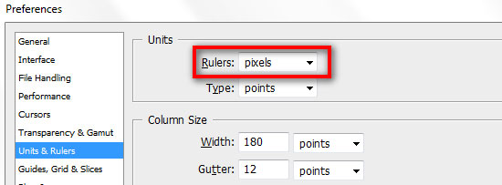
Add guides to designate the content area
3 Activate Photoshop Rulers from View > Rulers.
Toggle the visibility of the rulers by pressing “Ctrl/Cmd + R”.
Also open the Info panel from Window > Info (shortcut key: F8).
The Info panel gives useful information depending on the selected tool.
By pressing “M”, choose the Rectangular Marquee Tool and create a box that is 120px wide from the left corner of the canvas. You can adjust the size by looking into the Info panel while making the selection.
Now click on the left ruler and drag a guide to the right of the marquee selection as shown in the image below. 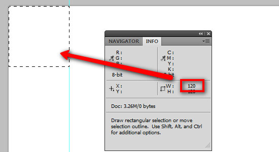 4 Move this selection on the right edge of the canvas. Assign another guide to the left side of the selection.
Your canvas now should look like this: 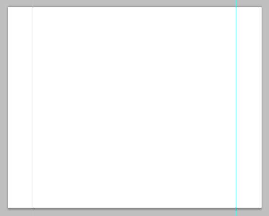
Creating the logo
5 Now we are going to create the logo for our website.
The logo is going to be very simple and it will have a color gradient effect. Create a new group (Layer > New > Group) and name it “logo“.
6 Select the Horizontal Type Tool (T) and type “SMASHING” (or the name of your website) in capital letters.
7 Then in the Character panel, set the font to Arial, the style to Bold and the size to 42pt. Also set the anti-aliasing method option to Sharp and use the color #101112.
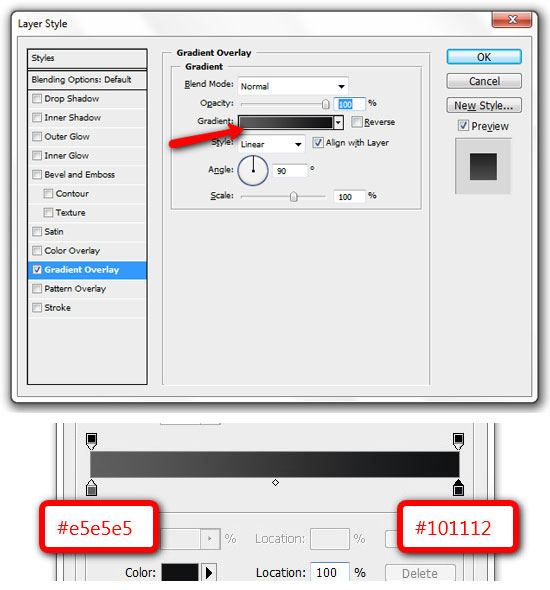
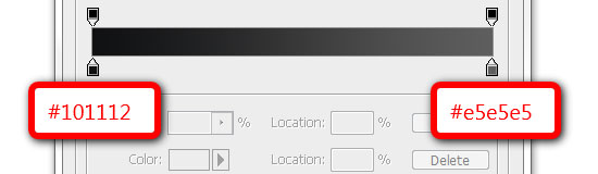
You can also set these options in the Options bar when the Type Tool is the active tool. 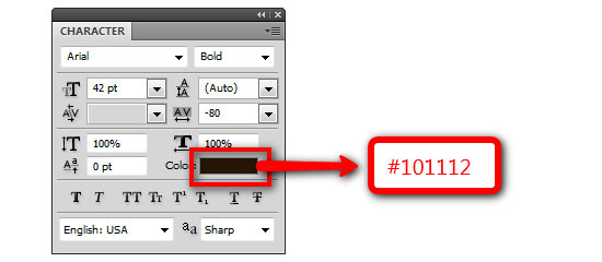 8 Double-click to open the Layer Style dialog box. Select Gradient Overlay, click the Gradient Editor and use the settings as shown below.
 9 Put the “SMASHING” type layer at the distance of 35px from top and 0px from left guide. You can do this accurately using the Move Tool (V) and your arrow keys. Duplicate this type layer (Layer > Duplicate Layer).
Move the duplicated layer right next to the “SMASHING” word and edit the text to “Dzine“. Repeat Steps 6, 7, 8 but use different gradient colors (Left color stop: #b27625, Right color stop: #e5ad27) for the word “Dzine”.
10 Select the Horizontal Type Tool (T) and add a tag line under the logo with following settings. 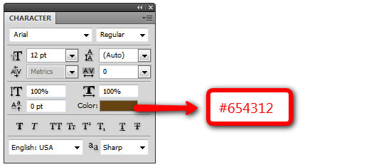 11 The final logo should look like the image below. To activate/deactivate the guides, go to View > Show > Grid or use the shortcut Ctrl/Cmd + ;
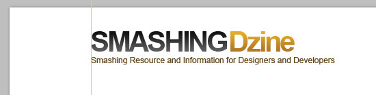
Creating the navigation bar
12 Create a new group and name it “navigation“, it should be above “logo” group.
Drag a guide from the top ruler, 150px below the top edge of the canvas. Select the Rectangle Tool (U) and draw a horizontal line of 4px height with a color of #e3ab27, across the canvas.
13 Add navigation links at 12px-high from this horizontal line and 20px to the right of the left guide. Select the Rounded Rectangle Tool (U) and draw a box with the size of 72px by 35px.
Move this layer below the text links and name the layer “hover“.
Straighten the bottom rounded corners with the Convert Point Tool. Move the sides of uneven edges below with an 8px margin to make the edges equal to other inner edges at bottom. Double-click the “hover” layer to open the Layer Style dialog box and add gradient colors (Left color stop: #e5ad27, Right color stop: #b27625).
Select the Horizontal Type Tool (T), select the text, “Home” and change color to #ffffff (white). 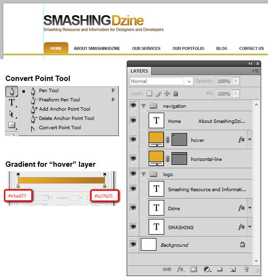
Creating the “call us” section
14 Next we are going to create the “call us” section at the top-right of our design (exactly opposite side of the logo). Download this phone icon and place this near the right guide.
Name this layer “phone icon“. Select the Horizontal Type Tool (T).
Add a phone number on the left of the phone icon using the font Arial, with the size set at 20pt and the color #292929. Add some related text below the phone number using font Arial, set at Bold, with a size of 11pt and a color of #595959. 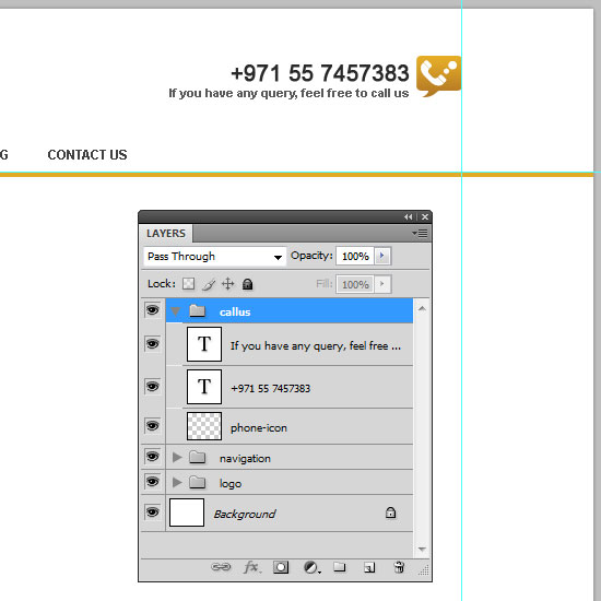
Creating the header
15 Now we are going to a create the header section.
Create a new group and name it “header“.
16 Select the Rectangle Tool (U) and create a rectangle shape with the size of 1200px by 440px. Put this rectangle at a distance of 1px below the navigation bar and name this layer “header bg“. Double-click the “header bg” layer, select the Gradient Overlay layer style and have these two colors in the Gradient Editor (Left color stop: #2e2226, Right color stop: #7a7556).
See the image below for the rectangle position and colors detail. 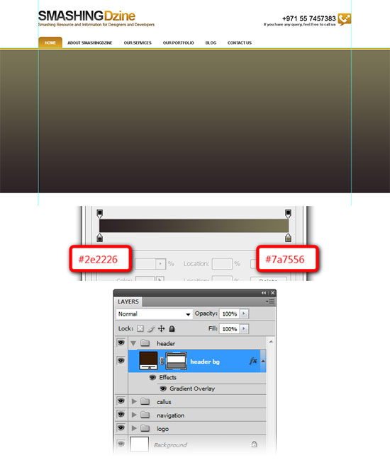 17 Create another rectangle from the Rectangle Tool (U) with the size of 960px by 360px. Put this rectangle at the distance of 40px from the top of the “header bg” layer and 0px from the left guide.
Name this layer “header container“. Preview below what we have done until now with the design. 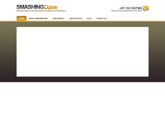
Creating the “featured project” section
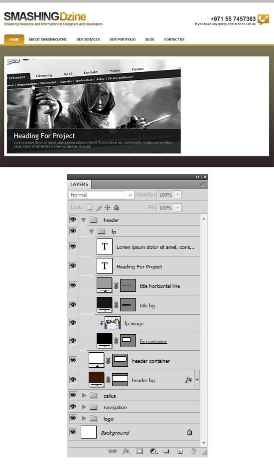
18 Next we will create the featured project section. Create a new group inside the header group and name it “fp“. Select the Rectangle Tool (U) and create a rectangle with the size of 630px by 340px at the distance of 10px from the top and the left of header container. Give this layer color of #000000 and name it “fp container“. 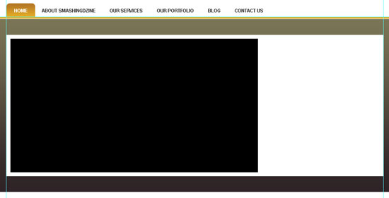 19 Open an image in Photoshop to place here as your featured project. Go to Select > All (Ctrl/Cmd + A), then Edit > Copy (Ctrl/Cmd + C). Come back to the our web design.
Create a new layer above the “fp container” layer and go to Edit > Paste (Ctrl/Cmd + V) to paste in your featured project image.
Rename this layer to “fp image“. Right-click the “fp image” layer and select Create Clipping Mask. Now the image is visible only inside the rectangle (“fp container”).
Make adjustments so that your featured project image is similar to the one shown below. 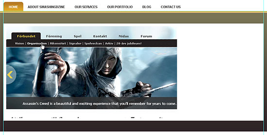 20 Go to Edit > Transform > Scale (Ctrl/Cmd + T).
From the Options bar, click in the rotation box and type -4 and press enter twice to adjust the angle. Stay on the same layer (“fp image”), and select Luminosity as the blending mode of this layer. 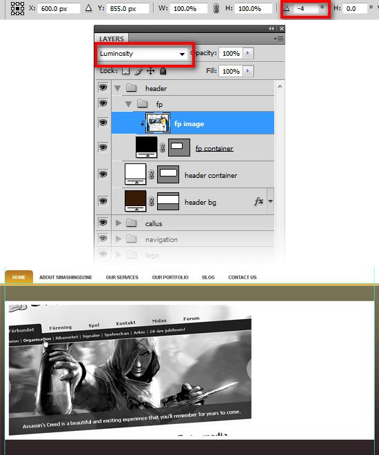 21 Next we are going to create the title and description bar for the featured project image.
Select the Rectangle Tool (U) and create a rectangle shape with the size of 630px by 90px using color #161718. Change opacity of this layer to 90% and name it “title bg“. Place this rectangle as shown in the image below. 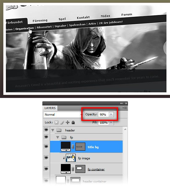 22 Create another rectangle with the size of 630px by 1px using color #9c9c9c and name it “title horizontal line“. Place this rectangle on the top edge of the contents of the “title bg” layer.
23 Add a title and description inside the rectangle we created in Step 21, using the following settings for title and description.
For the title:
- font: Arial, color: #ffffff, size: 25pt and anti-aliasing method option: Sharp
For the description:
- font: Arial, color: #a4a4a4, size: 12pt and anti-aliasing method option: None
Creating the “quick quote” section
24 Create another group inside the header group and name it “quick quote“. Select the Rectangle Tool (U) and create a rectangle with the size of 300px by 340px. Place this rectangle at the distance of 10px to the right of the featured project section and name it “qq container“.
25 We will copy a Layer Style from another layer we created in a previous step. Go inside the “navigation” group, right-click the “hover” layer, select Copy Layer Style, go back to the “qq container” layer, right-click and select Paste Layer Style.
We have the same Layer Style of the “hover” layer for our “qq container” now. 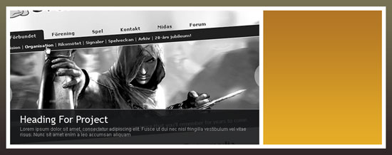
26 Select the Horizontal Type Tool (T). Write “Quick Quote” inside “qq container” at the distance of 20px from the top and left edges of the containing box.
Set the font family to Trebuchet MS (or a web-safe font of your preference) with thecolor of white (#ffffff) and anti-aliasing method option set to Sharp. We are going use the Rounded Rectangle Tool (U) to create three form fields. Select the Rounded Rectangle Tool (U) and set the radius to 3px.
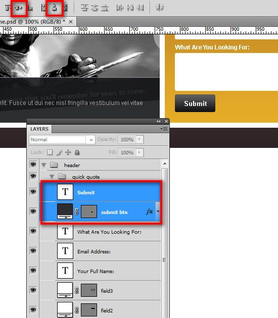
Then create two rounded rectangles with the size 260px by 35px using the color of white (#ffffff). Then name the shape layers as “field1” and “field2” respectively. Create the third rounded rectangle with the size of 260px by 75px using a white color (#ffffff) and name it “field3“. Select the Horizontal Type Tool (T) and create labels for each form field. 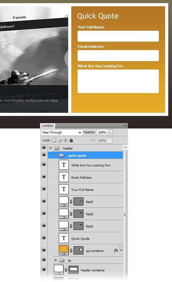 27 Select the Rounded Rectangle Tool (U) and create a box of 80px by 35px and name it “submit btn“.
28 Double-click the layer to open the Layer Styles dialog window and tick the Gradient Overlay checkbox from left. Click the Gradient Editor and change colors of the gradient as shown below.
29 Select the Horizontal Type Tool (T) and type “Submit” using the font Arial, style Bold and size at 13pt. Select both layers in the Layers panel (“submit btn” and “Submit text”).
30 Choose the Move Tool (V) from the Tools panel and click Align vertical centers and Align horizontal centers from the Options bar. (Alternatively, you can get the same result by going to Layer > Align > Vertical Centers and Layer > Align > Horizontal Centers).
Creating the main content area
31 Create a new group and name it “content“. Select the Rectangle Tool (U). Create a rectangle of 300px by 175px and name it “c01“. Place this layer 30px below the header and 0px from the left guide. Double-click the layer and use the settings from the following image. 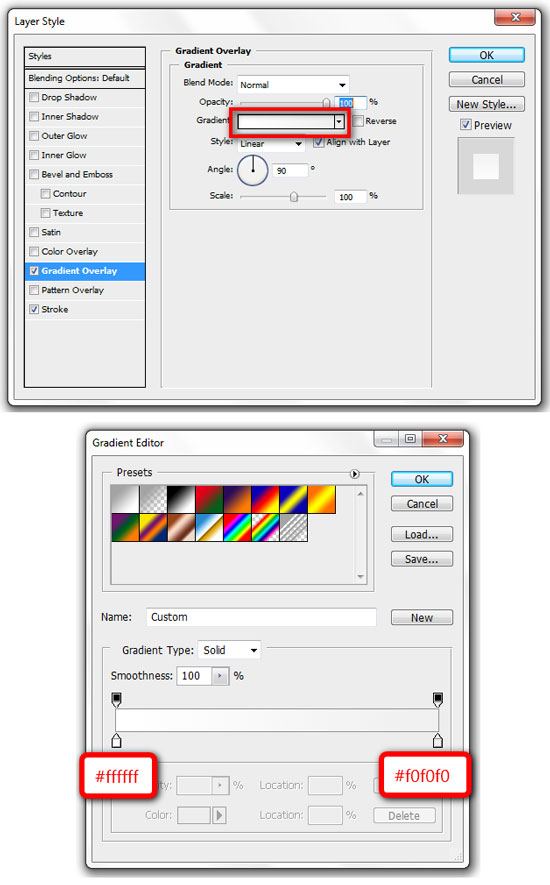
32 We are going to add content to this box now.
Select the Horizontal Type Tool (T) and add the text, “About SmashingDzine“. Make a selection of the “About” word using the Horizontal Type Tool (T), and then change its color to #b47825. Then make a selection of the “Smashing” word, and then change the color to #2f2f2f. Add a little description and a link text beneath the title.
The following options were used for the title, description and link text. (You can adjust these options as needed). 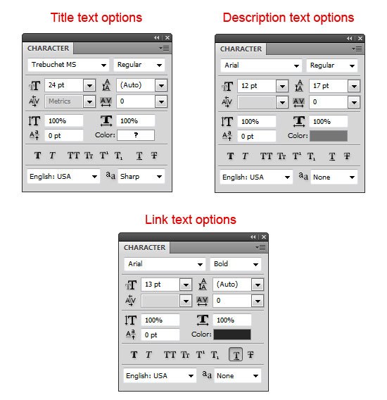
For the Title:
- Font: Trebuchet MS, style: Normal, size: 24pt, anti-aliasing method: Sharp
For the Description:
- Font: Arial, style: Normal, size: 12pt, anti-aliasing method: None, color: #767676
For the Link text:
- Font: Arial, style: Bold, size: 13pt, anti-aliasing method: None, color: #252525, Underline
33 We will add a square box next to the description now. Select the Rectangle Tool (U) and color #ffffff, hold down the Shift key to maintain the proportions and create a square with the size 88px by 88px. Move this square at a distance of 10px from the left of rectangle (“c01”).
Name this layer “border“. Double-click the layer to open the Layer Style dialog window, and add a Stroke layer style with the following settings: 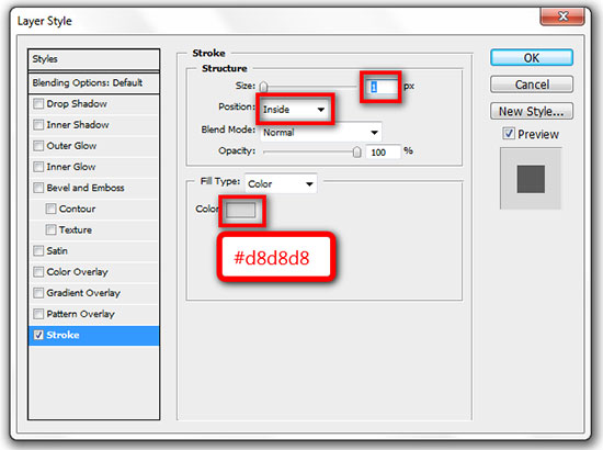
34 Create another box with the size of 82px by 82px and place it in the center of the “border” layer. Name this layer “box” and change the color of this square to #d5d5d5. Select all layers in this group (“content” group), go to Layer > New > Group from Layers (Ctrl/Cmd + G) and rename this new group “about“. 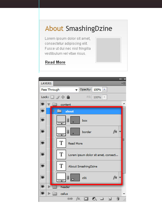 Note: The inside grey square box is a place holder for an image and can be replaced with any image of your choosing.
35 Duplicate the “about” group (Right-click on the group and select Duplicate Group) and name it “services“. Right-click on the “services” group and select Duplicate Group again and name it “portfolio“. We have three groups now (“about”, “services”, and “portfolio”). Move the last group (“portfolio”) to the right guide as shown below. 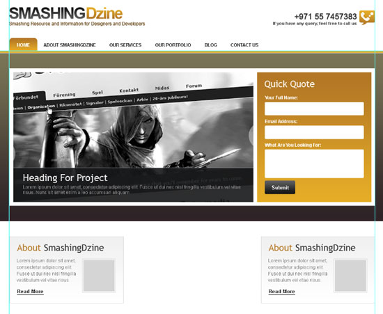 36 Select all three groups in the Layers panel, and then go to Layer > Distribute > Horizontal Centers to space them out equally.
Click here to see the full size image of the following image. 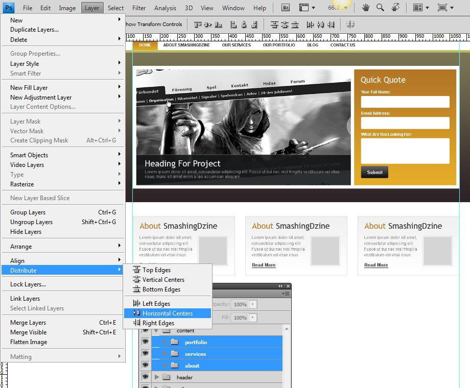 37 Change the titles for the “services” group (center) and “portfolio” group (right) as shown below. (You can change these titles according to your requirement.)
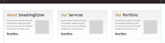
Creating the footer
38 Create a new group and name it “footer“. Select the Rectangle Tool (U) and create a rectangle with the size of of 1200px by 100px at the bottom of our design layout. Name this layer “footer bg“. Use the same Gradient Overlay style as the “header bg” layer by right-clicking the “header bg” layer and choosing Copy Layer Style. Go back to the footer group, right-click the “footer bg” layer and select Paste Layer Style. 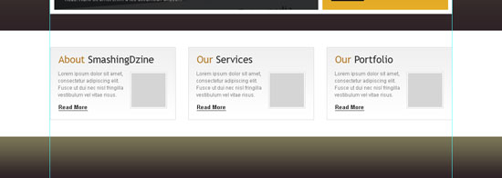 39Select the Horizontal Type Tool (T) and add copyright text and footer links text on the left using the font Arial, size of 12pt and a grey color (#dddddd).
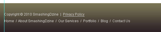
40 We are going to add the email subscription section on the right.
Create a new group inside the “footer” group and name it “subscribe“. Select the Rounded Rectangle Tool (U) and create a rectangle of 85px by 35px. Name this layer “subscribe btn“.
41 Repeat Step 26 for adding the form fields and labels.
42 Select the Horizontal Type Tool (T) and type “Subscribe” using the font Arial, style set to Bold and size at 13pt. Select both layers (“subscribe btn” and “Subscribe text”).
43 Repeat Step 28 for creating the subscribe button.
44 Select the Rounded Rectangle Tool (U) and set the radius to 3px.
Create a rounded rectangle with the size 210px by 35px using a white color (#ffffff) and name this shape layer as “email field“. Add a text line above “email field”. 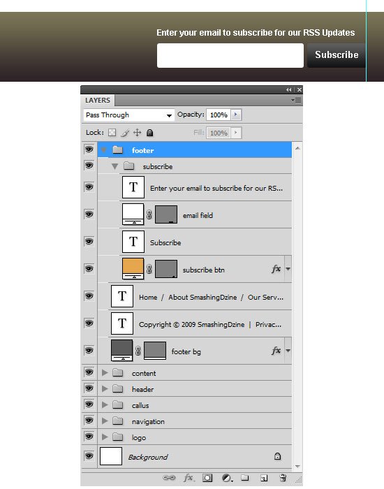
Final Result
OK, that’s it and we are done. Here is the final result.
Click on the image below to see the full size layout. Thanks for following along with my tutorial. I hope you all enjoyed and learned something new from this tutorial.
Kindly leave your comments below and share your thoughts and opinions, I would love to hear them. You can also share this design tutorial to your friends if you think it could be helpful to them!
Download the source file
You can download the Photoshop file (PSD) of this tutorial from the link below as a ZIP archive.
- clean-professional-weblayout (ZIP, 2.4 MB)
Summary
If you decide to use this design, be sure optimize the images to reduce load time. This decide should be great for small sites such as one for a golf course because it’s simple, easy to use, and user friendly.
Related Content
- How to Create a Clean Blog Design with Photoshop
- Coding a Clean Web 2.0 Style Web Design from Photoshop
- Create a Slick and Minimalist Web Layout in Photoshop
- Make a 3D Pencil and Paper Icon in Photoshop
- Create a Slick Video player UI in Photoshop
About the Author
 Waheed Akhtar is a freelance web designer from Dubai, UAE. He is the founder and editor of Boost Inspiration, where he showcases different creative resources of Digital Art, Graphic Design, Illustration, Photography and Typography for inspiration. You can reach him via Twitter or Facebook.
-
 President of WebFX. Bill has over 25 years of experience in the Internet marketing industry specializing in SEO, UX, information architecture, marketing automation and more. William’s background in scientific computing and education from Shippensburg and MIT provided the foundation for MarketingCloudFX and other key research and development projects at WebFX.
 -

WebFX is a full-service marketing agency with 1,100+ client reviews and a 4.9-star rating on Clutch! Find out how our expert team and revenue-accelerating tech can drive results for you! Learn more
Make estimating web design costs easy
Website design costs can be tricky to nail down. Get an instant estimate for a custom web design with our free website design cost calculator!
Try Our Free Web Design Cost Calculator
Share this article


Web Design Calculator
Use our free tool to get a free, instant quote in under 60 seconds.
View Web Design CalculatorMake estimating web design costs easy
Website design costs can be tricky to nail down. Get an instant estimate for a custom web design with our free website design cost calculator!
Try Our Free Web Design Cost Calculator


