
 In this Photoshop web design tutorial, we’re going to learn how to create a slick and minimal-looking website layout. We will use the 960 Grid System as a template to make it easy to align the design elements on the layout.
Preview
Here’s a preview of what we’ll be creating together, click the image to enlarge. 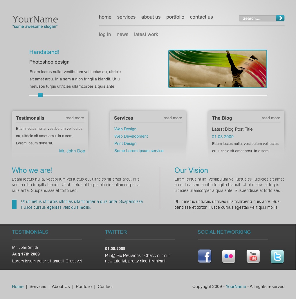
Create a new Photoshop document
1 We’ll be using the 960 Grid System (download it at http://960s/) as a starting template.
Once downloaded, ppen up the file called 960_grid_12_col.psd and then hide the group called 12_col_grid. 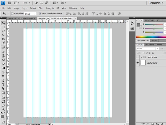
Creating the background
2 First of all, right-click on the Background layer in the Layers Panel and then choose Layer From Background. This will unlock the Background layer so that it’s editable.
I named the Background layer as bg. 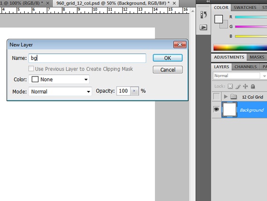 3 Now select the Gradient Tool (G), set your Foreground color to #efefef and your background color to #cacaca. Select Radial Gradient as the type of gradient in the Options bar.
Drag the gradient onto the canvas so that you have something similar to this: 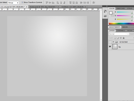
Designing the header section
4 We’ll add a new horizontal guide at the 50px mark from the top of the document to set our top borders. This will mark the location of the layout’s header section. 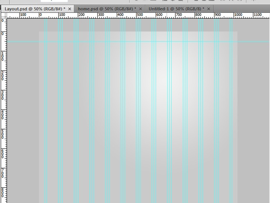 5 We’ll start adding our title and slogan; select the Horizontal Type Tool (T) and type your site’s name and your slogan.
Here are the font settings I used in the layout:
“YourName”
- Font family: Nilland font (get it from dafont.com)
- Font size: 33pt
- Font weight: Bold
- Anti-aliasing setting: Strong
- Color: #525252
“some awesome slogan”
- Font family: Arial
- Font size: 14pt
- Font weight: Regular
- Anti-aliasing setting: Strong
- Color: #207687
6 Align the fonts on the left top, using your guides for accurate placement. 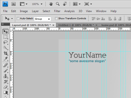
Creating our navigation
7 Select the Horizontal Type Tool (T) and type the navigation text (home, about us, services, portfolio, and contact) using the following font settings:
- Font family: Arial
- Font size: 17pt
- Font weight: Regular
- Anti-aliasing setting: Strong
- Color: #525252
8 Use the document’s guides to align the navigation link text like the following image: 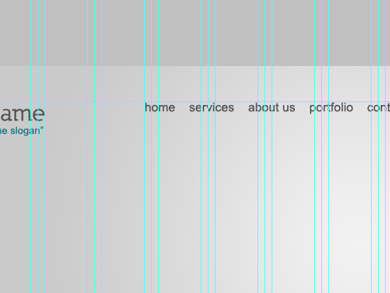
Creating the search bar
9 Now it’s time to create the search bar that’s situated on the right of the navigation links. Select Rounded Rectangle Tool (U), set the Radius option value to 5px, and then draw the rounded layer shape onto the canvas such that it has 155px width and 20px height, and located at the right of the navigation links. 10 Add an Inner Shadow layer style by double-clicking on the rounded rectangle shape layer in the Layers Panel to open up the Layer Styles dialog box.
Use the following settings below for the layer style settings: 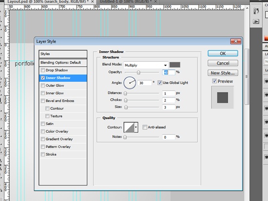 11 Let’s create the GO button now. Create a new rounded rectangle shape with the same height (20px) and Radius option value (5px), but with a width of 30px. 12 Apply a vertical (90 degrees) Linear Gradient layer style onto the Go button, with the left color stop being #2fa9c1 and the right color stop being #207687.
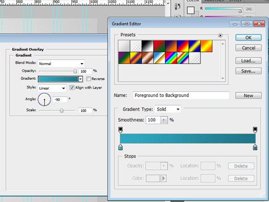
 13 And then write any text like “search…” using the Horizontal Type Tool (T) on top of the search bar; use a white color (#ffffff). 14 Using the Custom Shape Tool (U), create a white arrow and align it to the center. I used the custom shape called Arrow 2, which comes standard in Photoshop CS versions.
Look for it in the Shape option dropdown menu in the Options bar. Our search bar should be looking like this: 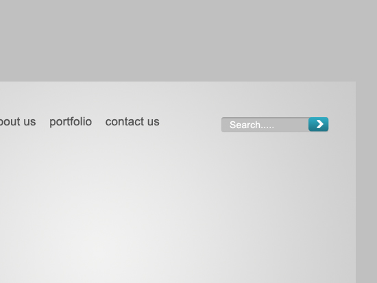 15 Before we move to the next step, just make sure that everything is well-organized in our document. Here’s a screen grab of my Layers Panel as I was developing the layout:
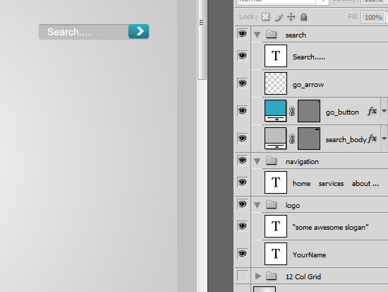
Creating the separating lines
16 Using the Line Tool (U), Create two 1px lines on top of each other, with the following color values: 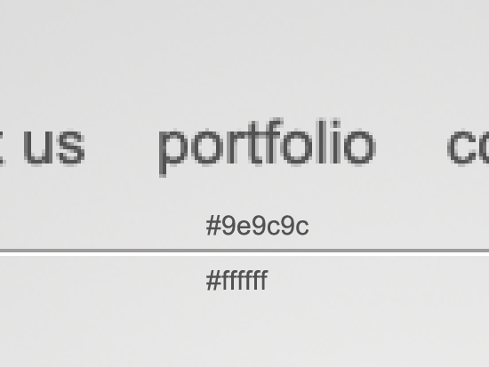 Note: There are many ways to set the colors of the line shapes.
The first is by setting the Color option in the Options bar before drawing the lines. The other way, if you already drew the lines, is to use a Color Overlay layer style. I’ll let you decide how to do this.
Adding the sub-navigation
17 Type your sub-navigation text using the Horizontal Type Tool (T) using the following settings:
- Font family: Arial
- Font size: 17pt
- Font weight: Regular
- Anti-aliasing setting: Strong
- Color: #787878
18 Make sure that the separating line is centrally aligned between the main and sub-navigation. Here’s how it should look: 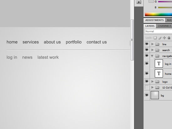
Creating the featured designs area
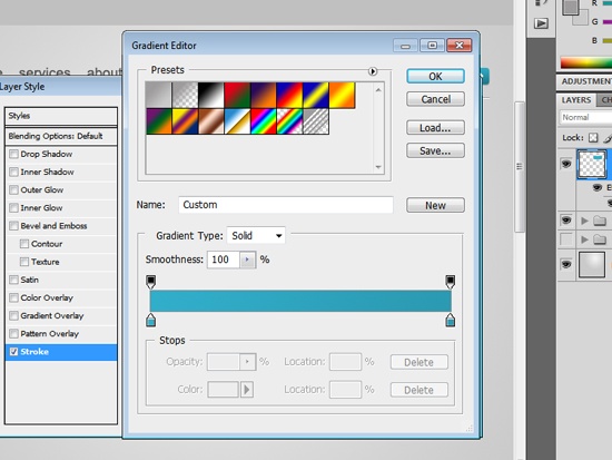
19 We’ll start creating the place where the image of a featured design would be, so we’ll select Rounded Rectangle Tool (U), and we’ll create a rectangle of 335px width and 128px height, and a Radius option set to 5px. 20 Apply a gradient Stroke layer style to it by setting the Fill Type option to Gradient.
Modify the gradient colors so that it starts at #31aeca and ends at #2b9ab2. 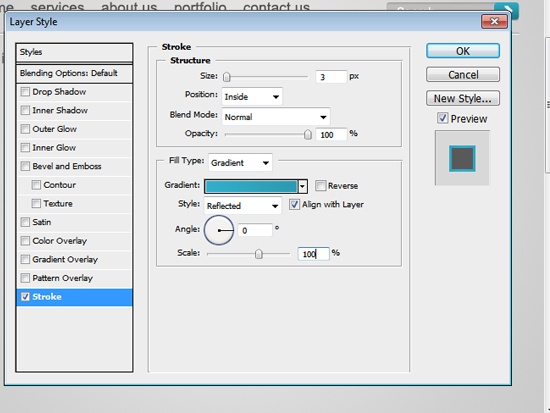
 21 Call this newly created layer photo_holder. 22 Well, let’s add an image of a featured design by going to File > Place.
This will open up the Place dialog box where you can select an image to place on our canvas. Pick an image, and then press the Place button when you’re done. 23 Make sure that the layer of the image is above the photo_holder layer; if it isn’t, move it.
Right-click on the image layer and choose Create Clipping Mask. 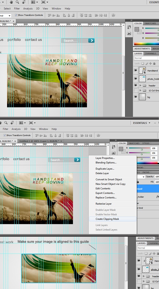 24 Modify the size of the image to fit; you can use Free Transform (Ctrl/Cmd + T). When you’re happy with the size, Make sure that your image is aligned according to the image above, flushed to the right of the layout design.
Image size is super important to lower site load time, so optimizing your images will make your site more SEO-friendly.
Add some content to the design
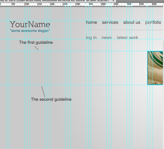
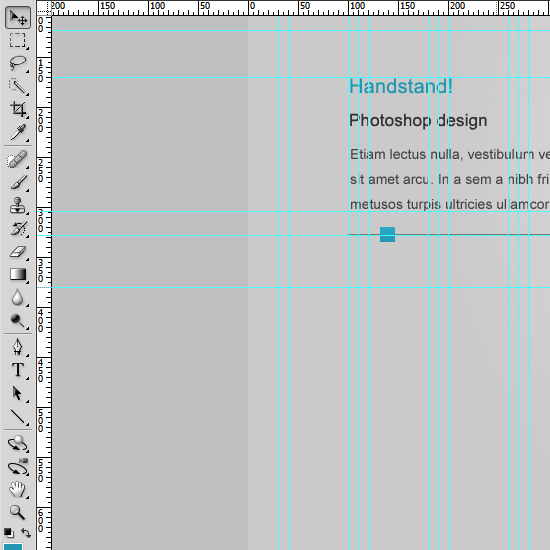
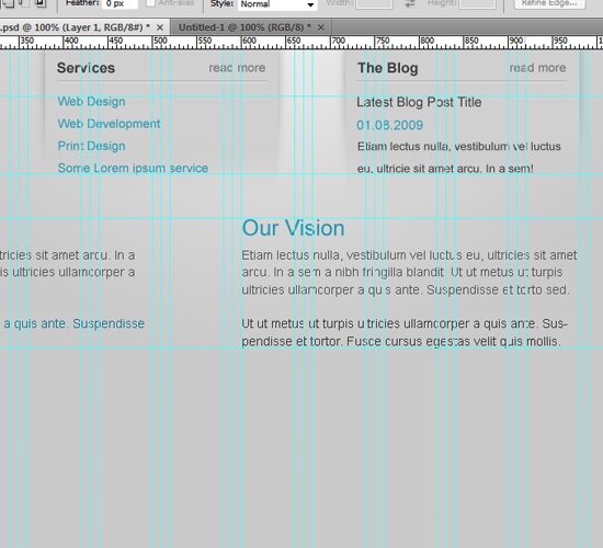
25 Let’s add some content to our design, but before we do that, we have to set our boundaries for our content. To do that, drag two horizontal guides like in the following image.
Add a title and a category
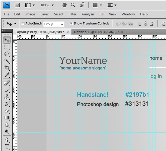 26 Use the following settings for the title and category.
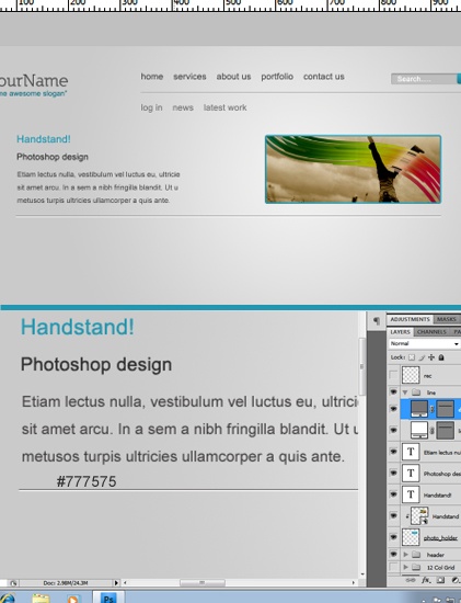
Title (in my case it was “Handstand!”)
- Font family: Arial
- Font size: 20pt
- Font weight: Regular
- Anti-aliasing setting: Strong
- Color: #2197b1
Category (in my case it was “Photoshop design”):
- Font family: Arial
- Font size: 17pt
- Font weight: Regular
- Anti-aliasing option: Strong
- Color: #313131
Paragraph content
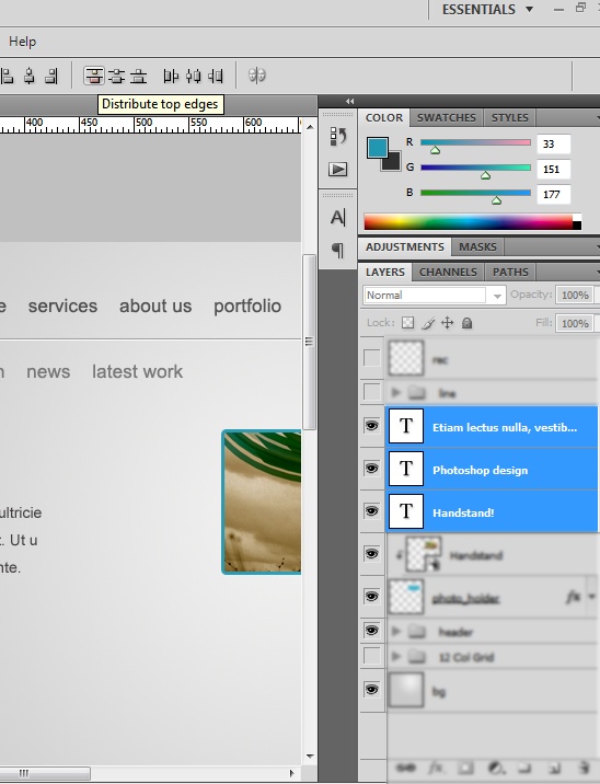
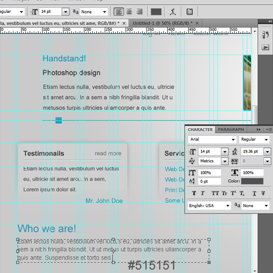
27 Add your paragraph text, using the following image for reference. 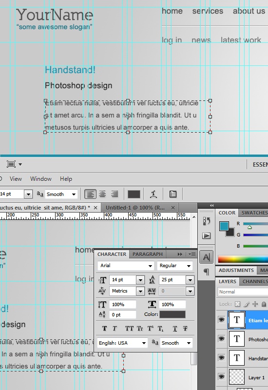 28 Choose the Move Tool (V) in the Tools Panel and select our three text layers in the Layer Panel (hold down Ctrl/Cmd while clicking on them to select all of them). 29 Give them equal spacing using the Distribute top edges option.
Create the slider control
30 It’s time to create the slider control. Start by duplicating the two lines we’ve created for the navigation, and then resizing them (you can use Free Transform to do this). We’ll make the dark line darker, giving it a color value of #777575.
 31 Then create a small box rectangle shape using the Rectangle Tool (15px wide and 15px high) and apply a Gradient Overlay layer style to it.
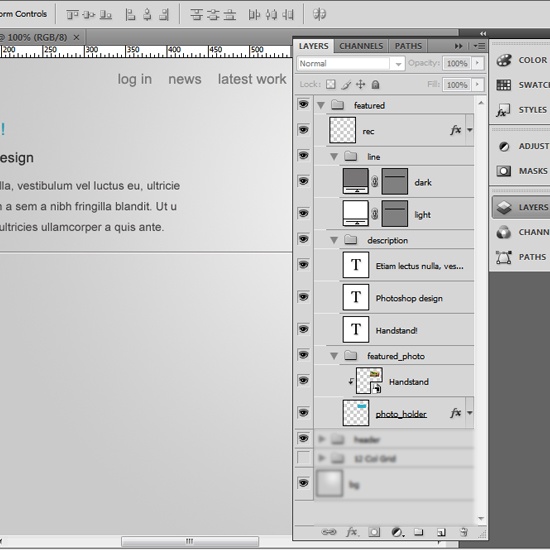
 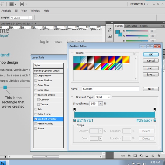 32 Before we move to the next step, we have to organize our layers. Use the following reference image to make sure the layers are in proper order.
Creating the content boxes
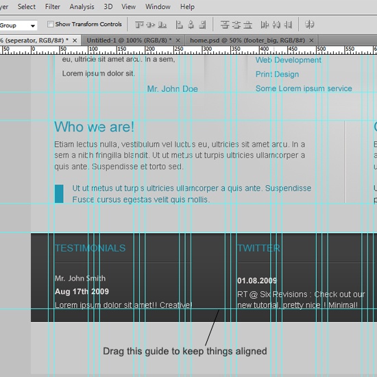
33 First off, we need to set our boundaries. Drag a horizontal guide and put it on the slider line. Leave a 50px gap, and then add another horizontal guide.
 34 Now select the Round Rectangle Tool (U). Create a rectangle of 260px width and 170px height and a color of #d0d0d0. Call this layer bg_1.
35 Align the rectangle like the following reference image, using the Move Tool (V) to position them accurately. 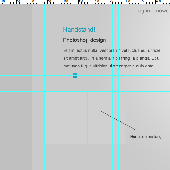 36 Right-click on the bg_1 layer in the Layers Panel and choose Create Layer Mask from the contextual menu. 37 Select the Gradient Tool (G), set your foreground and background color to Black and White (press D to automatically reset the colors).
With a linear gradient, drag from top to bottom until you’re satisfied with the look. 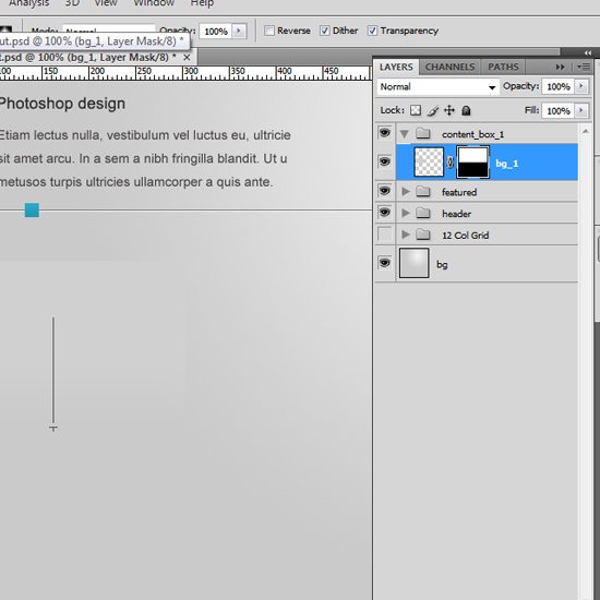 38 Now let’s create the shadow. Duplicate the bg_1 layer.
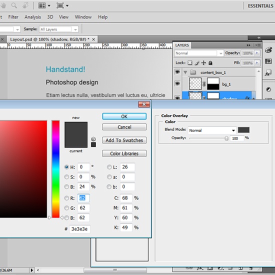
Name the duplicated layer shadow. Place the layer beneath the bg_1 layer. Then apply a Color Overlay layer style with a dark gray color (#3e3e3e).
 39 While having the shadow layer selected, go Filter > Blur > Gaussian Blur. Set the Blur Radius to 5.0px.
 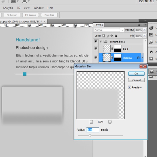 40 Using Gradient Tool (G), adjust the layer mask until you have something like this:
 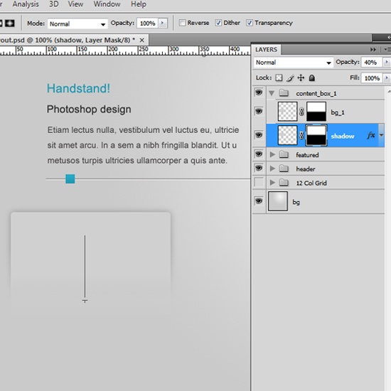 41 Add some content to the box.
Below, you’ll see what I ended up with. 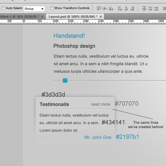 42 Group the content layers that you created into a group called content. 43 Now we want to align it.
Select the content group, hold down the Ctrl/Cmd key, and select the bg_1 layer in the Layers Panel. Choose the Move Tool (V), and click on the Align horizontal centers option and the Align vertical centers option to position them. 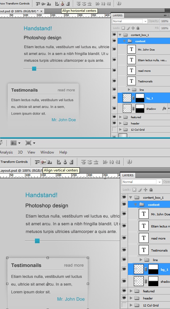 44 Now make two copies of this box by duplicating the layers of the original content box we just created.
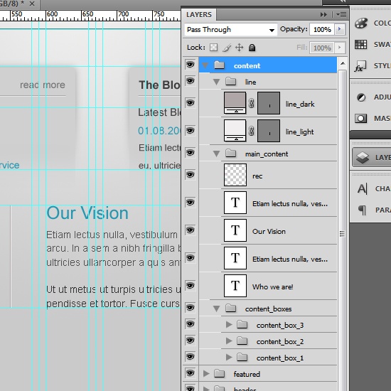
Align them, change the content, and don’t forget to add a horizontal guide at the bottom. 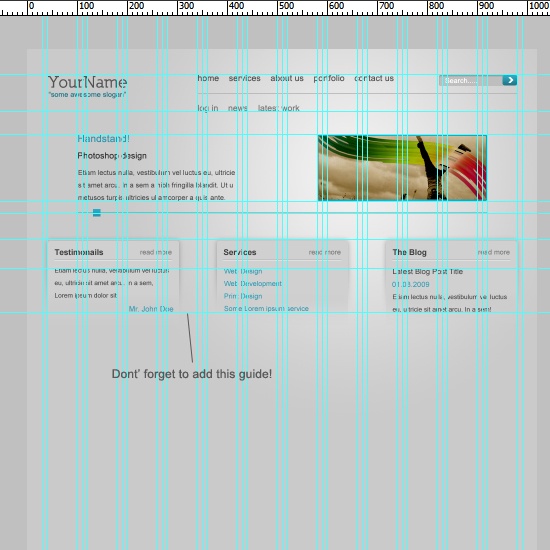 45 Let’s check back and make sure that all of our layers are organized; use the screenshot of my layers as reference.
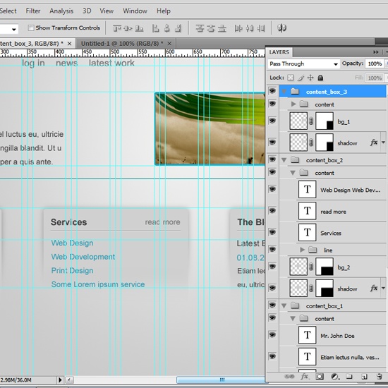
Creating the main content area
46 Leave a 50px gap and drag a new horizontal guide.
Start adding your content and align it according to the following image. 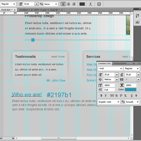
 47 Let’s make it look a bit better. We’ll select Rectangular Marquee Tool (M).
In the Style option, choose Fixed Size with a fixed width of 15px and a fixed height of 30px. Set your foreground color to #12197b and fill the rectangular marquee selection with the color (Press Ctrl/Cmd + Backspace to fill). 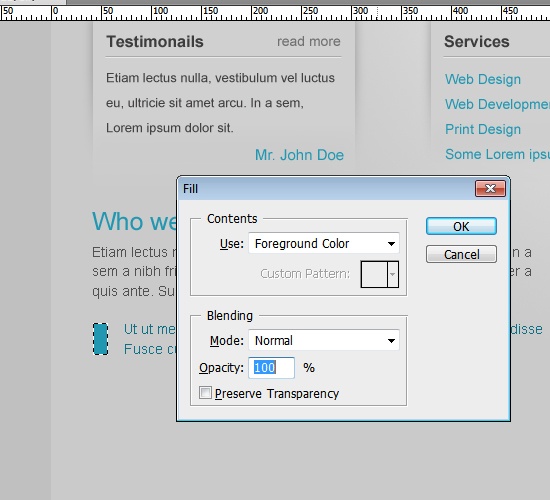 48 Using the same settings, you can add some content in the right side.
 49 Drag a new horizontal guide at the bottom. Add a separating line; use the following image for reference.
 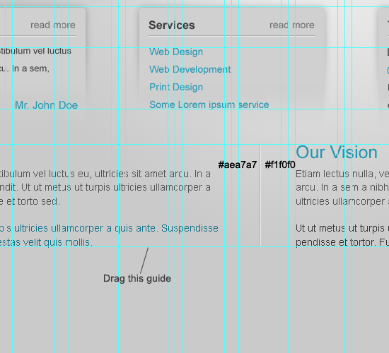 50 Check back to see all your layers are organized, using the following image as reference.
Creating footer area
51 We’ll start with the footer area creation by (again) creating a new horizontal Guide. Leave a 50px gap between the guide above, and drag a new horizontal guide! 52 Select the Single Row Marquee Tool (M).
Set your foreground color to white (#ffffff). Click on the canvas to create the marquee selection. Then press Ctrl/Cmd + Backspace to fill it.
Call this layer 1px_upper_line. 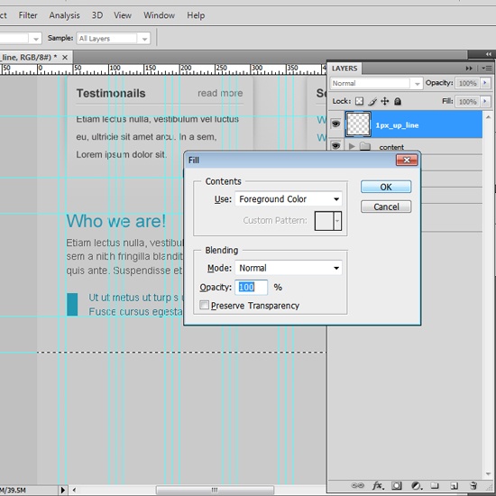 53 Select Rectangular Marquee Tool (M) and create a rectangle of 1020px width (it spans the entire width of the canvas, and 160px height. This will be the background of the footer area.
Fill it with any color. Apply a Gradient Overlay layer style to it using the following settings. 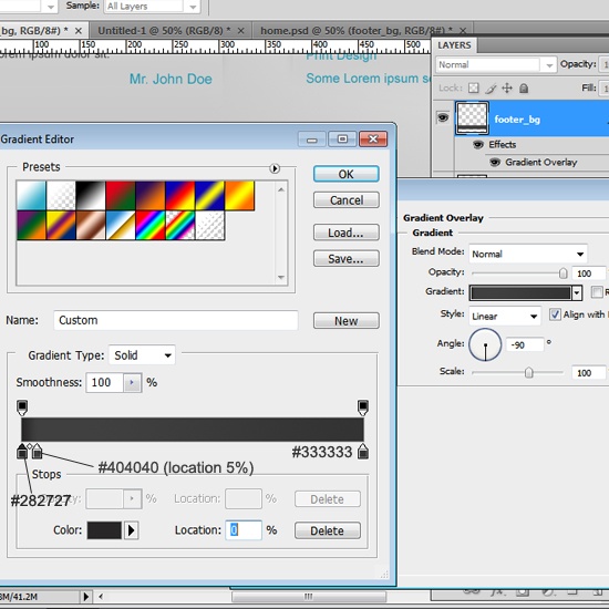 54 Duplicate the 1px_upper_line layer and move it to the bottom of the footer, call it whatever name you want, but I’ve called mine 1px_down_line.
Here’s how it looks. 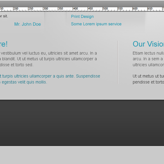 55 Start adding some content; use the following images for reference:
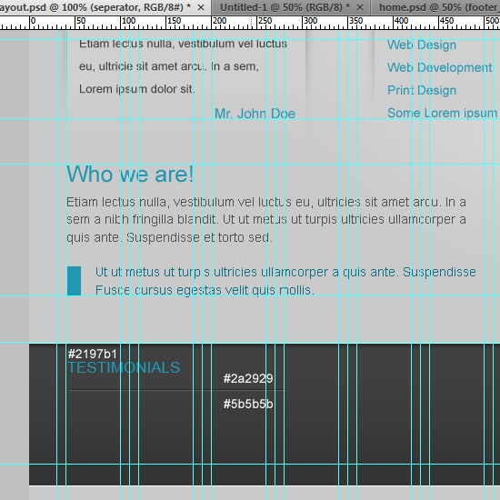
 56 You can download the social media icons from deviantART – they’re called Aquaticus.Social by Junwei. 57 Align them like in the following image:
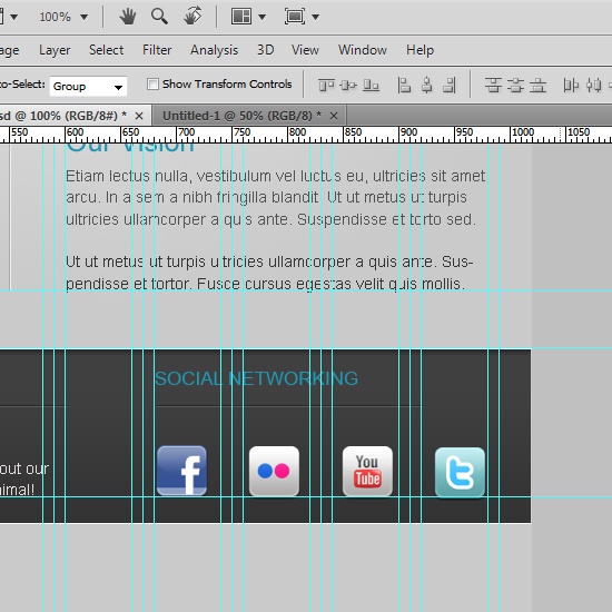
Creating the small footer
58 Drag a new horizontal guide at the bottom of the big (brown footer), leave a 50px gap, then add a new horizontal guide.
59 Then write your footer navigation text like so: 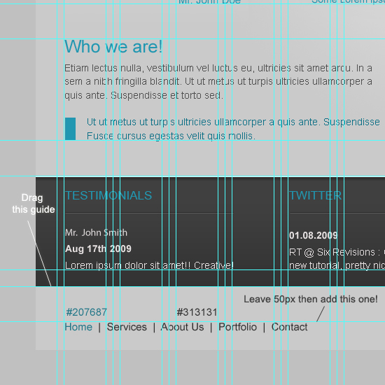 60 Write the copyright text and align it to the right, add a final horizontal guide.
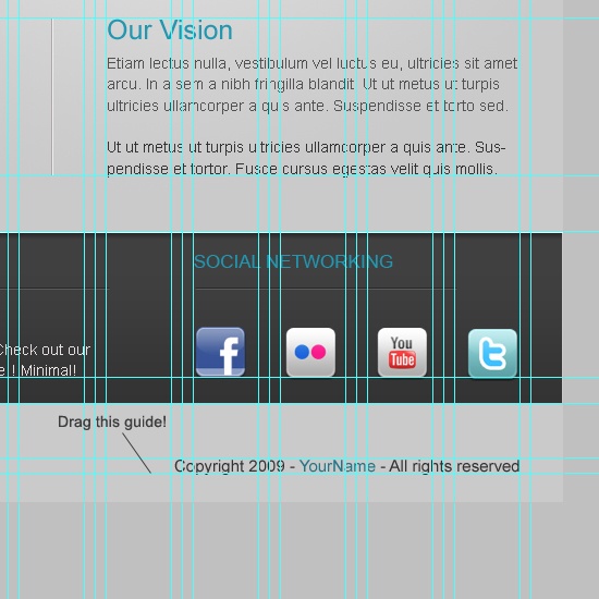
Adjusting the canvas size
61 Finally, we need to leave another 50px gap between the footer navigation, copyright text and the borders in order to do that, we’ll adjust our canvas size. 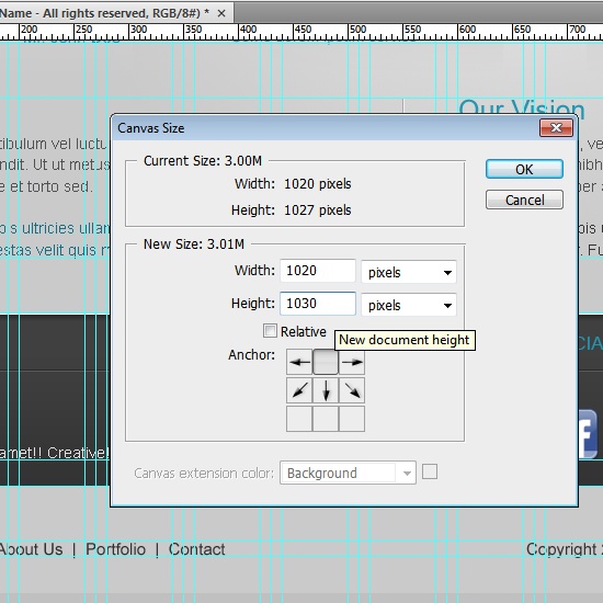
Conclusion
And there we have it!
We’ve created a clean and minimal layout design!
Download source file
You want a PSD copy don’t you? Here’s a ZIP archive that contains a PSD, and a JPG preview, get it now!
- slick-minimal-layout.zip (4.97MB, ZIP)
Related Content
- Create a Winter Theme Web Design in Photoshop
- Create an Animated “Call to Action” Button
- Design a Minimal and Modern Portfolio Layout with Photoshop
- Related categories: Tutorials and Web Design
Real Advice
WebFX, located in Harrisburg, PA, is a full-service web development and internet marketing agency. Check out some of their work with hotels here, and contact them for your next internet marketing or web design project!
-
 President of WebFX. Bill has over 25 years of experience in the Internet marketing industry specializing in SEO, UX, information architecture, marketing automation and more. William’s background in scientific computing and education from Shippensburg and MIT provided the foundation for MarketingCloudFX and other key research and development projects at WebFX.
 -

WebFX is a full-service marketing agency with 1,100+ client reviews and a 4.9-star rating on Clutch! Find out how our expert team and revenue-accelerating tech can drive results for you! Learn more
Make estimating web design costs easy
Website design costs can be tricky to nail down. Get an instant estimate for a custom web design with our free website design cost calculator!
Try Our Free Web Design Cost Calculator
Share this article


Web Design Calculator
Use our free tool to get a free, instant quote in under 60 seconds.
View Web Design CalculatorMake estimating web design costs easy
Website design costs can be tricky to nail down. Get an instant estimate for a custom web design with our free website design cost calculator!
Try Our Free Web Design Cost Calculator


