

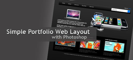
 In this web design tutorial, we will be creating a minimalist, dark-themed web layout that’s perfect for a portfolio site. We’ll only cover the creation of the basic parts of the layout and leave it up to you to apply your own finishing touches.
Final Result
To view the finished product, click on the following image to see the full-scale version. 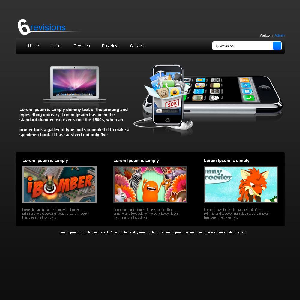
Setting up the Photoshop document
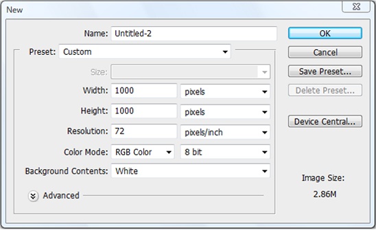
1 Open up Photoshop, create a new document (Ctrl + N) that is 1000px by 1000px and with a white background (#FFFFFF).
Creating the background
2 Select the Rectangular Marquee Tool (M) and create a marquee selection covering the entire Photoshop canvas (Ctrl + A). 3 Choose Edit > Fill and fill the selection with any color. Fill the Background layer with a dark gray color, #0E0E0E.
4 Duplicate the Background layer (right-click on the layer in the Layers Panel and choose Duplicate layer). Double-click the duplicated layer to open up the Layer Styles dialog box and then add a Gradient Overlay with the following settings. 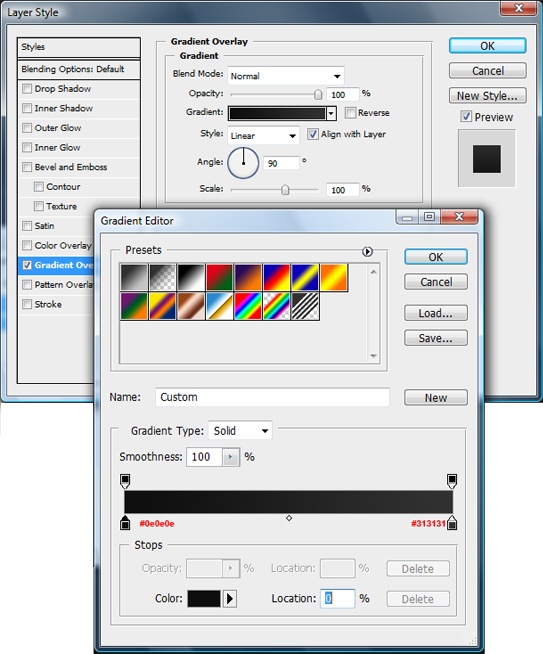
Making the Navigation menu
5 Select the Rounded Rectangle Tool from the Tools Panel.
Set the Radius of the tool to 5px. Create a large rectangle in the canvas that is 900px by 50px. This will serve as the navigation menu’s background.
6 Select the Gradient Tool (U), then in the Options bar, open Gradient Editor and use the settings shown below. 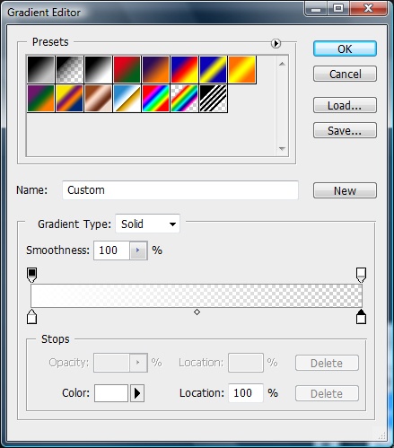 7 Make a new layer. Create a linear gradient going from top to bottom of the navigation with the Gradient Tool.
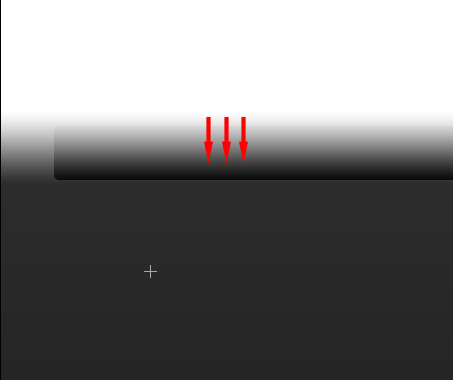 8 Choose the navigation background layer in the Layers Panel, select the Magic Wand Tool (W) and click the outside of the navigation. You should see a selection like the following figure.
 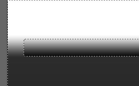 9 With the Magic Wand selection still active, switch to the layer with the linear gradient on it, and press the Delete key to clear the area beneath it.
This is what you should end up with:  10 Lower the opacity of the layer to 25%.
Designing the content area
11 Select the Rounded Rectangle Tool from the Tools Panel. Set the Radius of the toml to 5px.
Create a large rectangle in the canvas (900px by 200px). This will serve as the Main content area’s background. 
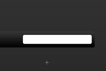
Adding a search input field
12 Select the Rounded Rectangle Tool again.
Set the Radius of the tool to around 5px. Create a small white (#FFFFFF) rectangle (250px by 30px) at the right side of the main menu bar. This will serve as the search input field.
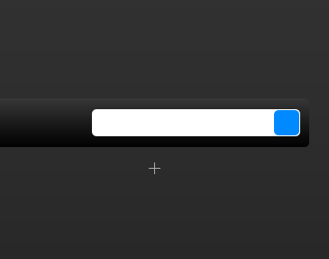
Adding a search button
13 Select the Rounded Rectangle Tool from the Tools Panel. Set the Radius of the tool to 5px. Create a small (38px by 38px) light blue (#0089FF) rectangle on top of the search input field, oriented at the right of it.
 14 Double-click the layer with the search button to open up the Layer Styles dialog box and then add a Gradient Overlay as shown below.
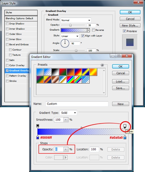
Finishing touches
15 Finish the layout by adding your content: add your header, banners, navigation links, content boxes and footer.
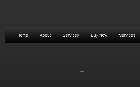
Navigation links
To simulate HTML text, I chose Arial with the anti-aliasing method set to None (you can do this in the Options bar of the Horizontal Type Tool).
Mid content
I placed introductory text and an image in the top “mid content” area. 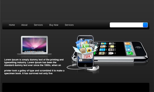
Main content/ Copyright
I filled in the main content area section with a few image thumbnails arranged in a three-column layout.
I placed the copyright information of the site at the bottom of the design. 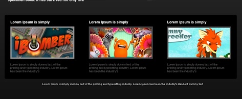
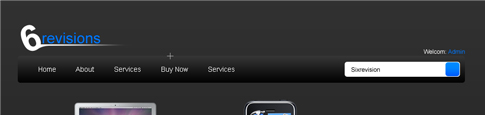
Header
I placed a simple logo at the top left corner of the design. Here’s the finished view of the header section of the design.
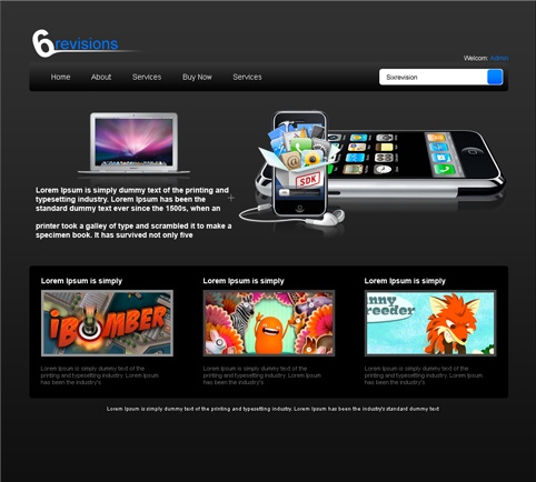
What I ended up with…
Now it’s your turn to show us what you what you’ve got!
If you followed along this tutorial and would like to share your final touches, share it with the rest of us in the Six Revisions Flickr Group.
Download the source file for this tutorial
The PSD source file is available for you to download and study.
- simple-portfolio-web-layout.zip (ZIP, 1.2MB)
Related Content
- How to Design a Space Futuristic Gallery Layout in Photoshop
- How to Make a Light and Sleek Web Layout in Photoshop
- How to Create a Dark and Sleek Blog Design in Photoshop
-
 President of WebFX. Bill has over 25 years of experience in the Internet marketing industry specializing in SEO, UX, information architecture, marketing automation and more. William’s background in scientific computing and education from Shippensburg and MIT provided the foundation for MarketingCloudFX and other key research and development projects at WebFX.
 -

WebFX is a full-service marketing agency with 1,100+ client reviews and a 4.9-star rating on Clutch! Find out how our expert team and revenue-accelerating tech can drive results for you! Learn more
Make estimating web design costs easy
Website design costs can be tricky to nail down. Get an instant estimate for a custom web design with our free website design cost calculator!
Try Our Free Web Design Cost Calculator
Share this article


Web Design Calculator
Use our free tool to get a free, instant quote in under 60 seconds.
View Web Design CalculatorMake estimating web design costs easy
Website design costs can be tricky to nail down. Get an instant estimate for a custom web design with our free website design cost calculator!
Try Our Free Web Design Cost Calculator


