
In this web design tutorial, you will discover a way to create a sleek and professional web page layout that incorporates the 3D Ribbon design trend, as well as some other captivating 3D elements, using Photoshop.
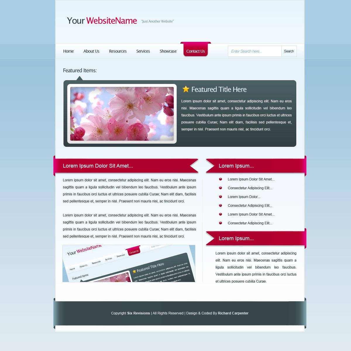
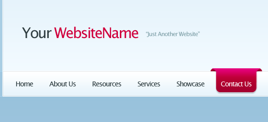
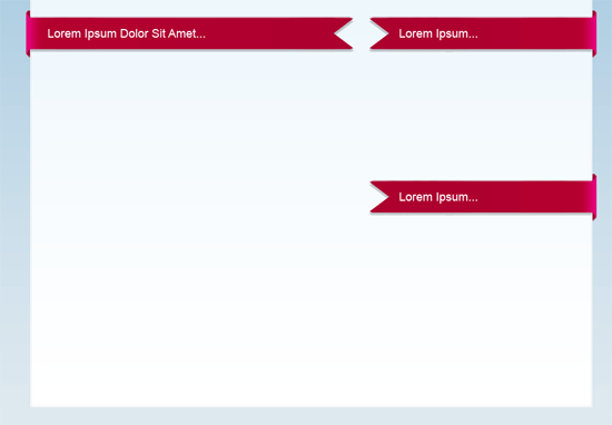
Final Result
Here’s a preview of what we’re going to create. Click on the image below to see the full-resolution final product.
Creating the Photoshop document
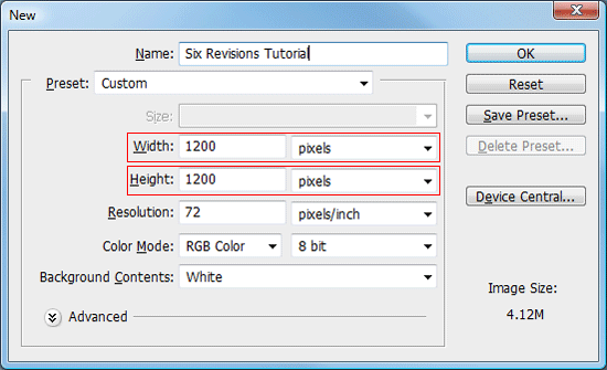
1 Start off by creating a new document (Ctrl+N); enter the dimensions 1200 pixels by 1200 pixels.
Making the Background layer editable
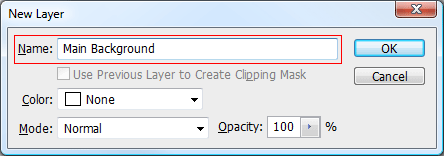
2 By default, Photoshop locks the Background layer so that you cannot edit it. To make it editable, double-click on your Background layer within the Layers Panel (press F7 to toggle the Layers Panel if it is not visible).
Alternatively, you can right-click on the Background layer and choose to “Layers from Background”. Once double clicked, you’ll be presented with a dialog box (as shown in the figure below). Enter a new name for your Background layer and press OK; doing this will enable us to edit our background layer.
Creating the background
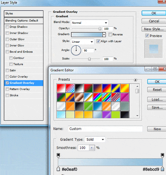
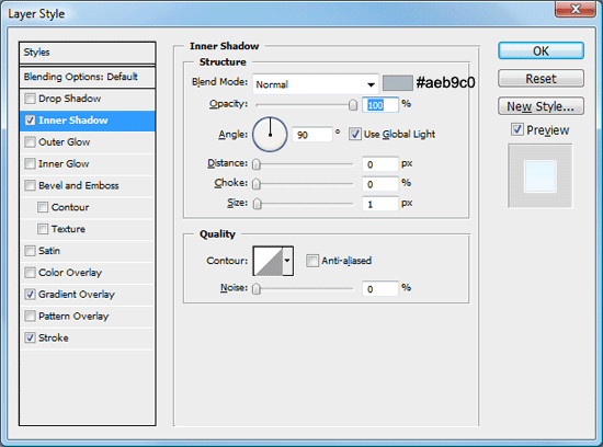
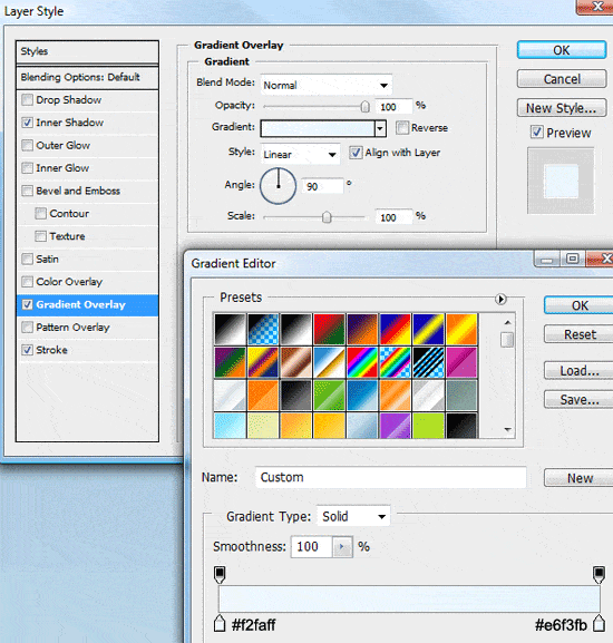
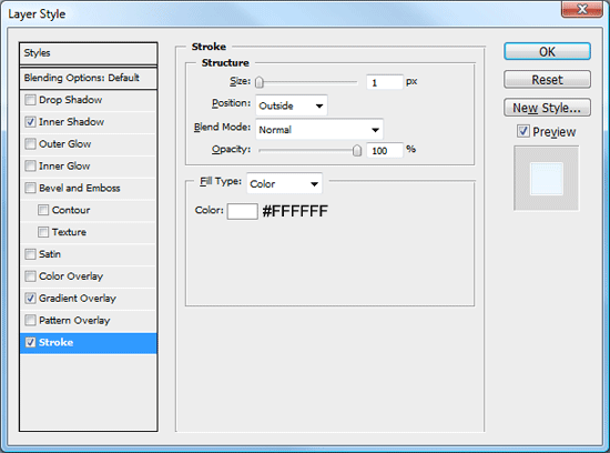
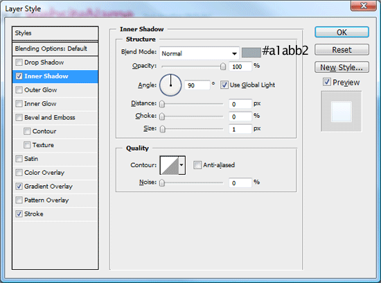
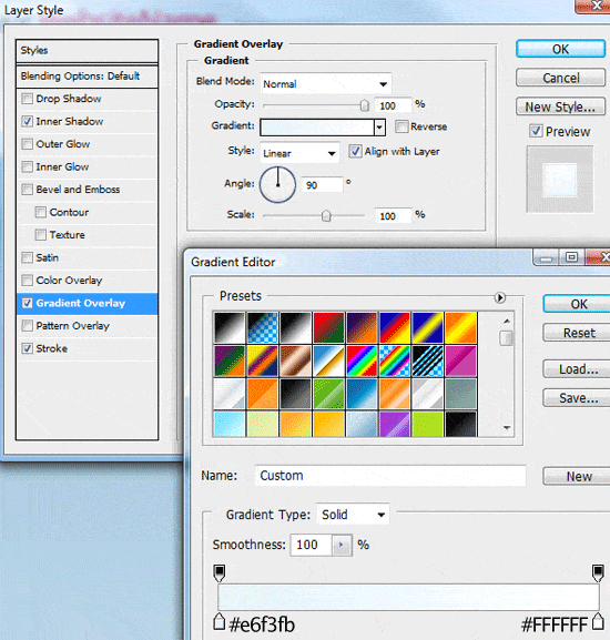
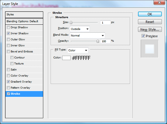
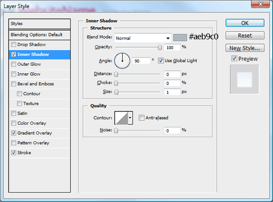
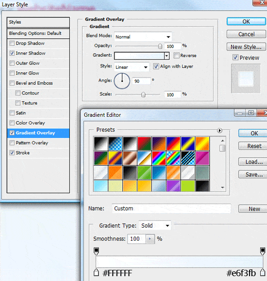
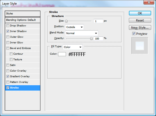
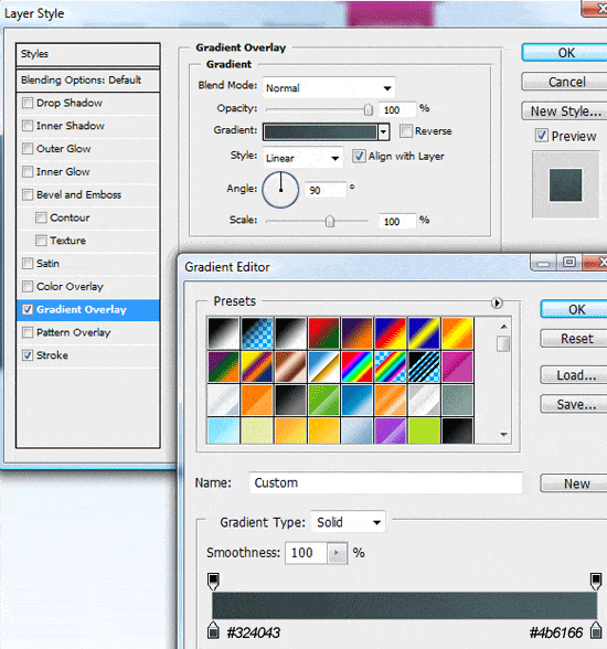
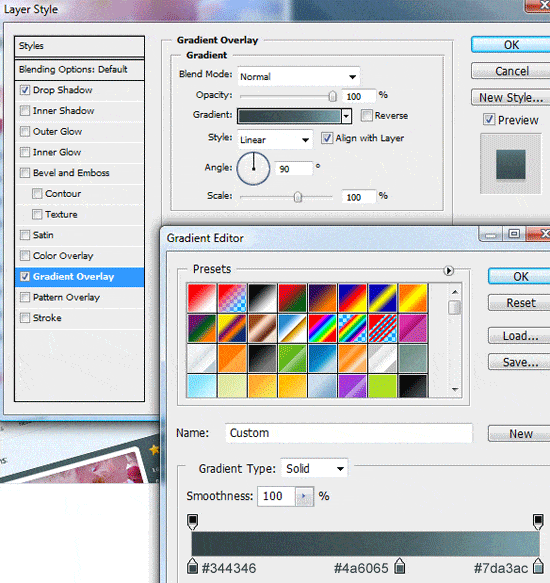
3 Now that our background layer is editable, double-click on the layer’s thumbnail to add a Gradient Overlay layer style; use the following figure as a guide on the layer style’s settings.
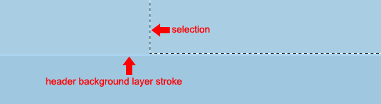
4 Create a new layer (Ctrl+Shift+N) named “header background“.
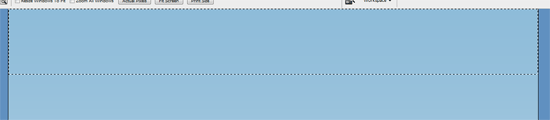
Choose the Rectangular Marquee Tool (M) in the Tools Panel and then make a selection across the top half the canvas; the selection should be about 150px in height and span the entire width of the canvas.
5 Fill the selection (Alt+Backspace) with any color then add these layer styles.
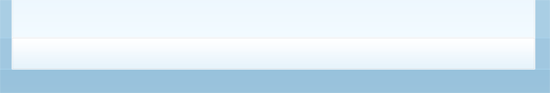
6 Create a new layer (Ctrl+Shift+N) labeled “navigation background“. Repeat Steps 4 – 5, only this time the selection should be about 50px in height, still spanning the full width of our canvas; the selection should also be made directly underneath the last one.
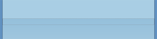
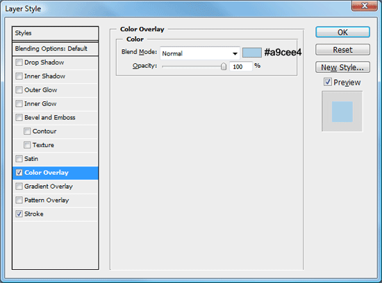
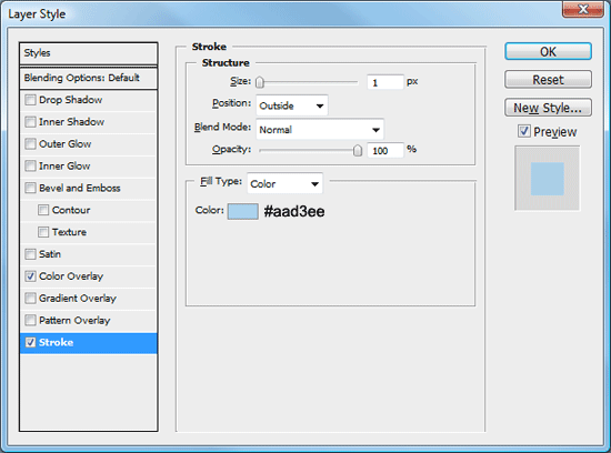
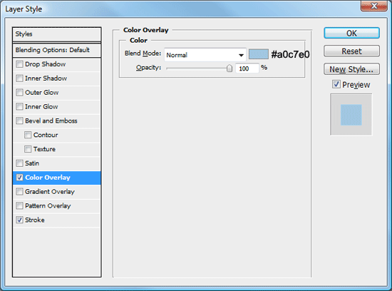
7 Fill the selection (Alt+Backspace) with any color then add a couple of layer styles (a Color Overlay and a Stroke layer style).
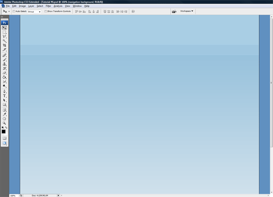
You should now have something like this.
Creating the Header
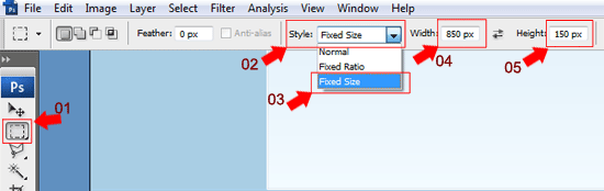
8 Create a new layer (Ctrl+Shift+N) labeled “header“, get the Rectangular Marquee Tool (M) from the Tools Panel and then make a fixed sized selection that is 850px wide and 150px in height.
9 Place the selection in the middle of the canvas, making sure that the bottom of the selection ends on the stroke which is applied to the “navigation background” layer.
10 Fill the selection (Alt+Backspace) with any color, and then add the following three layer styles.
Adding the Header title
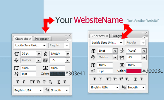
11 Add your website title and slogan on to the left side of the header by utilizing the Horizontal Type Tool (T). The settings and color codes are listed in the figure below.
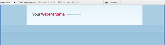
You should have something like this.
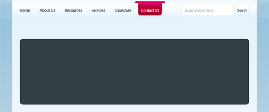
Creating the Navigation bar
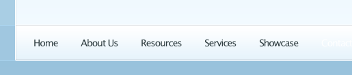
12 Create a new layer (Ctrl+Shift+N) labeled “navigation“.
Use the Rectangular Marquee Tool (M) to make a fixed selection that’s 850px wide and 50px in height.

13 Make the selection directly underneath the header, then fill with any color.

14 Now, add these three layer styles to your “navigation” layer.
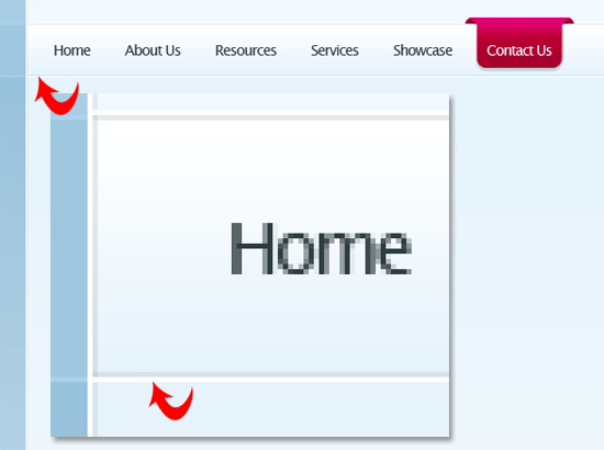
You should have something like this.
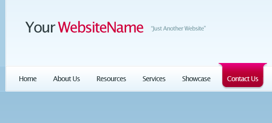
15 Use the Horizontal Type Tool (T) to add your navigation links onto your navigation bar.
Making the Navigation Hover button
16 Select the Rounded Rectangle Tool (U) from the Tools Panel and set its Radius to 10px.
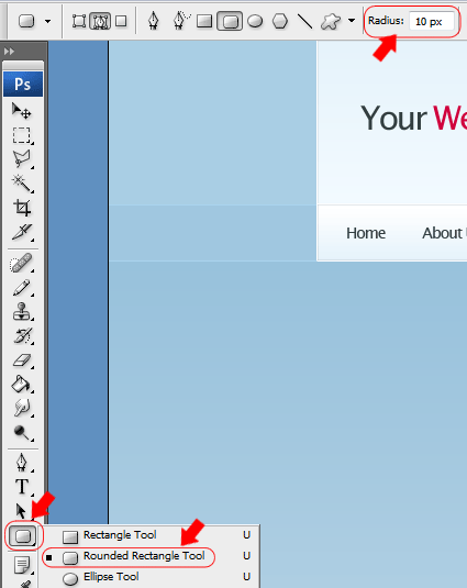
17 Draw out a small rectangle that’s about 80px x 50px.
18 Use the Rectangular Marquee Tool (M) to make a rectangle over the top half of the rectangle. Fill the rectangle the same color as the rounded rectangle.

19 Duplicate the shape by right clicking on the layer and choosing Duplicate Layer. Then rotate the duplicated layer 180 degrees using the Transform feature, Edit > Transform > Rotate 180o.
Finally, place the shapes next to each other making sure there level; use the Move Tool (V) to move the shape around.

20 Make a selection around half of the duplicated shape using the Rectangular Marquee Tool (M). Once you’ve made a selection, hit the Del key to clear the area beneath the marquee selection.
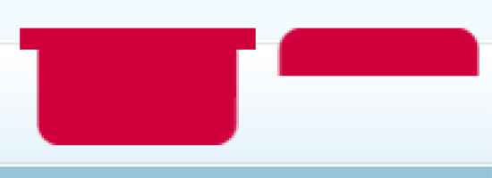
21 Use the Move Tool (V) and your arrow keys to align the little shape next to the bigger shape, making sure they are not directly overlapping.
Once moved into place, Ctrl + click your little shape layer’s thumbnail within the Layers Panel window to load a selection around it.
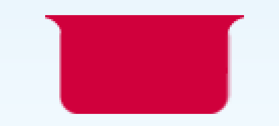
22 Switch to the bigger shape’s layer and hit the Del key to clear the area beneath it. Repeat the steps for the other side of the shape – and when you’re finished – you should have something like this.
Transforming the Hover button
23 Once you have your hover button you can delete the duplicated layer, and then rename the remaining layer “nav hover“. Now, add these couple of layer styles to it.
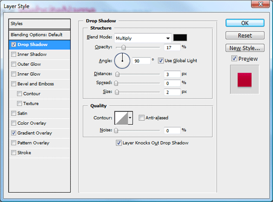
24 Drag the “nav hover” layer underneath your navigation text layer.
Shift the “nav button” layer behind one of your navigation links and then change the link texts color to white (#FFFFFF).
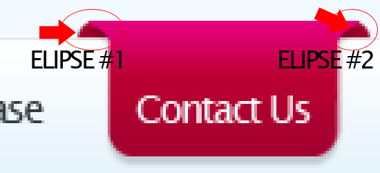
25 Underneath your “nav hover” button layer, create a new layer (Ctrl+Shift+N) called “nav hover extra“. On this layer, create a small ellipse using the Elliptical Marquee Tool (M) and fill the ellipse with the color #A3002F.

26 Cut the ellipse in half by using the Rectangular Marquee Tool to make a selection of the bottom half, and deleting the bottom portion of it. Then move the half-ellipse under the rounded part of the nav button.
If the ellipse hangs over the navigation, trim it some more. Once the ellipse is the correct size, duplicate its layer and place the duplicated one on the other side.
You should have something like this.
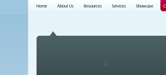
Creating the Content Area
27 Create a new layer (Ctrl + Shift + N) called “content area“. Using the Rectangular Marquee Tool, create a selection 850px in width, same as our other boxes, and as high as you need depending on the amount of content your going to have; you can make it bigger or smaller later, as needed.
Fill the selection with any color and then add these three layer styles.
28 Drag the “content area” layer below the “navigation” layer and adjust the content area box using the Move Tool (V) so its looks like an indented line where the content area and navigation meet.
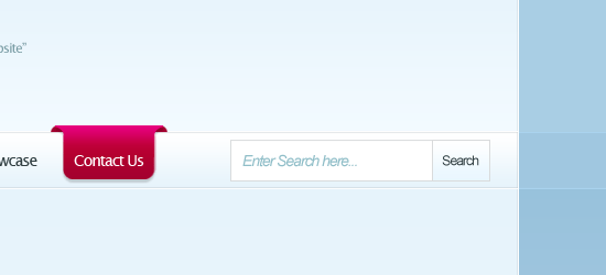
Making the Search box graphic
29 Create a new layer (Ctrl+Shift+N) called “search field” and create a rectangular marquee selection inside the navigation area on the right hand side using the Rectangular Marquee Tool (M).
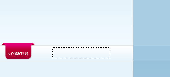
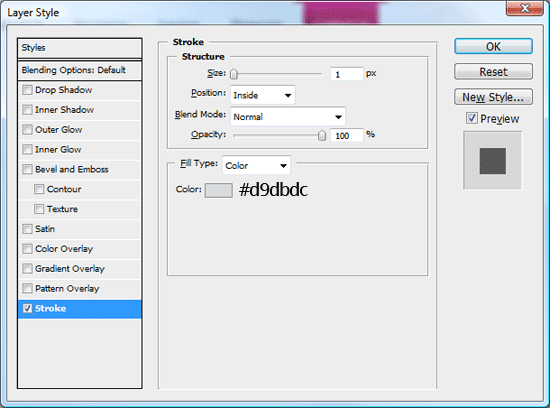
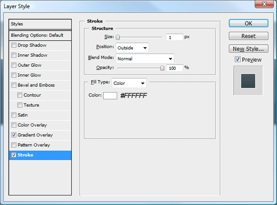
30 Fill the selection by choosing Edit > Fill (Shift+F5) with the color of white (#FFFFFF), and then add a Stroke layer style.
31 Inside the dummy search field, add some text inside using the Horizontal Type Tool (T).
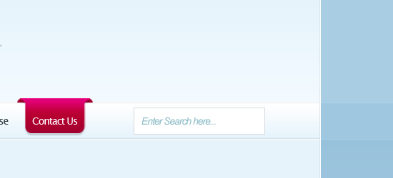
32 Directly next to the dummy search field, create another selection using the Rectangular Marquee Tool (M).
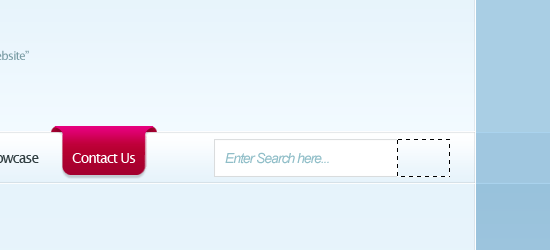
33 Fill the selection with any color then add a Gradient Overlay and Stroke layer style; use the following figures for guidance on their settings.
You should have something like this.
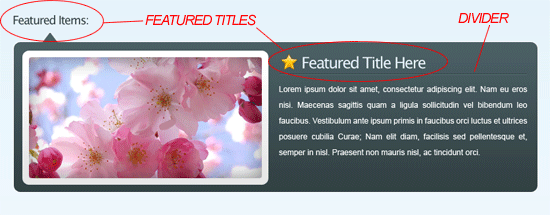
Creating the Featured Area
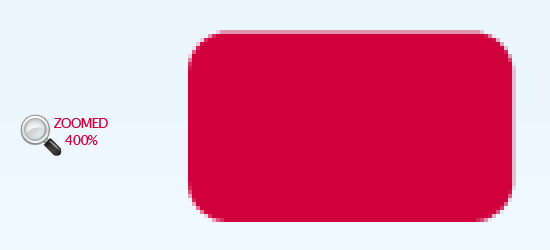
34 Create a new layer (Ctrl+Shift+N) called “featured area” and create a rounded rectangle area using the Rounded Rectangle Tool with a radius set at 10px.
35 Use the Polygonal Lasso Tool (L) to create a pointed arrow on the upper left side. Fill the arrow on the same layer with the same color as the rounded rectangle.
36 Now add a couple of layer styles (a Gradient Overlay and Stroke) to your featured area layer.
Filling in the Featured Area with content
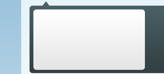
37 Create a new layer (Ctrl+Shift+N) called “featured border” and using the Rounded Rectangle Tool (U), create a rectangular shape inside the featured area.
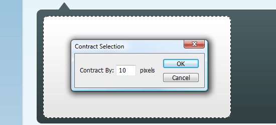
38 Add a subtle gradient overlay to the featured border layer. Click the layer’s thumbnail whilst holding down the Ctrl key on the keyboard to load a selection around it, and then go to “Select > Modify > Contract”.
Contract the selection by 10px, and then press OK.
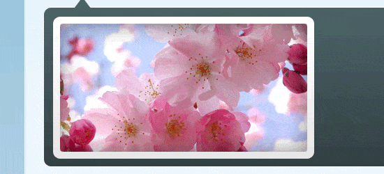
39 Find an image/photo that you want to use (I used an image of some flowers), open it in Photoshop, and copy the image to your clipboard (Ctrl + C). Then with the contracted marquee selection that we made in the previous step still active, go to Edit > Paste Into (Shift+Ctrl+V). The image will then be paste inside the selection.
40 Finish off the featured area with some dummy text and titles.
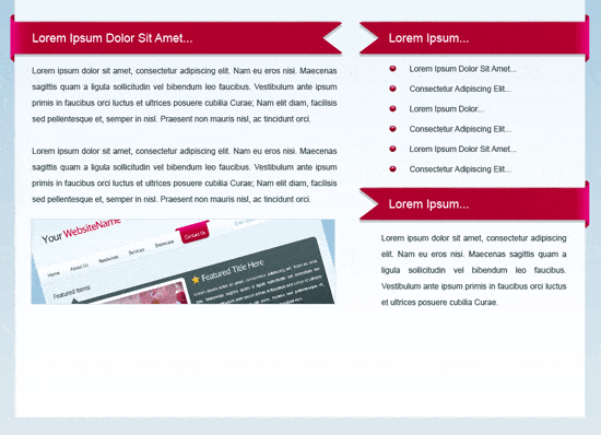
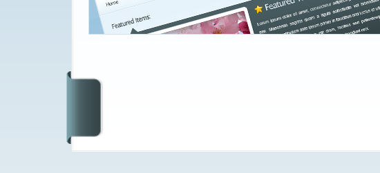
Creating the content area’s 3D Ribbons
41 Use the same method as our navigation hover buttons to create the left par, only this time create the main overlapping part much longer and horizontally oriented instead of vertically oriented (jump back up to the Making the Navigation Hover button section of the tutorial to refresh your memory if needed).
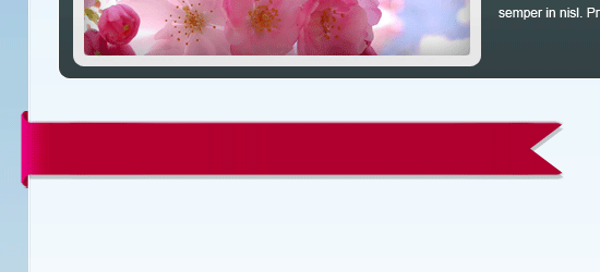
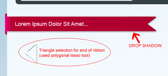
42 At the end of the ribbon (right-hand side), create a triangular shape using the Polygonal Lasso Tool (L) and use the Del key to remove the unwanted area.
Finally, add a Drop Shadow layer style to this layer (use your preferred settings) and some dummy text.
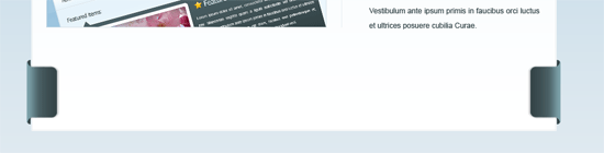
43 Duplicate the 3D ribbon layer and flip the duplicated layer by choosing Edit > Transform > Flip Horizontally. Use the Move Tool (V) to position it on the right; they will serve as the headings for the sidebar content.
44 Underneath each heading, add some dummy text and maybe an image or two.
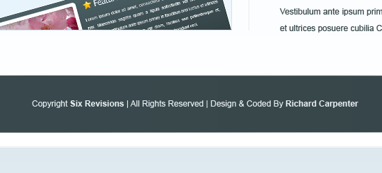
Creating the Footer
45 Recreate the hover button again (alternatively, you can simply duplicate the layers of the hover button).
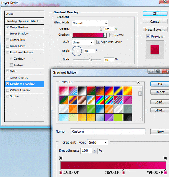
46 Replace the Gradient Overlay settings using the colors listed below.
47 Merge them into one layer and rotate it via Edit > Transform > Rotate 90o CCW. Move the object on the left side of the layout.
48 Duplicate the shape again and flip it horizontally using Edit > Transform > Flip Horizontally.
Move the shape across on to the other side of the layout.
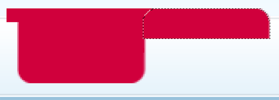
49 Merge both shapes into one layer (Ctrl+E), zoom (Z) into any one of the shapes, and make a rectangular selection just like in the figure below, and choose Edit > Free Transform (Ctrl+T).
50 Select the middle anchor point and drag across to the other side of the canvas.
You should have something like this.
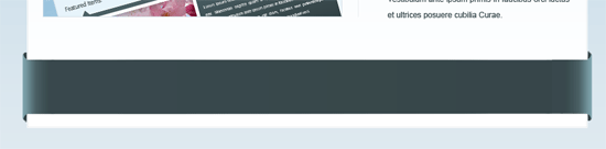
51 Finally, using the Horizontal Type Tool (T) add your footer information.
The end!
If you followed along the tutorial, you should end up with something like the following figure.
Download the Photoshop file
You can download the final Photoshop file (PSD) used in this tutorial to enhance your learning and to compare your own work with ours.
- 3d-ribbon-layout.zip (ZIP, 1.24MB)
Please share your results!
You can share your own results on Flickr by joining the Six Revisions group and uploading your final product. Whether you’re just a beginner or an advanced Photoshop user – we’d love to see what you’ve got!
Related content
- How to Make a Green & Sleek Web Layout in Photoshop
- Create a Dark and Sleek Web Layout Using Photoshop
- How to Create a Clean Blog Design with Photoshop
-
 President of WebFX. Bill has over 25 years of experience in the Internet marketing industry specializing in SEO, UX, information architecture, marketing automation and more. William’s background in scientific computing and education from Shippensburg and MIT provided the foundation for MarketingCloudFX and other key research and development projects at WebFX.
 -

WebFX is a full-service marketing agency with 1,100+ client reviews and a 4.9-star rating on Clutch! Find out how our expert team and revenue-accelerating tech can drive results for you! Learn more
Make estimating web design costs easy
Website design costs can be tricky to nail down. Get an instant estimate for a custom web design with our free website design cost calculator!
Try Our Free Web Design Cost Calculator
Share this article


Web Design Calculator
Use our free tool to get a free, instant quote in under 60 seconds.
View Web Design CalculatorMake estimating web design costs easy
Website design costs can be tricky to nail down. Get an instant estimate for a custom web design with our free website design cost calculator!
Try Our Free Web Design Cost Calculator


