
 In this Photoshop web design tutorial, we’re going to create a mock-up of a clean and modern-looking website. This is Part 1 of a tutorial series that will show you how to create the design, and then convert it to an HTML/CSS template.
Minimal and Modern Portfolio Layout Tutorial Series
- Part 1: Design a Minimal and Modern Portfolio Layout in Photoshop
- Part 2: Minimal and Modern Layout: PSD to XHTML/CSS Conversion
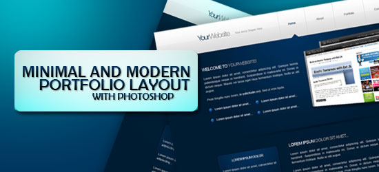
Preview
Here’s a preview of what we’ll be creating together. Click on the image to enlarge. 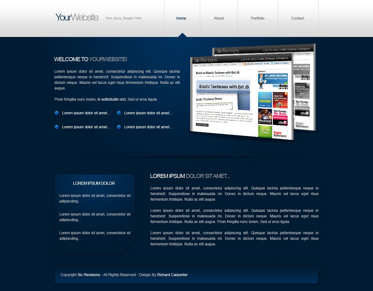
Make a new Photoshop document
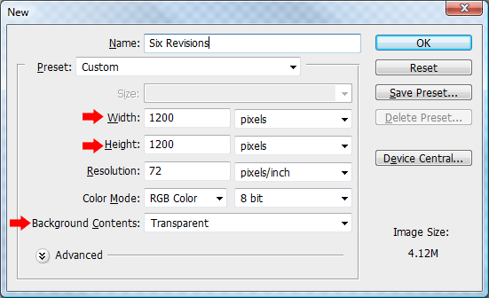
1 Start off with a new document (Ctrl + N) in Photoshop; make the document 1200 x 1200px with a transparent background.
Creating the Header’s background
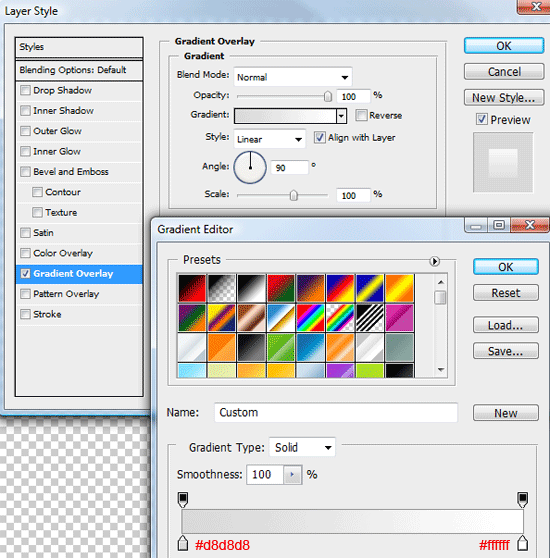
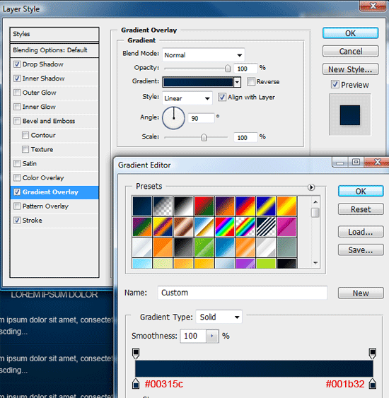
2 Choose the Rectangular Marquee Tool (M) from the Tools Panel and then create a rectangle selection spanning the width of the canvas; the height of the rectangle should be about 120px. 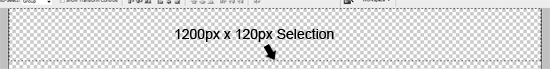 3 Use the Paint Bucket Tool (G) to fill the selection with any color. Double-click on the layer in the Layers Panel to open up the Layer Styles dialog box then add a Gradient Overlay using the settings below.
 You should have something like this.
Creating the Content Area background
4 We’re now going to create the second half of our background for the layout’s content area. Start by setting your Foreground color to #00315C and Background color to #001B32 in the Tools Panel.
Select the Rectangular Marquee Tool (M) and make a selection around the remaining transparent area; once you’ve made the selection, select the Gradient Tool (G), and set the Gradient Type in the Options bar to Radial Gradient. 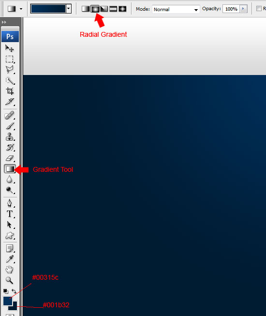 5 Once you’ve set up the Gradient Tool (G), drag it over the marquee selection we created, and start dragging from the top middle of the selection to about a quarter of the way down the Photoshop canvas.
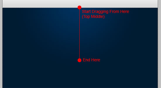
Setting up Guides
6 We are now going to set up some guides so that the website layout remains 850px wide throughout the design process.
To create your first guide, go to View > New Guide. In the New Guide dialog box, enter 175px and make sure that the Orientation setting is set to Vertical. This will create a guide 175px away from the left edge of our 1,200px canvas.
 7 Repeat the previous step and create another vertical guide, only this time enter 1025px (175px + 850px = 1025px). This will give us a layout that is 850px wide and centered on our 1,200px wide canvas.
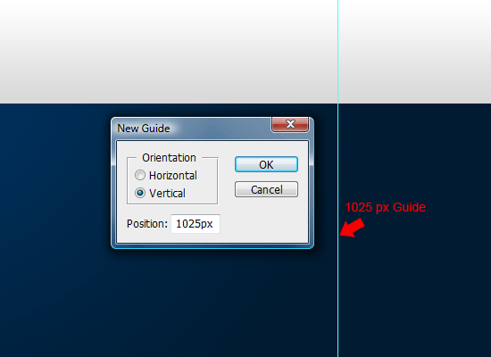
Designing the Header section
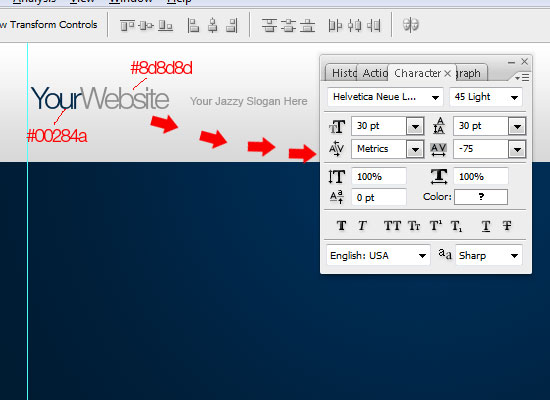
8 Select the Horizontal Type Tool (T) and then add your layout title and slogan text at the top against the left guide.
 9 Create a new layer underneath your layout title text, and then get the Rectangular Marquee Tool (M) ready. Make a selection over your header area; the selection should be the whole width but only half of the height of the header (about 60px in height).
 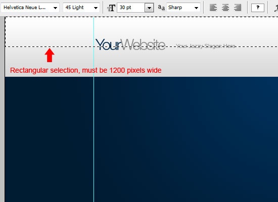 10 Fill (G) the selection with the color white (#FFFFFF) then set the layer’s Opacity to 25% in the Layers Panel.
You should have something like this. 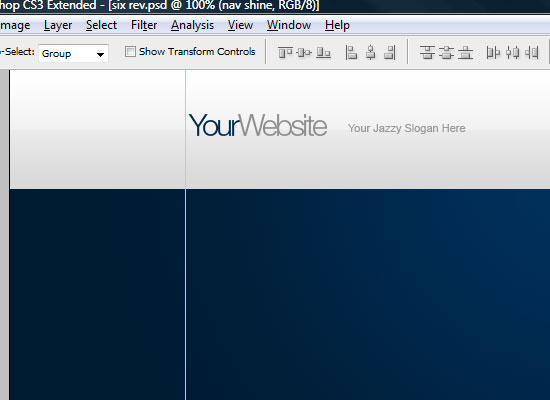
Creating the Navigation
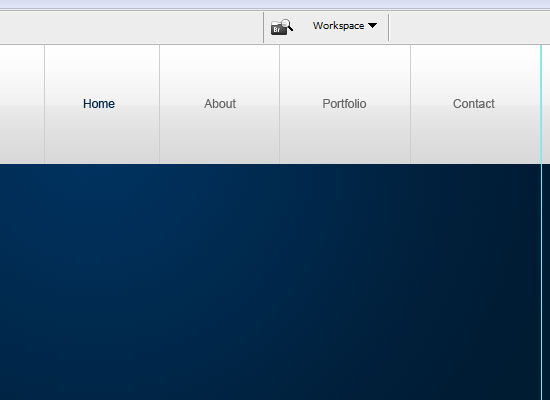
11 Select the Horizontal Type Tool (T) with a font size of about 11-12px. Add your dummy navigation text to the right of your layout’s title and slogan; leave margins in between each dummy link.
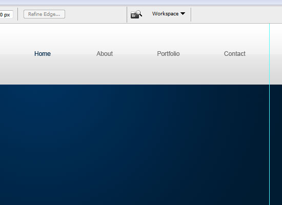 12 In between each dummy link, add a 1px lineusing the Rectangular Marquee Tool (M); the line should be from the top of the header/navigation to the bottom. Fill (G) the 1px lines in the color #CECECE. You should have something like this.
 13 Now, let’s add a simple hover state to one of our dummy links. I’ve already colored one of the links in a dark blue color to represent a hover state. Select the Polygonal Lasso Tool (L) and create a triangular shape – holding down the Shift key whilst making the triangle will ensure each side is perfectly straight.
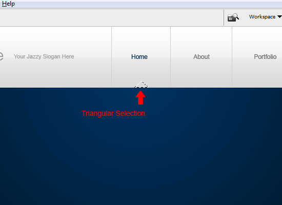 14 Fill the triangular selection with the color #00315C.
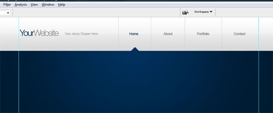
Creating the Welcome Area
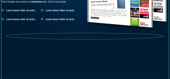
15 Choose the Horizontal Type Tool (T), and then add some dummy welcome text; again place the text against the left guide and leave a decent amount of space in between the header/navigation and the welcome text. At the bottom of the welcome text, I’ve added 4 bullet points for a small list.
The bullet points are icons from the Function Icon Set (the file name is circle_blue.png). 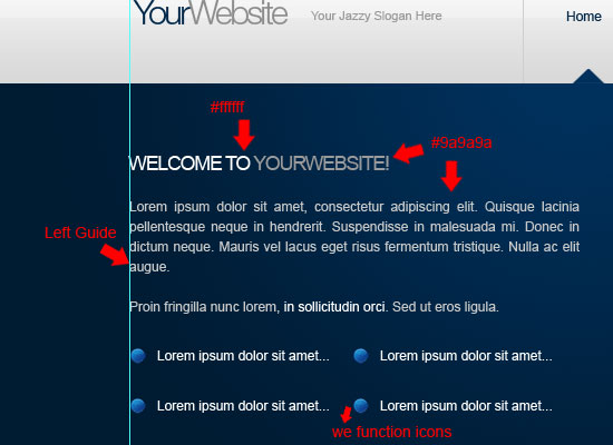 16 We’re now going to add a welcome image on the right side of our welcome text; I’m using a screenshot of Six Revisions. Crop your image and remove any unnecessary parts that aren’t needed.
Once you have your image ready, alter the perspective by going to Edit > Transform > Perspective. 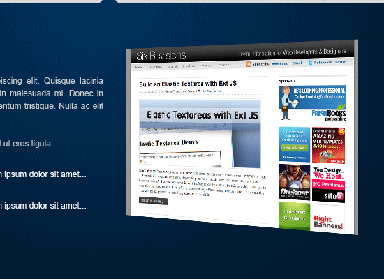 17 Select the Elliptical Marquee Tool, and then make an elliptical selection at the bottom of your welcome image.
 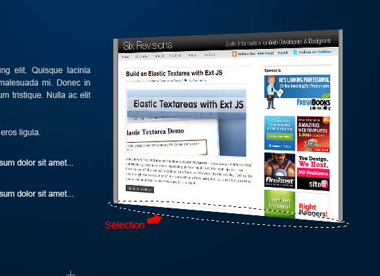 18 Fill (G) the selection with the color black (#000000) on a layer underneath your welcome image.
19 Once you’ve filled the selection, set the layer’s Opacity (you do this in the Layers Panel) to 35%. 20 Then go to Filter > Blur > Gaussian Blur and blur the ellipse by about 1 to 2px. 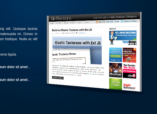 21 Duplicate your welcome image and shadow layers, and then drag them underneath there originals.
Move the duplicated image and shadow so that it looks like it’s standing behind the first one. 22 Once you’ve moved it in place, go to Filter > Blur > Gaussian Blur and blur the second screenshot by 1px. 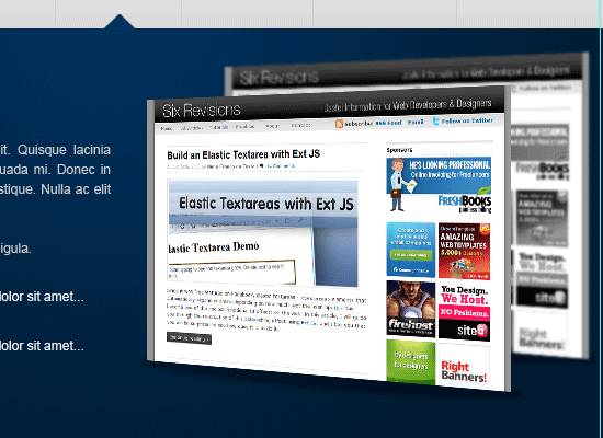
Creating the horizontal 3D divider
23 Select the Rectangular Marquee Tool (M) and create two 1px lines on top of each other; the lines should be 850 pixels wide from the left guide to the right guide.
You can create the two lines on the same layer. 24 Fill the top line in the color #000D19 and the bottom line in #003461. 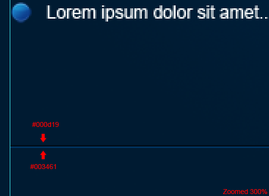 25 Select the Elliptical Marquee Tool (M) and make a selection over the divider line.
 26 Fill (G) the rectangle with the color black (#000000) then apply a 2 to 3px Gaussian blur. Once you’ve blurred the ellipse, cut the top half away from the divider by using the Rectangular Marquee Tool and deleting the area beneath it so that you are left with half an ellipse.
 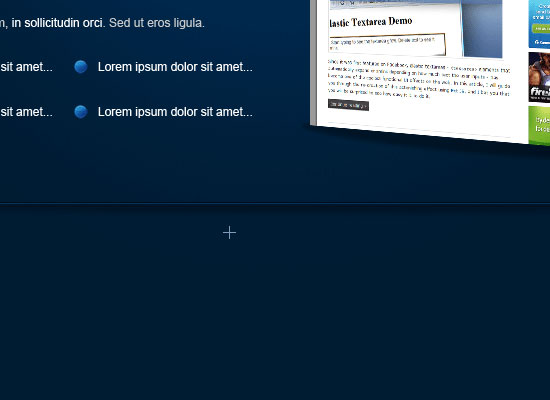 27 Merge both layers together (Ctrl + E with the top layer selected in the Layers Panel), and then add a layer mask (click on the Add layer mask icon at the bottom of the Layers Panel) to the merged layer.
28 Select the Gradient Tool (G) with a gradient type of Reflected Gradient, and then set your Foreground color to white (#FFFFFF) and Background color to black (#000000). 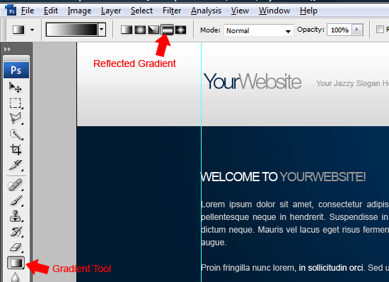 29 Drag the reflected gradient from the middle of the divider to either the left edge or right edge – both the left and right sides should slowly fade into the background.
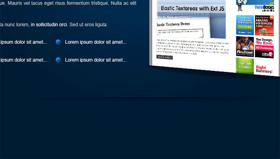
Designing the Content Area
30 Select the Horizontal Type Tool (T) and then add a dummy header and paragraph on the right side of the layer underneath the 3D divider.
 31 On the left side of the layout next to the dummy paragraph, create a rounded rectangle using the Rounded Rectangle Tool (U); make sure that it has a Radius option is set to 10px (the radius is set to 10px by default).
 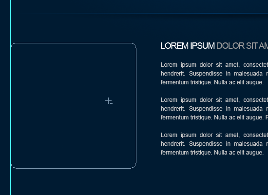 32 Once you’ve dragged out your path, select the Pen Tool (P), right-click inside the rectangle, and then choose to Make Selection. 33 Set your Foreground color to #00315C and Background to #001B32 and choose the Gradient Tool (G) with a gradient type option set to Radial Gradient.
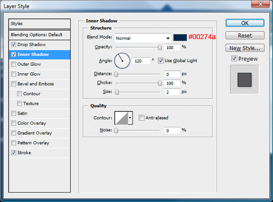
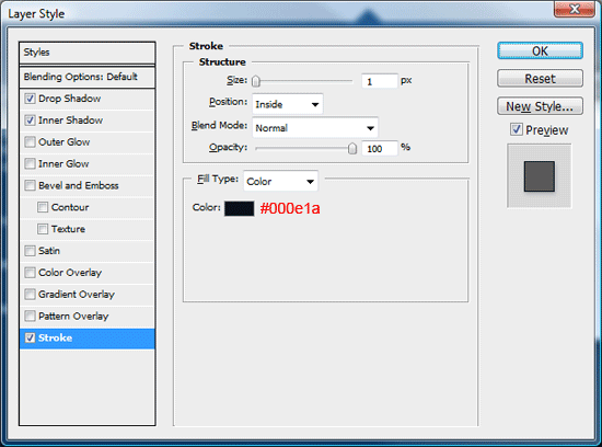
34 Drag the gradient from the top of the selection down to the middle, just as we did for our background. Once done you should have something like this. 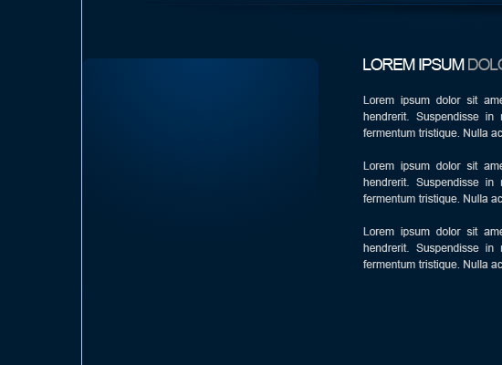 35 Now Add a Drop Shadow, Inner Shadow, and Stroke layer styles to your rounded rectangle layer (double-click on the layer in the Layers Panel to open up the Layer Style dialog box).
Use the settings as shown in the following figures. 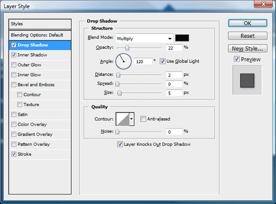
 36 Select the Polygonal Lasso Tool (L), and then make a triangular selection around the bottom corner of the rectangle.
 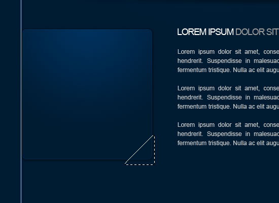 37 Cut and paste the selection to a new layer.
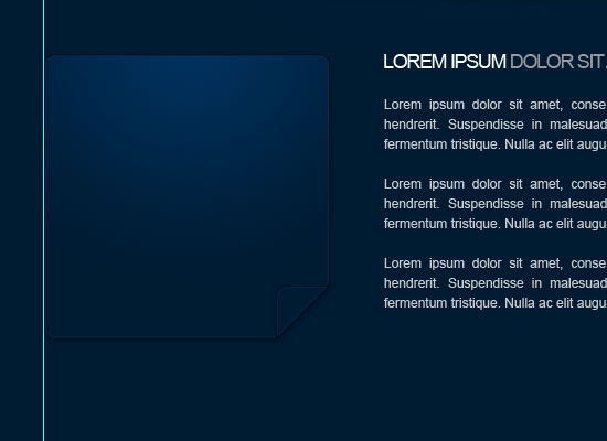
Once you’ve re-pasted the corner you cut off to a new layer, you would have lost its layer styles. So before we go any further, re-apply the Layer Styles from above to the corner layer. 38 Once you’ve re-applied the layer styles, rotate the corner 180 degrees by going to Edit > Transform > Rotate 180; place the corner back at the bottom of the rectangle.
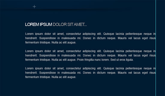
 39 To finish off the content box, add your dummy content.
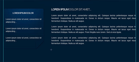
Creating the Footer area
40 Select the Rounded Rectangle Tool (U) and then drag out your footer sized rectangle. 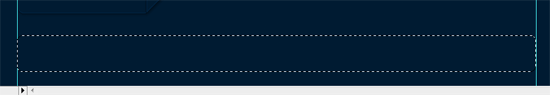 41 Fill the rectangle with any color, then add a Gradient Overlay with the following settings.
 42 Finally, add your footer information to your footer and you’re done!
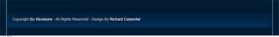
Finished!
That concludes this tutorial, thank you for reading. In the next tutorial, I’ll show you how to code it into a working portfolio template.
Share your work on Flickr
If you followed along this tutorial, why don’t you show it off to the rest of the Six Revisions community by placing it in the Six Revisions Flickr Group?
Download
If you want to download the PSD file of this tutorial, you can grab it as a ZIP archive.
- minimal-mordern-layout.zip (ZIP, 1.5MB)
Related Content
-
 President of WebFX. Bill has over 25 years of experience in the Internet marketing industry specializing in SEO, UX, information architecture, marketing automation and more. William’s background in scientific computing and education from Shippensburg and MIT provided the foundation for MarketingCloudFX and other key research and development projects at WebFX.
 -

WebFX is a full-service marketing agency with 1,100+ client reviews and a 4.9-star rating on Clutch! Find out how our expert team and revenue-accelerating tech can drive results for you! Learn more
Make estimating web design costs easy
Website design costs can be tricky to nail down. Get an instant estimate for a custom web design with our free website design cost calculator!
Try Our Free Web Design Cost Calculator
Share this article


Web Design Calculator
Use our free tool to get a free, instant quote in under 60 seconds.
View Web Design CalculatorMake estimating web design costs easy
Website design costs can be tricky to nail down. Get an instant estimate for a custom web design with our free website design cost calculator!
Try Our Free Web Design Cost Calculator


