
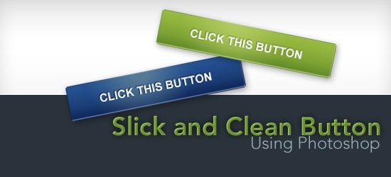 This Photoshop tutorial shows you how to create a simple and clean “Web 2.0 style” button sprite with a rollover state. You’ll also learn how to set up the sprite using some basic CSS techniques (CSS background sprite and CSS text image replacement). The button on this tutorial was inspired, and is modeled after, the Campaign Monitor web interface. By following along, you’ll learn how to create a very similar button.
Final Result
Click on the following image to see a working demo (mouse over the button to see the rollover state).
Download source files
If you’d like to download the source files used in this tutorial, go ahead. The following download link contains the Photoshop PSD file, the finished CSS image sprite in PNG format, and an HTML demo with the HTML and CSS source code.
- campaign-monitor-button.zip (ZIP, 58 KB)
Let’s get started with the tutorial, shall we?
Setting up the document
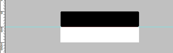
1 The button’s dimension will be 250px wide and 50px high. To accommodate both the idle state and rollover state, double the height (100px). 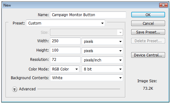 2 Drag a guide to the 50px mark to clearly delineate the top half and bottom half of the document.
Make sure that Rulers are turned on (Ctrl + R) by checking to see that View > Rulers is checked. Drag a horizontal guide from the Ruler down to half of the document (50px marker). 
Creating the shape
3 Activate the Rounded Rectangle Tool and set the radius of the rounded corners to 3px.
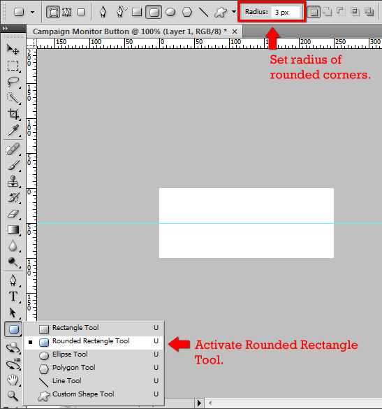 4 Drag the shape over the top half of the document. The color of the shape doesn’t matter, as you’ll soon see. The dimensions of this shape should be 250px wide and 50px high.
 5 Create a selection around the rounded rectangle shape by Ctrl+ clicking on the shape layer.
 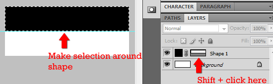 6 With the selection still active, create a new layer (Ctrl + Alt + Shift + N). Name it Idle.
With the new layer active, fill the selection by going to Edit > Fill (Shift + F5). 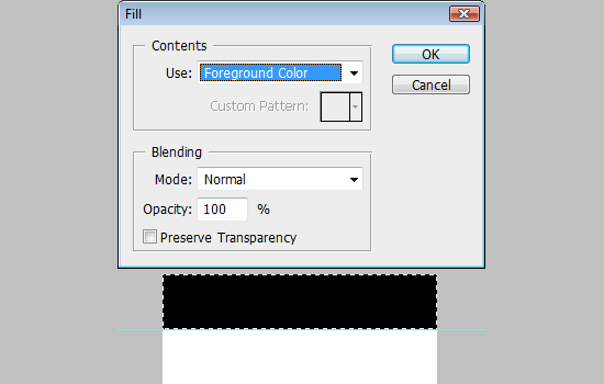 7 Delete the Shape layer of the rounded rectangle, it’s no longer needed.
Adding some layer styles
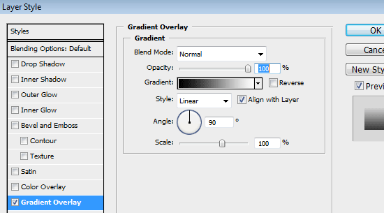
8 Double-click (or right-click > Blending Options…) on the Idle layer to open up the Layer Styles dialog box. 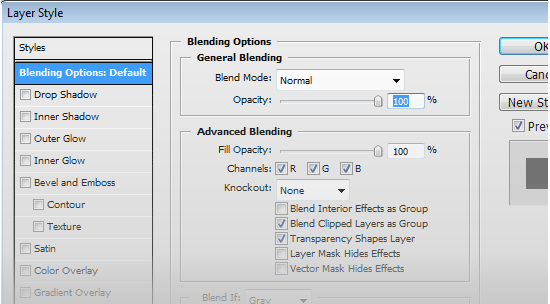 9 Add a Gradient Overlay.
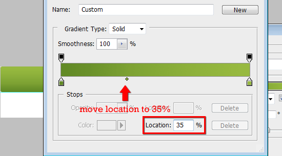
Double-click on the Gradient to open up the Gradient Editor dialog box. For the left Color Stop, use a dark green color #618926 and for the right Color Stop, use a lighter green color: #98ba40. Move the Color Midpoint to 35%.
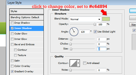
 10 Add an Inner Shadow. Change the Blending Mode to Normal. Change the color to a light green color, #c6d894.
Set the Opacity to 100%. Give Distance and Size a value of 2px. See figure below for the settings used.
 11 Add a Stroke. Set the Size to 1px and Position to Inside. Set the color to the dark green as in step 9 (#618926).
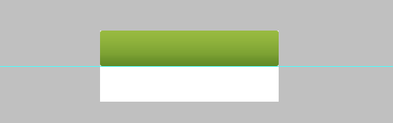
See figure below for the settings used. 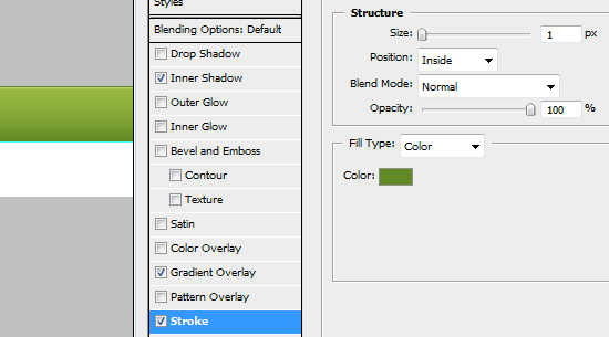 Here’s what you should have so far.
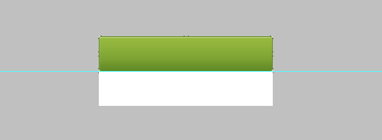
Adding a Radial Gradient
12 Create another layer on top of the Idle layer, name it Radial_Gradient.
Switch the foreground color to # b8cf69. Make a selection around the rounded rectangle shape by Ctrl + clicking on the Idle layer. Then switch back to the Radial_Gradient layer. 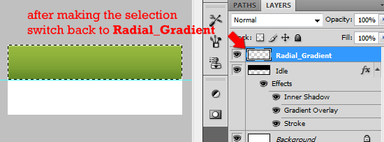 13 Switch to the Gradient Tool (G).
Set the gradient style to Radial Gradient. Click on the gradient to open up the Gradient Editor dialog box. 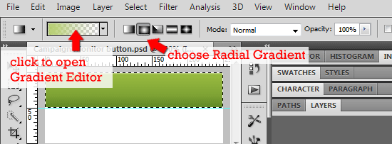 14 In the Gradient Editor dialog box, select the Foreground to Transparent Preset.
Make sure the left color stop is set to light green color, #b8cf69. 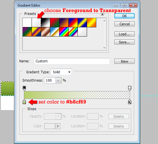 15 Make sure you still have a selection around the rounded rectangle shape and that the active layer is Radial_Gradient. Make sure that Rulers are turned on.
With the Gradient Tool (G) active, drag from the top of the selection to about 30px below the selection. 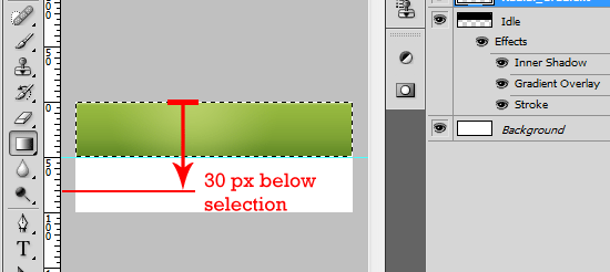 16 Adjust the Opacity of the Radial_Gradient layer to 80% or to a level that you like.
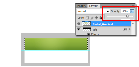
Creating the rollover state shape
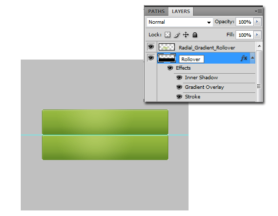
17 Duplicate the Idle and Radial_Gradient by first Shift + clicking on each one and then right-clicking to open up the context menu.
Select Duplicate > Duplicate Layers… 18 Move both duplicated layers down to the bottom half of the document by clicking on them in the Layers palette and then using the Move Tool (V). Rename the duplicate layers – use Rollover for Idle copy and Radial_Gradient_Rollover for Radient_Gradient layer.
Tweaking the rollover state layer styles
19 Except for the colors, we’ll keep everything the same. Double-click on the Rollover layer to open the Layer Styles dialog box. For Inner Shadow, change the color to a light blue, #839dbf.
For Gradient Overlay, change the left color stop to a dark blue, #0f2557 and the right color stop to a lighter blue, #245293. Finally, change the Stroke color to a dark blue, #0f2557. 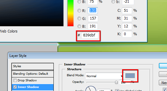 20 We’ll add a Color Overlay layer style for Radial_Gradient_Rollover.
Double-click on that layer to open the Layer Styles dialog box. Add a Color Overlay style and set the color to a blue color, #5c737c. 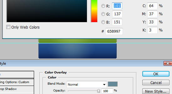
Adding the text
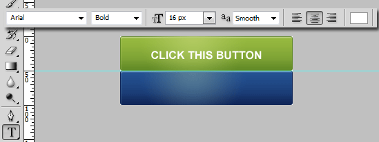
21 For this, we’ll use a simple font family: Arial.
Feel free to use whatever you like, but for the following techniques, something that’s bold/thick is suggested. 22 Use the Horizontal Type Tool (T), set the font family to Arial, font style to Bold, font size to 16px, anti-aliasing to Smooth, and the color to white (#ffffff). Type in the text you’d like the button to have.
Giving the text a drop shadow
23 Double-click on the text layer you just created to open up the Layer Styles dialog box. Set the Blending Mode to Normal, the color to a dark green color (#618926), Opacity to 100%, uncheck Use Global Light, Angle to -60%, and finally Size and Dimension to 1px. 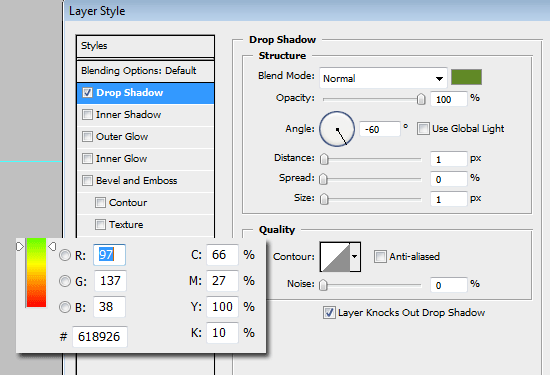
Centering the text
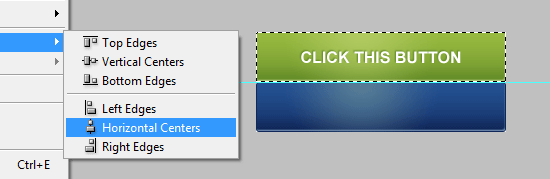
24 Ctrl + click on the Idle layer to make a selection.
Make sure that the text layer is the active layer. 25 Center the layer vertically by going to Layer > Align Layers to Selection > Vertical Centers. 26 Center the layer horizontally by going to Layer > Align Layers to Selection > Horizontal Centers.
Duplicating the text layer for the Rollover state
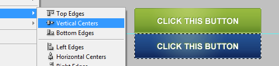
27 With the text layer still active, right-click on it and select Duplicate Layer… (or Alt + down arrow key if you have the Move Tool active). Move it down to the bottom half.
28 Ctrl + click on the Rollover layer to create a selection around the lower shape. Use Layer Align to Selection > Vertical Centers. If you somehow moved the duplicated text layer to the left or right, you should also do Layer > Align Layers to Selection > Horizontal Centers to recenter it.
Change the layer style
29 Double-click on the text layer you just created to open up the Layer Styles dialog box. Set the color to a dark blue color (#0f2557), leave the rest the same.
You’re done (with the Photoshop part)!
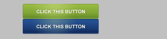
If you followed along, this is what your button sprite should look like. Now let’s do the HTML and CSS to get your button working. 30 Save your creation for the web, name it campaign-monitor-button.png.
31 Create an HTML document. Save it in the same location as the campaign-monitor-button.png file.
The HTML
The markup is basic, a link inside a paragraph tag. I chose to use a paragraph tag as a wrapper/container because I don’t think <a> elements should stand alone.
It would work without the <p> tag.
<p class="button"><a href="#null">Click this button</a></p>
The CSS
The CSS is a simple CSS background sprite image replacement technique. I chose the text-indent method because it has been tested to work with screen readers; the downside is that it doesn’t degrade well in the CSS on / Images off scenario (which is a rare situation and usually done out of choice by the user). Giving the <a> element a CSS property of outline: none removes the gray outline in Mozilla-based browsers.
.button { display:block; width:250px; height:50px; text-indent:-9999px; } .button a { display:block; width:100%; height:100%; background:transparent url(campaign-monitor-button.png) no-repeat top left; outline:none; } .button a:hover { background-position:0 -50px; }Demonstration
Conclusion
These buttons not only need to look appealing and stand out but be relevant. Including a strong call to action will significantly increase the number of people who click on the button. An example of this would be for a realtor should include an enticing call to action such as “contact us today for a free quote.”
Credit
The button on this tutorial was inspired the Campaign Monitor web interface which has these call-to-action buttons in their interface.
Check them out when you have a chance, they provide a great service for designers and developers!
Questions and thoughts?
If you have any questions or if you’ve found errors, leave us a note in the comments! Also, feel free to showcase your work here by sharing a link to your finished product if you followed this tutorial. For those of you who aren’t comfortable making these types of changes, you may want to look into getting a web design company!
The right company can do everything from online radio advertising to website edits and SEO for your business!
Related content
- How to Make a Stylish Glowing Box in Photoshop
- How to Create a Sleek and Textured Web Layout in Photoshop
- Related categories: Photoshop Tutorials, Tutorials
-
 President of WebFX. Bill has over 25 years of experience in the Internet marketing industry specializing in SEO, UX, information architecture, marketing automation and more. William’s background in scientific computing and education from Shippensburg and MIT provided the foundation for MarketingCloudFX and other key research and development projects at WebFX.
 -

WebFX is a full-service marketing agency with 1,100+ client reviews and a 4.9-star rating on Clutch! Find out how our expert team and revenue-accelerating tech can drive results for you! Learn more
Make estimating web design costs easy
Website design costs can be tricky to nail down. Get an instant estimate for a custom web design with our free website design cost calculator!
Try Our Free Web Design Cost Calculator
Share this article


Web Design Calculator
Use our free tool to get a free, instant quote in under 60 seconds.
View Web Design CalculatorMake estimating web design costs easy
Website design costs can be tricky to nail down. Get an instant estimate for a custom web design with our free website design cost calculator!
Try Our Free Web Design Cost Calculator


