How to Create Inset Typography in Photoshop

In this beginning-level design tutorial, I’ll show you how to apply a beautiful and super-easy text treatment in Photoshop: the inset text effect. It’s also often called the letterpress effect because it looks similar to text created by a Letterpress printer.
Final Result
Here’s a preview of what we’re about to create.

Creating the Photoshop document
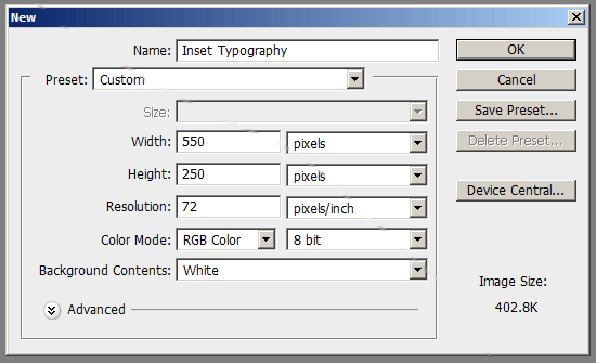
1 Let’s start with the basics: setting up the Photoshop document. Open up Photoshop and create a new document (Ctrl + N). We’ll start with a small canvas, a 550px by 550px document, but know that later on, you’ll be able to adjust the canvas size of your project.

Styling the Background Layer
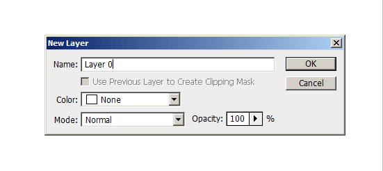
2 We’ll add a Gradient Overlay layer style onto the default Background layer. To do this, we need to make the layer editable. Double-click on the Background layer in the Layers Panel, which will result in opening the New Layer dialog box. Enter a Name for the layer (by default – it’s Layer 0); I’ve named mine Background.

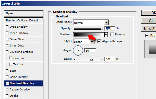
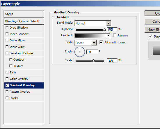
3 Double-click on the Background layer’s thumbnail in the Layers Panel to open up the Layer Styles dialog box. We want a vertical color gradient that transitions from darker blue (#003471) at the bottom, to a lighter blue (#448CCB) at the top. To begin, check the Gradient Overlay checkbox to apply the layer style. Then click on the color gradient on the right of the Gradient option to open up the Color Gradient Editor.

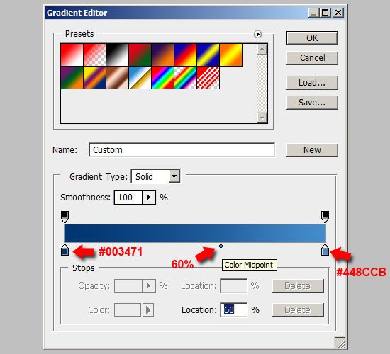
4 Double-click on the left Color Stop and enter the color value of a dark blue shade (#003471) which will be the color at the bottom of the canvas. Do the same for the right Color Stop, but this time, enter a lighter blue color (#448CCB). Let’s move the Color Midpoint to a Location of around 60% to make the darker blue color more dominant in the color gradient.

5 Lets give the background a light source from the top left corner of the canvas. 
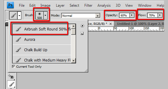
Grab the Brush Tool (B) from the Tools Panel. Set the brush tip to a rounded brush (I used Airbrush Soft, but feel free to explore your options). Set the Diameter option to 500px, Opacity option to 60%, and Flow option to 70% in the Options Bar.

6 Create a new layer (Ctrl + Shift + N) on top of the Background layer where we will apply the light source, call it Background light source.
7 Set your Foreground color to white (#FFFFFF). With the Brush Tool (B) still active, click on the top left corner of your canvas.


Creating the Inset Type
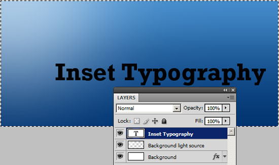
8 Use the Horizontal Type Tool (T) to write some text onto the canvas. When choosing a font family, it’s best to choose something that’s bold and thick to more readily show the inset effect. This type effect also works best on larger font sizes. I used Rockwell Std set to Bold and with the font size set to 30px (you can set these options in the Options bar). The color doesn’t matter because we will use a Gradient Overlay layer style (later on) that will supersede whatever foreground color you used.

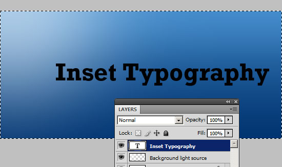
9 Let’s center the text in our canvas. In the Layers Panel, make sure the text layer is the active layer. Select the entire canvas by choosing Select > All (Ctrl + A). Then choose Layer > Align Layers to Selection > Vertical Centers. This will center the text vertically. With the canvas still selected, align the text horizontally by choosing Layer > Align Layers to Selection > Horizontal Centers to center our text in the middle of the canvas.


Adding the Inset Typography layer styles
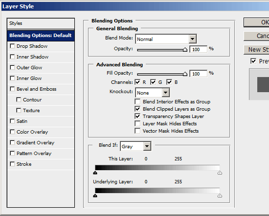
10 We’ll be adding three layer styles on the Inset Typography text layer: a Gradient Overlay, an Inner Shadow, and a Drop Shadow. This is all we’ll need in order to get the inset text effect. Start by right-clicking on the Inset Typography text layer in the Layers Panel and then choosing Blending Options – this will open up the Layer Styles options dialog (alternatively, double-clicking on the layer in the Layers Panel will perform the same action of opening the dialog box).

11 Lets work on the Gradient Overlay first. Check the box beside Gradient Overlay to apply this style to the text. We’ll want a similar color gradient as the background: a vertical color gradient with a darker color at the bottom of the text, and a lighter color at the top.

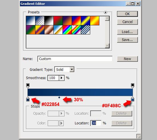
12 Double-click on the color gradient beside the Gradient option to open up the Color Gradient Editor. For the left Color Stop, choose a dark blue color (darker than the dark blue color of the Background layer). I chose #022854. For the right Color Stop, choose a lighter blue color than the left Color Stop, but still a little darker than the dark blue color of the Background layer. I chose #0F498C.
13 Because the Inner Shadow layer style that we’ll apply next will be at the top left of the text, lets make the lighter blue color more dominant in the color gradient to make the Inner Shadow more visible; do this by moving the Color Midpoint Location to around 30%.


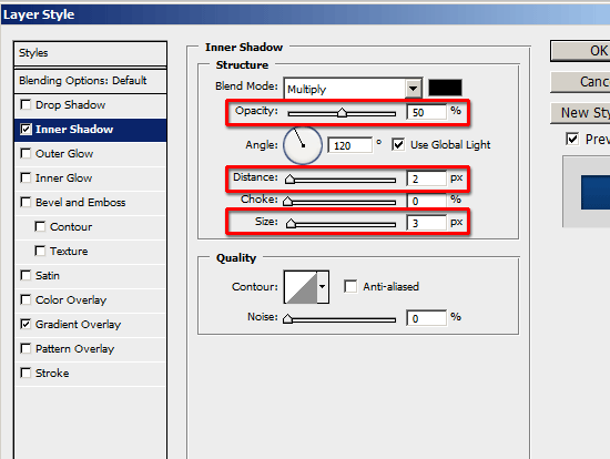
14 Let’s apply the Inner Shadow layer style next. Check the box beside Inner Shadow . Keep the angle at 120o so that the Inner Shadow’s light source comes from the top left, congruent with the light source we created earlier.
15 Changing the values of the Opacity, Distance and Size options will determine how pronounced or how subtle the inset effect will be. I chose to set the Opacity at 50%, the Distance at 2px and the Size at 3px because I wanted it to be visible, yet not exaggerated. Experiment with these option values until you get just the right inset effect.


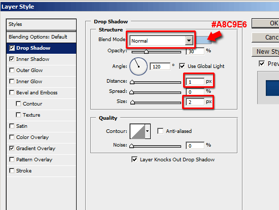
16 Finally, we’ll apply a Drop Shadow to make the text effect consistent with the light source. We want it to be very subtle, just enough to accent the text effect. Start by checking the box beside Drop Shadow.
17 Change the Blend Mode option to Normal to make the drop shadow less feathered.
18 Change the Shadow color from the default (which is black) to a bright blue color. I used the Eyedropper Tool (I) from the Tools Panel to sample a color from the top left corner where the light source was to start, and tweaked it until I got the color I was happy with: #A8C9E6.
19 I wanted the drop shadow to be subtle and small, so I used 1px for the Distance option to locate the drop shadow just at the bottom right of the text, and 2px for the Size option. I then lowered the Opacity option using the slider so that the drop shadow isn’t too prominent, and I was satisfied with it at 30% opacity. Also, note that it’s important to keep the angle of the drop shadow at 120o so that it’s consistently angled with the background’s light source and the Inner Shadow layer style.


We’re done!
Didn’t I tell you it would be super-easy?
Share your work!
Let’s see how yours ended up: upload your work to the Six Revisions User Group on Flickr.
Download the source file
If you’d like to check your work, you may download the PSD file for this tutorial.
- inset-typography.zip (ZIP, 0.16MB)
Related Content
- How to Create Stunning and Bold 3D Text
- How to Create a 3D Text Photo Manipulation
- 30 Beautiful Photoshop Text Effect Tutorials
- Related categories: Tutorials and Photoshop
Jacob Gube is the Founder and Chief Editor of 
67 Comments
Andy Feliciotti
September 10th, 2009
great post, Chris spooner did a good job with a tutorial on this also
http://line25.com/articles/web-design-trend-showcase-letterpress-text-effect
has some examples and tutorial on the bottom
gagahput3ra
September 10th, 2009
This is a very useful tutorial, thanks :D
qalih
September 10th, 2009
A nice simple tutorial on letter press effect. Great stuff.
linh
September 10th, 2009
wow, great tutorial, thanks @sixrevisions
z0r
September 10th, 2009
Was always missing the #18 step, thank you for sharing.
Roberto
September 11th, 2009
Very good tut. Thanks!
sandeep
September 11th, 2009
Good one:-)
cypherbox
September 11th, 2009
This is cool and easy to follow. Thanks for this tuts!
Marcel
September 11th, 2009
This is something that’s done with Fireworks in 3 or 4 clicks :)
vik
September 11th, 2009
Simple tutorial but very useful, thanks
Niranjan Thilak
September 11th, 2009
Now i should try and see whether it will be good to add that extra gradient ,which i didn’t apply on my site’s text . :D. I didn’t know that gradient would make that paper press look good. !…Lazy me :).
AtiKuSDesign
September 11th, 2009
Such a simple technique that you see being used a lot these days!
Thanks for the tut
Holger
September 11th, 2009
Thanks,
very nice tutorial. The bright blue drop shadow really does the trick.
Carol
September 11th, 2009
Excellent, easy to follow tutorial, and highly adaptable even for a novice like me!!! Many thanks.
Jacob Gube
September 11th, 2009
Thank you everyone for the positive comments and I’m glad many of you find this useful. Please don’t forget to upload your work by joining our community Flickr Group: Six Revisions User Group.
@Andy Feliciotti: Yep, great tutorial by Chris. I’m also putting together a showcase of inset typography on the web, stay tuned for my version! :)
@z0r: That step is very subtle, yet very important. It makes the type a bit more three dimensional, as well as remaining consistent with the light source from the top left of the canvas.
@Niranjan Thilak: It works without the color gradient as well. The text is a lot more subtle that way.
Arun Basil Lal
September 11th, 2009
I liked the style or writing. Thanks for including the psd too!
George
September 11th, 2009
Ewww Windows ;)
Great tutorial thanks for the tip!
Nils Rasmusson
September 11th, 2009
I was just about to start searching for this effect when I decided to check some favorite sites first. Such timing. Great tutorial – thank you!
Robert Simpson
September 11th, 2009
Nice tutorial, but instead of applying a drop shadow why not apply a downward outer bevel and turn that effect’s shadow element opacity down to zero? That way it would feel more like it was actually cut into the page, as opposed to an inverted drop shadow. I’m probably just being pedantic, the shadow thing would bug me!
Cheers,
Robert
Gjergji Kokushta
September 11th, 2009
Very nice tut! – Same effect using CSS: http://line25.s3.amazonaws.com/wp-content/uploads/2009/letterpress/demo/demo.html
Mars
September 12th, 2009
that was cool, before i am contented using the bevel and emboss
Jacob Gube
September 12th, 2009
@Arun Basil Lal: You’re welcome – I think that it would be useful to include the PSD so that you may check your work against mine, or maybe build on it, or tweak it.
@Gjergji Kokushta: Thanks for sharing that link on Line25 – I believe it uses CSS3.
@Mars: Inner Bevel works similarly, but this technique gives you greater versatility in terms of getting the effect that you want.
Khoi Nguyen
September 13th, 2009
Nice work here. Very simple, yet super elegant.
Vitezslav Valka
September 15th, 2009
Lovely :) We’re just incorporating this into new Pixmac.com refined design. MacHeist and Pixelmator started all that… :-)
Kerrick
September 16th, 2009
Thanks! I’d been trying to get this effect, but couldn’t get it to where I was happy with it. As it turns out, I hadn’t been doing the light-colored drop shadow.
Alessandro
September 16th, 2009
Great work!
Plugo.cz
September 17th, 2009
Great and easy-to-use example. Thanks. Added into bookmarks.
DTG
September 17th, 2009
This is technically not “inset” type. Traditionally it’s known as “debossing” the opposite of “imbossing” where the letters would be raised. It’s a classic, though, and the addition of the light source is a nice twist on the age-old technique.
Here’s a tutorial that puts it into a marbled background, and a wood background…
http://www.graphic-design.com/Photoshop/tutorials/deboss_carve/index.html
Redstage Magento
September 17th, 2009
Great tutorial. Simple and easy to execute. Thanks!
James
September 18th, 2009
Great tutorial… Quick question that’s a little off topic… Is Rockwell STD a font that’s included in Photoshop? I don’t seem to have it.
Ben
September 18th, 2009
A simple, but very effective tutorial. Excellent stuff.
Jacob Gube
September 19th, 2009
@James: It’s included in Adobe’s Fontfolio, but no, it does not come standard with Photoshop unfortunately.
Ashley Adams : Postcard Printing
September 22nd, 2009
Inset typography in photoshop sounds interesting….and you have a great tutorial here. It’s really very easy to follow. Thanks
studio-Cs
September 23rd, 2009
Simple and easy to understand tutorial. Great sharing!
rik
September 23rd, 2009
Thank you i’ve looked at a few inset type tuts and they all do it different, but this is easy and simple.
Nice !
Phil
September 24th, 2009
Which version of Photoshop was used here, because this tutorial was useless to me?
There are several cases of ‘click this then alter that’ where ‘clicking this’ doesn’t actually do what your screen-shots are showing! At least not on CS3 anyway.
Jacob Gube
September 24th, 2009
@Phil: I used Adobe Photoshop CS4.
Lauren Jordan
October 3rd, 2009
Funny thing…I never knew it was this easy! I actually figured out how to do it when I was messing around with Photoshop before I read the tutorial. When I figured it out on Photoshop, I was thinking maybe I was doing it wrong and it couldn’t be this easy….but, it was. =)
Damilola
October 20th, 2009
This was a great tutorial. I used this in creating the header for my (yet to be launched) blog. Thanks for taking the time to share this and I hope to get more inspiration from your blog in the future.
xRommelx
November 6th, 2009
really good wordk, i love it
Mary Hutson
November 12th, 2009
Very nicely done. More detailed than other tutorials on the same subject.
Anish
December 21st, 2009
great tutorial. Thanks for explaining all the details so precisely with those screenshots.
-Anish Kumar
Shavit
January 5th, 2010
What about the accessibility and SEO issue?
isn’t it the best to html the menu and just add css?
how you can get over it with this technique ?
maybe add background and add some shadow to the text with css?
Jure
January 9th, 2010
I’ve been searching for that effect quite a while now and it’s one of the best I stumbled upon.
You can see my attempt here since I don’t have a Flickr account:
http://localhostr.com/files/64543e/Inset.jpg
Joe Fletcher
January 12th, 2010
Very cool! That tutorial nailed it – very easy to follow… and I even worked off the mobile version of this article with the smaller mobile-sized images not knowing I bookmarked it from my phone.
Maxi
January 25th, 2010
good tut man
exceLLency
February 25th, 2010
Great tutorial. Simple and easy to execute. Thanks!
Lobo
March 10th, 2010
U can get similiar effect just by seting drop shadow on:
color white,blend mode “soft light”,distance 1px, size 0.
This and your way works if text is darker than background ofc.
Brian Jones
April 9th, 2010
Nice tutorial – thanks Jacob! Mine has been posted.
Dre"
May 21st, 2010
since i found sixrevisions.com, i never late to read every days, niche, share and fuel of soul here…Dear Jacob …can you explained about the art of adobe photoshop ??? any one known how to imaging our soul into canvas or layer???
thanks.
Best Regards
KarlMarx23
May 21st, 2010
Nice tutorial! very easy to understand!
I love it!
Tara
June 3rd, 2010
I’ve been looking for this forever! And you solved two problems for me 1) Inset Typography and 2) How to get that splash of white in the corner.
Thanks!
gameuber
June 10th, 2010
Simple tutorial with stunning result..Thanks for sharing this
bvsmohan
June 16th, 2010
good tutorial with simple steps to learn and understand,
thanks
donna
September 22nd, 2010
easy to understand tutorial. I’ve been working on a book cover project with this effect. Thanks for sharing!
jwight
September 22nd, 2010
Great tutorial Jacob! You do a great job of going the little extras such as providing specific visual aids that makes a big difference in the end. I love that I can still change my font afterwards and see how this looks with other text. Thanks!
richtaur
September 23rd, 2010
Love the effect. Thanks for being so thorough too, most tutorials don’t explain enough IMO …
seylom
September 25th, 2010
thumbs up! Very easy to follow! and the effect is just great!
Savioursix
September 30th, 2010
Great and simple tutorial, I love it. Regarding fonts in Photoshop, there are no “installed fonts”. On loading, ps reads your font folder in the user library, and generates its list from the ttf and otf files there. Consider fonts as plugins.
Sami
October 14th, 2010
Thanks for such a nice tutorial.
abdessamad
October 14th, 2010
thx man for this !!!! nice 1, im using it in my blog :)
fims
February 23rd, 2011
wow, great tutorial.
many thanks
kapil thanju
March 18th, 2011
nice tut thank you
Carlos E. Quevedo
June 21st, 2011
Finally I had found the letter effect inset typography; and not just that, explained to the detail to the point that you (I) learn new things. Jacob keep the good job up. I am a beginner to this, but willing to learn from the pro like you.
Thanks a lot.
Alexsh
July 30th, 2011
thanks…nice tutorial…! :D
Ovidiu Pp
September 26th, 2011
Thank you for this excellent tutorial. You made my day :)
Zaxx
October 13th, 2011
Nice tutorial…
Out of topic a bit, why comment system in Six Revision doesn’t use direct reply to specific comment? I find it in other blog so you don’t have to put “@someone” to pointing at who’s comments you are replying to. That would be nice i think :)
Leave a Comment