
The focus of this template is on a design agency that offers a range of web-based services. The primary aim of the page we’re designing, therefore, is to promote what the business does and what services they provide.
This is the first part of a tutorial on building a clean business website. This first part will focus on creating the design in Photoshop, and in the second part, will focus on converting the PSD outcome to a working XHTML template.
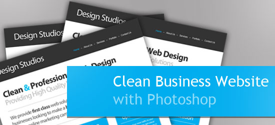
“Clean Business Website” Series
- Part 1: How to Design a Clean Business Website with Photoshop
- Part 2: PSD/HTML Conversion: Code a Clean Business Website Design
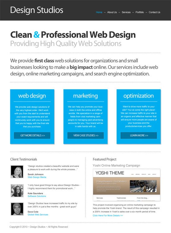
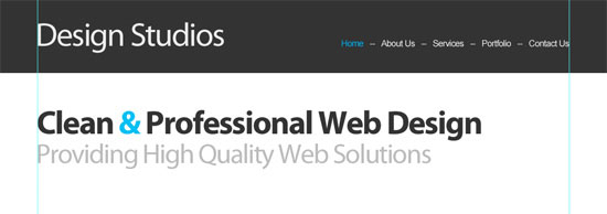
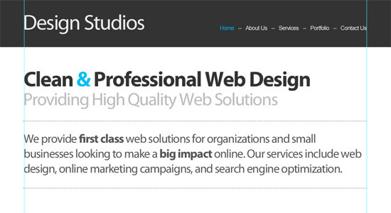
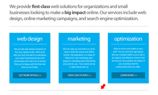
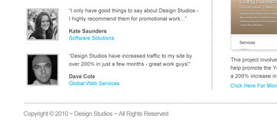
Final Result
Here’s a screenshot of the design we’ll be creating.
Overview
In this tutorial, I’m going to assume that you have a basic understanding of Photoshop and know how to do basic tasks such as adding text, drawing shapes, and resizing/rotating objects.
My goal in this walkthrough is to show that you don’t always need lots of fancy effects in a design to make a nice-looking template. With a couple of fonts and some subtle effects, it’s still possible to create a professional-looking design that will impress your visitors.
The design we’re going to build has a header that contains the name of the company and the navigation area. Below that is an area that highlights what the business does along with some additional details.
Following this, there is a section that describes the specific services in more detail. The section underneath this has some client testimonials and a featured project overview.
We also want to try and build credibility and trust through the use of some client testimonials and an example of a “featured project.”
Finally, we have a simple footer at the bottom that contains some fairly standard copyright text.
Create the Document
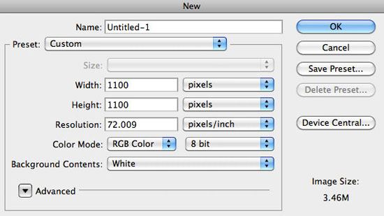
1 Create a new document with a size of 1100x1100px.
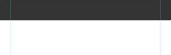
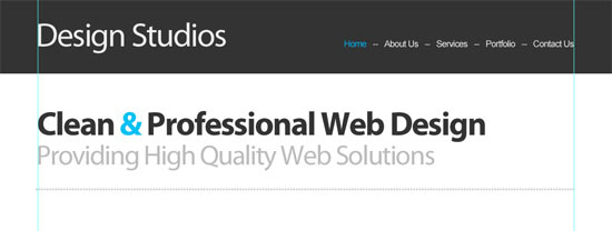
Then add some vertical guides at 70px and 1030px — this gives us a width of 960px, which should easily fit on most screens.
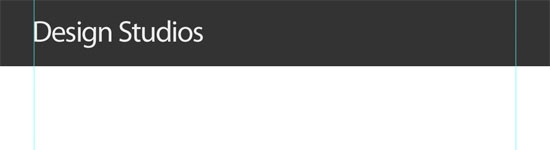
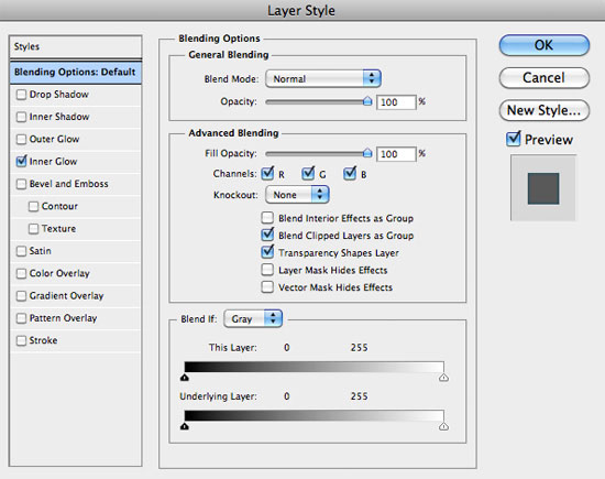
Make the Header
2 To create the header, we first need to add the background. Select the Rectangle Tool (U), set your Foreground color to a very dark gray color (#333333), and then draw a box from the left of the document to the right that is around 130px in height.
Add the Site Name/Logo
3 To add the company name, set the font to Myriad Pro. Set the font size to 60px, the color to a light gray (#EEEEEE), and the letter spacing to -40px.
You can set all of these options in the Character Panel (Window > Character). With the Horizontal Type Tool (T), type the name and position it against the left guide.
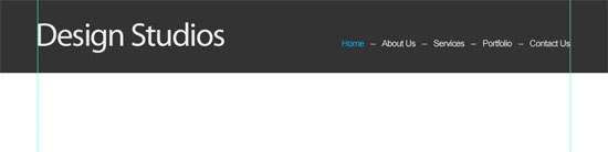
Make the Navigation
4 To add the navigation area, set the font to Arial. The font size to 16px and the color is #EEE. Type some page names (e.g.
Home, About, etc.) separated by two hypens (–):
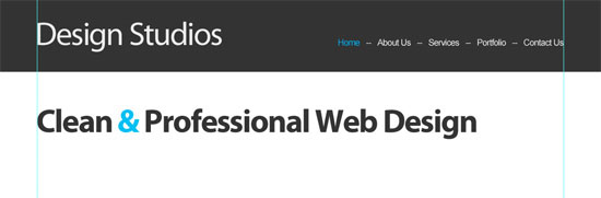
Create the Featured Content Section
5 To create the featured content section, we need to start by adding the headline of the featured content. Set the font to Myriad Pro, the font weight to bold, the font size 60px, the letter spacing to -40px, and the color to #333333. Type the title in with the Horizontal Type Tool (T).
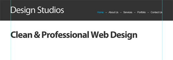
6 To make the headline stand out a little more, we’ll change the color of the ampersand (&) to a nice blue (#00BFF3).
7 Underneath that, we need to add the subtitle.
Set the font to Myriad Pro, the font weight to Regular, the size to 50px, and the color to #BBB. Type a subtitle and position it just underneath the title.
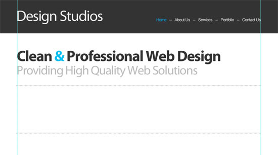
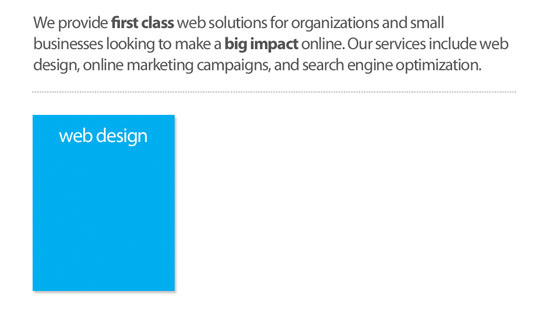
8 We now want to add a short overview of what the company does. Pick up the Horizontal Type Tool, set the font size to 30px, the color to #CCCCCC, and type a series of periods (.) from the left guide to the right.
9 Create a copy (choose the text layer in the Layers Panel and then press Ctrl/Cmd + J) of this dotted horizontal line, and then place it about 40px underneath the first line.
10 We now need to add the text between these lines. Set the font to Myriad Pro, the font-size to 34px, the color to #555555, the line spacing to 42px, the letter spacing to -40px, and then type a few lines of text.
You can use a lorem ipsum generator just to get some dummy text content in quickly.
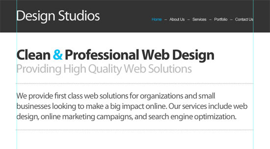
11 You may also want to pick out some key words and make their font weight bold to give them more emphasis; I’ve selected the words “first class” and “big impact.”
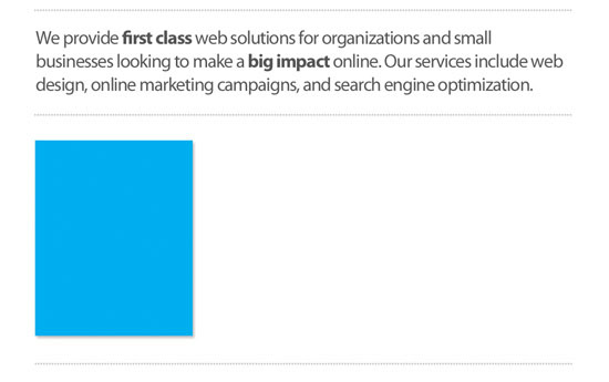
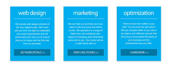
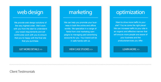
Add the Services Details
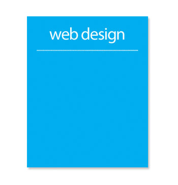
12 We now want to add some more specific details about our services. Select the Rectangle Tool from the Tools Panel, set your Foreground color to #00AEEF, and draw a rectangle shape that is around 280x350px in size, positioned against your left guide.
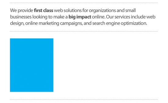
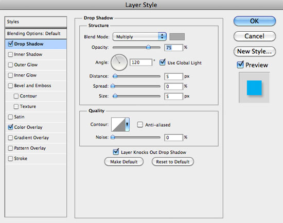
13 To make this box stand out a little more, we’ll add a drop shadow layer style (double-click on the layer’s thumbnail in the Layers Panel to access the Layer Styles dialog window); set the color of the dropshadow where the color is set to a gray color (#AAAAAA).
Your box should now have a little more emphasis.
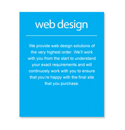
14 We now need to add a title for our service. Select the Horizontal Type Tool and set the font to Myriad Pro, the font weight to Regular, the font size to 40px, and the text color to white (#FFFFFF).
Draw a text box from the left border of the box to the right and set the alignment to Center text. Then, type in a title.
15 Now set the font size to 18px and type a series of periods that will become a dotted line.
16 Following this, set the font size to 15px and draw a text box from the left side of the box, to the right of it. Enter some text describing the services.
17 Finally, we need to add a button at the bottom of this box.
Select the Rectangle Tool, set the color to a blue color (#0076A3), and draw a box that is around 230x40px in size.
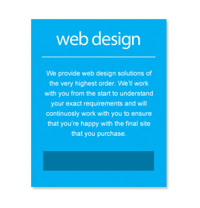
18 Add an Inner Glow effect to the button where the color is set to a darker shade of blue — I’ve used #235162.
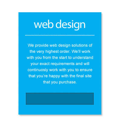
19 Now add a label to the button. Set your font size to 18px and type in uppercase, “GET MORE DETAILS>>”.
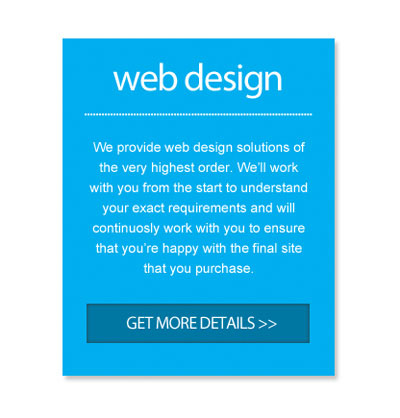
That’s the first box created.
20 Create two copies of this box by duplicating the first box and everything contained within it. Use the Move Tool (V) to space them out evenly.
Also, change the details in each of the boxes.
21 To finish this section of the layout, take a copy of the large dotted line that we created in a previous step and add it at the bottom of the section.
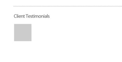
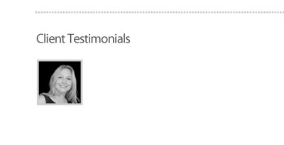
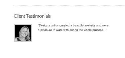
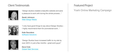
Add the Client Testimonials
22 For the client testimonials section, we initially need to create a title. Set the font to Myriad Pro, the size to 24px, the color to a dark gray (#555555), and then type “Client Testimonials” with the Horizontal Type Tool (T).
23 Now for the first testimonial author photo, choose the Rectangle Tool, set the the color to a lighter gray color (#CCCCCC), and draw a box that’s around 84x84px.
24 Now add a photo of yours that has slightly smaller dimensions. Add the photo in a layer above the Background layer.
25 Next, we need to add some text next to the photo.
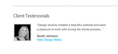
Set the font to Arial, the font size to 14px, the color to the dark gray we used for the title of the client testimonials section (#555555), and then type some dummy text (again, you can use lorem ipsum for this).
26 Now, set the font weight to Bold and type the author’s name. On the next line, type the author’s affiliation (i.e. the name of their organisation/company) and set the color to bright blue (#00AEEF).
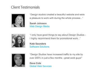
27 Take all of the elements used to create the first testimonial and create two copies.
Place them underneath each other with consistent spacing and change the content and images.
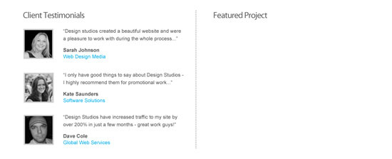
28 We now need to add a vertical divider to the right of the testimonial section. Create a copy of the dotted line we created earlier and delete around half of the periods. Rotate the line about 90o degrees (Edit > Transform > Rotate 90o CCW) and place it to the right of client testimonials section.

Create the Featured Project Section
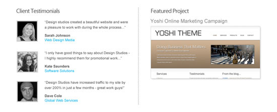
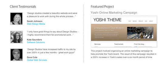
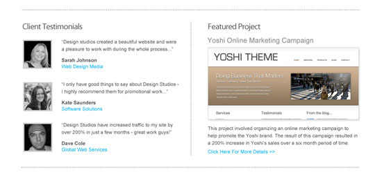
29 To create our featured project area, first we need to add a title.
Set the font to Myriad Pro, the size to 24px, the color to a dark gray (#555555), and then type “Featured Project”.
30 Now add a title for the featured project. Set the font size to 20px, the color to a gray color (#888888), and type a title.
Below this title, we need a screenshot of the project that is around 430x200px.
31 Then add some text that provides a brief overview of the project. Set the font to Arial, the font size to 14px, the text color to a dark gray (#555555), and type a few lines of content.
32 Also include some text at the bottom that says something like “Click Here For More Details.” Change the color of this text to a light blue (#00AEEF).
33 Finally, add another copy of the dotted horizontal line at the bottom of this section.
Make the Footer
34 The footer is very straightforward to complete.
Set the font to Arial, the font size to 16px, the color to #888888, and type some footer content.
All Finished
That’s everything done!
Wrapping Up
In this tutorial, I was hoping to illustrate that you don’t always need lots of fancy effects to create a nice design. Sometimes a couple of fonts and colors coupled with some subtle effects can do the job nicely.
Let me know if you have any questions or if anything was unclear and I’ll my best to answer them in the comments. In the next part of this tutorial, I’ll show you how to create an XHTML template from this design.
“Clean Business Website” Series
- Part 1: How to Design a Clean Business Website with Photoshop
- Part 2: PSD/HTML Conversion: Code a Clean Business Website Design
Download Source Files
- clean-business-website-psd (ZIP, 0.53 MB)
Related Content
-
 President of WebFX. Bill has over 25 years of experience in the Internet marketing industry specializing in SEO, UX, information architecture, marketing automation and more. William’s background in scientific computing and education from Shippensburg and MIT provided the foundation for MarketingCloudFX and other key research and development projects at WebFX.
 -

WebFX is a full-service marketing agency with 1,100+ client reviews and a 4.9-star rating on Clutch! Find out how our expert team and revenue-accelerating tech can drive results for you! Learn more
Make estimating web design costs easy
Website design costs can be tricky to nail down. Get an instant estimate for a custom web design with our free website design cost calculator!
Try Our Free Web Design Cost Calculator
Share this article


Web Design Calculator
Use our free tool to get a free, instant quote in under 60 seconds.
View Web Design CalculatorMake estimating web design costs easy
Website design costs can be tricky to nail down. Get an instant estimate for a custom web design with our free website design cost calculator!
Try Our Free Web Design Cost Calculator


