
This is a guest post by Jerry Cao, coauthor of The Guide to Mockups.
In this article, I will discuss the various levels of UI design mockup fidelity to help you choose the best option.
Web designer Brad Frost summarizes the progression of design fidelity best, using an analogy:
You start out with a big slab of rock, and slowly chip away to get the rough shape of the form you’re creating. You take another pass at it to get a better sense of the object you’re trying to extract from the stone. You take another pass to start getting a bit more detailed.
Eventually, you start honing in on a particular aspect of the form: a face, the arms, or the torso. Slowly but surely you detail each section of the sculpture until you’ve arrived at the final form.
The Fidelity Continuum
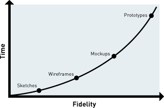
“Design methods are not mutually exclusive. Rather, each method exists on a continuum of fidelity,” Tyler Tate, a well-regarded UX designer and book author, says in this article.
According to Tate, the design process starts with low-fidelity (lo-fi) sketches, and progresses towards high-fidelity (hi-fi) prototypes.
 source: jfarny.com
Where do mockups fit, in the continuum of fidelity?
I would put design mockups at the mid- to high-fidelity range, wedged between low-fidelity wireframes and high-fidelity functional prototypes.
To apply too much fidelity prematurely in the process will waste time and money.
On the other hand, not giving this process enough time and money will leave many avenues unexplored.
There’s this balance that needs to be established between time, resources and fidelity.
 source: uxbooth.com
The optimal level of fidelity is the minimum amount of fidelity needed to get the job done. Nothing more, nothing less. This is what you might call “being lazy in a good way” or “responsibly lazy.”
Concept Mockups
Concept mockups exist outside the traditionally accepted form of UI design mockups.
They are useful nonetheless.
Companies sometimes skip the wireframing phase and replace it with a concept mockup, which they then iterate on as they climb up the continuum of fidelity.
As illustrated in the following diagram, a concept mockup comes before wireframing or detailed (higher-fidelity) mockups:
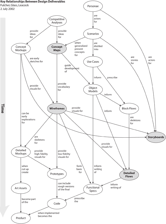 source: leacock.com
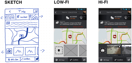
Below, you can see that concept mockups can be done simply by sketching out some of your initial design ideas on paper:
 source: alistapart.com
Concept mockups are helpful if you prefer starting on paper and plan on digitally creating mid- or high-fidelity mockups later on.
Concept mockups may add extra work onto the design process, but it lets you quickly explore some ideas on paper.
In addition, if you plan on wireframing before the mid- or high-fidelity mockup, your concept mockups can serve as rough guidelines.
Digital Mockups
Moving forward, we go to the subject of digital mockups.
There are two schools of thought that divide the preferred approach to creating digital mockups:
- Those that see the mockup phase as transitional, and thus should not take too much time (mid-fidelity)
- Those that believe design mockups should represent the end-product exactly (high-fidelity)
Mid-Fidelity Mockups
Mid-fidelity mockups have these advantages:
- You can go from the conceptual phase to the implementation phase more quickly.
- It allows for more flexibility, creativity and exploration during the implementation phase.
- It can reduce the creation of unnecessary design components that might eventually be scrapped when developing the actual front-end.
Creating a mid-fidelity mockup also has its drawbacks:
- The lack of polish means many design decisions are up in the air.
- A lot of the time you may have saved during the mockup phase will go into fine-tuning UI components in the implementation phase.
- Clients and stakeholders won’t be as impressed with a mid-fi mockup as they would with a hi-fi one, so that’s worth keeping in mind.
 source: uxpin.com
High-Fidelity Mockups
The high-fidelity mockup plans out and develops most of the design decisions right at the start, including font size, dimensions, color scheme, margin sizes, etc. This level of fidelity can be considered as being “pixel-perfect”.
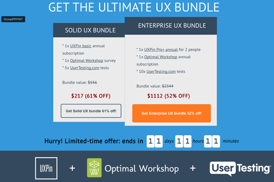
You can see the level of design detail we include in our high-fidelity landing page mockups over at UXPin:
 source: uxpin.com
Hi-fi mockups are beneficial for several reasons:
- You give yourself more time to iterate and perfect the UI design.
- You will make most of the design decisions early in the production process.
- They are easier to present to non-designers: Clients and stakeholders prefer this style over mid-fi mockups because they may not be aware of the continuum of fidelity. However, anyone can understand high-fidelity prototypes.
- Front-end developers can see what the final product must look like, which means hi-fi mockups can doubly serve as a visual specs sheet.
However, there’s a downside, and one that shouldn’t be overlooked: High-fidelity mockups take longer to produce.
One could make the argument that creating high-fidelity mockups isn’t time efficient since we’ll need to rebuild the design in HTML, CSS, and JS anyways. To some, this workflow process might seem redundant.
However, you could also say that high-fidelity mockups can save time in the end because of all design decisions, design testing, and planning that are made early in the process. This can all equate to time-savings during the implementation phase.
Mockup Fidelity Progression
When choosing how much fidelity to give your mockups, consider first your individual needs, and then examine how you want mockups to fit into the process as a whole.
Mockups will be as varied as the end-products they represent, so there’s really no fixed standard for how they should look or function.
Only guidelines.
The choice of how much fidelity or how much time to spend making your mockup is up to you.
We at UXPin recommend an iterative approach that allows for simultaneous mid-fidelity mockup and prototype creation:
- Start with sketches: Get your ideas on paper first, where you won’t get too attached to your initial designs. For each concept, draw out and explore a couple or so options.
- Move to a digital environment: Once you’ve drawn out some ideas, switch over to a digital tool like Axure, OmniGraffle, or my company’s own tool UXPin. There’s tons of options. Converge your sketches into a quick digital wireframe, then add visual details until you are at mid-fidelity.
- Prototype the functionality: The beauty of digital design tools these days is that many of them allow for simultaneous wireframing and prototyping. With a few clicks, you can turn a mockup into a functional prototype quite easily.
- Test, iterate, refine: At this point, your mockup is now a high-fidelity prototype. Test it with users or even coworkers (grab at least five people for a quick test session). Then, analyze your results and add fidelity and functionality as needed.
Repeat this step as much as required.
In our experience, this progression helps balance resources, time and fidelity well. Visual design is first explored on paper through sketching, and then we move to a specialized tool to build functionality and improve the visuals.
Further Reading
Download my free ebook called The Guide to Mockups for a thorough look at mockup best practices and methods.
The ebook includes insights from experts such as Luke Wroblewski, Marcin Treder and Ash Maurya.
Related Content
- The Benefits of Wireframing a Design
- Wireframes vs. Prototypes: What’s the Difference?
- Ultimate Guide to Website Wireframing
- A Quick Introduction to Agile UX Design
- Improving Usability with Fitts’ Law
-
 President of WebFX. Bill has over 25 years of experience in the Internet marketing industry specializing in SEO, UX, information architecture, marketing automation and more. William’s background in scientific computing and education from Shippensburg and MIT provided the foundation for MarketingCloudFX and other key research and development projects at WebFX.
 -

WebFX is a full-service marketing agency with 1,100+ client reviews and a 4.9-star rating on Clutch! Find out how our expert team and revenue-accelerating tech can drive results for you! Learn more
Make estimating web design costs easy
Website design costs can be tricky to nail down. Get an instant estimate for a custom web design with our free website design cost calculator!
Try Our Free Web Design Cost Calculator
Share this article


Web Design Calculator
Use our free tool to get a free, instant quote in under 60 seconds.
View Web Design CalculatorMake estimating web design costs easy
Website design costs can be tricky to nail down. Get an instant estimate for a custom web design with our free website design cost calculator!
Try Our Free Web Design Cost Calculator


