

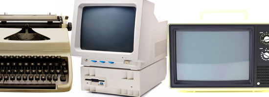
 Technology, and especially information technology, evolves rapidly. People have come to terms with the constant, big and fast changes that fall upon the hardware and software we use. It’s considered common practice to adapt to these changes and to keep your software and hardware up to date.
Upgrading your browser to the newest version takes minutes. Operating systems are updated every couple of years. It’s not unusual to purchase a new computer every 3 years.
Oh, Is That So?
As to be expected, there are still individuals (many, actually) that aren’t up to speed with modern technology trends.
They might be your older siblings, your grandparents, your boss. They might be people born and raised in an era where computing devices weren’t as “mainstream” as it is today. They may be individuals who didn’t have access to computers or the Internet due to economic situations or geographical restrictions.
Reading this article on the Web in a web design/web development-oriented site (probably through a modern and standards-compliant web browser[1] like Firefox or Chrome), it might be difficult for you to imagine these situations. But, especially in the mainstream, designing for users and clients with limited technology backgrounds is all too common; individuals that were submerged into information technology without choice. What happens when we want our websites to be useful not only to the technology-savvy, but also to people with little IT background?

Your Old-Fashioned Clients and Their Restrictions
Clients with IT restrictions are not as scarce as you think they may be. If you happen to work for an academic institution like me, you would find a fair amount of such people who want a personal website for presenting their bio, research and publications, class schedules, resources for students, and so forth. You might wonder why people with no interest in information technology would want a website.
Possible answers are that either their institution requires it by law (as it is in my country), or because they want to stay competitive with colleagues who have their own websites. They might see the value of having a website, regardless of their familiarity with the underlying technologies and concepts associated with it. So you create a wonderful website using the latest, greatest and most user-friendly content management system (CMS) you can find.
It looks stylish in today’s standards. It’s highly functional and meets the client’s objectives. But when the time comes to present it to the final judge — our old-fashioned client — oh, the disaster!
Later, you discover that the browser they’re using is IE6. The spiffy Ajax script you used to load images asynchronously and remotely from the Flickr account you set up for them wasn’t working because they had JavaScript disabled. They couldn’t log into the admin panel of the CMS to edit their posts because the system needed them to have cookies enabled, and they have turned off that feature as well. The layout looks terrible because, as we all know, IE6 has the tendency to completely waste the hours of CSS perfection we put in.
The client doesn’t understand why the colors aren’t brighter here and there, or why there’s no obvious indication for the news section or their email address (and by “obvious indication”, I mean the missing flashing text and spinning @ symbol animated GIF we forgot to use). 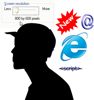 There’s a horizontal scrollbar hiding 20% of the site’s layout. “Where are the links?
Oh wait, that was a link? It wasn’t blue and underlined, I didn’t see it.” Your client is clearly confused with the work you have produced. And you are a bit flustered and mildly frustrated.
You check the calendar just to make sure and, yes, it’s says “2010.” Scripts are common in websites, computer screen resolutions are no longer at 800×600, there is a handful of awesome standards-based browsers available for free that can be installed in minutes (or at least an upgraded version of IE), and crazed animated GIFs are passé. But it seems that your employer is oblivious to these facts. Where do we go from here?
Step 1: Education
Taking the time to explain what your client has been missing out on is a must, and the professional way to go in this matter.
You are obliged to educate them on these advancements and requirements. Educating your employers is important for two reasons.
Educating Clients is Part of the Job
You respect your client’s needs and want them to get the most out of what will be their future web presence. Since they’re using the Web, they will probably meet the technology they are rejecting/ignoring eventually.
Furthermore, they will remember the advice and information you shared with them, and will be thankful for the time you took to explain to them these things. Using metaphors that your client will understand is an effective teaching and relational technique. For example, since I mainly work with researchers and academicians, I tell them that using IE6 is like using a magnifying lens instead of a microscope (i.e., a modern browser) to browse their cell collections (i.e., websites).
Your Professional Reputation is at Stake
If you don’t take the time to explain the “malfunctions” of the site you built, you might give the idea of being unprofessional and lacking knowledge.
Use your expertise to show that you understand what has happened and that you can fix it to comply with your client’s needs.
Step 2: Accept That Some People Will Not Change
From my personal experience, you probably won’t manage to convince many of your clients to use modern IT practices, no matter how good your arguments are. People still used IE6 even when I would install another browser for them; upgrading to a recent version of IE would be a futile attempt because the system would not allow it. I would fix their monitor resolution to properly fix their screen so as to not blur or stretch images, but they were so used to how things were that they would quickly go back to 800×600, even if web pages looked malformed.
They are wary of JavaScript. And even if I take the time to set the security settings for them on their main computer, they’ll have other devices such as their home computer and laptop that won’t be set up properly. Long story short: if you know that the client and the audience of a particular site will be in these outdated IT situations, you must create designs that work in these environments.
Step 3: Know the General Design Concerns
To get a website working right under restricted conditions, I personally prefer completely relying only on well-formed and clean HTML and CSS.
This ensures cross-browser compatibility and reduces the chances of rendering issues.
Scripting
The dilemma of whether to use scripts or not is a big one. JavaScript, for example, is used for social media integration and third-party web services such as Google Analytics. You can certainly get away without social media integration if the client doesn’t care about the Social Web, and you can use server-side analytics software for tracking site stats, but it still does narrow down your options for providing a rich and engaging web experience.
If you want to use scripts for functionality, prepare your customers on the matter. Ask them if scripts are activated in their browser. Ask them what browser they’re using and give them instructions on how to check JavaScript or cookie options.
Better yet: You can write a script that checks for these options — feature detection, if you will. Explain the importance of these scripts and how scripts can enhance the user experience of a site. If you can’t justify the use of scripts to your client — then do you really need them?
And of course, you should always code for graceful degradation. While building the website, try to imagine a situation where JavaScript and cookies are turned off: is your site still functional? Do main elements like navigation appear properly?
As a live example of graceful degradation, check out this accessible jQuery slideshow. Turn off JavaScript in your browser, and you will notice that the content is still accessible. 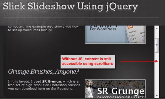 The site must be able to sustain functionality even when scripts are off.
It’s OK if it doesn’t look and work optimally; the important thing is that, in these situations, you’re not making JavaScript a barrier to accessing and using the site.
Content Layout
Content must be presented in a uniform way. Your users will want to view the contents of the website in a templated, standardized and predictable manner, which means each element and component (e.g., headings, header, navigation menu, body text, and footer) mustn’t change to avoid confusion. Simple is better.
Page Layout
If you need to design for smaller-screen resolutions without the benefit of being able to use CSS3 media queries, it is a good idea to go with a fluid layout so that your layout adjusts depending on the size of a person’s monitor.
(Read about different layout types.) This avoids situations where content is partially hidden horizontally, caused by fixed-width layouts that are wider than the user’s monitor. In order to help with fluidity, and hence resolution issues, try to keep the title and logo of the header in one place (say, left or centered). Avoid setting fixed widths, especially for the site width and the main text areas.
I personally set the total layout width at around 70% so that it won’t get too wide on widescreens. I fix the vertical menu width to a standard value (typically 35% of the 70% width), and leave the rest of the space for the main text. It takes slightly more math than your typical fixed-width layout — and a heck of a lot more debugging — but it’s worth it for your clients.
Site Navigation
Your clients will expect to find a clear navigation menu with no hidden secrets, so try to break it down to a list of 5-10 pages that will sum up the content of the website.
Avoid subcategories, but if they must be used, you can use a CSS only drop-down menu like the lovely ones provided at CSSPlay. It will be useful if you give a one-line description for the menu categories at the index page so that the user will know where to navigate in order to quickly find what they’re looking for.
Code Semantics and Playing It Safe
Proper syntax and correct use of elements (headings, divs, tables) help structure a layout that is easily understandable. Simple and nicely done hover effects (like background color or border change) can give a stylish feel to the page without scripting.
Same goes for CSS background image changes on hover. You can achieve a fair deal of great aesthetics and functionality, in the context of helping the user distinguish different parts of the website, with hover states to suggest that an element is clickable. It is important to style hyperlinks in a way that someone can immediately understand.
Blue and underlined, no matter how hackneyed, works[2]. Underline (text-decoration:underline;) or use the border-bottom CSS property for links. Use a color that differs from normal text.
Finally, remember to use web safe fonts that are easy to read. Serif or sans serif? Legibility-wise and on the web, the research results are inconclusive.
Whether you use serif or sans serif, make sure font-sizes are not too small. La Cantina is a beautiful example that includes the ideas mentioned above. 
Step 4: Mind the Details
Our site will be a little plain without the nice and useful UI effects scripts provide us, but we’ve worked our way through it.
Still, there are some more issues waiting around the corner.
Browser Testing
As far as IE6 is concerned, I haven’t come across a possible way to satisfy the needs of modern, functional browsers together with that nightmare Microsoft has provided. Clean and simple design is what will help you get a good presentation on IE6. Whenever needed, I design my pages for modern browsers (to be forward-compliant and standards-compliant), and then when I create my first functional template (HTML/CSS), I test it on IE6 and other versions of the Internet Explorer using IETester. If there are acceptable rendering issues that cannot possibly be fixed without completely ruining the site for modern browsers, I kindly explain to the client that this is the best result that can be achieved to satisfy browsers of all sorts. It’s important to show your client how the website looks on other browsers. More specifically, show the site to them on popular browsers like the latest version of the IE or Firefox — the two most common browsers today[3] — and explain to them that this is the way the site normally looks and that you did it this way so that the site design will be future-proof.
Security Settings of Scripts in Local Files
The “scripts deactivated for safety reasons” warning that pops up on IE for stored local files is a tricky situation.
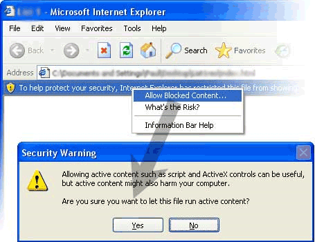 It usually occurs when you present a version of the website before it goes online (e.g., a static prototype viewed locally). If you are presenting it to them in person, be ready to explain why this happens, why it’s not a threat and that it’s normal. If you’re sending the files to them (because you won’t always available when they want to look at the prototype), make sure to give clear directions on how to manage the issue.
Old-School and Bad Design Preferences
If your clients insist on using annoying animated GIFs that come to haunt you from the past or comic sans for content headings, you can use education and training to teach your employer about these types of outmoded or tacky design practices.
![]() Use functional and user-oriented reasoning. You can use a metaphor that relates to them. For example, if I’m working with researchers and teachers, I have them imagine how difficult it would be for them to try and read an important research paper/document in a location where there’s plenty of distraction such loud music, flashing lights coming from the window nearby, and someone talking loudly near them.
Use functional and user-oriented reasoning. You can use a metaphor that relates to them. For example, if I’m working with researchers and teachers, I have them imagine how difficult it would be for them to try and read an important research paper/document in a location where there’s plenty of distraction such loud music, flashing lights coming from the window nearby, and someone talking loudly near them.
Would they not agree that the fewer distractions, the better? Then tell them that their website and content is exactly this: important documents (in online form) that someone needs to read and derive information from. The loud music, flashing lights, and loud-mouthed colleague have digital equivalents in the form of annoying sound effects, GIF animations, poor color choices, and garish design elements.
Suggest best practices and ways to achieve the same goals without sacrifice to the user experience. For example, though they have requested an animated GIF to be placed somewhere, their intention is probably to draw attention to something important. They just used something familiar to them to describe their goal.
Look for solutions to their problems. You could suggest, for example, using distinctive colors, bigger fonts to signify importance, icons to aid visual cognition, and borders or underlines to provide distinction for highlighting specific parts of the site. Last but not least, there are cases where the person you work for will want a website filled with an excess of clipart and poor-quality photos.
The “excess” that I’ve dealt with most is the request to add irrelevant photos to inappropriate places such as in logos, in headers, and as web banners. What are the problems that arise with that? The page ends up being overloaded, slow and, let’s be honest, amateurish.
The photos are usually images the client found while browsing the Web (or forwarded to them through chain emails). First, recognize that their intentions are good. These sorts of requests aren’t being done to make your job a living hell.
They’ve sent you photos probably in an effort to contribute and add their ideas to their website. Whether it’s clipart, poor-resolution photos, or images found on the Web, explain the reasons why they are not a good idea. For example, excessive use of images leads to bad page response times, which in turn degrades the user experience.
These images may be under copyright. The images may be too poor in quality to place on a website. They may be distracting to the reader.
Turn situations like this into positive things that can bolster your relationship with your clients. Instead of putting them on the spot and launching into an unprofessional tirade of finger-wagging lecturing, thank them for their efforts in trying to help in the design process. Remember that designing a website is a collaborative process.
To Sum Up
Creating websites within technology restrictions can be a challenge, but you can certainly pull it off with wonderful results that will satisfy everyone’s needs.
Keep in mind that the client’s needs go first and that you’ll mostly have to rely on your technical and intrapersonal skills to get you through the project. I look forward to hearing your own tips, suggestions and experiences in the comments.
References
- Firefox and Chrome users make up 70.48% of traffic to Six Revisions. IE6 users account for less than 0.3% of site traffic.
- ” To maximize the perceived affordance of clickability, color and underline the link text. […] Shades of blue provide the strongest signal for links […].” Visualizing Links: 7 Design Guidelines
- Usage share of IE8 is 27.90% versus IE6 at 16.18%. IE total market share is 49.87%. Firefox is second to IE at 29.95%.
Usage share of web browsers. October 2010.
Related Content
-
 President of WebFX. Bill has over 25 years of experience in the Internet marketing industry specializing in SEO, UX, information architecture, marketing automation and more. William’s background in scientific computing and education from Shippensburg and MIT provided the foundation for MarketingCloudFX and other key research and development projects at WebFX.
 -

WebFX is a full-service marketing agency with 1,100+ client reviews and a 4.9-star rating on Clutch! Find out how our expert team and revenue-accelerating tech can drive results for you! Learn more
Make estimating web design costs easy
Website design costs can be tricky to nail down. Get an instant estimate for a custom web design with our free website design cost calculator!
Try Our Free Web Design Cost Calculator
Share this article


Web Design Calculator
Use our free tool to get a free, instant quote in under 60 seconds.
View Web Design CalculatorMake estimating web design costs easy
Website design costs can be tricky to nail down. Get an instant estimate for a custom web design with our free website design cost calculator!
Try Our Free Web Design Cost Calculator


