
 In this guide, we will display the power of CSS3 in drawing complex shapes. We will magically create Christmas tree ornaments using only CSS3 and HTML (no images). In particular, we will be drawing baubles, which are the hallmark ornamentation of Christmas trees.
Note that this is merely a fun, proof-of-concept that explores the possible applications of CSS3. If you intend to use this in production, you should be aware that what we will be creating uses W3C specifications that are not yet, or will never be, supported in many browsers (such as IE6 through IE8). Also, the markup must be updated in order to avoid empty div elements.
CSS Ingredients
Before we get started, let’s just quickly go over what we be using.
:beforeand:afterpseudo-elements: Using pseudo-elements will help us in reducing the amount of unnecessary HTML we need to use. If you have worked with rounded corners in CSS2 before, you probably know that, in order to produce flexible rounded corners that accommodate various sizes of content, you had to use a lot of empty divs and such. By using these elements, we will have minimal markup.In this case, just one empty
divper bauble, which, if you were enterprising, you would fill with some text content. Note that these pseudo-elements are in CSS2 specs.- CSS3 linear and radial gradients: To get the metallic color fills and shines of the baubles, we will use color gradients.
- Box shadows, transformations, border radius, etc.: To create the shapes, we will be using a combination of
box-shadow,transform, andborder-radius(for rounded corners).
HTML
First, let us create the markup. As you can see below, the structure is quite minimal and contains only the minimum amount of markup necessary. Since the globes need to be block elements, I chose to go with <div> instead of <span>, however, if you are not comfortable with that, you can use <span> tags and then use the display: block CSS property/value pair.
I have placed them in an unordered list because I decided that they are a group of items with no particular hierarchy (e.g. red-bauble is not greater than green-bauble), and so, to me, the metaphor of unordered lists is retained.
<ul id="bauble-container"> <li> <div class="baublered-bauble"></div> </li> <li> <div class="baubleblue-bauble"></div> </li> <li> <div class="baubleyellow-bauble"></div> </li> <li> <div class="baublegreen-bauble"></div> </li> </ul>
Explanation of the IDs/classes:
#bauble-containeris our unordered list, which will be used for targeting the list items (<li>) with greater specificity..baubleis the main part of the ornament; the spherical shape..red-bauble,.blue-bauble,.yellow-baubleand.green-baubleare the classes used for adding color variations. It makes our work flexible so that, if you wanted various combinations, you’re not stuck with the color combinations I chose. For example, you could have two yellow baubles or no yellow baubles–that’s why we use classes, and not IDs, for these.
CSS
What follows are the style rules that will turn our boring unordered list above into a magical set of Christmas tree ornaments. For discussion, I have commented the CSS below so that you can see how it works to highlight the major parts of the CSS. Note that, in production, you would not want this much commenting in your stylesheet because it is over the top and because it can increase your stylesheet’s file size.
/* General */ html { background: #f2f5f6; /* Fallback background color if gradients are not supported */ background: -moz-linear-gradient(top, #f2f5f6, #c8d7dc); background: -webkit-gradient(linear,left bottom,left top,color-stop(0, #c8d7dc),color-stop(1, #f2f5f6)); height: 100%; } #bauble-container { list-style: none; /* Remove bullets */ width: 568px; margin: 150px auto; /* Center it */ padding: 0; /* In production, this may not be needed if you reset your styles in your global stylesheet: https://www.webfx.com/blog/web-design/css-tip-1-resetting-your-styles-with-css-reset/ */ } #bauble-container li { margin: 0 20px; /* let's add some space */ float: left; /* place them in line */ } /* This is the part where the Christmas bauble string is added */ #bauble-container li:before { content: ""; background: #dadada; /* Fallback */ background: -moz-linear-gradient(bottom, #9c9c9c, rgba(255,255,255,0) ); background: -webkit-gradient(linear, left bottom, right top, from(#9c9c9c), color-stop(100%, rgba(255,255,255,0))); height: 50px; width: 2px; display: block; margin: 0 auto; } /* Alernatively rotate them */ #bauble-container li:nth-child(odd) { -moz-transform: rotate(-5deg); /* Firefox */ -webkit-transform: rotate(-5deg); /* Chrome and Safari */ -o-transform: rotate(-5deg); /* Opera */ -ms-transform: rotate(-5deg); /* Surprise! IE9 with its own prefix */ } #bauble-container li:nth-child(even) { -moz-transform: rotate(5deg); -webkit-transform: rotate(5deg); -o-transform: rotate(5deg); -ms-transform: rotate(5deg); } /* Style the bauble */ .bauble { -moz-border-radius: 100px; border-radius: 100px; -moz-box-shadow: 0 0 5px #777777; box-shadow: 0 0 5px #777777; -webkit-box-shadow: 0 0 5px #777777; border: 1px solid rgba(0,0,0,0.3); position: relative; height: 100px; width: 100px; } /* Style the bauble head */ .bauble:before { content: ""; background: #fff; /* Fallback */ background: -moz-linear-gradient(left, #fff, #9c9c9c, #fff, #9c9c9c ); background: -webkit-gradient(linear, left center, right center, from(#fff), color-stop(25%, #9c9c9c), color-stop(50%, #fff), color-stop(75%, #9c9c9c)); -moz-border-radius: 2px; border-radius: 2px; -moz-box-shadow: 0 1px 0 rgba(0,0,0,0.2), 0 -1px 0 rgba(255,255,255,0.3) inset; box-shadow: 0 1px 0 rgba(0,0,0,0.2), 0 -1px 0 rgba(255,255,255,0.3) inset; -webkit-box-shadow: 0 1px 0 rgba(0,0,0,0.2), 0 -1px 0 rgba(255,255,255,0.3) inset; border: 1px solid #dadada ; height: 10px; width: 20px; position: absolute; left: 50%; top: -12px; margin-left: -10px; } /* Add bauble light reflection */ .bauble:after { content: ""; -moz-border-radius: 100px; border-radius: 100px; background: #fff; /* Fallback */ background: -moz-linear-gradient(bottom, #fff, rgba(255,255,255,0.1) ); background: -webkit-gradient(linear, left bottom, right top, from(#fff), color-stop(100%, rgba(255,255,255,0.1))); position: absolute; top: 0; left: 50%; margin-left: -40px; opacity: 0.15; height: 80px; width: 80px; } /* Colorize them */ .red-bauble { background: #c8171f; background: -moz-radial-gradient(center 45deg,circle cover, #f9d0be, #c8171f); background: -webkit-gradient(radial, 40% 40%, 0, 40% 40%, 50, from(#f9d0be), to(#c8171f)); } .blue-bauble { background: #00a1ee; /* Fallback */ background: -moz-radial-gradient(center 45deg,circle cover, #cde6f9, #00a1ee); background: -webkit-gradient(radial, 40% 40%, 0, 40% 40%, 50, from(#cde6f9), to(#00a1ee)); } .yellow-bauble { background: #fcb83d; /* Fallback */ background: -moz-radial-gradient(center 45deg,circle cover, #fcf3a6, #fcb83d); background: -webkit-gradient(radial, 40% 40%, 0, 40% 40%, 50, from(#fcf3a6), to(#fcb83d)); } .green-bauble { background: #4d8d00; /* Fallback */ background: -moz-radial-gradient(center 45deg,circle cover, #d1e5b2, #4d8d00); background: -webkit-gradient(radial, 40% 40%, 0, 40% 40%, 50, from(#d1e5b2), to(#4d8d00)); }Comparison of How Web Browsers Render CSS3
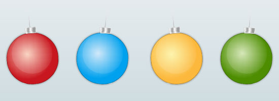
So how does our work look in various browsers? Let’s have a look, shall we?
Mozilla Firefox 3.6
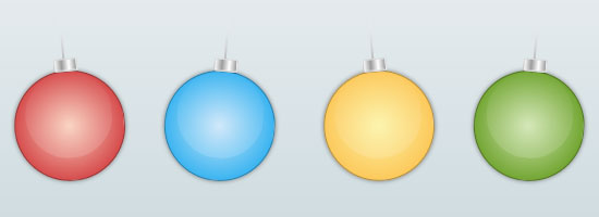
Google Chrome 6.0.4
In Google Chrome, you may notice slightly different color tones because of the difference in the way the CSS3 gradients are rendered.
Safari 5.02
The ornaments in Safari and Chrome are almost identical because they use the same layout engine (WebKit). 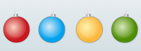
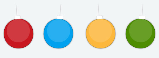
Opera 10.63
Although Opera browsers support most of the W3C CSS3 specs, the color gradients are missing so they degrade to the solid color we set for the background properties.
IE9 Preview
IE9 behaves similarly to Opera, but the latest news regarding this browser is that it will support 2D transformations like WebKit (with its own vendor prefix, -ms-). 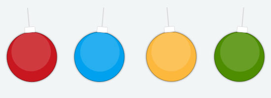
IE8
Even if IE8 has support for pseudo-elements like :before and :after, it totally lacks CSS3 support, so our baubles look like boxes. I included it here just for you to see how our work degrades in browsers that do not have CSS3 support.
They look like floppy disks (linked because our younger audience might not know what these ancient devices are), so they might be suitable for a geeky family’s Christmas tree! 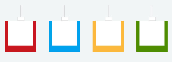 IE6 and IE7 couldn’t join our Christmas party for well-known reasons: they lack more than just CSS3 specifications support, but also the
 :before and :after pseudo-elements; so we would just have four squares with different colors in these two browsers. I hope you were inspired to learn about CSS3 in this guide and that you have discovered a trick or two that you can use in your projects.
I wish you a Merry Christmas and Happy Holidays!
Related Content
-
 President of WebFX. Bill has over 25 years of experience in the Internet marketing industry specializing in SEO, UX, information architecture, marketing automation and more. William’s background in scientific computing and education from Shippensburg and MIT provided the foundation for MarketingCloudFX and other key research and development projects at WebFX.
 -

WebFX is a full-service marketing agency with 1,100+ client reviews and a 4.9-star rating on Clutch! Find out how our expert team and revenue-accelerating tech can drive results for you! Learn more
Make estimating web design costs easy
Website design costs can be tricky to nail down. Get an instant estimate for a custom web design with our free website design cost calculator!
Try Our Free Web Design Cost Calculator
Share this article


Web Design Calculator
Use our free tool to get a free, instant quote in under 60 seconds.
View Web Design CalculatorMake estimating web design costs easy
Website design costs can be tricky to nail down. Get an instant estimate for a custom web design with our free website design cost calculator!
Try Our Free Web Design Cost Calculator


