
 The hyperlink has been a staple of the Internet since it began. The Web simply wouldn’t be a web at all if we didn’t link from one web page to another. Links make the Web work.
So it would make sense to put a lot of time and effort into how we design our links and navigation systems. But, this isn’t always the case. Oftentimes, we shortchange the information architecture phase of a site build and fall back to one of the few tried-and-true design patterns — a canned template — for designing site navigation.
The Status Quo of Site Navigation
One of the many beautiful things about Web Design is the near-limitless options available to us.
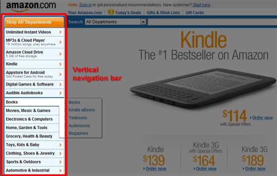
Yet, still, our navigation systems seem stuck into the existing preformed solutions. For small, personal sites, a simple top horizontal navigation bar is the typical option. 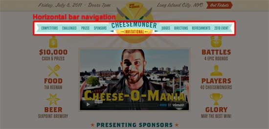 For larger sites with more pages to link to, we default to a stacked vertical navigation bar to give us the ability to include more links.
 In other situations, we find that drop-down menus or fly-out menus are used to keep the navigation menu compact.
 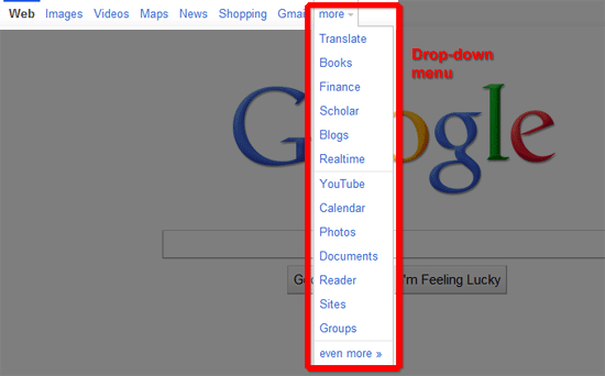 Drop-down menu on Google home page. It’s easy to see why we have these options. To some degree, we have been forced to conform to them because of the early limits in web design.
As time went on, our users got used to the status quo. As a result, we’ve been hesitant to rethink the way navigation systems are designed. And even if we didn’t put our users first, why spend time creating something new when the hackneyed solutions work?
(At least we think they do, anyways.) But are these conventional forms of navigation still the best solutions?
Natural Evolution
Since its inception, Web Design continues to evolve at a rapid pace. Our designs are getting easier to use, they’re more pleasing to experience, they have become richer in features, and are better optimized for speed.
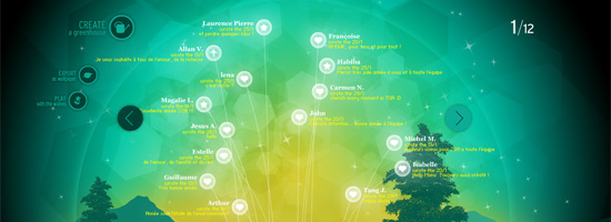
Through the changes, our conventions for navigation have stayed the same, perhaps with the exception of the short surge we saw of entirely Flash-based websites that introduced some pretty unique navigation system designs. 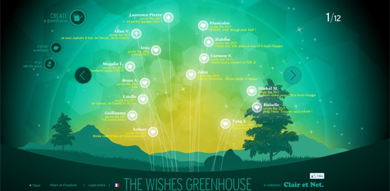 This Flash site forgoes the common navigation design patterns we see in most websites. While there are plenty of reasons to avoid going back to the days of entirely Flash website builds — whether your reasons are related to performance, SEO, web accessibility, independence from a proprietary technology, etc. — for most of our projects, we may still be able to gain some inspiration from what Flash sites showed us, especially in the rethinking of how website navigation can look and function.
As web browsers become broader in features and as web design specifications continue to advance — most recently with CSS3 and HTML5 — our design opportunities broaden. Website navigation should be at the forefront of our minds as we take advantage of these new technologies for the betterment of the user experience. We have already seen CSS3 in action to some degree, most notably on responsive web designs that transform the navigation menu’s layout on-the-fly depending on the size of the user’s display (with the help of media queries).
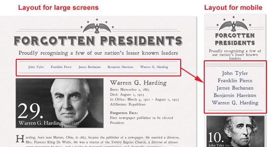 On the Forgotten Presidents site, navigation layout changes from horizontal to vertical depending on display size.
Change with Purpose
Of course, changing something just for the sake of change is a poor excuse. We shouldn’t be changing the design and layout of navigation systems just because we have the tools to do so. Instead, we should approach the situation by looking at existing issues with navigation design, and how we may address them with the new techniques available to us.
Some of the bigger questions touch on things such as where the navigation should be located, how expansive it should be, what shapes it consists of and what kind of feedback it will provide users. All of these lead to huge decisions that play a pivotal role in how usable, flexible and practical your design is. 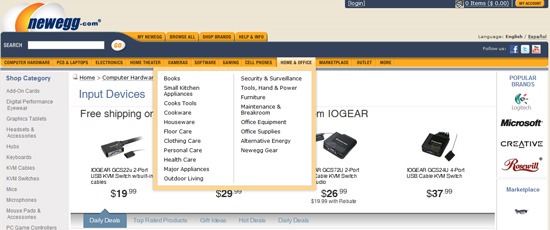 Newegg provides the ability to navigate its immense inventory of products with multiple navigation solutions.
The New Face of Navigation
CSS can do some downright exciting things these days and it’s in the nature of many designers to experiment and push the boundaries of innovation.
For example, blogger and web developer Chris Coyier shows that we can draw adaptive shapes that can transcend the scalability limitations of images. 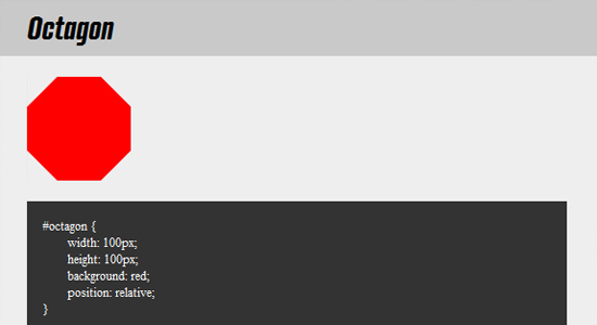 Graphic designer/web developer Alex Girón shows us that we can create pretty impressive animation effects and transformations with his experiment involving the solar system’s orbit. This sampling of possibilities demonstrates some pretty impressive capabilities.
It doesn’t take long to see that these experiments can be adapted practically to solve design problems. With shapes, and the ability to animate them, we have the building blocks to create flexible and imaginative interfaces.
Offline Inspiration?
We don’t have to go far to see new twists on navigation.
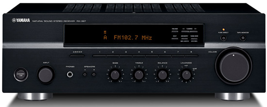
Our computers, stereos, appliances, vehicles, and even our keyboards all use a wide array of shapes, sizes and colors to build interaction. The spacebar on your keyboard is not larger than the other keys because it contains more characters. It’s used the most, so it’s the largest — an application of Fitt’s Law.
 Source: Wikipedia Compare the size of your spacebar to your Y key, for example. In your web design, could the Home link (or any other frequently used navigation link) also benefit from the same boost in size over a less important link? The interfaces on our sound system receivers, remote control, and car dashboards all house a wide variety of size, shape and color to denote differences in importance and function.
 We hold the ability to craft these solutions in our web interfaces without sacrificing flexibility or accessibility, the traditional reasons we’ve stayed away from them, using progressive enhancement and other best practices. To illustrate my point, I put together a quick example of an early-generation-iPod-inspired navigation using just HTML and CSS.
 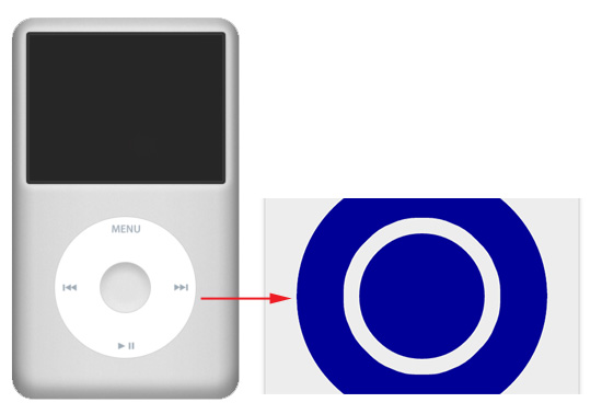 iPod illustration by Matthieu Riegler, Wikimedia Commons In reality, a circle can often provide a much more convenient use of space when compared to rectangular shapes.
Also with all of the active areas of our navigation naturally placed at equal distance from each other, this type of navigation is consistent with Fitts’ Law. Of course, this may or may not be the best solution for any single situation, but that is the beauty of our profession. Designers should be taking the time and consideration to explore all of the constraints each project comes with and working out individualized and ideal solutions.
Take Advantage of New Opportunities
Now, more than ever, we have the opportunity to use our creativity to solve complex issues with our navigation systems. The rapid adoption of CSS3 unlocks a huge amount of design potential. We can start to think outside of the limited array of design patterns we have for site navigation.
Related Content
-
 President of WebFX. Bill has over 25 years of experience in the Internet marketing industry specializing in SEO, UX, information architecture, marketing automation and more. William’s background in scientific computing and education from Shippensburg and MIT provided the foundation for MarketingCloudFX and other key research and development projects at WebFX.
 -

WebFX is a full-service marketing agency with 1,100+ client reviews and a 4.9-star rating on Clutch! Find out how our expert team and revenue-accelerating tech can drive results for you! Learn more
Make estimating web design costs easy
Website design costs can be tricky to nail down. Get an instant estimate for a custom web design with our free website design cost calculator!
Try Our Free Web Design Cost Calculator
Share this article


Web Design Calculator
Use our free tool to get a free, instant quote in under 60 seconds.
View Web Design CalculatorMake estimating web design costs easy
Website design costs can be tricky to nail down. Get an instant estimate for a custom web design with our free website design cost calculator!
Try Our Free Web Design Cost Calculator


