
 Negative space is often misunderstood as a tool to implement in certain designs that call for a simple aesthetic. However, it is in fact something you should pay attention to and carefully structure in every design you create. This guide discusses what negative space is and how to effectively use it to analyze and improve your designs.
What is Negative Space?
Negative space, also known as whitespace, can be loosely defined as the area of a page not occupied by content. More appropriately, it is the space between specific items on the page. Negative space does not have to be white, or even solid in color.
It can contain gradients, patterns or background objects. In the example below, you’ll see that it contains complex graphical content, yet it still employs negative space between the headline and the search bar. 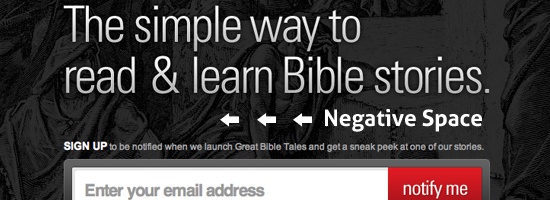
Negative Space is Not Minimalism
Contrary to popular misconceptions, proper use of negative space has nothing to do with minimalism.
It is true that minimalist designs are characterized by lots of negative space, but even the busiest of designs implement negative space either effectively or ineffectively.
Why Does Negative Space in Web Layouts Matter?
There are no absolute rules that separate good designs from bad ones. However, there are plenty of rough guidelines and general principles to follow in the quest for a strong layout.
Designing a webpage layout involves taking diverse objects and arranging them in an attractive, logical, and functional manner. The key concept to remember is that designing a webpage layout goes well beyond the attractiveness of the design elements you use. You can feature beautiful artwork made by the most talented artists in the world and still have an poorly-designed and unattractive web design.
Just as important as the aesthetic of the elements is the physical space being occupied by each element in relation to other items on the page. If you’ve never properly studied design theory, then you probably intuitively position objects without really knowing why you’re doing what you’re doing. However, as with many skills, if you want to improve, you should work on turning your intuitive ability into explicit knowledge.
This will help you power through design ruts and identify what is and isn’t working in a particular layout. It will help you rationalize why things are they way they are. You must learn to logically analyze both complex and simple arrangements of items, and identifying and using negative space is the key to this discipline.
Learning to See Negative Space
To use negative space effectively, you have to retrain your brain to look not only at the content on a webpage, but also the inverse of the content. The old cliche example is the wine goblet/faces illustration below. You can trick your brain into making two distinctly different interpretations of the image.
You will either see a wine glass or the faces of two people looking at each other. 
Negative Space in Logo Designs
Many logo designers have mastered the use of negative space and have utilized the concept for decades to create some excellent visual double entendres. Perhaps the most famous of these is the FedEx logo with its hidden arrow between the “e” and “x”.  One of my favorite examples of this kind of logo design is the superb logo below that features a mix of both positive and negative shapes to create a golfer and the head of a Spartan.
  The examples above are merely meant to get your brain ready to begin thinking about negative space instead of focusing on the content. In webpage layouts, the negative space is rarely used so cleverly and pertains more to the simple spacing between objects.
Simplifying a Design to Basic Shapes to See Negative Space
The easiest way to master the art of seeing and using negative space in webpage layouts is to simplify your layouts to basic shapes and examine the spatial relationships of the objects. For example, let’s take the design below and apply this method to it. 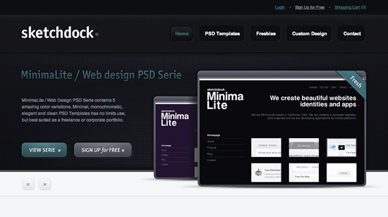 To eliminate all unnecessary distractions, we’ll convert it to black and white and reduce all of the objects to simple rectangles.
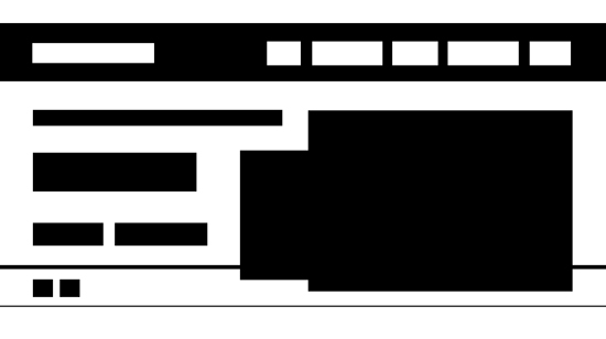 Now we can quickly and easily make clear mental distinctions between content and negative space. Remember to focus on the shapes that the white areas are making in addition to the black areas. A strong layout is subtle and it’s all in the gaps.
As you can see, this design actually uses very little negative space. Never let anyone tell you that this is a bad thing. Good layouts are not defined by the amount of negative space, but by the distribution of it.
For example, notice how the complex design above has a carefully structured volume of negative space between objects. Unique objects have been given similar spacing, while groups of objects have been placed closer together. This is the concept of proximity.
Simply put, if two items on the page belong together conceptually, place them closer to each other than to other objects. Visually speaking, if the objects on the page are equally spaced, it’s the items that break this trend that will stand out. 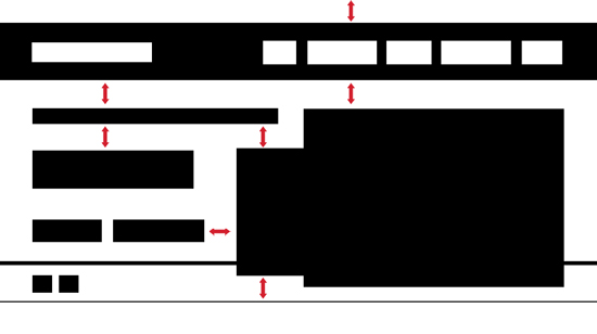 Again, this may seem a bit obvious, but the key here is to really start paying attention to these concepts in your own designs.
Analyzing and Improving Negative Space
Now that we’ve outlined a method for simplifying a design, let’s apply this technique to see if we can improve a layout. I was recently asked to critique a web design that would be a perfect example. When I told the designer that I liked his design in general, but thought that his use of whitespace needed work, he was quite confused as to what I meant.
To illustrate, I’ve recreated the basic layout below. 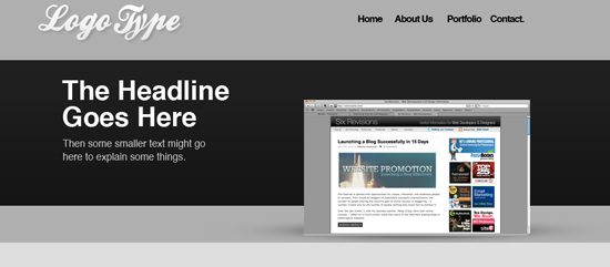 This is a perfect example of why filling your designs with lots of whitespace isn’t always a good idea. The layout above utilizes tons of whitespace — so much so that the designer didn’t know what to do with it all.
Let’s break this down using simple shapes like we did with the previous design.  As you can see, this makes it really easy to spot troublesome areas. Nearly everything on the page is distributed oddly.
There are large, unequal gaps that distract your attention rather than refocus it. Additionally, many elements are crammed too far to one side of an area, creating an asymmetric design. The designer was no doubt attempting to replicate a layout that he’d seen before, but failed to apply any sort of logic to the spacing of the elements.
What’s Wrong with It?
Let’s take a look at some of the problems with the negative space in this design. 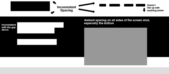 The diagram above points out just a few of the problems with this layout. As you can see, the objects in the header are misaligned.
Also, the negative space between the top of the page and the bottom of the header is too large for the sparse elements that it contains. Furthermore, the screenshot (on the right of the layout) seems oddly small in its space. There are strong arguments for surrounding an object with whitespace to better draw your attention to it, but this technique just isn’t working in this case as the page is too complex for this to work effectively.
Finally, the headline and sub copy aren’t aligned with the logo at the top left and could use some size adjustments to make better use of the space they’re in.
Fixing the Problems
Keeping your design in a basic wireframe, adjust the size and positioning of the elements to address the issue outlined above. Try to pay close attention to gaps all across the page that should be similar in volume, and break this trend when you’re using proximity to visually connect distinct elements.
Here we see a much more logical distribution of negative space. The header area has been reduced and the elements within centered vertically in the space.  The screenshot and headline have been enlarged to eliminate awkward gaps and give the page clear areas of focus.
The area under the sub-copy was looking a little empty, so an element has been added here to help eat up the space (notice in the screenshot below that this creates functional benefits with the addition of a button). Here’s what the example looks like when we apply our changes to the actual layout. 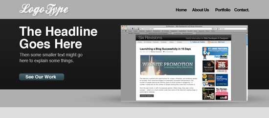
More is Not Necessarily Better Than Less
Notice that the negative space on the page has actually been decreased overall.
Don’t misinterpret this as an argument that less negative space is always a good thing, there are many cases where the opposite is true. Effective use of negative space is not a matter of quantity (e.g. “more is better than less”), it’s a matter of proper utilization.
Many discussions of negative space often wrongfully focus only on situations that call for an increase in negative space and tend to pitch minimal layouts as a miracle cure-all for bad design. In reality, improving your layouts means analyzing the current amount and appropriateness of the empty space in your design, and then deciding which areas have too much and which areas have too little. By doing so, you are optimizing website user experience.
Negative Space in the Wild
To conclude our discussion of negative space in webpage layouts, let’s take a look at a few sites that use negative space in completely different ways to accomplish a particular aesthetic.
Wide, Open Spaces
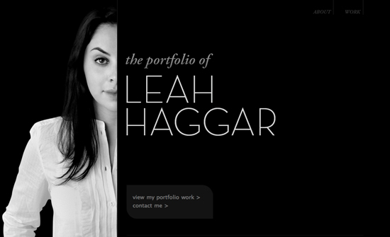
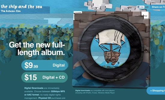
Designs that properly use lots of solid negative space typically appear classy and upscale. Simple, uncluttered layouts make the content easy to sort through visually and are ideal for highlighting a specific area of the page such as a product shot or JavaScript slider.


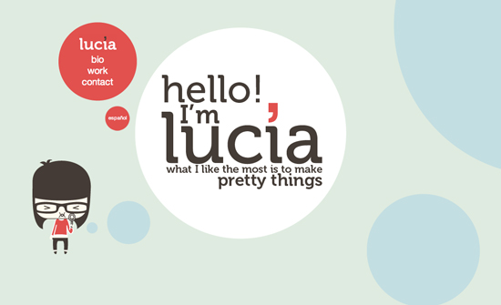
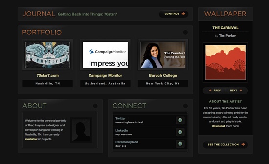
100% Organic
Not all whitespace is strictly structured to conform to the guidelines above. Organic designs specifically break these rules to provide a sense of natural randomness to the design. Remember to look at the gaps and not the content. The designs below are characterized by irregular spacing and sizing of the objects on the page.
This method tends to come across as informal or even fun and is particularly well suited for sites with lots of illustrations. 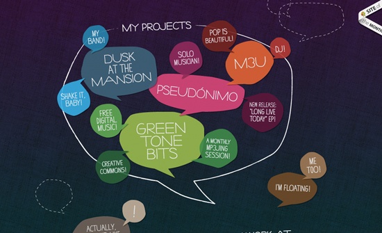
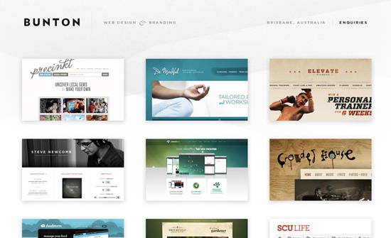
Busy Space as Negative Space
Some designers fill every nook and cranny of space with swirls, text, complex artwork and other random elements. If you look closely, you can see that the page still contains an underlying structure with primary content and plenty of negative space.
The difference is that the negative space has been disguised with intricate details to add visual interest to the page. 
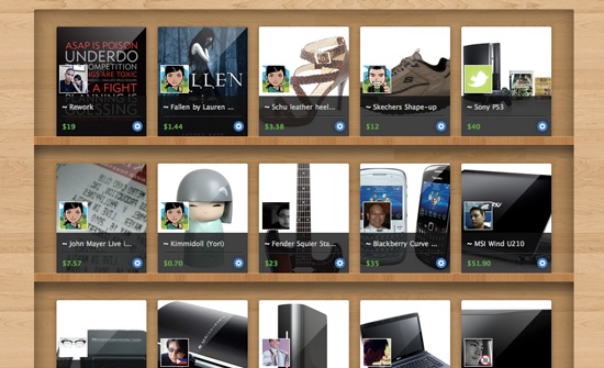
Negative Space in Grid Layouts
The last type of layout we’ll look at uses strict whitespace distribution. Grid-based layouts eliminate most variations in the sizes of gaps between elements.
This is ideal for organizing lots of content in a fairly small space in a regular and systematic manner. 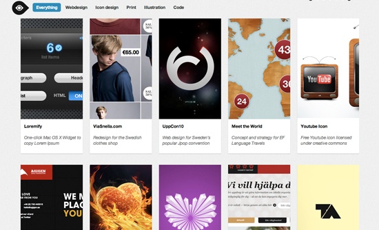
Closing Thoughts on Negative Space
To sum up, negative space isn’t something to pull out of your bag of tricks. It’s a major feature of every design that largely determines how a page is read and what type of impact it has on the viewer.
Learning to see and use negative space is the key to creating strong, consistent layouts with clear visual hierarchies.
Related Content
-
 President of WebFX. Bill has over 25 years of experience in the Internet marketing industry specializing in SEO, UX, information architecture, marketing automation and more. William’s background in scientific computing and education from Shippensburg and MIT provided the foundation for MarketingCloudFX and other key research and development projects at WebFX.
 -

WebFX is a full-service marketing agency with 1,100+ client reviews and a 4.9-star rating on Clutch! Find out how our expert team and revenue-accelerating tech can drive results for you! Learn more
Make estimating web design costs easy
Website design costs can be tricky to nail down. Get an instant estimate for a custom web design with our free website design cost calculator!
Try Our Free Web Design Cost Calculator
Share this article


Web Design Calculator
Use our free tool to get a free, instant quote in under 60 seconds.
View Web Design CalculatorMake estimating web design costs easy
Website design costs can be tricky to nail down. Get an instant estimate for a custom web design with our free website design cost calculator!
Try Our Free Web Design Cost Calculator


