
With all these CSS3 effects and tutorials popping up every day that show all the new and wonderful things we can make happen, we sometimes forget about poor little old CSS2.1 and the great potential it still has.
With very good browser support, we can do lots of cool things that we know will work in all major browsers.
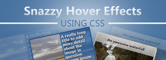
In this tutorial, I will be going over creating flexible advanced hover techniques using CSS2.1 properties.
Here is a live demonstration of the effect we will be creating.
Advanced hover states are quite simple
When I first started learning CSS, the :hover pseudo-element was no more than a way to remove the underline on a text link.
Since then, through experimentation, I have learnt that it is so much more powerful and it can create some really cool effects when used in conjunction with other CSS properties.
One of these effects is creating caption text to appear over the top of images, creating some nice visual feedback for the user and giving them some information about the image they’ve moused over or focused on.
The astute reader will see that this technique has great potential outside of what we discuss here, such as showing CSS tool tips when hovering over a hyperlink.
We’ll be using these key CSS property, pseudo-classes, and pseudo-element to accomplish our technique:
contentRather than create unnecessary mark-up to display our caption, we’ll use CSS generated content to add the caption.:hover,:focusLets us show/hide the caption overlay with our mouse/keyboard.:afterUsed in conjunction with the content property to dynamically append our caption content and layout.
Generated content is king
CSS-generated content allows us to append (:after) or prepend (:before) content to an element that can display hard-coded content, dynamic content (attr()), images (url()) and counters (counter()).
In this example, we’ll utilise the attr() function to extract the title attribute from the anchor (<a>) tag.
<li> <a href="#" title="Sunrise on the farm"> <img src="img01.jpg" width="200" height="206" alt="Beautiful sunrise" /> </a> </li>
ul a:hover:after { content: attr(title); }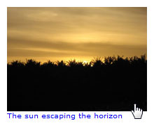
As you can see from above, the mark-up is very simple and the use of the content property allows us to create some great behaviour without the bloat. All it’s doing here is getting the anchor’s title attribute value and appending the content:after the anchor.
Make it sit nice
Now that we have some simple mark-up and are now displaying our caption on hover/focus after the image, we’ll add some extra CSS to pretty up the caption and make it sit over the image, rather than beneath it.
We first do some simple styling to the containing list item. The only style required here is the relative position.
Using a relative position allows us to absolutely-position elements inside the list item.
The other styles are decorative.
ul > li { position: relative; float: left; list-style: none; margin: 0 20px 20px 0; font-size: 10px; }Adding some more styles to our :hover pseudo-class, we absolutely position the CSS-generated content and give it a height, background, line height (this is the same as the height, so we can vertically-centre the text).
We also do the same for the :focus pseudo-class so someone who can’t use a mouse still gets the full experience.
ul a:hover:after, ul a:focus:after { background: rgb(255,255,255); bottom: 2px; content: attr(title); color: #000; display: block; font-weight: bold; height: 30px;line-height: 30px; position: absolute; text-align: center; width: 100%; }We’ll also add an outline around the image to create a nice border effect when the user focuses or hovers on it.
The reason we don’t use the border property is because outline doesn’t affect the area it “outlines”, whereas border will affect the element.
ul a:hover img, ul a:focus img { outline: 3px solid #ccc; } 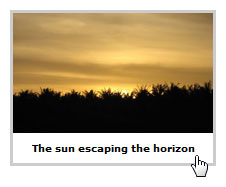
We now have a simple and effective caption overlay, which has very lean mark-up and some simple CSS to create an effective technique.
Let’s extend it further
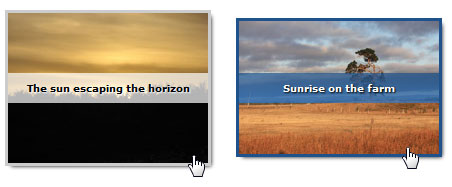
We have a simple caption overlay that works nicely, but how about we add some additional styles so we can change the position of the caption very easily by adding a couple lines of CSS?
We will create a .reverse class that we can assign to any of our anchor elements that will reposition our caption to appear at the top of the image rather than the bottom.
ul a.reverse:hover:after, ul a.reverse:focus:after { top: 0px; }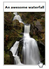
We can also create an .offset class to position the caption in the middle or offset it by any value. The negative margin is used to pull it into the middle.
ul a.offset:hover:after, ul a.offset:focus:after { top: 50%; margin-top: -15px; }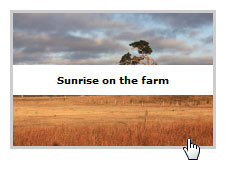
A sprinkle of CSS3
Of course, I couldn’t resist using some CSS3 goodness to make it that little bit nicer. At this point, we’re just using the principles of Progressive Enhancement where browsers that are CSS3-capable will have a slightly better experience.
Our effect will still work on CSS2-capable browsers (such as Internet Explorer) even after we’ve spruced it up with CSS3.
On the anchor I’ve added the CSS3 box-shadow property to create a nice drop shadow effect when the image is hover/focused on. The outline is set to none so that the dotted outline won’t appear when it’s focused on.
(Check out more CSS3 techniques.)
Normally this would be frowned upon, but since we are adequately showing that the image has focus by showing the caption, outlining the image and applying the drop shadow, it’s still obvious that the element in question has focus.
Note: It should be said that the box-shadow property has officially been removed from the W3C CSS3 draft specification for further discussion, however browser vendors appear to have no plans of removing it any time soon, if ever.
ul a:hover, ul a:focus { display: block; outline: none; -moz-box-shadow: 3px 3px 5px #000; -webkit-box-shadow: 3px 3px 5px #000; box-shadow: 3px 3px 5px #000; }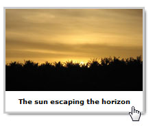
Using the CSS3 rgba() property, we can make the background slightly opaque so that the image can be seen beneath our caption. Setting rgb before our rgba value ensures that browsers such as IE8 still show a background.
ul a:hover:after, ul a:focus:after { background: rgb(255,255,255); background: rgba(255,255,255,0.7); }We can also add a CSS gradient in Firefox 3.6, Safari 4 and Chrome 4. (See another tutorial on using CSS gradients on your web typography.)
In the gradient, we also use rgba so that we can have an opaque gradient that blends between two colours.
background: -moz-linear-gradient(top, rgba(255,255,255,0.7), rgba(204,204,204,0.7)); /* Firefox 3.6+ */ background: -webkit-gradient(linear, 0% 0%, 0% 100%, from(rgba(255,255,255,0.7)), to(rgba(204,204,204,0.7))); /* Safari/Chrome */
To make the caption text pop out a little more, I’ve added the text-shadow property to give it a subtle drop-shadow on the text.
text-shadow: 1px 1px 1px #fff;
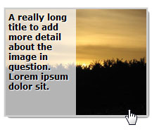
Another CSS3 property that is quite useful is box-sizing, which lets us adjust how the box model works.
ul a.alternate01:hover:after, ul a.alternate01:focus:after { top: 0; width: 50%; height: 100%; line-height: normal; text-align: left; padding: 4px; font-size: 12px; -moz-box-sizing: border-box; -webkit-box-sizing: border-box; box-sizing: border-box; }By adjusting the box model, the technique can further extend the caption by utilising box-sizing to our advantage, and so we can keep this technique as flexible as possible by making the overlay cover half the image and have the content run down the side.
With a few adjustments, it’s quite simple using this technique.
The box model—by default—adds padding and borders on top of the height that is set, and since we are setting our height to a 100%, this will essentially push out our overlay by a few pixels.
To change that behaviour, we utilise the CSS3 box-sizing property and set it to border-box. This allows us to set our percentage value and have any padding and borders calculated in conjunction with our height, so as not to push it out like it naturally does.
By default box-sizing is set to content-box. IE8 obviously doesn’t support this property, however IE’s box model naturally behaves like it was set to box-sizing: border-box and therefore doesn’t need any special treatment to work.
Mozilla and WebKit based browsers require their specific prefixes, whereas Opera supports it without any need for a prefix.
ul a.reverse:hover:after, ul a.reverse:focus:after { top: 0; right: 0; }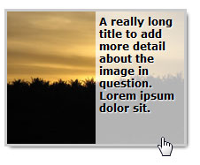
With a small addition to our original reverse class, adding right: 0, we can create some reusable CSS to reverse it either horizontally or vertically without affecting either of the anchors that have the .reverse class.
Depending on the caption type— horizontal or vertical—the .reverse class will handle either situation correctly.
It wouldn’t be CSS if IE didn’t do something funky
Of course, IE8—ironically, the first IE browser to support the full CSS2.1 spec—has got an issue with generated content.
Upon initial testing, I thought IE8 didn’t actually support generated content as when I hovered over the image, nothing was showing up.
After some testing and using a text colour that contrasted with the image, I noticed that the background colour wasn’t showing up, but the text was.
So then, I thought at least it still works, just not with a background. Not content with that, I investigated further and discovered that the background colour was appearing behind the image. Don’t ask me how or why this is happening.
I came up with a solution that fixes this issue and allows the CSS-generated content and its background to appear over the image like it does in the other browsers.
Basically, we give the image a relative position and set the z-index to -1 to force it under the generated content.
We then have to reset the position back to static for the better browsers as position relative causes havoc with the caption overlay.
I utilised the CSS3 not() pseudo-selector—which IE8 doesn’t support—and set the position back to its default behaviour of static.
ul li img { position: relative; z-index: -1; } /* For IE8 */ ul li:not(#foo) img { position: static; } /* Reset position for better browsers */Putting it all together
Let’s put it all together into a fully working version.
You can see a demonstration of the snazzy hover effects using various images sizes to show its flexibility.
Here’s the full markup required to create a single image with caption overlays. The demo page has more images on it, as well as demonstrating changing colours and shifting the overlaying caption into different positions as explained earlier in the article, just to show various potential tweaks and use cases.
<!DOCTYPE html PUBLIC "-//W3C//DTD XHTML 1.0 Strict//EN" "http://www.w3.org/TR/xhtml1/DTD/xhtml1-strict.dtd"> <html > <head> <meta http-equiv="Content-Type" content="text/html; charset=utf-8" /> <link rel="stylesheet" type="text/css" href="_styles.css" media="screen" /> <title>Snazzy hover effects using CSS demo</title> </head> <body> <ul> <li> <a href="#" title="Sunrise on the farm"> <img src="img_sunrise.jpg" width="300" height="200" alt="Beautiful sunrise" /> </a> </li> </ul> </body> </html>
And the CSS to transform the simple markup into a snazzy hover/focus effect.
ul { overflow: hidden; padding: 5px; } ul > li { position: relative; float: left; list-style: none; margin: 0 20px 20px 0; font-size: 10px; } ul a { text-decoration: none; display: block; } ul li img { display: block; position: relative; z-index: -1; } /* IE8 fix, background colour appears behind img for uknown reason set negative z-index */ ul li:not([class=na]) img { position: static; } /* Reset relative position, as this plays havoc with good browsers */ ul a:hover, ul a:focus { display: block; outline: none; -moz-box-shadow: 3px 3px 5px #000; -webkit-box-shadow: 3px 3px 5px #000; box-shadow: 3px 3px 5px #000; } ul a:hover img, ul a:focus img { outline: 3px solid #ccc; } ul a:hover:after, ul a:focus:after { content: attr(title); color: #000; position: absolute; bottom: 0; height: 30px; line-height: 30px; text-align: center; font-weight: bold; width: 100%; background: rgb(255,255,255); background: rgba(255,255,255,0.7); background: -moz-linear-gradient(top, rgba(255,255,255,0.7), rgba(204,204,204,0.7)); /* Firefox 3.6+ */ background: -webkit-gradient(linear, 0% 0%, 0% 100%, from(rgba(255,255,255,0.7)), to(rgba(204,204,204,0.7))); /* Safari */ display: block; text-shadow: 1px 1px 1px #fff; } Wrap up
We now have a simple technique that’s very capable using only CSS2.1. Of course, I also showed how to spruce it up with some additional—but not critical—CSS3 to make it a little nicer in more modern browsers.
We have good browser support; it works in all the latest release browsers.
And we made sure the technique was keyboard-accessible so that if you don’t or can’t use a mouse, the technique still works.
What do you think? Will you be using any of the techniques I’ve mentioned above? Why or why not? Share your thoughts and questions in the comments.
Download Source Files
- snazzy_hover_css (ZIP, 44.0 KB)
Related Content
-
 President of WebFX. Bill has over 25 years of experience in the Internet marketing industry specializing in SEO, UX, information architecture, marketing automation and more. William’s background in scientific computing and education from Shippensburg and MIT provided the foundation for MarketingCloudFX and other key research and development projects at WebFX.
 -

WebFX is a full-service marketing agency with 1,100+ client reviews and a 4.9-star rating on Clutch! Find out how our expert team and revenue-accelerating tech can drive results for you! Learn more
Make estimating web design costs easy
Website design costs can be tricky to nail down. Get an instant estimate for a custom web design with our free website design cost calculator!
Try Our Free Web Design Cost Calculator
Share this article


Web Design Calculator
Use our free tool to get a free, instant quote in under 60 seconds.
View Web Design CalculatorMake estimating web design costs easy
Website design costs can be tricky to nail down. Get an instant estimate for a custom web design with our free website design cost calculator!
Try Our Free Web Design Cost Calculator