
Symmetry creates balance, and balance in design creates harmony, order, and aesthetically pleasing results. It is found everywhere in nature, and is probably why we find it to be so beautiful. Symmetry is one of the fundamental principles in gestaltism, a human behavior theory that proposes that our mind naturally creates order and completeness in the things we see and encounter.
However, symmetry can get boring. Asymmetry is a break in symmetry, which when used effectively, can make things more interesting. We will also talk about asymmetry.
How can designers use symmetry as a tool? In this guide, we’ll look into symmetry as a part of design and cover the basic concepts of symmetry, some symmetry techniques, tips and best practices, and a discussion of a few websites that embody symmetry.
Types of Symmetry
There are three types of symmetry: reflection (bilateral), rotational (radial), and translational symmetry. Each can be used in design to create strong points of interest and visual stability.
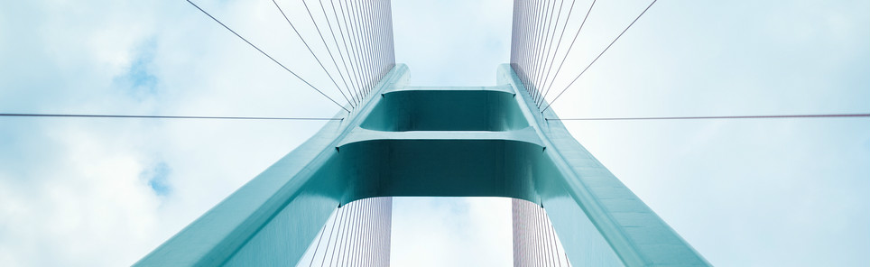
Reflection Symmetry
Reflection symmetry is also known as bilateral symmetry.
It is the “mirror” effect, or when one object is reflected across a plane to create another instance of itself. 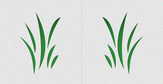 The most common type of reflection we think of, and the most common we see in nature, is horizontal reflection (a butterfly, the human body), with the central axis being vertical. Reflection symmetry can take on any direction: vertical, diagonal, and anything in between.
Rotational Symmetry
Rotational symmetry (or radial symmetry) is when an object is rotated in a certain direction around a point.
 Rotational symmetry in nature is found in everything from the petals of a flower to the topside view of a jellyfish. In art and design, rotational symmetry can be used to portray motion or speed. Even on a static medium, rotational symmetry can convey action.
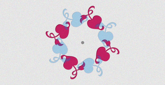
Translational Symmetry
Translational symmetry is when an object is relocated to another position while maintaining its general or exact orientation.
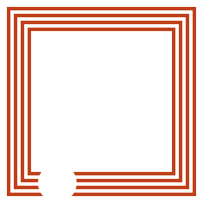
In the example below, we’ve moved one object several times at even intervals. These intervals do not have to be equal in order to maintain translational symmetry; they just need to be proportional. 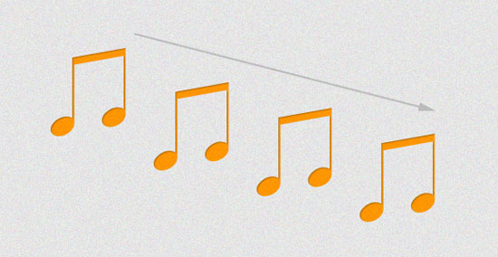 Translational symmetry can be used to create patterns, such as in the case of tiled website backgrounds and repeating design elements.
It can also be used strategically and more profoundly to create the feeling of motion and speed just like rotational symmetry.
Asymmetry
Asymmetry is the lack of symmetry. Asymmetry can also represent an object that breaks a predefined pattern of symmetry, or an imbalance of design elements. Asymmetry can be used as a design tool to create points of interest and organize visual hierarchy within a group of similar elements.
It creates disorder, which can call attention to certain points of a design through distinction. In nature, we can see asymmetry in tree branches, in clouds, and in the fur of animals.  We may find asymmetry appealing because of its ability to introduce visual complexity and variations to an otherwise orderly design.
Asymmetry vs. Symmetry
An asymmetrical object is visually heavier than symmetrical objects. Therefore, symmetry is great for patterns, backgrounds, the general layout, content, and anything else that is meant to be visually passive. Asymmetry is effective in drawing attention and breaking monotony.
Symmetry/Asymmetry Design Tips and Best Practices
When working with symmetry (or asymmetry) in design, there are several best practices you should keep in mind.
Use Symmetry Strategically
Strategic use of symmetry (and the lack of it) is a powerful design tool. Designs that need more stability, a strong organizational structure, and a classic and trusting message, tend to use more symmetry in the design. For risk-loving designs, providing asymmetry can reinforce the message.
You can use asymmetry to punctuate an otherwise orderly, boring design.
Translational Symmetry is Good for Layout Structure
Keeping pieces of content roughly the same size and spanning them across a web page or print piece is a great way to keep symmetry while maintaining enough space for all of the essential text and imagery. For example, many grid layout systems (such as the 960 Grid System) exhibit translational symmetry in the way they break up column widths to maintain balance and proportion. 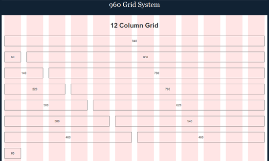
Use Rotational Symmetry to Convey Movement and Action
Rotational symmetry can simulate motion even in an otherwise flat and static medium.
It can also infer progress or forward movement. 
Use Asymmetry to Draw Attention
Asymmetry can make designs more interesting overall, but it serves another primary purpose: to grab attention and create visual hierarchy. Sometimes a design can intentionally be thrown off balance to direct the viewer’s eyes to a certain area.
Follow Your Gut Instinct
Symmetry is natural. If you know of Gestalt principles, then you’ll no doubt already know that our brains are wired to create symmetry and balance in the things we encounter. Our bodies have natural symmetry.
Symmetry is in nature and is all around us. If something looks and feels unbalanced, it probably is.
Symmetry in Web Design: Examples
Below you’ll find 15 examples of how symmetry and asymmetry are used in designs. From the use of symmetry, we can see how each design portrays a certain message, with those designs that have more symmetry being more calming and organized, while those with more asymmetry tend to be more unconventional and organic.
IWC 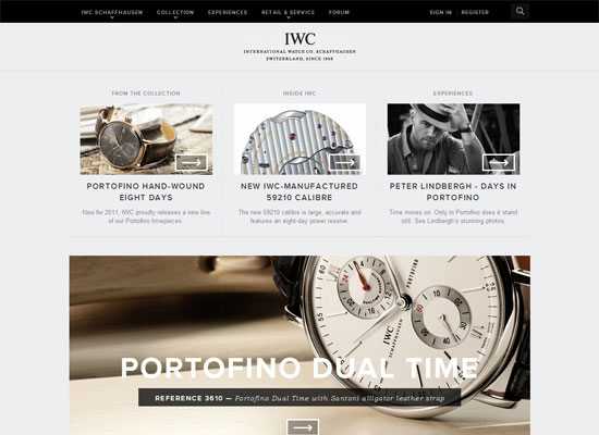 In the IWC website, we see both translational and reflection symmetry. Many elements and blocks of content are centered and are evenly proportional on both sides to create reflection symmetry, and we can see how sections of content are kept to the same size and then translated across the page. With the use of these two forms of symmetry throughout the entire design, this website has a very stable and professional look.
Regenerator 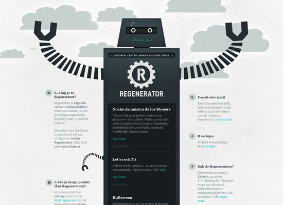 Regenerator is a great example of reflective symmetry in web design. Everything from the logo to the central piece (an illustration of a robot) is reflected horizontally. This fairly simple solution creates a great design.
Beanstalk 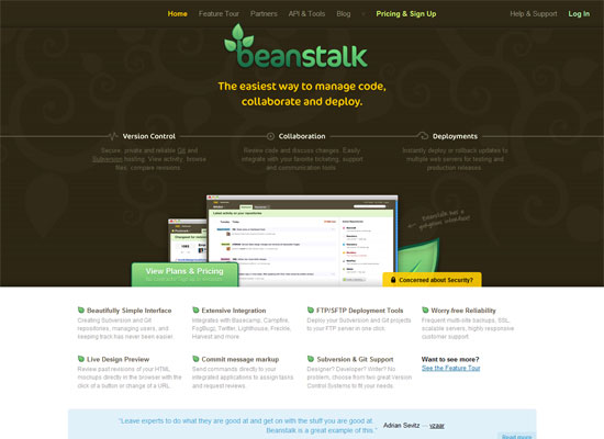 For the most part, this design remains centered and creates a horizontally symmetrical look. Although the imagery is not an exact reflection, the overarching balance of the design is. We also see content elements located at the top and bottom of the layout shifted (translated) horizontally across the page for further symmetry.
Pointless Corp 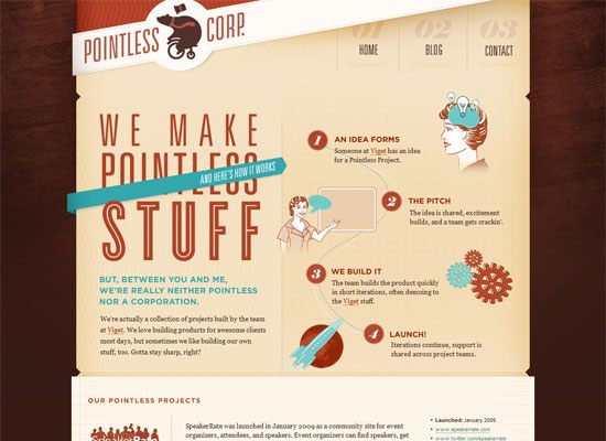 Pointless Corp has a very asymmetrical design, which makes it creative, whimsical, and visually appealing (although there is also symmetry involved to help keep the design cohesive). Note how some shapes and directional flow are repeated (a manifestation of translational symmetry). The Idealists
 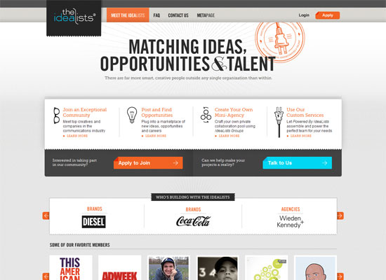 We can see both translational symmetry between the shape and size of content blocks, and reflection symmetry from the main elements centered and evenly spaced across a vertical plane in this web design.
This design, however, does a bit more by adding some interest with overflowing elements such as the logo and imagery. Note that even though these two design elements (and a few more throughout the site) add visual interest, they still balance each other out to maintain symmetry in the design. The logo on the left is darker and overlapping, but it is balanced by the more complex and brighter image to the right of the tagline.
Typographisme 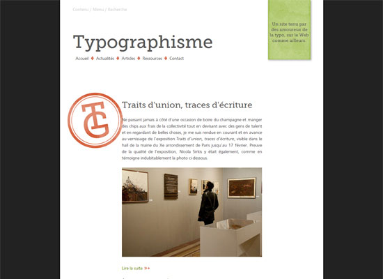 This web design uses reflection symmetry. The main content is evenly centered, and would match up on either side if folded in half. However, we can also see that there are plenty of asymmetrical elements, employing them to create visual hierarchy and distinction in certain areas of the design.
The orange “TG” stamp, for example, serves to punctuate the monotonous symmetry. Coda Automotive 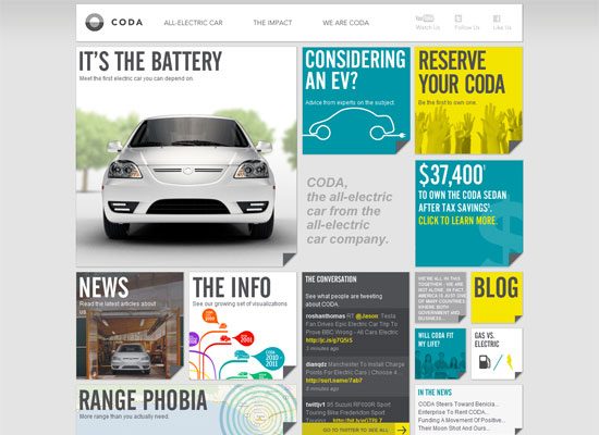 Coda Automotive is a content-heavy site, which means balance and organization is essential to site usability. We can witness a lot of translation symmetry in this design, where the same-sized block shape is repeated in various locations.
For interest — and likely due to practical content-related layout purposes as well — the shapes of the squares also vary in size, yet still maintain visual balance on either side by mixing up size versus complexity, color, and density. Jessica Allen 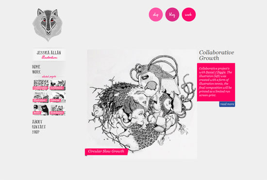 This web portfolio is likely the most asymmetrical design in this showcase. There are a few areas of translational symmetry, and the logo provides perfect reflection symmetry, but beyond that, not much else.
As you can see, asymmetry is equally effective as a design tool. Ambassadors for Life 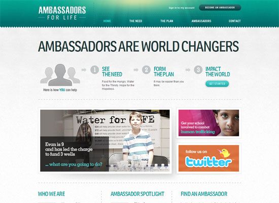 Here again we see a lot of translational symmetry in the content, from the size of the content blocks to the additional imagery surrounding those blocks. There is some reflection symmetry present in the logo, as well as in the image directly below it.
What keeps this design interesting is the jarring asymmetry in the main photos below the “process” content, helping draw focus to the site’s featured story. QTRLY 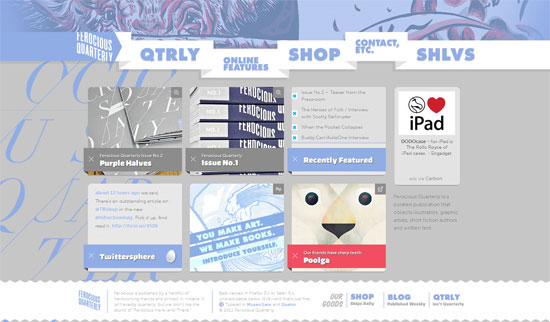 The background and main navigation menu of QTRLY are abstract. However, the main featured pieces of content are repetitive blocks, translated horizontally and vertically for balance and structural integrity.
Elegant Seagulls 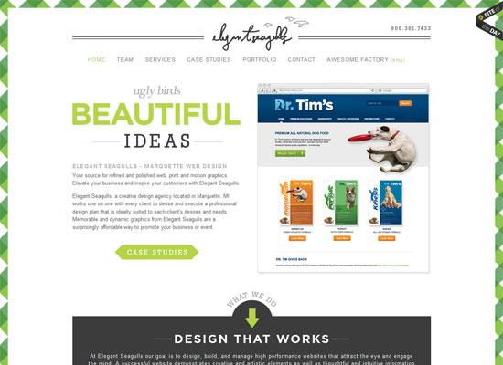 The Elegant Seagulls website is a symmetrical design. The logo, tagline, and navigation are all centered, as are many other header elements. The listed section of services towards the bottom of the layout also displays translational symmetry.
Dark Sky 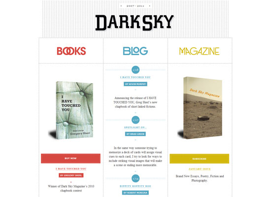 This web design is clean and simple, but embodies a grid layout that maintains translational and reflective symmetry. Where there is a book image on one side, there is another one at the opposite of it. Polecat
 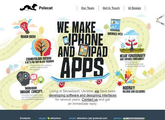 Polecat features rotational symmetry put to use in web design.
There is a general use of rotational symmetry up top around the list of features, but also a more concrete use down below by the “Our Team” section. Beyond this, there’s asymmetry going on in the background, while the main elements of content retain balance. This is a great mixture of using visual interest created by asymmetry, with balance, proportion and organization made with strategic symmetry.
SVN 2 FTP 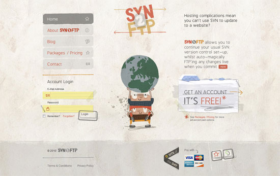 The general layout and imagery of this entire design features reflection symmetry, yet each element individually holds a lot of uniqueness and lack of symmetry. For example, the image of the two characters holding up the Earth graphic is relatively symmetrical, yet has details that would not allow it to line up perfectly. This creates just enough balance and stability, while at the same time preserving uniqueness and creativity.
Forever Heavy 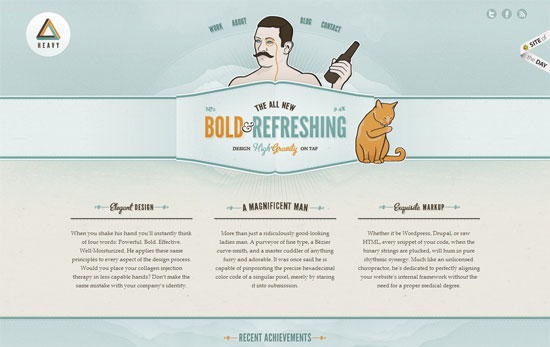 Forever Heavy is another mainly centered design, with its design components more or less centered and reflected horizontally. However, note how asymmetrical items are used to punctuate the general symmetry the layout has.
Summary
Symmetry (or lack thereof) can be a very strong tool in design projects. It can create or maintain balance, calmness, and stability.
It can communicate integrity, professionalism, and solidarity. Asymmetry, on the other hand, can develop strong points of interest, uniqueness, and character. Using symmetry and asymmetry in their various forms can do a lot for our designs.
Resources and Further Reading on Symmetry
- Is Your Web Design Balanced?
- Symmetry and Asymmetry in Web Design
- Does Red Weigh More than Blue?
- A Treatise on the Aesthetics of Symmetry
- Tools and Resources for Creating Symmetrical Patterns, Art, and Design
Related Content
- Reductionism in Web Design
- Creating a User Interface That Speaks Your Users’ Language
- Minimalism in Web Design: A Guide
-
 President of WebFX. Bill has over 25 years of experience in the Internet marketing industry specializing in SEO, UX, information architecture, marketing automation and more. William’s background in scientific computing and education from Shippensburg and MIT provided the foundation for MarketingCloudFX and other key research and development projects at WebFX.
 -

WebFX is a full-service marketing agency with 1,100+ client reviews and a 4.9-star rating on Clutch! Find out how our expert team and revenue-accelerating tech can drive results for you! Learn more
Make estimating web design costs easy
Website design costs can be tricky to nail down. Get an instant estimate for a custom web design with our free website design cost calculator!
Try Our Free Web Design Cost Calculator
Share this article


Web Design Calculator
Use our free tool to get a free, instant quote in under 60 seconds.
View Web Design CalculatorMake estimating web design costs easy
Website design costs can be tricky to nail down. Get an instant estimate for a custom web design with our free website design cost calculator!
Try Our Free Web Design Cost Calculator


