
 Websites and web applications are getting more and more interactive each day. Content on websites have the advantage over their printed counterparts in that, if we wanted to, we can let our users interact with them. We have already discussed site navigation patterns and popular web content presentation patterns.
Now, let us explore some UI patterns for our interactive website content.
Edit-in-place
Edit-in-place is a valuable UI for web applications that either allows users to create or edit content. Edit-in-place means that users can edit values right where they appear within the page instead of going to a new page with another interface. Edit-in-place is often seen in WYSIWYG editors and apps that focus on data entry or organization (like mind-mapping apps, for example).
When to Use
Use edit-in-place as a UI design pattern wherever practical within your web apps.
It’s more intuitive to use and causes less confusion among users.
Examples
Here are two examples of edit-in-place. Flickr In this wildly popular photo-sharing site, users can edit photo titles and certain other information in place.  Lovely Charts This mind-mapping app has an edit-in-place editor, making it super easy to use.
Copy Box
Copy boxes are useful anytime you’re sharing formatted text or code with your visitors. A copy box provides formatted text that can be easily copied to a user’s clipboard. Some sites have an auto-copy feature, so that text is copied as soon as the user clicks inside the box.
This saves time and makes it easier for less tech-savvy users to copy the text they need. In most cases, a note indicating that text is automatically copied is displayed next to the box. Other times, a button is provided to copy text or keyboard shortcuts are provided.
When to Use
Use a copy box any time you want your visitors to copy formatted text or code from your website.
Examples
Below are three examples of copy boxes used on website interfaces.
Snook.ca This blog uses copy boxes wherever code snippets are displayed.  Web Designer Wall This popular web design blog uses copy boxes for code snippets.
  Mozilla Ubiquity The copy box used on this site is formatted a bit differently, with code showing up parallel to the descriptions rather than underneath.
Input Suggestion and Forgiving Format
Search boxes and other input fields that allow for a variety of inputs are becoming more popular. For example, a mapping app might allow users to enter a zip code, coordinates, or a city and state all within the same input box, and either suggesting a correction of the input or allowing the user to enter it as-is and making the server-side code parse and correct the entered data. This reduces confusion and makes it quicker and easier for visitors to supply the information they want to.
It also lends itself nicely to a more streamlined and cleaner layout versus multiple input boxes.
When to Use
Any time there is a variety of possible inputs for a box, it makes sense to use input suggestion and a forgiving format that allows multiple types of inputs.
Examples
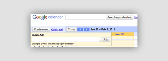
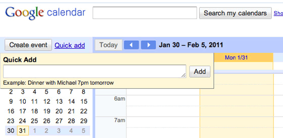
Here are three examples of input suggestion and forgiving format. American Airlines This redesign mockup by Dustin Curtis would use a forgiving format for booking travel, allowing users to enter their search terms the way they want to. 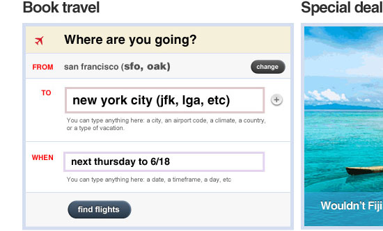 Google Calendar The Quick Add function in Google Calendar uses an auto-suggestion and a forgiving format for input.
 Bing Maps Bing Maps offers forgiving search inputs when you are looking for directions.
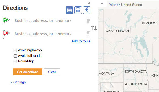
Multi-Step
Any time you have a lengthy web form for your visitors to interact with (e.g. checkout forms, questionnaires, and signup forms) it can be made less daunting if you split it up into multiple steps.
A common practice for multi-steps is to show the user which step of the process they’re on and how many steps they have left. Note that multi-steps do not negate the fact that your web forms should always be as short as possible.
When to Use
Any time you have a form or other process that takes more than half a dozen questions, it can be helpful to users if you break it up into multiple steps. Remember, though, that having too many steps can be just as frustrating, so make sure you account for that situation.
Also, make sure that answers are saved between each step, in case the user runs into any problems. In addition, make sure that users can review and go back to change or edit their answers in previous steps.
Examples
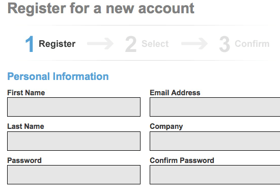
Here are four examples of multi-step web forms. Statement Stacker This site uses a three-step web form for their signup process.
 Livestream This live streaming platform has a three-step signup process.
 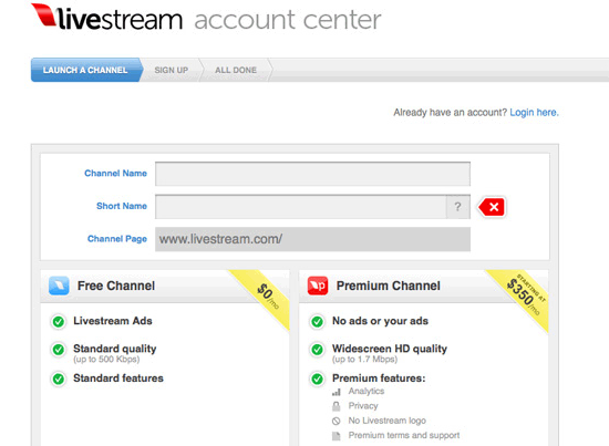 Autobutler.dk This website uses a five-step signup process, but each step is short.
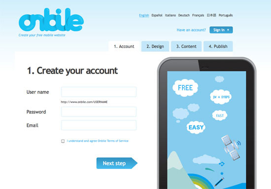
 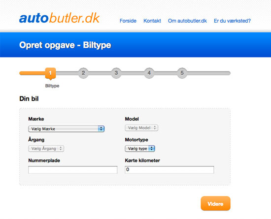 Onbile Onbile has a four-step process for creating a mobile website.
Hover Controls for Content
UI controls for pieces of content can make it easier to interact with. These controls often appear when you hover over the target content. Facebook, for example, makes great use of hover controls in the newsfeed.
Hover over someone’s status in your newsfeed, and you get the option to block them or remove their updates from your feed. Hover over your own Facebook status or comment, and you get the option to delete it. It’s user-friendly and de-clutters the user interface.
When to Use
Any time you need functions that are easily accessed but aren’t used often, hover controls can be the perfect solution.
Examples
Here are a couple of examples of hover controls for content.
Facebook On Facebook, hover controls allow admins to edit a Facebook Page’s information. 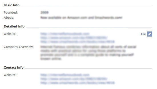 Twitter Twitter uses hover controls to show options for replying to a tweet, along with retweet options and other controls.
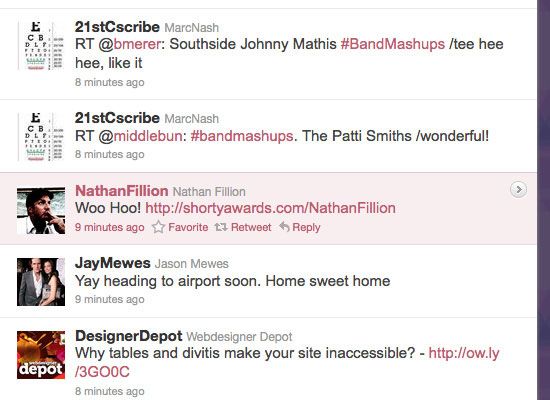
Related Content
-
 President of WebFX. Bill has over 25 years of experience in the Internet marketing industry specializing in SEO, UX, information architecture, marketing automation and more. William’s background in scientific computing and education from Shippensburg and MIT provided the foundation for MarketingCloudFX and other key research and development projects at WebFX.
 -

WebFX is a full-service marketing agency with 1,100+ client reviews and a 4.9-star rating on Clutch! Find out how our expert team and revenue-accelerating tech can drive results for you! Learn more
Make estimating web design costs easy
Website design costs can be tricky to nail down. Get an instant estimate for a custom web design with our free website design cost calculator!
Try Our Free Web Design Cost Calculator
Share this article


Web Design Calculator
Use our free tool to get a free, instant quote in under 60 seconds.
View Web Design CalculatorMake estimating web design costs easy
Website design costs can be tricky to nail down. Get an instant estimate for a custom web design with our free website design cost calculator!
Try Our Free Web Design Cost Calculator


