
 A core place to begin a website discovery process is to learn the goals and objectives of your client. It is imperative to understand what the website needs to do and which things are the most important. In order to do that, we need to establish a hierarchy.
A hierarchy is essentially an order of items, goals, ideas, and/or needs. Hierarchy in web design is centrally about influencing a user to understand and embrace the principal goals of a website and interact with the material in the ideal order to facilitate a smooth and pleasant experience with the website.
Practical Hierarchy
If you have ever learned a business theory, played a video game, ordered from a menu, or interacted with businesses, then hierarchies are already a huge part of your general knowledge. Hierarchies are the key to communicating value, importance, and order.
The Power Structure
A hierarchy does not need to have an actual chart or diagram to explain the position, relationships, importance and relative value of its contents, but it’s certainly a useful exercise.
The actual structure of a hierarchy is called the power structure — a very appropriate name. To create a hierarchy for a website, most designers will start with a site map or flow document for a website. A site map is a roadmap to the site’s architecture.
This is an inherent structure that builds and drives the website. Without a plan, the website is going nowhere fast. Just like a site map guides our decisions on structure of content, a power structure serves as a guide and reference point for the visual hierarchy.
Below is a basic power structure for websites. This will cover many common website setups, but it does have some exceptions (such as resource sites and enterprise-level structures). 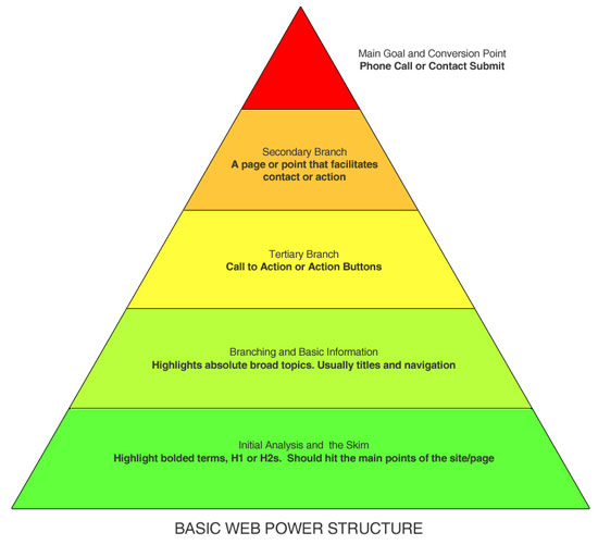
The Power Breakdown
In any hierarchy, no element is superior to itself, so it must be assigned to a rank and level.
Further, a hierarchy must have an absolute superior element, or a hierarch. I would like to give you a basic template and roadmap for building your own power structures.
The Hierarch
It almost goes without saying, but a website needs to have an ultimate goal or objective. Sure, a website can have multiple goals and objectives, but at the end of the day, there is one objective that is crucial to measuring the success of the website.
Whether the hierarch is X amount of page views, getting a 2% conversion rate to the contact page, or pushing every customer to call the client, it must be clear what you are aiming for. No one gets very far swinging in the dark.
The Ranking
Under the hierarch, the objects of interest must be ranked based on conversion and importance. This is where it gets a bit tricky. You might think that if something is on a higher level, that it is instantly a priority over the lower elements, right?
Wrong. There is a subtle but important difference between priority and importance. While superior elements are certainly more important, that means they rely heavily on their subordinate elements for success and exposure.
The Skim: Power Level 1
There is a basic concept of design: I will call it “The Skim”. Even if you have never heard this term, you still probably know what it means. Common sense, heat map studies that track eye movement and activity, and the human mind will tell us that we have shorter attention spans than we think. We skim first and read afterwards.
It is likely that you skimmed over this article for words and images of interest before making the decision to read it. Even though addressing “The Skim” is in the bottom power, it is still essential. You cannot direct your user to a branch, call to action, or conversion goal if they have left the website.
Alright, so how do you address this “Skim”? It’s not as hard as you think, but it requires some planning and organization. Luckily, HTML has a structure for this built right in for us.
The heading tags (e.g. <h1>, <h2>, <h3>) are an essential part of markup, not just for search engine optimization, but also for your hierarchy. This particular concept strikes a direct cord with visual hierarchy.
Simply put, make you most essential points big, bold and clear. In the following example, we can see the “Skim” layer has been addressed with a value statement and a few simple feature listings. It is clear what this site is for, why I am here, and what I can do. 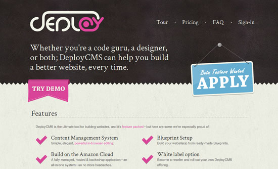 DeployCMS
Branches: Power Level 2
Now that we have jumped the “Skim” hurdle and kept the user on the site, we have established a basic structure in the user’s mind.
This is similar to when you walk into a McDonald’s and think, “Hey, they have tasty burgers.” The next power level of a hierarchy is setting up and handling branches. A branch is a fancy way of saying that not everyone will click the same thing. A branch should attack with broad topics, general points of interest, or important points.
Normally, branches fall into typical items such as specific services or areas of the website and branch the user toward different subjects. Always remember that you don’t have to have a lot of branches — many times, simple is smarter. When a user chooses a branch, the hierarch should never be out of the picture.
On the web, reiteration is your friend. In the example of Barley’s, the branch is bold and clear: Menu or Beer. Many users feel good about choice.
But not too much choice — just enough to assist them in making discerning decisions. 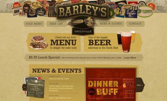 Barley’s Greenville
Call to Action: Power Level 3
The call to action is something that most designers will be familiar with. It is clear how this fits into hierarchy.
This is because a call to action has to stand out and grab attention.  However, there is something that you may not know. Sometimes a call to action is more powerful when it’s not a button, or more specifically, not a call to direct action.
Just like people don’t like being up-sold at a restaurant or an electronics store, they will react similarly online. Users believe that they know what they want. If super big, loud, in-your-face call to action buttons worked well, then by the same logic, flashing online web banners would be more popular.
A gentle — but still commanding — call to action can be more effective. In this example, “Read On” is loud and draws your attention, but it doesn’t ask for a commitment like “Register Now!” or “Buy Now!” 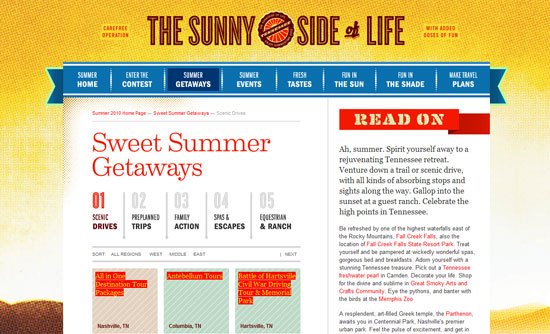 TNVacation.com It is commanding of attention, but in a less abrasive manner. I’ve heard from many designers that I should be making my buttons as garish and in-your-face as possible.
What are we? Used car salesman? No one likes that kind of marketing, and website users are no different.
The basic idea is clarity and respect. Use calls to action to make your users aware of primary points and focus on supporting ideals to the hierarch, but don’t shove it in their face.
Facilitation: Power Level 4
The facilitation level of hierarchy is the last object that the user interacts with before they get to the hierarch. A fatal mistake that many designers will make in formulating their power structure and strategy is that they combine the facilitation with the hierarch.
That is to say, a landing on the contact page does not equal an email or a phone call. Just because you have gotten the user to the conversation point, does not mean the battle is over — you still need to make the conversion. For this piece to work within the hierarchy, the facilitation page must reinforce all the previous objects and entice the user to continue to the finish line.
How do we do that? Easy! Make sure that labels are easy to skim, include the core pieces of information you need, ask for minimal commitments and remember to be friendly and commanding, but not unpleasant or abrasive.
In this example, we are looking at a contact page for a web design company. On “The Skim”, we are able to quickly figure out what each section is. 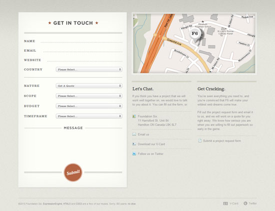 Foundation Six The formatting is clean, attractive and non-threatening.
The contact form asks a few questions, but they are straightforward and mostly utilize dropdowns, so providing responses carry little time and brainpower commitment. Notice that the language used is still using a commanding tone but is friendly and approachable. Finally, we come to the “Submit” button that is the hierarch on this page.
Power It Up!
That covers the basics of power structure.
I encourage you to run through the exercise of creating a structure for any current websites you have and then compare it to your analytics reports to see if your goals and hierarchy actually line up. There are actually more types of hierarchy situations going on then you might think. Now that you have a feel for how to build a hierarchy, let’s talk about what battles we are fighting on each website.
Let’s take a break from hierarchy and look at the psychological side of it all.
Applying Gestalt to Power Structure
We have just reviewed the elements of building a hierarchy. Let’s take it one step further and delve into the psychological aspects of hierarchy.
Understanding the Whole Picture
Gestalt, which translates roughly to “Unified Whole” in English (from German), is a school of psychology that addresses visual perception in humans. I highly recommend that you check out this overview of Gestalt application in design for a broader discussion of Gestalt.
Gestalt seeks specifically to explain how humans organize visual elements into groups or whole pieces of information based on a number of factors and organizational paradigms. Gestalt hleps us udnaersntd how it’s poiblsse taht you jsut raed tihs secnetne eevn tguohh alosmt erevy wrod is mssiplleed. What does this mean?
A design is the sum of its parts — but those parts have to fit and have to address the problems. We can’t hope to attack problems head-on if we don’t understand how the pieces will fit together. Many designers will make important decisions about hierarchy, usability or design based on how they personally perceive something.
This can be dangerous when objectively trying to understand how a user will see the same thing. Spending some time to learn about general facets of visual perception will help you move your design approach outside of your own perception and create more effective designs. We want to attack how to build your power structure and use a handful of Gestalt ideals in tandem with other methodologies and techniques.
Hierarchy is as much about ordering information as it is about how the entire design fits together. Usage of hierarchy is like a good strategy for a sports team: While the team may have some star athletes, they cannot run the play alone. The team is only as effective as their teamwork and overall approach; they must function as a unified whole to most effectively leverage the strategy.
Continuation
Continuation is a principle that is demonstrated when the eye is propelled from one object to another by implied movement.
The appropriate application of continuation in web design is undeniable. A designer should seek to build a design that guides the user’s eye from one object to the next. The most simple example of continuation is a well-placed arrow towards the next item, but finely crafted flourishes or smooth curves can be just as effective.
 Let’s look at some examples.
 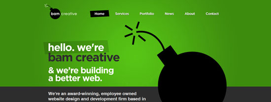 Bam Creative Don’t see it? I gotcha covered.
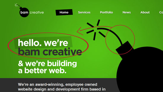 In this example, the bomb grabs our attention first because it is a strong form. The fuse on the top has a curve that moves across then down. It almost forces the user’s eyes to move along the fuse and jump to the greeting text that is anchored on a high contrast text-block with a slight green backdrop.
Look at the following and see if you can identify the use of continuation: 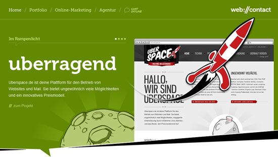 web://contact Did you find it? Here’s the answer below:
 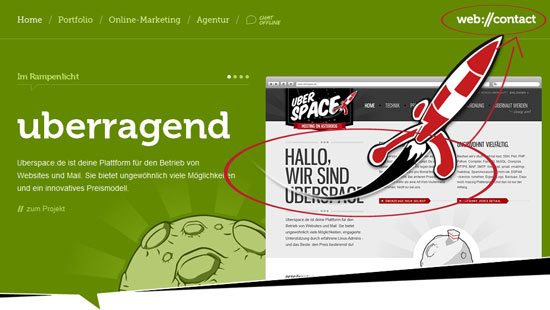 While continuation may not always be appropriate, remember that when you need to help a user locate a specific element, you can guide their eye to it and they won’t have much choice in the matter.
Similarity
When a group of objects looks similar to one another, humans will generally perceive them as a related group. Specifically, the human mind will search for patterns and form them even when one doesn’t quite exist.
This is what allows us to understand a navigation bar as one element, a dock bar as a set of tools, or a set of bullets as a list.  Baney Design In the next example, there are actually two examples of simple but effective execution of similarity. The rotating set of icons and the carousel with client logos are both using similarity to drive a good user experience.
The icons in the header are different shapes made similar by a consistent dark circle. We understand them as a related group of icons because of this similar element. The bottom carousel shows us multiple different logos in a number of soft white and gray boxes.
Again, we immediately group them together because of the consistent framing, regardless of which shape or design is within it. 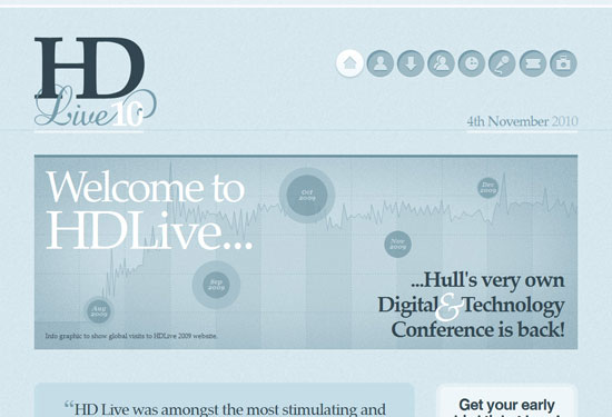 Hull Digital Live 10 This example allows us to see another principle of similarity that is called an anomaly. By highlighting the active page with a white circle, our mind immediately focuses on the element that is different from the similar object group.
As you can see, many elements implement Gestalt principles, even if we don’t realize we are using it.
Closure
The principle of closure addresses the human tendency to mentally complete a shape even if they are only presented with a partial form. This is the same principle that governs how we interpret negative space to be a specific shape. We can see closure at work in web design as well.
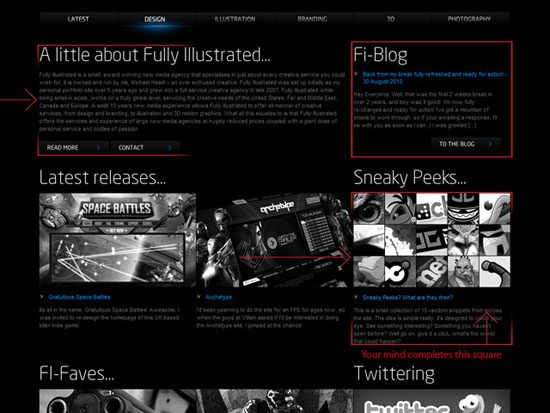
For instance, closure allows us to see columns where no enclosure or guidelines exist or understand a circle of buttons as one navigation menu instead of a bunch of circles. In the example of Fully Illustrated (below), we can see the application of closure is subtle but key to the site layout. When you look at this layout, you will see 2 neat columns, but you will also see 3 columns in the middle and bottom as well as a block grid of art snippets.
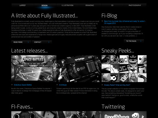 Fully Illustrated Closure is what makes you see the columns. There are no enclosures, connections, borders, or guidelines, just the consistent usage of alignment and the echo of square shapes in the images, text rag, image links, and left alignments. A block column is implied, and our mind does the work to complete it.
It seems a bit strange to think about it, but our minds are extremely analytical. The human mind is constantly recalling conventions, previous experiences and paradigms to build the world around you and therefore your website experience. Let’s look at Fully Illustrated again.
 When he designed this site, the designer probably did not think, “I want the user to see the squares”. Instead, the important information lies in implied shapes, specific alignment and design techniques which leveraged the human mind’s ability to fill in the blanks. Our perception is constantly moving, adapting and building. This is a core reason that design philosophies such as minimalism and reductionism can be so effective.
Sometimes we need to get out of the way and let the user’s brain do some of the work for us.
Proximity
Proximity addresses the tendency for the mind to see a number of shapes placed close together as a group rather than a number of separate objects. As designers, we can use this principle of perception to communicate relationships in hierarchy and form shapes with multiple views or branches. In the following examples, you will see how specific usage of proximity is an effective tool for branches and usability.
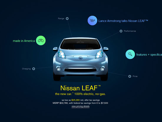 Nissan LEAF In this example, we can see the placement of different floating items are separated and therefore read as different options and shapes. We know that each dot will take us to a different section of the website. We can also see the usage of similarity at work here to distinguish that the smaller circles will take us to features of the car and that large multi-colored circles will take us to more feature articles or media that is related to the vehicle.
Further, the overall proximity of the dots to the car in specific distances helps the user immediately understand that the circular shapes are related to the car. The next screenshot is from the same Nissan website as above, but in this case, the web designer is utilizing proximity to denote relationships. 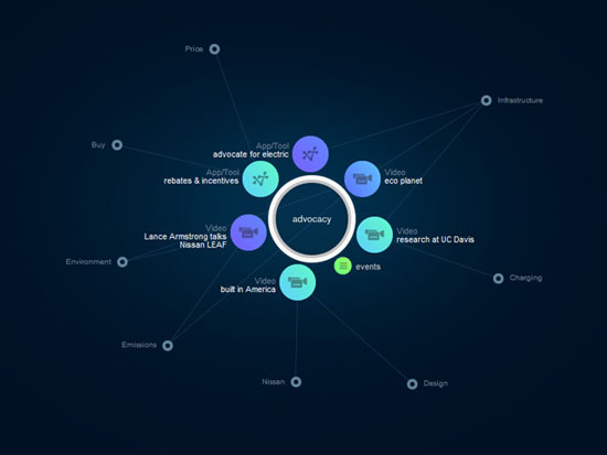 Notice how the use of proximity is used on the middle circle to communicate that all the colored circles relate to advocacy.
While usage of similarity to help us perceive the related nature of the smaller gray dots is present, we do not see them as a group of directly related links because they are not close enough together.
The Whole Attack Plan
Now that we have a good feel for power structure and Gestalt in web design, we can head feet first into hierarchy design and tools we can use to empower our structure.
Two Types of Hierarchy
For website design, there are two types of hierarchy that are essential and ever-present:
- Objective Hierarchy
- Visual Hierarchy
Objective Hierarchy Objective hierarchy is controlling, affecting and defining the order of elements to guide a user toward a website’s overall objectives, goals, and conversion points. Objective hierarchy is about ranking your goals and designing around their success and prominence in the appropriate order. A power structure is a visualization of these goals.
Let’s take the site for the “Build” conference as an example: 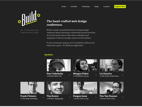 Build Conference There are a number of intelligent things going on in that website that are focused on the hierarchy of objectives. What are the main elements that stick out? The logo and premise, the “Register Now” button and the lineup of speakers.
Not surprisingly, this corresponds to the objective’s hierarchy. The list of objectives is probably something like this:
- Tell people the name and premise of the conference
- Get them to register
- Brag about the awesome lineup of speakers
Let’s look at the homepage again, with some helpful notes: 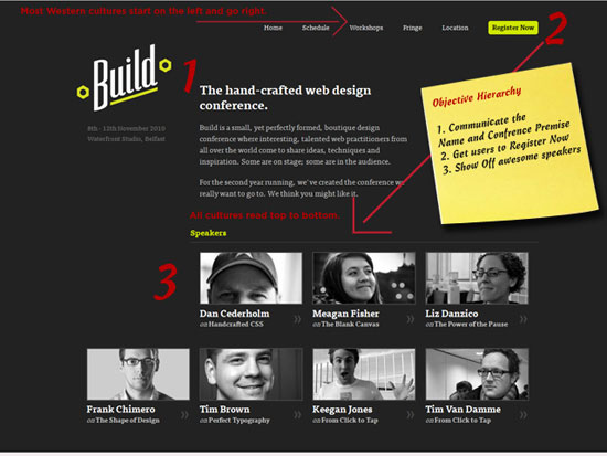 Let’s break down some of the decisions that are affecting hierarchy in this design:
- You will note that this conference is targeted at Western cultures (e.g. American and European). Western cultures tend to read left to right.
Build started their logo up in the left corner. The angle of the “Build” logo uses continuation to move our eye to the right.
- Our eyes have undoubtedly caught the similarity of the type in the navigation and grouped it together, but “what’s this bright yellow box?! That doesn’t belong there!” Due to the anomaly, we are drawn to it.
- At this point, our mind has managed to synthesize all of the data on the page and group them together, so we move down from the top, towards the Speakers section (using similarly shaped frames and desaturated photos to group the elements as related set).
All in all, the flow of the page is concise and quickly pushes us toward the most important elements. A good way to imagine objectives is to ask yourself (and your client) what things must the user see before leaving the page. When you look at the website for Build, whether or not you like it, you leave the site knowing that there is a web design conference, that it is called Build, that you have to register to attend it, and that it has a set of speakers.
That’s not everything that you need to know about the conference, but those are the core information, and that’s more than adequate for most situations. This sets the groundwork for your branches. If you manage to capture user attention and quickly communicate why the user should care — and how they can act on it — then you have done your job as a designer.
Visual Hierarchy Visual hierarchy refers specifically to how the design effectively communicates which elements stack in relation to each other and how that relationship affects how we view it. Visual hierarchy is more important to implement when you’re handling branches and “The Skim”. 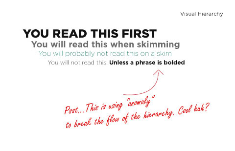 The visual side of hierarchy is a bit more straightforward, but it is not to be trivialized. Unlike the objective-oriented side of hierarchy, this type specifically focuses on legibility and clarity. Both types of hierarchy should be pillars of your design approach, but we are going to be a bit more on-the-surface in the case of visual hierarchy.
In the following example, take notice of how clear it is what you should read and what it is intended for. 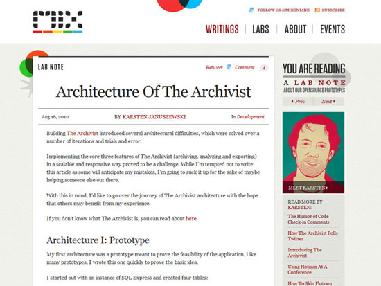 MIX Online The largest text is the title, the uppercased red type is the author, the body text recedes but has breathing room and clarity. On top of the precise usage of size and color, we can see usage of similarity in the navigation and usage of closure for the design elements.
Tools to Build Hierarchy
When you are constructing a strategy for implementing your website’s hierarchy, it is helpful to take note of what attributes are specifically helpful in visual language.
Size
The relative size of a button or text is a solid tool for drawing attention to it.
Basically, make it bigger to be more prominent. This element is obvious, but all too often I see designers making something less important even bigger than their “big” element. For size and scale to work, your focused element must have something to relate its size to.
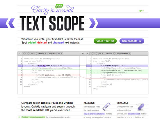
- The large type, “Text Scope” uses its excessive size to communicate its importance.
- The usage continuation is evident in the top bar surrounding the header text.
- The top title describes the feature, but is not the most important piece of information on the page, therefore it is intentionally lower contrast.
Contrast
Contrast may be one of the most essential ways to bring attention to an element. Contrast is not to be confused with color. Color is only an effective tool when used in the correct situation.
Yellow text may jump out at a user on a black background, but on white, it is useless. Remember, usage of color comes down to contrast. If something is hard to read, it isn’t good enough.
One of the biggest mistakes you can make in building a focused element is convincing yourself that legibility is not the most important thing. Don’t fall into this trap. It doesn’t matter how cool the picture is or the custom illustration, if users can’t read the content, the battle is already lost.
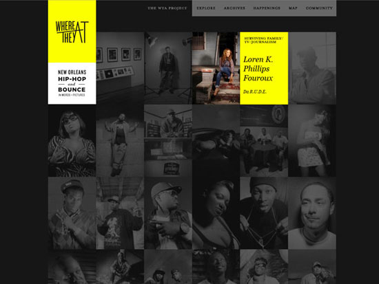 Where They At
- The logo uses a heavily saturated color (yellow) on a completely desaturated backdrop
- Opposite colors create contrast
- For the selection, color is imbued into the active photo with the yellow color and against a faded desaturated backdrop, this creates a sharp contrast
- Our eyes jump to the anomaly
Convention
Convention is a precept centered around familiarity. Conventions should leverage usage, symbolism, context and approach that are commonly understood to make an impact. For instance, a website link is conventionally understood to be underlined and blue.
If you are consistent enough, you can build your own conventions into your designs (such as having website links not be underlined or blue) — or even break conventions to create extremely effective anomalies. What this means is using consistent language and cues to point toward one task or action. This can be utilized to push users toward a certain task or conversation point.
- Clean and simple visual levels
- A conventional left menu, all columns are left aligned with clear spacing
- Elegant use of continuation and closure
- Usage of visuals to address “The Skim”
Conventions in hierarchy can also apply to cultural conventions. Websites from different countries and regions are not the same. Make sure you are aware of what your users will be expecting.
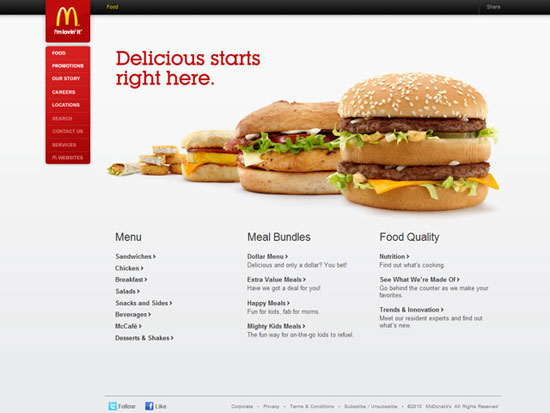
Let’s look at McDonald’s in Japan, in contrast to the US MacDonald’s website (shown above): 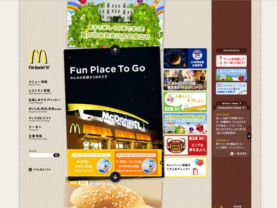 McDonald’s Japan It’s not quite the same as its American counterpart. When designing for an international audience, stick to simple tools such as size and contrast.
Conclusion
At the end of the day, just remember that when you build websites, you are structuring an experience for the user. Not everyone can be organized all the time.
However, when you understand the psychology and structure of your techniques, the path to measurable solutions becomes clear. Many successful public speakers have confided during interviews that they spoke much more effectively when they understood the source material rather than memorizing a pre-written speech. Just like a durable car, well-prepared meal, or a solid business, success is more than just what you see: it’s in the planning, structure, approach, and execution.
Related Content
-

WebFX is a full-service marketing agency with 1,100+ client reviews and a 4.9-star rating on Clutch! Find out how our expert team and revenue-accelerating tech can drive results for you! Learn more
Make estimating web design costs easy
Website design costs can be tricky to nail down. Get an instant estimate for a custom web design with our free website design cost calculator!
Try Our Free Web Design Cost Calculator
Share this article


Web Design Calculator
Use our free tool to get a free, instant quote in under 60 seconds.
View Web Design CalculatorMake estimating web design costs easy
Website design costs can be tricky to nail down. Get an instant estimate for a custom web design with our free website design cost calculator!
Try Our Free Web Design Cost Calculator