 In design, visual weight is the notion that design elements have varied weights; that is, some objects, even on a two-dimensional medium, can appear to be heavier than others. Visual weight is a powerful concept that allows us to create visual hierarchy, symmetry, balance, and harmony in designs. When applied strategically, the concept of visual weight can help us guide the viewer’s attention to the places we want in a design.
This article covers the concept of visual weight and the factors that affect it. Chosing a color for elements of your site has more science behind it than just using a random color generator.
What Is Visual Weight?
Visual weight revolves around the idea that distinct elements in a design have varying heaviness relative to each other.
Sometimes visual weight is obvious, such as in the case where larger objects appear heavier than smaller objects because they take up more space. In certain instances, it’s not so cut and dry, such as in the case of color. Some colors may look as if they are heavier and more dominant than others.
For example, on a white background, compare pure black to a light baby blue color: instinctively, which one to you appears visually heavier?  The main visual weight factors we will discuss are:
- Color
- Contrast
- Lightness/darkness
- Size
- Density
- Complexity
Visual weight is heavily tied to symmetry. To accomplish symmetry and balance in designs, we’ll want to make objects appear equal in visual weight. To draw attention to certain objects (or to deemphasize others) we’ll want to purposely throw off the balance and create a visual hierarchy so that the focus shifts in the areas we intend.
Let’s now go over some of the main factors that affect visual weight.
Color
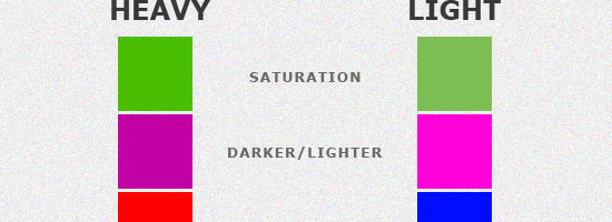
Color is a big part of design, and even in plain black, white, or gray designs, the lack of color makes a statement in itself. Color has many properties that can affect an object’s visual weight relative to others in the design, such as saturation, brightness/darkness, and hue.
 Most of what we can intuit about the weight of color is true; it seems instinctive to know that one color is heavier than the other. For example, more saturated colors will garner more attention than unsaturated colors. Darker colors also take more of a stance than their lighter counterparts on light-colored backgrounds.
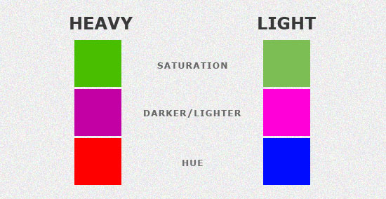
Hue is a color property that psychologists are only recently beginning to realize to have differing visual weights. Even with full saturation and equal lightness, two colors, such as red and blue (shown in the image above), can appear to have different visual weights. Red and blue, however, according to studies discussed in the article Does Red Weigh More Than Blue, are very close in visual weight, and studies have varied as to which is actually heavier.
Yet, aside from hue, there are several color properties that are far more obvious in terms of their effects on visual weight. For example, red is heavier and will draw more attention than yellow or orange with low saturation. In the example below, we can see how we could balance visual weight of elements by using other factors such as visual complexity and size.
The red heart shape on the left carries a lot more weight because it’s bigger and its color is more vibrant. To attempt to balance the piece, we can place several objects to create an area that has more visual complexity. 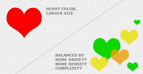 Here are some colors that are generally regarded to have varying visual weights, arranged from heaviest to lightest:
- Red (heaviest)
- Blue
- Green
- Orange
- Yellow (lightest)
Contrast
Contrast is a big part of design, and can help certain features stand out more than others. Elements with more contrast between it and its background will be more prominent than those with little contrast to its background color. Using contrast can maintain visual hierarchy and readability.
In the example below, we can see that the left side is more prominent/heavier than the right because it has a higher foreground/background contrast. 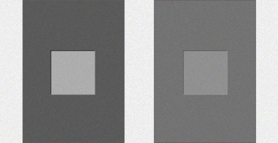 To create visual balance and make both sides equal to each other in terms of weight, we could use other factors such as color, size, complexity, and so forth.
Lightness/Darkness
Darker colors carry a lot more weight than lighter ones.
Lightness and darkness are powerful tools for balancing designs. 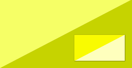 Psychologists aren’t sure why we see darker colors as heavier. In one study, they found that many people found an image to be more natural when the darker shade was at the bottom.
The instinct that heavier objects should be at the bottom and lighter ones at the top mimics that of the physical world where gravity pulls heavier objects to the bottom.
Size
Size is an evident visual weight factor because, in the physical world, an object that’s bigger than another (if they are the same type of object) will naturally be heavier and will take up more physical space. 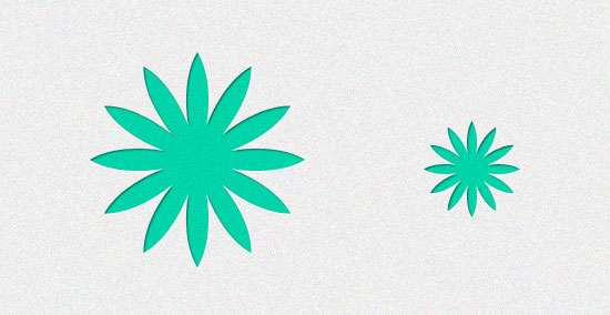 What can you do to balance the visual weight in the instance of size?
You could counter-balance a larger design element with several smaller ones or give the smaller element a heavier color and/or contrast, for example. If an object is should be a primary focal point in the design, then making it larger is good. This is why we often see oversized call-to-action buttons that are larger than their surrounding elements; they are attempts to drawing the user’s attention for the purpose of increasing conversion rates.
Proportion and Density
In the physical world, denser (or more compact) objects are heavier than less dense, more dispersed objects. We can achieve this concept in graphical representations by using less whitespace between objects. 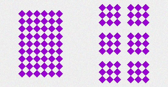 Note that while excess whitespace within a set of objects can make the area appear lighter in terms of visual weight, having a lot of whitespace around it still draws attention because of contrast around its location.
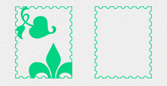
Complexity
More complex shapes or patterns seem heavier visually when compared to plainer shapes. A simple object, like the one on the right in the image below, can be taken in and understood almost instantly, while the element to its left takes more time to process. And because an element takes more time to process, we must look at it longer and, thus, it occupies more of our attention.
 In design, visual complexity can come from surface texture, photographic images, and repeating patterns.
Summary
Visual weight is a concept that heavily relies on the designer’s instincts. It is affected by what we’re exposed to in the physical world where weight is expressed in size and density and where color evokes certain emotional responses (often due to cultural factors).
Attaining visual hierarchy, symmetry, and design harmony relies on how we utilize visual weight factors in concert with each other. One recommendation I have is to be careful when choosing colors though as some brands or colleges have branded colors they use for everything! In most circumstances, explaining things like this to clients will allow you to charge a higher price for your web design because it shows you are truly an expert on the topic.
Related Content
-
 President of WebFX. Bill has over 25 years of experience in the Internet marketing industry specializing in SEO, UX, information architecture, marketing automation and more. William’s background in scientific computing and education from Shippensburg and MIT provided the foundation for MarketingCloudFX and other key research and development projects at WebFX.
 -

WebFX is a full-service marketing agency with 1,100+ client reviews and a 4.9-star rating on Clutch! Find out how our expert team and revenue-accelerating tech can drive results for you! Learn more
Make estimating web design costs easy
Website design costs can be tricky to nail down. Get an instant estimate for a custom web design with our free website design cost calculator!
Try Our Free Web Design Cost Calculator
Share this article


Web Design Calculator
Use our free tool to get a free, instant quote in under 60 seconds.
View Web Design CalculatorMake estimating web design costs easy
Website design costs can be tricky to nail down. Get an instant estimate for a custom web design with our free website design cost calculator!
Try Our Free Web Design Cost Calculator