 Welcome to our new Tool of the Month series! Each month, we’ll select a new tool to review and recommend for your use. We’re kicking off the month of May with our very first tool selection, which you’ll read about below. When it comes to your website’s speed, SEO makes this factor a top priority.
No one likes sitting around waiting for your site to load, and Google likes it faster. There are tools out there that will tell you how fast (or how slow) your site loads and what you need to do to fix it. Google itself has a useful tool that offers helpful recommendations for improving your site’s pagespeed.
But when you go into the nitty gritty for finding places to improve load times, there is no better place than Feed the Bot.
Tools to Help You Speed Things Up
Feed the Bot is a great place to run a few tests and see where you can improve page speed. Entering your URL into any of the dozen tools Patrick Sexton has on his site will give you a speedy answer that will help you make decisions.
He has six different tools related to page speed and performance that are all very useful for analyzing your own efforts in improving load times. Each tool will directly address common speed killers, including CSS usage, resources and services usage, and image size and compression.
Looking for an all-in-one SEO audit tool? You’ve found it.
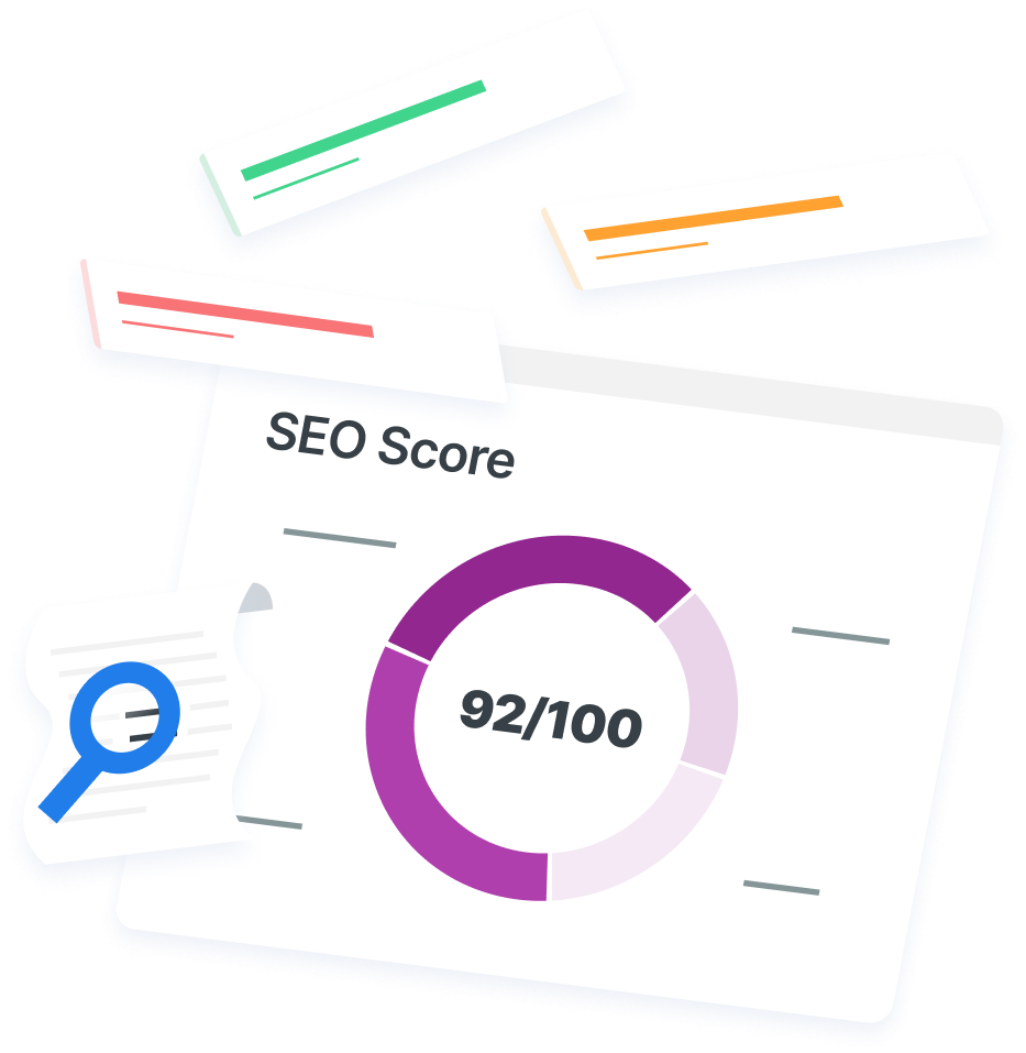
SEO Checker provides data on key metrics to give you:
- Complete SEO score
- Content Grade
- Site Speed Analysis
- and more.

Feed the Bot Isn’t Like the Others
At this point you might be saying, “there are literally a million of these types of tools out there.” But there really is a big difference between these tools and the others you have seen floating around the web.
1. It’s just a great resource
Patrick isn’t selling anything. He isn’t an SEO company trying to generate leads from low quality tools. Feed the Bot is just a great resource that he has made available to the general public.
This allows him to really focus on the user experience as he isn’t directing people to buy something or sign up for a service. Rather, he just wants to show you how to improve your website! Even beyond the tools, he provides extremely useful how-tos and explanations on some pretty advanced page speed topics.
If you use one of his tools and you aren’t exactly sure what to make of it, a detailed and user friendly explanation isn’t too far away. General speed improvement principles are also common in his massive list of resources in order to better help you understand how to improve your overall website speed. He does have advertising and affiliate links thinly spread throughout the site, but they aren’t bombarding you, and they are mostly relevant to what he provides within the site.
2. It’s by the book
Feed the Bot also knows its stuff! Many of the topics and tools within the site are created directly in response to recommendations from Google and many other industry experts. Patrick even provides a tool that analyzes your site against Google’s webmaster guidelines.
His recommendations are top notch and respectable, since following the rules is an important enough reason to make a tool.
3. It practices what it preaches
Not only does Feed the Bot provide a great resource for others, it also follows its own rules. Pages load nearly instantly – scoring a 97 out of 100 on PageSpeed Insights (by Google).
That certainly is not an easy score to obtain. 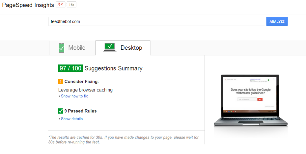 But it doesn’t stop there. The tools themselves are just as fast!
Normally when you use tools similar to this on any of the other lead generating SEO sites, it takes a minute or two (or 10) to complete. Tools on FeedTheBot.com are quicker than you’d expect, further adding to the already great user experience. That’s exactly what us SEO folks want.
We hate wasting time and we want results now. Combining this with an already great resource for SEO and page speed improvements makes Feed The Bot our Tool of the Month for May! Have a SEO tool you’d like to nominate for our SEO Tool of the Month series? Tweet us @webfx with the URL and we’ll check it out.
Come back next month to see what we’ve picked! header image via (cc)
-
 Dan is a marketer for WebFX who likes everything tech, marketing, and startups. Follow him on Twitter @ShafferDan.@ShafferDan
 -

WebFX is a full-service marketing agency with 1,100+ client reviews and a 4.9-star rating on Clutch! Find out how our expert team and revenue-accelerating tech can drive results for you! Learn more
Try our free SEO Checker
Boost your site’s search performance with our free SEO Checker. Analyze your website for optimization tips on titles, headers, content, speed, and more. Get a free report now to enhance rankings on Google, Bing, Yahoo, and beyond!
Share this article

How Is Your Website’s SEO?
Use our free tool to get your score calculated in under 60 seconds.
Try our free SEO Checker
Boost your site’s search performance with our free SEO Checker. Analyze your website for optimization tips on titles, headers, content, speed, and more. Get a free report now to enhance rankings on Google, Bing, Yahoo, and beyond!