
 Conversions can be tricky to accomplish on any website. A conversion could mean more sales, more registered users or simply more engaged users. Having a great product and delivering value to the user are obviously the factors to focus on when you want to increase your conversion rate.
But a conversion rate can also be increased with smart design and strong content. In this article, we’ll discuss how to improve design and content for one type of website conversion: getting users to sign up on your website, whether it’s registering an account for your web app, for an email newsletter, your RSS feed, etc. We’ll go over some design trends and practices that have been proven to improve conversion rates.
Everyone Wants Something for Nothing
Let’s say you’ve stumbled on a website that you know nothing about. Perhaps you were intrigued by an ad banner that pointed to the site. Maybe you read a post on your favorite blog about it and decided to check it out.
Or perhaps you landed on the site because of a search query on Google. You’d like to investigate further to see if you want to sign up. What do you do first? Naturally, you want to try it out right away!
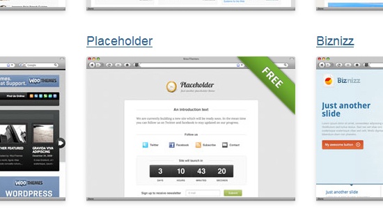
Trying it out is the only way to truly know whether it is worth your time and commitment. Trials are a strong selling point for increasing conversion rates. Your interest is already piqued; if you try it and it meets your standards, you’ll likely sign up. For example, one of the top premium WordPress theme sellers, WooThemes, releases a few free themes so that you can get a good look at the quality of their products before signing up for the premium service.
 The key is to get new visitors to try out the service, product or community in some way. What are some ways to do this? Some methods may be more effective than others.
Here are a few ways:
- Provide a limited-time trial version (e.g. 30 days free)
- Provide a free or “lite” version, and then ask users to upgrade for premium features
- Hand out freebies related to your product (such as a WordPress theme or an e-book with basic information)
- Let visitors peek inside to see what registered users are enjoying
- Offer detailed product tours, screenshots and videos that tell visitors what they’ll get before signing up
Some site owners may want to follow an established business model in their niche, while others may want to try a few methods and test their effectiveness. Before settling on one, track your current conversion rate metrics:
- How many sign-ups are you getting?
- What has been the average number of sign-ups in the past few months?
Then, implement the method you’d like to try out, and test the conversion rate for the same timeframe.
Should It Say, “Buy Today” or “Buy Now”?
Some web designers have dabbled in web copywriting. Whether you have or not, we should all pay some attention to the copy on the website we’re working on and be able to tell which content will be effective at increasing conversion rates.
Professional copywriters know how certain words can get more sign-ups, how certain paragraph lengths are more persuasive, and how the writing style and level can be tailored to get the best results. You could always hire a professional copywriter, but designers should still know the basics. We’re still responsible for the call-to-action elements, even if we’re not actually writing the content.
We need to know what will increase conversion rates. How should a button or link be worded? Should you use “Log in,” “Login,” “Sign in” or something else?
Studies show that consistency and various other factors affect conversion rates. Do you know how to make these decisions? Introductory sentences, calls to action, sign-up and log-in links, featured content: all of these and more are critical to websites. Even page titles are essential.
Anyone who has run a blog knows how changing the title of a post can increase the number of page views dramatically. So how to you go about figuring out what copy sells? The tricky thing is that it can be different for every website! One approach is to view trends in your niche.
At the very least, this contributes to consistency in style within the niche, which helps usability and findability. However, a stronger approach is to perform an A/B testing study.
A/B Testing
A/B testing (also referred to as split testing) is a simple yet effective user interface testing technique that can profoundly influence design and content decisions.
The idea is to use two designs (A and B) that have one minor difference: the item to be tested. 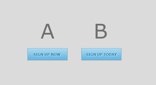 Let’s say you have to design a call to action button to get visitors to sign up. Many decisions need to be made:
- What color should the button be?
- How should it look?
- How should it be aligned or positioned relative to the text and imagery around it?
- How should it be worded: “Sign up now,” “Become a member,” “Sign up for a free 30-day trial,” or something else?
Some designers might conduct A/B testing for a number of these factors, but that’s not always necessary. The two most important elements are probably the color (or other means of distinction) and wording. Two simple tests can be done to determine what would lead to the biggest increase in the conversion rate, and further tests can be done later on if desired.
After creating two mockups with these minor differences, one can use testing software or even do an in-person test to see which is preferred. Live testing on a launched website can bring even better results and can be a part of an iterative web design process, although it’s not always an option, such as when the scope of the project ends after the website is live. Some designers might prefer to test the current call-to-action button, modify the design, and then test it again to see if there is an improvement.
Some A/B testing tools:
Images and Icons
Images and icons are a big part of most designs. Beyond adding visual interest, imagery can bring benefits at the psychological level. Icons create points of interest and help to organize and explain features.
Photography and illustrations can bring life and personality to a website, making it more relatable. Users are more inclined to sign up on a website if they feel connected to it. Look at the imagery on any website that requires registration, whether a web app or social network.
How is it used? It may be minimal, but it probably still reinforces the tone and feeling of the website. Icons improve user interfaces and help to brand websites.
Most importantly, icons and images help to convince new users to become members. One effective way to promote registration is to explain the process visually with illustrations or photos. The images could either be integral to the demonstration or simply be a visual aid.
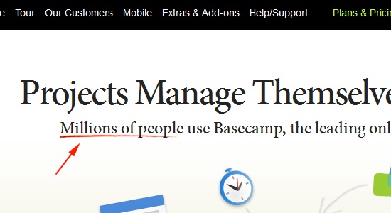
For example, the illustrations at the top of Basecamp‘s page lead to the call-to-action button. 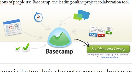
Simplify the Sign-Up Process
If you want users to sign up, don’t make it difficult for them. One-click registration has long been proven to promote usability and conversions.
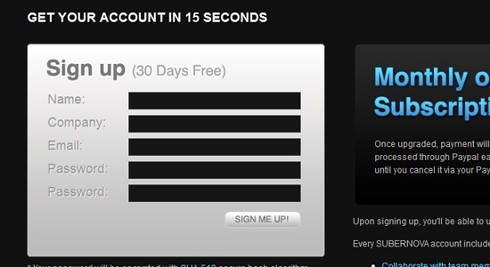
A long-winded process will frustrate users and make them stop partway, despite their initial interest. Keep forms to just a few fields if possible. For example, Subernova requires only five fields to sign up, and then the user is given instant access, without even needing to confirm their email address.
 While some would argue that email confirmation is essential for combating spam, the conversion rate increases when you lead users to the members section right away. Instead, consider restricting certain areas or features until the contact information has been confirmed. Below are some ways to simplify registration.
Make the Username the Person’s Email Address
Having to remember multiple user names is annoying. And any name that hasn’t already been taken will be harder to remember anyway. Because every email address is unique, why not just make that the username?
Let the User Choose Their Password
Don’t make password selection an arduous task. Some sites apply silly restrictions such as a password must be between 7-28 characters long, contain 3 numbers and a capital letter. This type of inflexibility just adds a potential exit point on your sign-up forms.
Require Only the Minimum Amount of Information
If more information is needed, then consider just giving the user the option to update their profile after creating the account. Likewise, put any information the user will want to know right on the registration page. Tell them up front about the costs, core features and important terms.
This will reassure them right on the sign-up page, and they won’t have to leave the page to find the information.
Allow Sign-in Using Popular Authentication APIs
More and more web apps and websites have been allowing new users to sign in with their social media profile. The user’s profile information is automatically filled in, and the person is spared the hassle of having to create yet another account they have to manage and remember.
Using the APIs of these social platforms to allow people to sign in, you can get people started on your website quite easily. 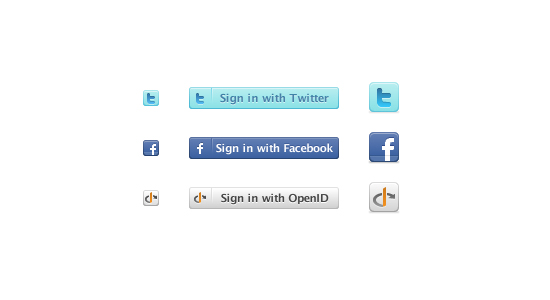 Some popular authentication APIs are:
- OAuth
- Twitter Authentication
- Facebook Authentication
- OpenID
- Google Account Federated Login
Many users may find this convenient because:
- It’s faster
- There is less perceived risk from signing up with an unfamiliar website
- The user does not have to remember another username and password combination
- Even less commitment is needed to get involved with the website
Another trend is that some applications and websites are using Twitter, Facebook and the like for initial sign-up, providing limited functionality, and then afterwards prompting the user to register for a permanent account in order to access all of the features. Fortunately, implementing or integrating these web services into your sign-up process is easy, too. Below are a few tutorials to get you started:
- Facebook Connect vs. Sign in with Twitter: Fight!
- Overview of “Sign in with Twitter”
- Facebook for Websites
- Get an OpenID
By Popular Demand: Social Proof
Social proof is another way to increase site conversions. Who else is using this website or app? Who belongs to the community?
Are any users famous or notable? How many satisfied members are there? 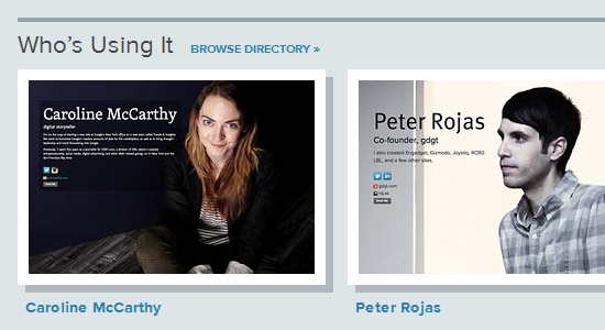 A website that looks lonely won’t get much attention.
If the website is membership-based, why bother signing up if no one’s there? If an application is set up for viral growth but doesn’t have a lot of sign-ups, then visitors will wonder what’s wrong with it. Be sure to mention popular brands affiliated with the product and famous users, or just mention the hundreds or thousands of satisfied members.
Basecamp is once again a great example. It mentions the millions of people using the tool, which creates strong social influence. It also uses this figure to lay claim to being the leading project management app.
 Whether it meets the needs of all companies or individuals, this social proof makes Basecamp seem valuable and reputable. What happens if you don’t have any big-name members or a large user base? If you’re just starting up, providing social proof can be difficult.
Membership websites must start small and grow gradually in order to gain high-quality attention. First, reach out to 15 to 20 people who might be interested in testing your website. Get valuable feedback this way before scaling up.
This will also get those first few members interacting; if visitors see no interaction or content, they’ll wonder why they should sign up. Focus on launching small first. Then, try out a launch page or invite-only page for the first month or two.
Conclusion
Building up the membership base is a primary goal of many websites, and it’s the main goal of any website that has a community or that relies on sign-ups for profit.
Increasing the conversion rate is essential, and there are a number of techniques for doing so. The most effective way is to measure your current conversion rate and then try different things to increase it, all the while measuring the changes. The designer’s main goal is to combine design and content as efficiently as possible in order to entice visitors to sign up and become members.
Mediocre design and poorly planned content is a recipe for disaster, even if the members area is up to standards.
Related Content
-
 President of WebFX. Bill has over 25 years of experience in the Internet marketing industry specializing in SEO, UX, information architecture, marketing automation and more. William’s background in scientific computing and education from Shippensburg and MIT provided the foundation for MarketingCloudFX and other key research and development projects at WebFX.
 -

WebFX is a full-service marketing agency with 1,100+ client reviews and a 4.9-star rating on Clutch! Find out how our expert team and revenue-accelerating tech can drive results for you! Learn more
Make estimating web design costs easy
Website design costs can be tricky to nail down. Get an instant estimate for a custom web design with our free website design cost calculator!
Try Our Free Web Design Cost Calculator
Share this article


Web Design Calculator
Use our free tool to get a free, instant quote in under 60 seconds.
View Web Design CalculatorMake estimating web design costs easy
Website design costs can be tricky to nail down. Get an instant estimate for a custom web design with our free website design cost calculator!
Try Our Free Web Design Cost Calculator


