


Marketing
Enhance your online presence with these marketing strategies.
"*" indicates required fields


Minimalism is tricky to get right. Beautiful typography, well-executed whitespace, a carefully chosen color palette, and -- perhaps most importantly -- making smart decisions about which design elements to include and leave out are some of the things that are […]
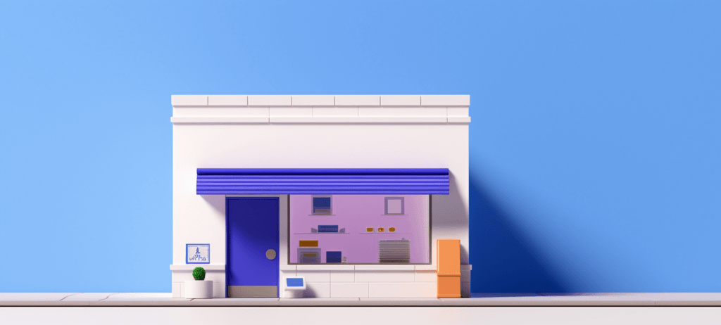
Your website is your online storefront, whether you operate online, offline, or both, which is why it makes sense to invest in professional web design. Here's a quick overview of everything we'll cover on this page: How […]
3 min watch

8 min watch

5 min watch


Website design costs can be tricky to nail down. Get an instant estimate for a custom web design with our free website design cost calculator!
Try Our Free Web Design Cost Calculator
Enhance your online presence with these marketing strategies.
Improve your website’s ranking with these simple SEO techniques.
Level up your PPC skills and dominate the online market.
Boost your engagement game with our Social Media tips.
Discover helpful insights to unleash the potential of the internet.
Stay in the loop with the latest WebFX scoop.
Our free Ecommerce Marketing Plan Template helps you organize your ecommerce marketing strategy to ensure you implement the best campaigns to fuel business growth.
Our Website Optimization Checklist guides you through essential web design optimizations that help boost your site’s rankings in the search engine results pages.
When you download our free Web Design RFP template, you’ll receive an actionable template for ensuring your RFP contains all the essential information you need.