
 Android is flexible. Most reviews tout that as a key advantage of the operating system, particularly when it’s being compared with iOS. To quote recent switcher Andy Ihknato:
Android has a consistent core philosophy that I find instinctively compelling: why wouldn’t a phone give its sole user a vote on how their device works?
Here’s why that’s a bad idea:
- Choice reduces user satisfaction.
- Choice reduces usability.
- Choice reduces product quality.
I’ll explain in a moment. But first, let’s see how choice plays out in the Android world.
Android: A Layer Cake of Choices
So you’ve decided to buy an Android phone.
Great! Which one? Verizon (a top U.S.
mobile service provider) offers you this dizzying amount of options to pick from: G2, Lucid 2, Spectrum 2, Enact, and Intuition by LG, Galaxy Note 3, Galaxy S 4, and Galaxy S III by Samsung, One and Droid DNA by HTC, Moto X, Droid Maxx, Droid Ultra, Droid Mini, Droid 4, and Droid Razr M by Motorola, Hydro Elite by Kyocera, Marauder and Perception by Pantech, and the G’zOne Commando 4G LTE (really, this is the name of this smartphone) and G’zOne Commando by Casio. Thankfully there are filters on Verizon’s site. You can filter for DROID, 4G Technology, ECO Specs, Certified Pre-Owned, Global Ready, Physical Keyboard, NFC, and Accessory Bundles. What?
Fine. At some point you make a decision on which phone to buy. You download a bunch of apps and set up your home screen.
Good news! You have choices here too. There’s a drawer with an alphabetical list of all your apps.
On some phones, there’s a Favorites page. You can have a potentially infinite number of home screen pages (which is different from the Favorites page). And on each of those, you can create folders.
There’s a dock at the bottom that’s shared amongst all the home screens, but not the alphabetical list or the Favorites page. You can set up shortcuts on your lock screen that look like — but are different from — the dock. And don’t forget: You can have multiple copies of the same app in the same place: 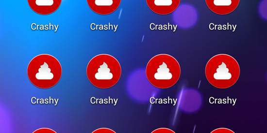 There’s more than one pile of crap here. Later, a friend texts you a hilarious photo.
You’d like to save it for later. You’re presented with these choices: 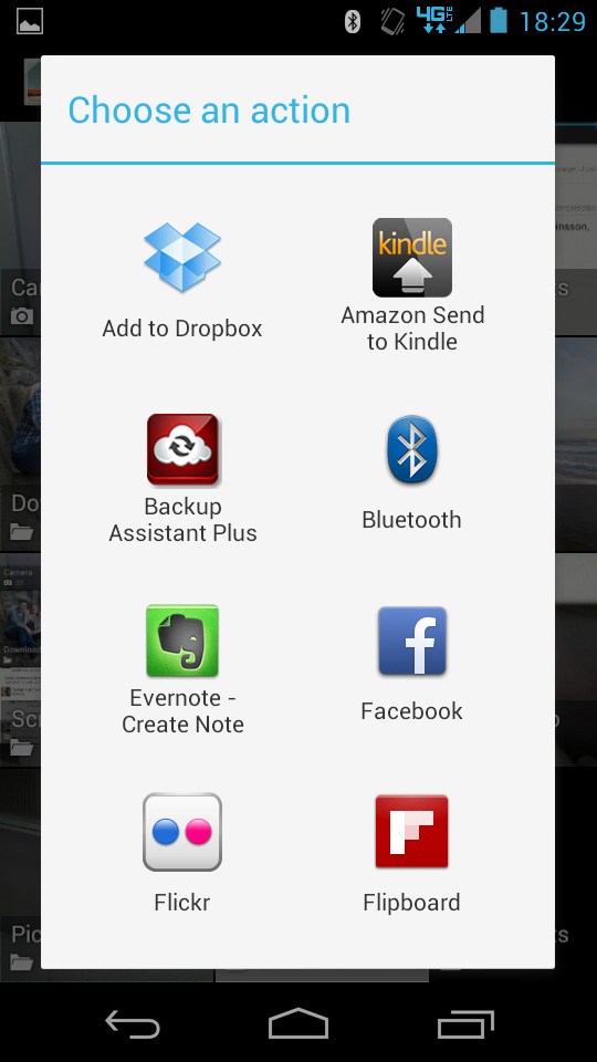 Note that this dialog window has a scroll bar. And that list of choices only gets longer because each app you install adds itself to it. Over time — talking to friends, reading blogs — you’ll realize you’ve barely scratched the surface of Android choice.
You can install custom lock screens! Launchers! Replacement phone apps!
Different fonts! Each choice comes with its own set of choices: entire marketplaces of themes, screens upon screens of settings, a never-ending buffet of choices. Some conflict with each other, some are crashy, some slow down your entire Android experience.
Sounds like fun, right?
Choice Reduces Satisfaction
As a society we’re deluded about choice. We perpetuate the myth that more is better — yet there’s research going back decades to suggest the opposite.
Perhaps the most famous is Sheena Iyengar’s 1995 “jam jar study“, which showed a 4x increase in options decreased purchases by 85%. Iyengar’s study is not alone. Barry Schwartz’s excellent book The Paradox of Choice covers the problem in detail. Of particular interest is his discussion of how choice affects buyer’s remorse.
The more choices you consider, the more likely you’ll be to regret your decision, and the less satisfied you’ll be. That’s bad enough in a traditional retail environment, where you make your purchase and move on. But it’s worse in the world of software, where apps are cheap and each app provides its own array of options.
On Android, it’s easy to end up in an infinite, layered world of choices; never quite satisfied, never quite sure if what you’ve got is the best, and — critically — never done.
Choosing vs. Tinkering
There’s a distinction here between choosing and tinkering. We all have friends who tinker with their cars, their bikes, their computers. It’s a hobby, and the constant fiddling is a destination in itself rather than just the journey. For such hobbyists, a plethora of choices is necessary: it’s the fuel that powers the tinkering.
I think many who extol Android’s flexibility fall into the tinkerer category, including some tech bloggers. They love all the ways they can customize their phones, not because they’re seeking some perfect setup, but because they can swap in a new launcher every week. That’s fun for them; but they’ve made the mistake of not understanding how their motivation differs from the rest of us.
Choice Reduces Usability
We often talk about the best products being simple. But that’s not quite it: The best products are opinionated. A great product is one you can disagree with because its creators have made choices on your behalf.
If they’re good product designers, they’ve made good choices, and the result is that much-lauded simplicity. But if they’ve punted too many times — resolving tough decisions with a checkbox here, a slider there — then they’ve shifted that responsibility onto you. It’s like going to a restaurant, ordering, and having the waiter ask you, How much coriander do you want on that?
OK, and should we cook it for twelve minutes or for eighteen? Choices can be a burden when you’re qualified to make them, and a disaster when you’re not. 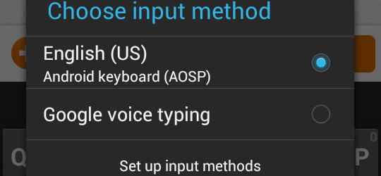 Do you know what to choose here? I don’t.
I bet someone at Google does. Perhaps they could make the choice for us. Most of us (even us product designers) don’t want to be product designers when we’re using someone else’s product. We just want to live our lives.
Choices vs. Preferences
It’s also worth distinguishing between choice and preference. Preferences can be a great way to support multiple use cases, or subgroups in your user base. Vertical vs. horizontal layout for widescreen vs. normal displays.Small vs. large fonts for young vs. old eyes. But there’s a fine line between valuable preferences and excessive choice. Everyone has preferences, including every member of your product team. (Indeed, failure to resolve team disagreements can be a source of user-facing choice.) Catering to all individual preferences creates a bloated, bland product.
Not to mention a UI that’s impossible to navigate. Furthermore, people are notoriously bad at identifying what we want. And what we do want is influenced heavily by what we know — our expectations are constrained by our experience.
To deliver a product that will improve people’s lives, we must sometimes break expectations and force users through a period of adjustment. The long-term path to user satisfaction sometimes involves short-term dissatisfaction. Apple has been remarkably good at this type of product development — from OS X to their Intel transition to iOS 7– breaking away from past choices to provide a streamlined, initially unfamiliar product that’s forward-looking.
Microsoft, on the other hand, tends to retain all the choices of the past, as Windows 8’s dual UI illustrates. That’s a shame. No matter how good Metro might be, a sizable number of users will revert to the old UI because they know it.
And that ensures Metro will remain sup-par: Microsoft’s product teams can avoid tackling difficult product design problems because users can always resort to the old experience. The situation is similar on Android: by allowing extensive customization — and by permitting vendors, carriers, and users to replace built-in apps with third-party ones — Android’s product team has excused themselves from finding optimal solutions and making tough decisions.
Choice Reduces Product Quality
It takes a lot of code to produce software.
And bugs are unavoidable because developers are human, and because that’s what happens with a system whose many, many moving parts are constantly changing with an incomplete awareness of each other and the dependencies among them. To test effectively, it’s necessary to replicate as many of the conditions under which the product might run as possible. And to fix a bug, a developer needs to reproduce it–make it happen again so she can see what’s really going on.
So, software teams spend a huge percentage of their time finding and fixing bugs. The more variation, the more testing, and the harder it becomes to replicate a bug when it’s found. This is why Android’s fragmentation — the array of Android versions and devices an app must support — is such an issue.
We can’t control fragmentation, but we can avoid exacerbating it. When we introduce excessive choice, we increase the number of possible environments in which something could break, and the number of conditions we have to test. That increase isn’t additive, it’s multiplicative: the number of conditions downstream of a choice is multiplied by the number of options it provides.
On its own, this isn’t an excuse for eliminating choices. But it is the technical cost those choices incur — something we ignore at our product’s peril. This is also why seemingly harmless choices aren’t so harmless; why “Let’s just stick a checkbox in Advanced preferences” isn’t an answer.
We need time to test and debug. And when we do, something else has to give. The problem of choice isn’t limited to Android.
Android is just a current, prominent, and severe example. Simple, elegant, usable, opinionated products are few and far between because the product teams willing to make hard choices are rare. So, what have you left out of your product lately?
Epilogue: Dealing With User Feedback
With Emu in beta, we get a lot of feedback. We love feedback — it’s wonderful that people care enough about our product to email us. But we don’t implement every request — that way lies exactly the sort of bloat I’ve discussed here.
To begin with, the loudest users aren’t necessarily the most typical; someone might request a feature that would genuinely improve his experience, at the expense of most other users. More importantly, user feedback requires sleuthing. Users often don’t know, or can’t articulate, what they really want.
So we look at each request and ask, What is this person really trying to accomplish? How do we best serve that goal? Sometimes the result will be more effective — and better-suited to the underlying need — than whatever the user requested in the first place. And that sort of innovation is incredibly satisfying.
Related Content
-
 President of WebFX. Bill has over 25 years of experience in the Internet marketing industry specializing in SEO, UX, information architecture, marketing automation and more. William’s background in scientific computing and education from Shippensburg and MIT provided the foundation for MarketingCloudFX and other key research and development projects at WebFX.
 -

WebFX is a full-service marketing agency with 1,100+ client reviews and a 4.9-star rating on Clutch! Find out how our expert team and revenue-accelerating tech can drive results for you! Learn more
Make estimating web design costs easy
Website design costs can be tricky to nail down. Get an instant estimate for a custom web design with our free website design cost calculator!
Try Our Free Web Design Cost Calculator
Share this article


Web Design Calculator
Use our free tool to get a free, instant quote in under 60 seconds.
View Web Design CalculatorMake estimating web design costs easy
Website design costs can be tricky to nail down. Get an instant estimate for a custom web design with our free website design cost calculator!
Try Our Free Web Design Cost Calculator


