

FAQ stands for “frequently asked questions.” As the name implies, it is a type of web page (or group of web pages) that lists questions frequently asked by users, usually about different aspects of the website or its services. The answers are typically shown with the questions. FAQ pages aim to make finding answers easy for users, and you can help with that by using tools such as FAQ schema.
The ideal FAQ page helps people use the website without the need for outside assistance. More often than not, unfortunately, this ideal is not realized. This article explores various aspects of FAQ pages, from design to efficiency issues.
We will also look at some examples (and counter-examples) of great FAQ pages.
Where FAQ Pages Go Wrong
Here are a few things that detract from the usefulness of an FAQ page.
The Questions Aren’t Frequently Asked
Imagine that you’ve just launched a new website and have included an FAQ page. Why? If you don’t have any users yet, then you certainly haven’t received any questions (much less frequently asked ones).
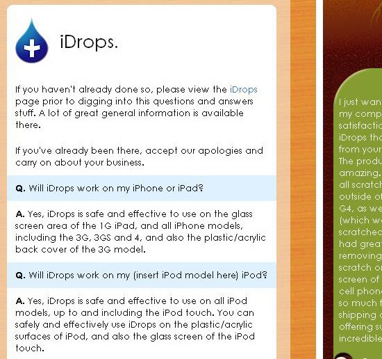
 Without user feedback, questions on this page are simply the site owner’s assumptions of what his users might want to know.
The Questions Are From Left Field
We’ve all seen FAQ pages that have bizarre questions — questions that have probably never entered anyone’s mind. Such questions are ones that website owners would like to be asked (e.g., “Why is this website so amazing?”, “Who are the talented people running this website?”).
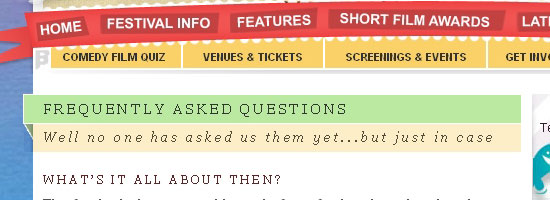
The Page Label Isn’t Intuitive
The first time I saw an “FAQ” link was 10 years ago. I wondered about it for a while and eventually learned its meaning.
Designers must be considerate of users who don’t understand technical terms. “Frequently asked questions” is clearer than “FAQ.” Also, descriptive and standard labeling is important. For example, California Court uses the label “Q&A,” but that’s even more ambiguous than FAQ.
Unless you have a good reason, stick with the standard label of “FAQ” or “Frequently asked questions.” 
The FAQ Page Isn’t Really Needed
Many websites have an FAQ page, but some don’t need one at all. Sometimes users find all the information they’re looking for and have no further questions. This means that the information architecture was designed well.
Imagine an online shop that presents prices and shopping instructions in one particular location; say, on a separate page or part of the home page. But if the FAQ page addresses pricing, it will be redundant; yet some users might seek it out to find pricing information. Link to the main pricing page instead.
Here’s a rule of thumb: if one type of information can be relayed in many ways on one website, there is something wrong with the information architecture of the website. Everything should be placed in its proper location.
How to Design an Effective FAQ Page
A good FAQ page lightens the load on help desks and customer support calls, which translates to cost savings and convenience for the user (since they don’t have to send a help ticket or pick up the phone to have their question answered). Thus, the importance of a well-crafted FAQ page can’t be denied.
When designing FAQ pages, have the following tips and strategies in mind.
Say “No” to FAQ Pages
Start by saying “No” to FAQ pages. In web design, you should strive for simplicity and you should constantly eliminate things that simply aren’t needed. The FAQ page supports the rest of the website’s content; if it doesn’t enhance what’s already there, it shouldn’t be a priority.
When an FAQ page is needed, it will be your users indicating the need for it. Perhaps you’ll start getting the same questions over and over again or a reoccuring feedback you get is the need for an FAQ page. Let users determine whether they need an FAQ or not.
Gather the Right Questions
The questions on the FAQ page must be real.
For a new website, choose a timeframe (say, one month), and then survey and categorize the questions that users ask during that time via direct calls or email. You could even announce your open question period on the website. If patterns emerge, it probably indicates a topic that should be addressed on the FAQ page.
In this way, you can update the FAQ page regularly. This method is effective because users are actually participating in the page’s creation. For example, The Invoice Machine invites questions, thus showing off its desire to create an FAQ page filled with useful questions.
Providing Good Entry Points
To use an FAQ page, users must be able to find it. Provide an obvious entry point: a distinct, clear and well-positioned link will do the trick. The two most common places for an FAQ link is in the primary navigation or site footer; these sections are separated from the rest of the web layout (often by color, hue, solid lines or white space) and thus stand out.
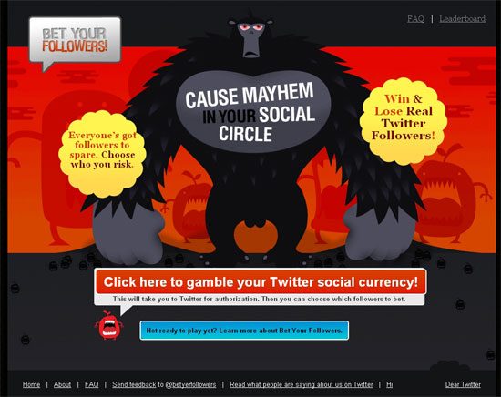
Visitors are used to checking the navigation menu and footer for important links. Bet Your Followers links twice to its FAQ page, once in the header and once in the footer. Users won’t have any trouble finding it.
 GoSiteWave puts their FAQ links in the primary navigation menu and footer, providing two entry points.
 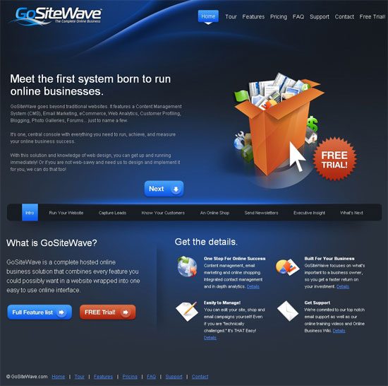 The Resumator has a well-positioned and clear link to its FAQ page.
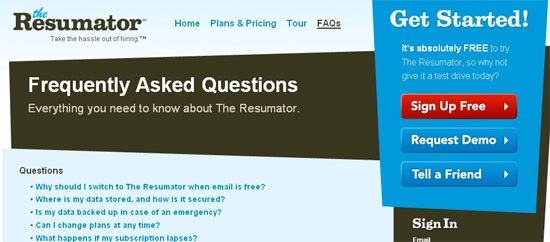
Readability
FAQ pages are generally text-based, so readability is important.
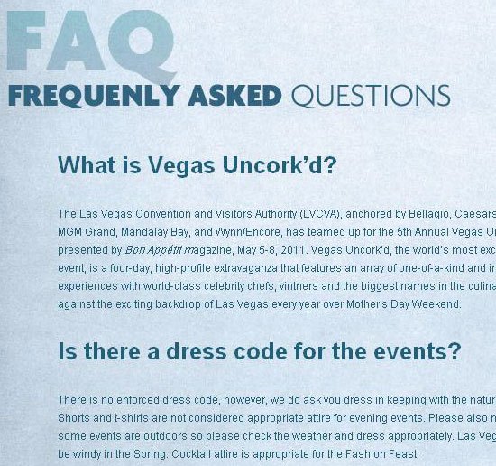
Readability can be achieved in different ways: text decoration (always minding the contrast between text and background), as well as line- and letter-spacing. Good CSS typography applies here. Bet Your Followers uses contrasting colors to good effect. 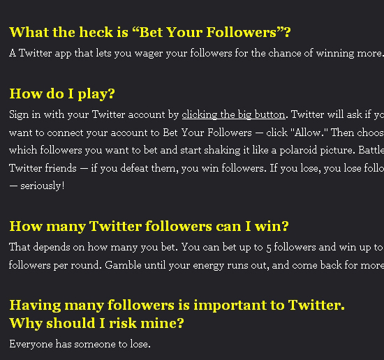 As a counter-example, Vegas Uncork’dloses on legibility because of the lack of contrast between background and text, as well as the small font size.
Categorization of Questions
Users who are looking for an FAQ page probably got confused somewhere else on the website. Don’t make it worse with tangled topics. Basic categories increase readability — a major building block of efficiency.
Name the categories intuitively to avoid further confusion. AGIA displays categories in a tree schematic, with a short description of each. 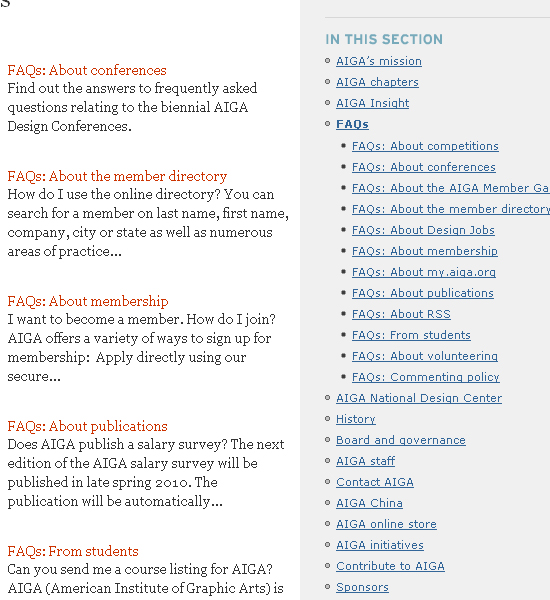 Here’s one idea: put the most important questions and answers in a distinct category.
IMDB puts its top questions in their own category, no doubt increasing findability. 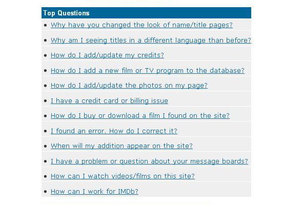 Mint has a well-categorized FAQ page. The categories are named well, too.
In addition, they list the most frequently viewed questions. 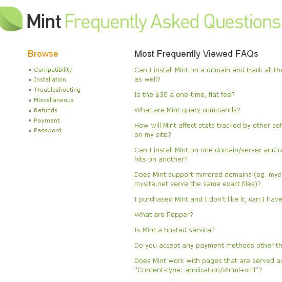 Notable also has good categories, as well as a list of top FAQs.
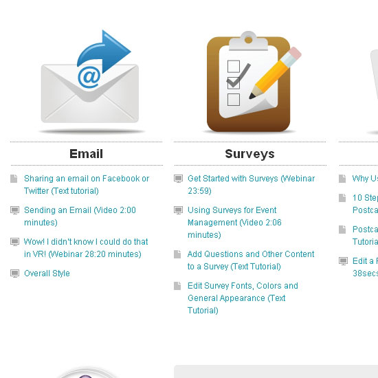
 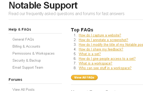 Using icons can be effective in supporting categories, as Vertical Response does here.
 While ABA English categorizes relatively well, the naming is inappropriate, so readability suffers.
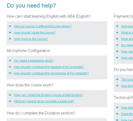
Search
For ease-of-use, search functionality is essential for longer FAQ pages. When an FAQ page has many categories and subcategories, each described in detail, search becomes more important than ever.
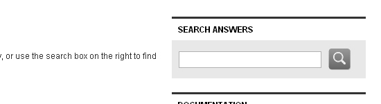
FAQ search should differ from the general search system of the website, and this difference must be denoted in order to reduce the amount of search results and make finding the right questions easier. IMDB adds a heading to indicate that the search will retrieve helpdesk topics only.  The label of the search feature on the FAQ page of SurveyMonkey works well.
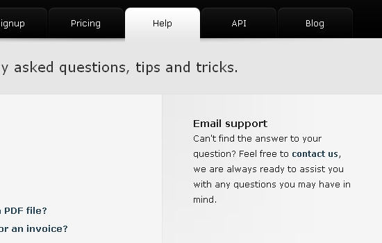
Providing Visuals with Answers
Often, a picture is worth a thousand words. If images can help solve a user’s question, don’t hesitate to use them. For example, The Bank of Washington offers screenshots to illustrate the answer to a question like, “How do I recover my lost password?” 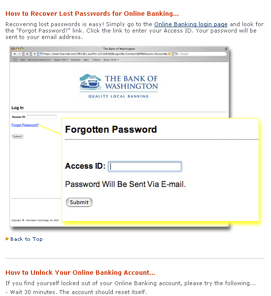
Tips For Structuring an FAQ Page
If you have only a few questions and answers, put them together rather than on separate pages.
Of course, page length must be considered. Endless scrolling will tire users and cause them to leave before finding answers to their questions. Keep the page as short as possible.
Make sure each question and answer pair is valuable. Some circumstances make long pages unavoidable; linking to the top of the page after each answer is a good solution. For the sake of readability, distinguish questions from answers, whether by color, size, typeface or decoration.
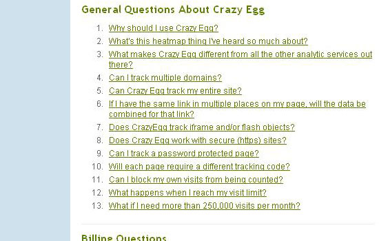
ETS has a well-structured FAQ page. Questions and answers are organized by topic, and the topics are collapsed by default, thus saving space. 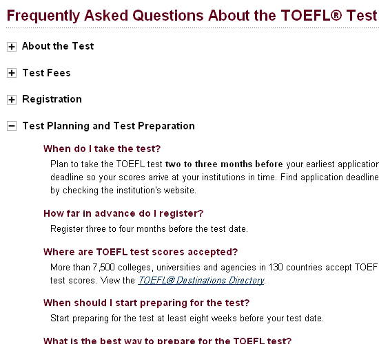 CrazyEgg puts its questions on one page and answers on another, which is not very convenient for users.
 Despite the wealth of material on NASA‘s website, the difference between the questions and answers isn’t very clear.
 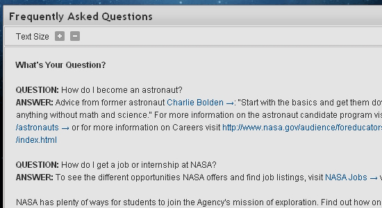 The way NetFaqs separates questions and answers is problematic.
 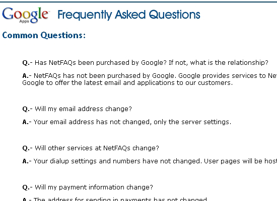 PodShop indicates questions with a different background, a simple and effective way of creating a distinction between questions and answers.
 The “Back to top” links on Rapid XHTML allow users to return to earlier sections of the page without having to scroll up.
Conclusion
Designing FAQ pages, amid all the other pages of a website, can be complicated work. Keep in mind that “FAQ” is a general name for the type of page that answers real questions and guides users.
Most users have had trouble somewhere else on the website and are looking for a specific answer, so design the page in a way that actually helps them.
Related Content
- Guidelines for Writing a Good About Page
- Five Simple but Essential Web Usability Tips
- Effective Website Help Systems: Tips and Examples
-
 President of WebFX. Bill has over 25 years of experience in the Internet marketing industry specializing in SEO, UX, information architecture, marketing automation and more. William’s background in scientific computing and education from Shippensburg and MIT provided the foundation for MarketingCloudFX and other key research and development projects at WebFX.
 -

WebFX is a full-service marketing agency with 1,100+ client reviews and a 4.9-star rating on Clutch! Find out how our expert team and revenue-accelerating tech can drive results for you! Learn more
Make estimating web design costs easy
Website design costs can be tricky to nail down. Get an instant estimate for a custom web design with our free website design cost calculator!
Try Our Free Web Design Cost Calculator
Share this article


Web Design Calculator
Use our free tool to get a free, instant quote in under 60 seconds.
View Web Design CalculatorMake estimating web design costs easy
Website design costs can be tricky to nail down. Get an instant estimate for a custom web design with our free website design cost calculator!
Try Our Free Web Design Cost Calculator


