

I will talk about a few interaction design concepts and best practices that when applied will result in the creation of great UIs. What is a good user interface? As you read through the following ideas, you will see two reoccurring themes: Ease of use and simplicity.
Ockham’s Razor and KISS
Ockham’s razor (or Occam’s razor) can be summarized as follows: When solving a problem that has more than one possible solution, the simplest solution is better, and most likely to be the correct one. In the context of user interface design (UID), this means the user should be able to do what needs to done with the minimum amount of actions required, and that a simple interface is better than a more complicated one. A closely related principle is the KISS principle.
The KISS principle espouses the idea that a concise and easy-to-understand design is better for the user. KISS is an acronym for “keep it simple, stupid”, or the more polite variations “keep it short and simple” and “keep it simple and straightforward”. 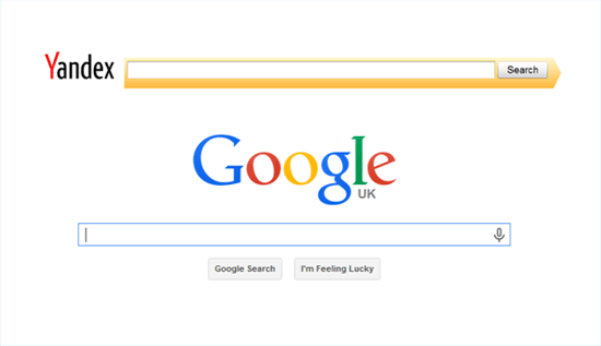 Use common design patterns to avoid confusion and maximize familiarity.
Comprehension is Better than Memorization
An effective UID doesn’t burden the user with the task of memorizing how the interface is supposed to work. One of the main roles of designers is to make the interface intuitive and straightforward. A few examples of techniques and components that help people understand a UI:
- Visual cues (such as icons)
- Metaphors
- Annotated illustrations
- Demos and walkthroughs
- In-line hinting
When we engineer interfaces that are optimized for comprehension, our users will be able to learn and reuse the UI more efficiently. 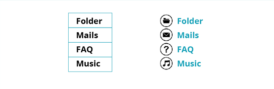 Visual cues like icons help people understand interface elements quicker.
Don’t Make Users Think
This design principle highlights the importance of clarity and self-evidence in user interfaces. In other words, an effective interaction is one that does not require significant amounts of brainpower to figure out.
Complex actions should be avoided. Interactions should not be mentally-encumbering. The layout and element groupings should be rationally sound.
This principle is from a usability book entitled Don’t Make Me Think by Steve Krug.
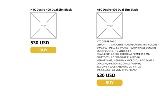
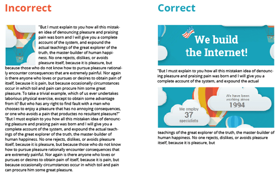
Omit Unnecessary Elements
UIs should only have essential elements. Nothing more and nothing less.
We can achieve this by through reductionism, progressive disclosure, following the 80-20 rule, and so forth.
Optimize the Signal-to-Noise Ratio
In certain cases, UIs may have important elements (signals) and not-so-important ones (noise). We should focus on increasing the signal and on avoiding noise.
Copywriting is Interface Design
You have heard it plenty of times: Content is very important and is a crucial component of UIs. This idea is discussed in the book Getting Real by Jason Fried.
Tried and True is Better Than New
Don’t strive to innovate for the sake of being different.
You should choose interface elements that have proven themselves in the past.  However, you should also test new design ideas for interface components that are questionably or inconclusively effective.
Poka-Yoke Principle
The Poka-yoke principle is also referred to as “mistake-proofing.” It’s a philosophy where you aim to prevent incorrect user operations through good design.
Miller’s Law
One function block should only contain 5-7 elements. According to Miller, 7 is the number of objects an average person can hold in his working memory (i.e. our RAM).
Consistency
Inconsistency is an issue that plagues large sites, such as portals, network sites and old sites. Consistency is a key factor in usability. A website’s design should be predictable.
A solid website architecture plan will help large sites maintain consistency.
Quick Access to Important Controls
Settings and management tools should be easily accessed. If possible, the user should be able to run everything from any page on the site.
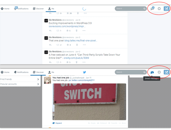 Twitter has a fixed top navigation bar that allows users to access important controls anywhere on the site.
Use Familiar Controls
Basic interface components such as buttons, text boxes, hyperlinks, and so forth are already familiar to Web users. Use these time-tested elements and visual cues when handling interactions to ensure success. 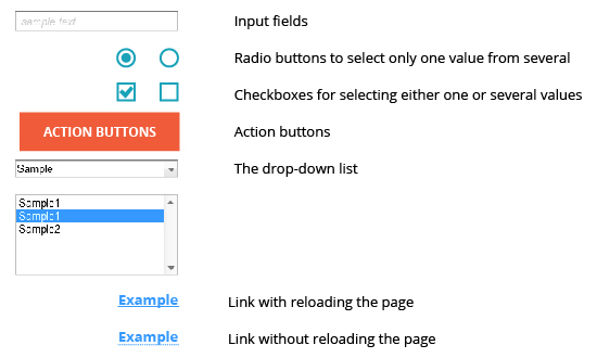
People Don’t Read, They Scan
People don’t like reading too much information, so don’t make them read a lot of it as a prerequisite to interfacing with your UI.
Related Content
-
 Mykyta Semenov, CEO at SECL Group https://seclgroup.com . Over 15 years of experience in the development of large web projects. Among our clients there are Kia Motors, Danone, Lego, Mazda Motor, Thomas Cook Group and many others.
 -

WebFX is a full-service marketing agency with 1,100+ client reviews and a 4.9-star rating on Clutch! Find out how our expert team and revenue-accelerating tech can drive results for you! Learn more
Make estimating web design costs easy
Website design costs can be tricky to nail down. Get an instant estimate for a custom web design with our free website design cost calculator!
Try Our Free Web Design Cost Calculator
Share this article


Web Design Calculator
Use our free tool to get a free, instant quote in under 60 seconds.
View Web Design CalculatorMake estimating web design costs easy
Website design costs can be tricky to nail down. Get an instant estimate for a custom web design with our free website design cost calculator!
Try Our Free Web Design Cost Calculator


