
Incorporating web forms into your website isn’t always the easiest thing to do; they often look very sales-driven, and don’t always flow well with your designs. But we need forms because they are the ultimate way to capture important user-contributed data. At Formstack (a web app that allows you to create online forms) it’s no surprise we love talking about web form optimization and best practices.
Users are more likely to see and complete your forms if they are easy to use and displayed strategically in your designs. Let’s explore a few strategic form-presentation techniques along with some examples.
Form Page
The most fundamental technique for displaying a web form is to have a dedicated web page for it. Examples of form pages are contact forms and sign-up forms.
People who come to form pages are generally ready to act, or are more likely to do so. For instance, when a user clicks on a sign-up button, they already have the intent to use the form they will encounter because they have a task they wish to complete (i.e., sign up for an account). For long web forms (like online surveys or e-commerce checkout processes) it would be better to use a form page because they need more screen space.
In addition, having a dedicated page will allow the user to focus at the task at hand without distraction. To be user-friendly and more successful at capturing information, form pages should be as short as possible. When we encounter unnecessarily long forms, there’s a higher likelihood we’ll choose to abandon it because there’s too much time and effort required from us.
Form Page Example
An example of a form page is HealthTab’s sign-up page.
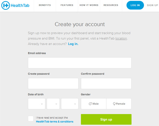 We can see in this example:
- The form is the most prominent component on the page.
- There are no distracting, non-essential elements in close proximity of the web form (e.g. photos, links, other calls-to-action, social media buttons, etc.).
- Text content is limited only to useful information that might help or encourage the user to complete the form. In this case, a promise of a reward: If you complete the form, you will be able to track your blood pressure and BMI.
On-Page Forms
This technique of displaying web forms is good for forms that need to be usable and available on multiple or all pages of a site. Examples of these forms are email newsletter sign-up forms and site search forms. Unlike form pages where the user has explicitly decided to see the form, on-page forms are presented without the user’s permission.
So we must make sure our on-page forms don’t drastically interrupt their experience. Since we know our users will see on-page forms without prior knowledge about them, we should be extremely transparent when describing the form. Being transparent will help build trust and encourage people to use the form.
On-Page Form Example
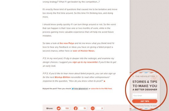
We can see an on-page form example by looking at the bottom of Sacha Greif’s blog posts where he has an email newsletter sign-up form strategically placed on the right-hand sidebar.
 As we can see from this example:
- It respects the user’s reading experience by being located off to the right and at the bottom of each blog post, away from the content — at this point of the page, the user has already gotten value from the site (reading a blog post for free) and thus more likely to be motivated to sign up.
- The form is very short, it only has one input field. We often see email sign-ups asking for our first name, last name and other information, but this form only asks for one thing: A person’s email address.
- The form explicitly tells users what to expect: A newsletter every Sunday, and we won’t get spammed by providing our email address.
Modal Window Forms
Modal windows are a way to display content on demand without requiring the user to leave the current page. Modal windows walk a fine line between being useful and being annoying (like popup windows), so using this technique should be used with utmost care. You can see many sites today automatically showing modal windows as soon as the page loads.
While this method might guarantee that you get your message in the face of your visitor, it’s frustratingly invasive. Allow your users to naturally find what they need through good, honest and thoughtful design.
Bad Modal Window Form
Under Armour, for example, immediately prompts new site visitors with a modal window that contains an email sign-up form. 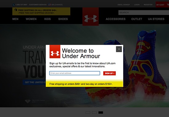 But is this effective?
As a newcomer to the site, how willing are you to give away your email address to this sign-up form? While this strategy might gain some traction for your email list, you need to prioritize UX.
Good Modal Window Form
Using modal window forms is a good technique if doing so can provide UX improvements. For example, Spotify uses a modal window form to speed up their sign-up process.
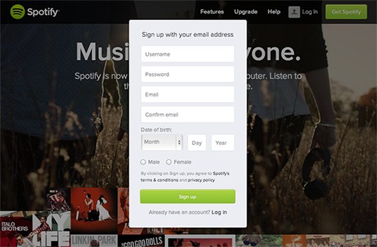 Instead of the user clicking on their sign-up button and then being directed to a form page, a modal window pops up near-instantly, saving her a few seconds and making the transition to the sign-up web form much smoother.
 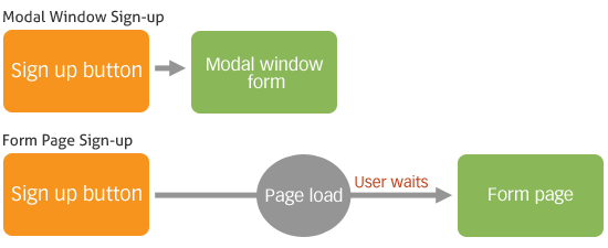 In the Spotify example, we can see a good rule to follow when displaying modal window forms: Let the user request for the form, don’t force it onto them. This concept is called progressive disclosure.
Off-Canvas Forms
Off-canvas layouts have become increasingly popular in mobile UI design.
And for good reason: When a designer is only working with about 2-3 inches of screen space, she doesn’t want to cram the screen with too much stuff. 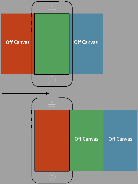 By placing elements such as navigation menus, auxiliary text and web forms off the screen until the user needs them, we can enhance UX and take advantage of progressive disclosure. In concept, it’s similar to modal window forms.
Where they differ is in execution.
When to Use Off-Canvas Forms
Forms that are suitable for off-canvas placement are those that aren’t regularly used, but are nonetheless essential and critical when a situation calls for them. One type of form that is well-served by off-canvas placement are search forms. The common design pattern for search forms is to place them at the top of the layout.
In other words, people expect search forms at the top-right or top-left of the screen when they need to search the site. But these locations are prime real estate that can be used more optimally for more critical elements. Not everyone that visits a web page needs to perform a search, so placing a big search form wastes valuable space in a vast majority of situations.
A good solution that allows the designer to shrink the space a search form takes up is to put it off-canvas until the user asks to see it. We can see this in Bellroy’s off-canvas navigation menu. 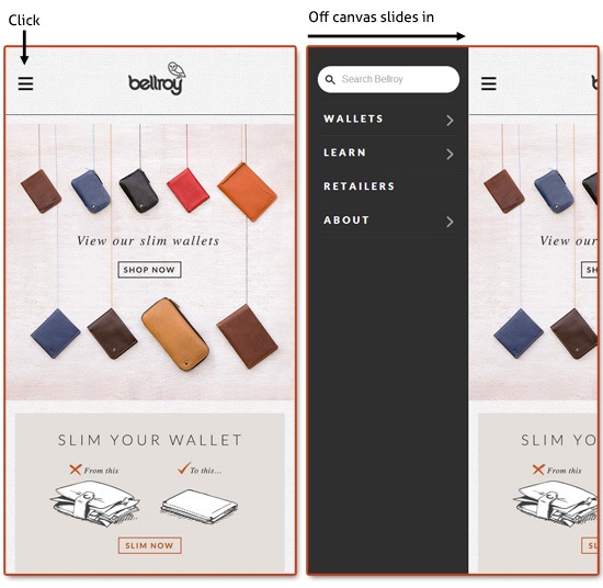 Placing not-always-crucial forms off-canvas allows us to free up screen real estate for more important elements.
When they become crucial — such as in the case when a user is having a hard time finding something specific on a site — that’s when we can show it to them.
Optimize Web Forms for People
Regardless of what design strategies you use to collect user information, make decisions based on your users’ needs. In business, it’s important to maximize leads or signups. But it’s even more important to keep your users happy.
Where have you found success with form placement in your designs? What’s one of your biggest pet peeves when it comes to lead generation techniques in UX/UI design?
Related Content
-
 President of WebFX. Bill has over 25 years of experience in the Internet marketing industry specializing in SEO, UX, information architecture, marketing automation and more. William’s background in scientific computing and education from Shippensburg and MIT provided the foundation for MarketingCloudFX and other key research and development projects at WebFX.
 -

WebFX is a full-service marketing agency with 1,100+ client reviews and a 4.9-star rating on Clutch! Find out how our expert team and revenue-accelerating tech can drive results for you! Learn more
Make estimating web design costs easy
Website design costs can be tricky to nail down. Get an instant estimate for a custom web design with our free website design cost calculator!
Try Our Free Web Design Cost Calculator
Share this article


Web Design Calculator
Use our free tool to get a free, instant quote in under 60 seconds.
View Web Design CalculatorMake estimating web design costs easy
Website design costs can be tricky to nail down. Get an instant estimate for a custom web design with our free website design cost calculator!
Try Our Free Web Design Cost Calculator


