

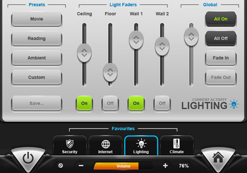
We encounter user interfaces everywhere in our daily lives. When I look at interfaces, they always inspire me and I hope that they will inspire you too. Here are 40 creative interface designs from DeviantART for your inspiration.
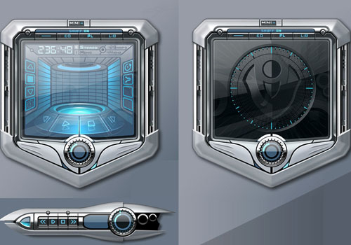
1. AdvancedUI: Status Screen
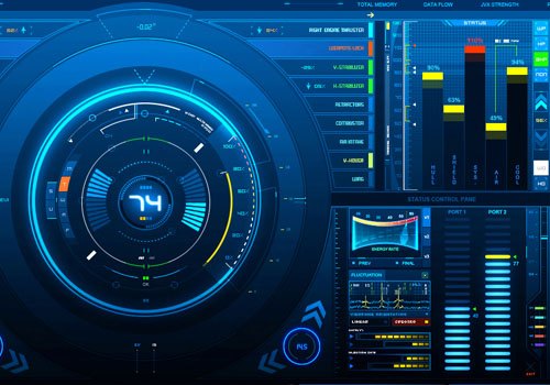 By ~z-design
2. Psyunit
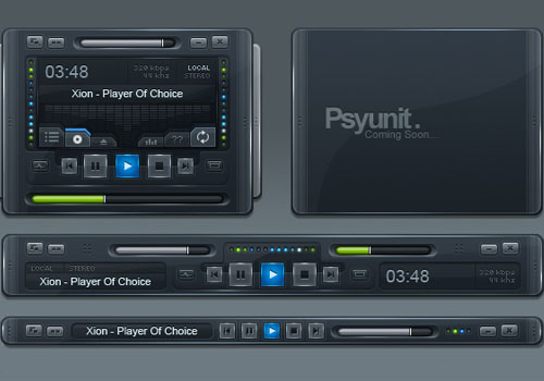 By ~Pureav
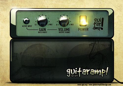
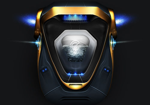
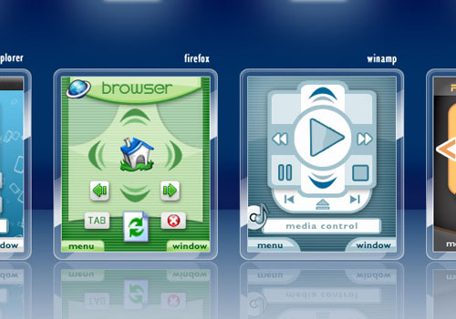
3. Car GUI
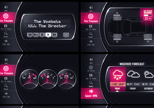 By ~upiir
4. Red Alert Interface
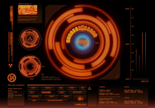 By ~metalkid
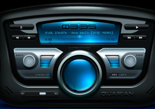
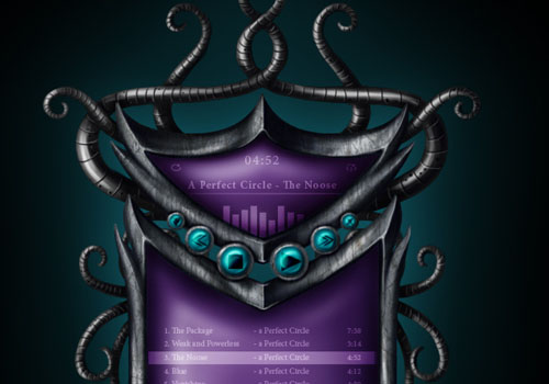
5. DarkMatter: Subspace Remote
 By ~skinsfactory
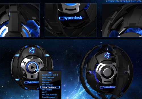
6. Quarian
 By ~SmarTramS
7. Blade alpha
 By ~vlda
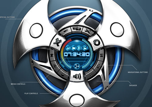
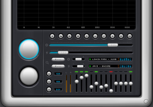
8. transformer music player
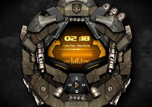 By ~kidaubis
9. Minimalistic – Winamp skin
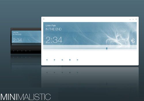 By ~Noergaard
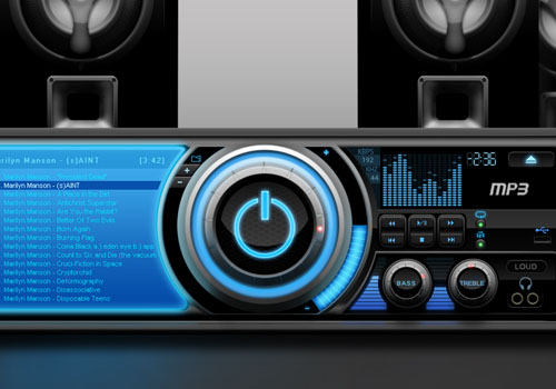
10. Signal
 By ~Pureav
11. Sylenth1
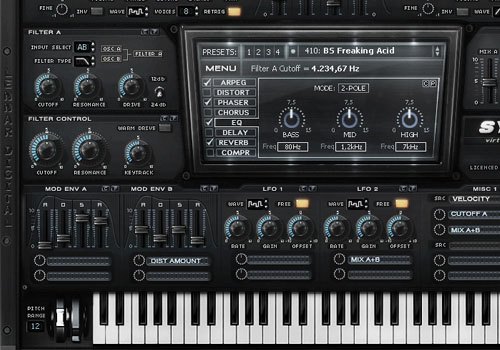 By ~s0nkite
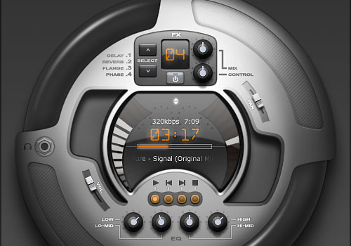
12. GUI design – guitar combo amp
 By ~upiir
13. Holy Quran MP3 Player Skin
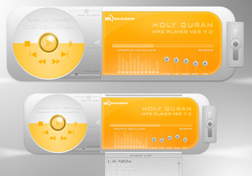 By ~riyaz7cp
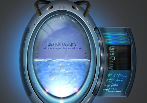
14. POD.249
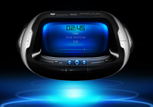 By ~ZelnickDesigns
15. what could have been
 By ~kriptoner
16. Insignia
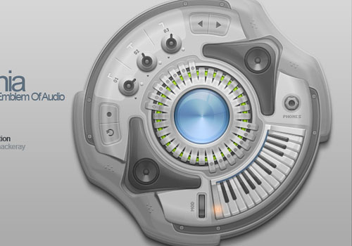 By ~Pureav
17. J.A.G.O – Grunge Interface
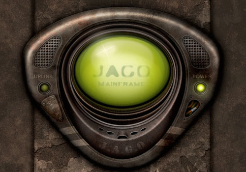 By ~screwcork
18. Soyuz Pocket Player
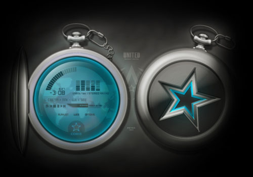 By ~kgbstyle
19. KrazyPlayer v1.4
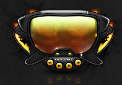 By ~krazytim
20. V O X Windowblind
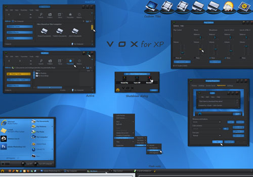 By ~vStyler
21. Second Battle Bay Step w PSD
 By ~ZelnickDesigns
22. GUIFX Practice Touchscreen UI
 By ~Pureav
23. Rage Player
 By ~Jonzy
24. Tangled Metal
 By ~Niarbon
25. Mobile Interfaces
 By ~actionthisday
26. leo+ player
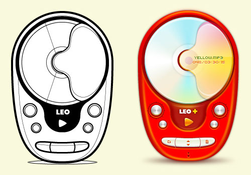 By ~leon-gao
27. mp3 player
 By ~DarthAcey
28. Dancida
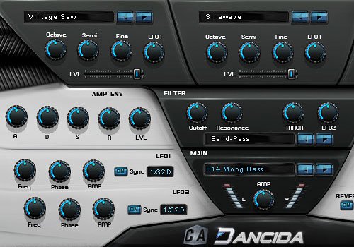 By ~s0nkite
29. VescoFX Provoker
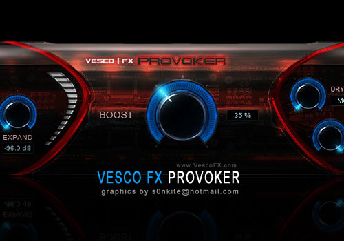 By ~s0nkite
30. W-Xindox
 By ~Shek0101
31. Mass Effect Pause
 By ~shadowh3
32. Vtion mobile business express
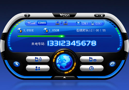 By ~seanking
33. SMC Interface preview
 By ~Shek0101
34. SAMSUNG dOtPHONE
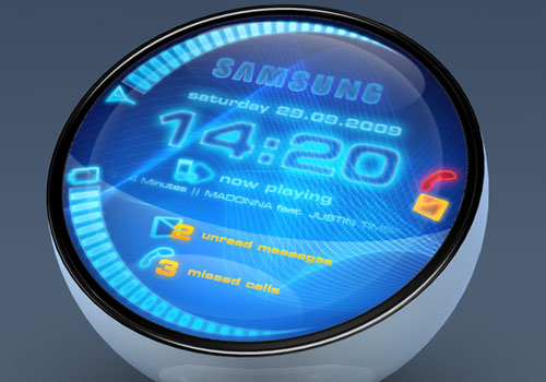 By ~switchu
35. The Shield Xion Skin
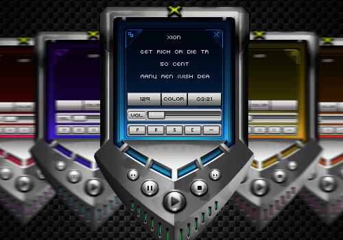 By ~ZelnickDesigns
36. interactive 3d touch screen
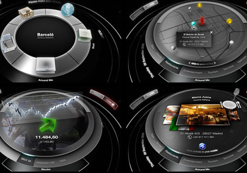 By ~stereolize-design
37. trying to inspire Z
 By ~verndewd
38. interface – netperformance
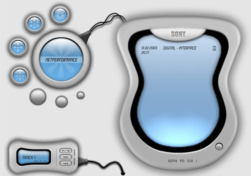 By ~000joker000
39. armor-AMP
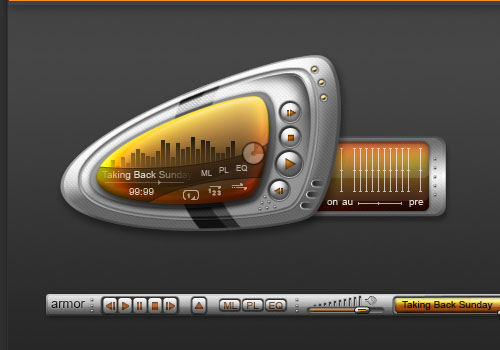 By ~faris18787
40. Wusikstation 2&3
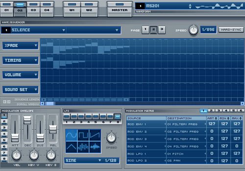 By ~grymmjack
Related Content
-
 President of WebFX. Bill has over 25 years of experience in the Internet marketing industry specializing in SEO, UX, information architecture, marketing automation and more. William’s background in scientific computing and education from Shippensburg and MIT provided the foundation for MarketingCloudFX and other key research and development projects at WebFX.
 -

WebFX is a full-service marketing agency with 1,100+ client reviews and a 4.9-star rating on Clutch! Find out how our expert team and revenue-accelerating tech can drive results for you! Learn more
Make estimating web design costs easy
Website design costs can be tricky to nail down. Get an instant estimate for a custom web design with our free website design cost calculator!
Try Our Free Web Design Cost Calculator
Share this article


Web Design Calculator
Use our free tool to get a free, instant quote in under 60 seconds.
View Web Design CalculatorMake estimating web design costs easy
Website design costs can be tricky to nail down. Get an instant estimate for a custom web design with our free website design cost calculator!
Try Our Free Web Design Cost Calculator


