

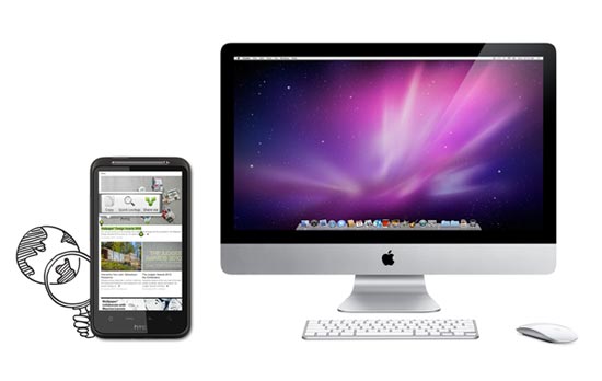
 Mobile web apps are useful alternatives to native apps for mobile devices. These days, Android-based products and iOS devices like the iPhone and iPad all come packed with fantastic mobile browsers (Mobile Chrome and Mobile Safari respectively), and Opera fans can install their preferred browser, too. From a desktop point of view, these products make browsing just about the most pleasurable experience possible.
CSS3 transitions, beautifully crafted HTML5 and embellishments mean their users get the highest possible browsing experience (assuming the content being viewed has been crafted with care and consideration). Their mobile counterparts equally do not disappoint. Fast-loading JavaScript, combined with equally impressive CSS3 and HTML rendering mean that your mobile browser can provide you with as rich an experience as a native app.
Being mobile and Web-based, there are obviously going to be performance concerns. One advantage of native over Web-based mobile apps is that you download much of the interface when you download the app originally, so you are only really loading relevant data when you use them. In addition, native apps can take advantage of the platform’s integrated development features (such as standard UIs), which can further aid performance.
Web-based mobile apps work in the same way as a website would, i.e., you load the content of a page when a user requests to view that page. We can use the browser cache to make things speedier for users with primed caches, but all graphics, images, scripts and data are loaded from your web server as opposed to being on the client’s device (in the case of most native apps).
Mobile Web App vs. Mobile Website
These days, more and more online products come with a mobile version, which is generally a slightly scaled-down version of a main website optimized for small screens (see Amazon, Twitter, and the BBC homepage, for example). A mobile version of a site often takes a site’s content and outputs it so the information can be consumed more easily on a mobile device. 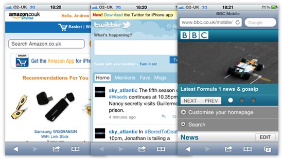 CSS media queries and other feature-detection techniques can be used to determine certain characteristics of a device or browser viewport, which gives developers the option to use the same code to present content at its best for the situation in which it is being viewed.
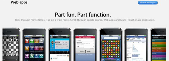
Mobile web apps are similar in a certain respect, because you want the content to be enjoyed and digested as easily as possible. I would argue, though, that a mobile web app differs from a mobile version of a website due to it being tailor-made for the mobile platform. The UI will generally be more customized, and will include more mobile-device-centric user interfaces, as can see from the following examples.
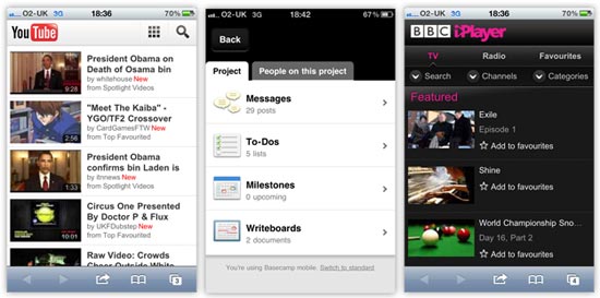 At a quick glance of the mobile web apps above, you can see how the user interfaces are more customized to suit the mobile platform. They use bigger hit areas optimized for fingertips, making them easier to use. The YouTube and iPlayer examples use more grid-based button layouts, presenting controls within the app in a similar way as native mobile apps do.
As an example, shown below, you can see the similarities between the two forms of apps and their UI elements by comparing the YouTube and iPlayer web apps, and the Sky Sports News native app on the iPhone. 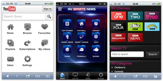
Mobile as a Platform
We’ve all got a mobile device these days — whether it’s a smartphone like the iPhone or a touchscreen tablet like the iPad — and most of us in the industry will use many different features of our mobile devices for various purposes. It’s now easier for a greater proportion of people to access the Mobile Web, and that should be an important consideration when you decide to launch a product in this space.
Mobile design and data delivery differs from the traditional desktop environment; let’s talk about that next.
Desktop vs. Mobile
 Here’s a quick breakdown of the big differences between desktop and mobile platforms:
- Mobile device hardware is smaller and generally tends to have lower hardware resources than desktops/laptops.
- Smaller screens bring about different design considerations and challenges.
- Touchscreen technology introduces new interaction concepts that differ from traditional input devices (keyboard and mouse).
- With a mobile device, internet connectivity is not always as reliable as a hard-wired broadband connection, which means internet connectivity is a concern and data transfer could be significantly slower.
Although these sound as if they are hurdles to get over, with careful thought and consideration, there’s no reason why they should be. Touchscreen technology is exciting. The smaller screen design will really make you think about how to get the user to interact with your mobile web app in the most satisfying way possible.
What we should really be doing is looking at the list of differences above and seeing opportunities to deliver our content in a different way. Building mobile web apps will be a paradigm shift from traditional web development and web design. Mobile is the platform that people can have with them all of the time.
That’s an exciting concept. In the next sections, we will discuss development/design considerations, as well as concepts and techniques for building mobile web apps.
Keep File Sizes Small
When you don’t have sufficient WiFi coverage, data connection will usually be slower or non-existent.
For any mobile product — whether it’s a native app that relies on data transfer, a mobile web app, or a mobile version of a site — concerns regarding internet connectivity means you should try to cut down on the amount of data that your user has to download. Quicker experiences are generally more satisfying and are therefore more usable. We can speed things up by keeping files smaller in size and reducing the number of files we serve to users.
Remember:
- Slower download speeds = longer loading times
- Smaller and fewer files = quicker loading times
It’s our responsibility to balance the above equations so that we create a beautiful-looking product that still functions responsively.
Dealing with Image Performance
We want to try to get rid of as many images as we can. For the images we keep, we want them to be as lightweight as possible.
If images are a necessity for particular parts of your mobile web app design, then there are a couple of extra steps we can use to trim off any excess fat from your files.
Use Adobe Fireworks for Transparent PNGs
I have to admit that I don’t really use Fireworks that much these days, as Illustrator and Photoshop more than meet my design requirements, but Fireworks does have one powerful ace up its sleeve. If you want to use PNGs with alpha transparency, then unfortunately, Photoshop will only allow you to export 24-bit PNGs (PNG-24), which are heftier than 8-bit PNGs.
Using Fireworks, we can save in 8-bit PNG, even when the image requires alpha transparency. In my experience, this can remove 20% or more off the file size with little to no loss in quality. All you have to do is open up your 24-bit PNG, then, in the PNG compression settings panel in Fireworks, set it to 8-bit with alpha transparency, and then export.
Voila, you have much smaller images to use! 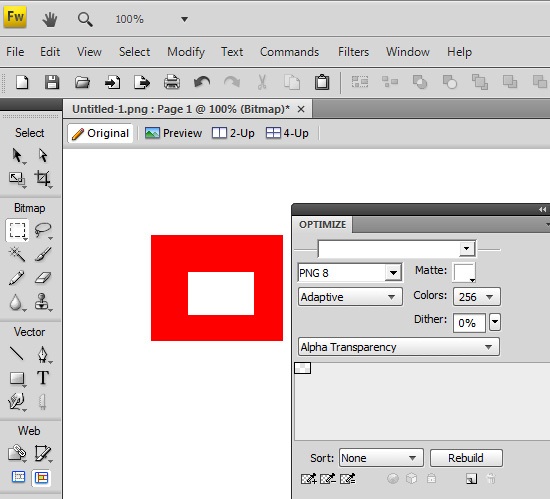
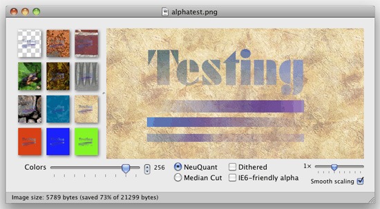
Using ImageAlpha
If Fireworks sounds like too much of a bother, check out ImageAlpha. Once installed, all you need to do is drag your images into its main window and then tweak the export settings to remove excess data from the images.
 Both techniques are very quick to implement. I would recommend using them for all projects, not just for mobile devices, because they’ll speed up web page loading times for your users due to reduced file sizes. To learn more about using PNGs in web designs, see the Web Designer’s Guide to PNG Image Format.
Leveraging CSS3
Mobile web browsers these days are pretty advanced. Android devices use a mobile version of Google Chrome, whilst the iPhone does the same with Apple’s Safari. Some mobile devices come with mobile Opera and others allow you to install a browser of your choice such as mobile Firefox.
So we’re talking about some pretty good browsers in terms of CSS3 and HTML5 feature support. CSS3 allows us to render things through code that would previously have required an image. We can use color gradients, draw rounded corners, create drop shadows, apply multiple backgrounds to HTML elements, and more — all of which can help improve performance and decrease development times.
If you look at a typical application interface via your smartphone, it’s almost guaranteed that you’ll find CSS3 being used. By using CSS3, we can reduce data transfer — particularly images and possibly excess HTML markup. We let the browser and the device do the work to render the interface more quickly.
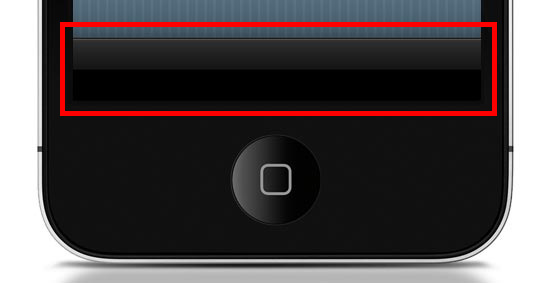 Want the Apple-esque toolbar highlighted above? All you need is the following style rule (which uses CSS3) rather than creating and loading a CSS background image (which is how we’d traditionally do this with CSS2).
.toolbar { width: 100%; height: 44px; background-color: #000000; border-top: 1px solid #4B4B4B; background-image: -moz-linear-gradient(top, #2F2F2F, #151515 50%, #000000 51%, #000000); background-image: -o-linear-gradient(top, #2F2F2F, #151515 50%, #000000 51%, #000000); background-image: -WebKit-gradient(linear, 0% 0%, 0% 100%, from(#2F2F2F), color-stop(50%, #151515), color-stop(51%, #000000), to(#000000)); background-image: linear-gradient(top, #2F2F2F, #151515 50%, #000000 51%, #000000); } Here’s what it looks like when applied to a div element viewed in Safari (desktop): 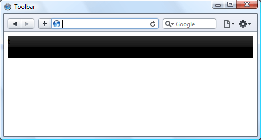 Now, instead of an image that won’t scale well — i.e., if the toolbar’s height needs to be increased, a CSS background image will not scale with it — we have a device-rendered HTML element with a gradient that will scale and adapt nicely for different device orientations and sizes.
It’s true that older browsers such as IE on a Windows Mobile device won’t necessarily render the gradient, but we can circumvent that problem by using the background-color within the same CSS rule as a fallback mechanism. This means all browsers capable of the gradient will show the gradient, but those that can’t will show the solid color instead (which we set to black, #000000). All users still get to enjoy your mobile web app interface, but older devices just have the extra layer of gloss removed.
This technique is called progressive enhancement.
HTML Canvas
If you fancy a little more work, then you can improve speed even further using the canvas element. Although using CSS gradients eradicates the loading of a physical image, that method still causes the device’s rendering engine to construct an image in the browser, which can result in a performance reduction depending on the device and browser.
By using the canvas element and some JavaScript, we can get the browser to draw the gradient without rendering it like an image. This technique can possibly be speedier on certain browsers, even if we need to use JavaScript. At the very least, using canvas is another tool you can use for drawing if it can’t be done in CSS3 or if you find that it’s a better option for performance.
To create the same toolbar above, first we need to create a canvas element in the HTML document like so:
<canvas id="toolbar"></canvas>
Then, with JavaScript, we can use the following script to produce the desired gradient on the canvas:
var canvas = document.getElementById("toolbar"); var context = canvas.getContext("2d"); var gradient = context.createLinearGradient(0, 0, 0, 44); gradient.addColorStop(0,'#2F2F2F'); gradient.addColorStop(0.5,'#151515'); gradient.addColorStop(0.51,'#000000'); gradient.addColorStop(1,'#000000'); context.fillStyle = gradient; context.fillRect(0, 0, 300, 44); This is what the above code looks like: 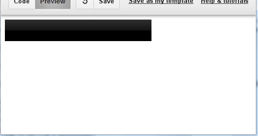
Hardware Acceleration
When it comes to mobile web apps, Apple’s mobile devices are a major consideration that we need to be aware of because of the current popularity of the iPhone and iPad. Safari 5 (on all platforms) brings hardware acceleration into the mix. If you’re not familiar with the feature, Apple describes it as follows:
“Safari supports hardware acceleration on Mac and PC.
With hardware acceleration, Safari can tap into graphics processing units to display computing-intensive graphics and animations, so standards like HTML5 and CSS3 can deliver rich, interactive media smoothly in the browser.”
Essentially this means that Safari can use extra hardware device capabilities to enhance the rendering of graphics and transitions, which in turn promises faster user interface performance.  Other browsers have added support for hardware acceleration, too — including Firefox 4, Chrome 10 and Opera 11 — so hopefully we’ll see them integrated into their mobile versions soon, providing silky smooth transitions and lightning quick graphics-rendering for all of us.
Be Cautious of CSS3 Rendering Performance
As brilliant as CSS3 is, certain properties can slow down a web page.
WebKit-based browsers, for instance, really seem to struggle with shadows in particular, so just be careful that you don’t apply too many of these to elements of your interface until the issue has been resolved. As another example, the opacity property can also cause problems with Safari’s hardware-accelerated rendering, so it’s probably worth avoiding over-use of this.
One workaround to the opacity property performance issue is the ability to use RGBa value notation to declare CSS color properties in modern browsers; the significant factor of this being that the a in RGBa stands for alpha. By declaring a color using RGB values, then appending one more value, we can have full control of the transparency of an element without having to use the opacity CSS property. Instead of:
.myElement { background-color: #000000; opacity: 0.75; }We could use:
.myElement { background-color: rgba(0, 0, 0, 0.75); }We can achieve the same results for our HTML element by using RGBa values, so when you want to add any transparency to HTML elements, make sure you’re using the most suitable method.
Consider the Offline User Experience
Finally, let’s briefly discuss HTML5 offline data storage.  Making use of local data storage means that once our data has been downloaded to the device, we can use a manifest file which allows us to cache certain files locally. What this means is that when users have no connection, we can continue saving data client-side.
Offline storage opens up a lot of opportunities. For instance, we can now try to maintain the user’s experience even when internet connectivity drops rather than having to defend against the issues posed by the possibility of internet interruptions. We’re not going to be able to allow data downloads from our server when there’s no connection, but at least we can provide the opportunity to store options and user-decisions on the client’s side, which we can then synchronize back to the server once the internet connection is restored.
Conclusion
Hopefully this article has shown you some best practices, tips, and techniques you can use to design and build quick-loading and beautiful user interfaces for your mobile web products. If you were on the fence, I also hope that this encourages you to get started with mobile web app development. Some people might think that mobile web apps are not as sexy as fully-fledged native apps for iOS or Android.
However, the biggest advantage of mobile web apps is that we are able to build them to be platform-independent — we can maintain independence from devices and operating systems. We can make web apps without the need for extra developer toolkits and platform-specific SDKs, and thus we can still use our everyday development tools.
Further Reading
- Developing Web Apps in 2011
- How to Make an HTML5 iPhone App
- 10 Excellent Tools for Testing Your Site on Mobile Devices
- Mobile Web Design: Is It Worth It?
- Mobile Web Design: Best Practices
Related Content
- Designing Web Apps for the iPad
- Situational Design for the Web
- Related categories:Web Development and User Interface
-
 President of WebFX. Bill has over 25 years of experience in the Internet marketing industry specializing in SEO, UX, information architecture, marketing automation and more. William’s background in scientific computing and education from Shippensburg and MIT provided the foundation for MarketingCloudFX and other key research and development projects at WebFX.
 -

WebFX is a full-service marketing agency with 1,100+ client reviews and a 4.9-star rating on Clutch! Find out how our expert team and revenue-accelerating tech can drive results for you! Learn more
Make estimating web design costs easy
Website design costs can be tricky to nail down. Get an instant estimate for a custom web design with our free website design cost calculator!
Try Our Free Web Design Cost Calculator
Share this article


Web Design Calculator
Use our free tool to get a free, instant quote in under 60 seconds.
View Web Design CalculatorMake estimating web design costs easy
Website design costs can be tricky to nail down. Get an instant estimate for a custom web design with our free website design cost calculator!
Try Our Free Web Design Cost Calculator


