
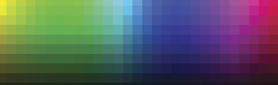
Creating the perfect color palette for each design project can be a time-consuming task. We might settle on a color scheme, only to change our minds five minutes later. Sometimes we’ll feel like we’ve found a solid set of colors, but don’t know how to make them work together in the project we’re working on.
Sometimes it seems like we don’t have enough colors or too many colors or the wrong combination of colors.
How is it that some web designers seem to be able to come up with the perfect color combinations in the work they produce?
How much of a role does choosing the right color palette play in web design? We’re going to explore some of the most popular colors being used in modern web design in the hopes of understanding why certain colors are used for particular websites. At the end, we will conclude with a list of tools to help you select colors.
Why Color Matters
Color is a strong influencing factor in design and in the world around us.
Each color has its own meaning to us based on culture, education, personality and a myriad of other factors. Thus, colors can strongly influence us in subconscious, natural ways.
Some people may trust a company more simply by their brand colors. Certain emotions and feelings can be evoked simply by seeing colors, such as “danger” for red, “cleanliness” for white, or “tranquility” for green.
An experienced designer knows that choosing the right colors isn’t just essential for aesthetics; colors can be used as a tool to convey a certain message.
When Color Doesn’t Matter
Most of us intuitively know why color matters, so before each design, we painstakingly develop a color palette, and then we adjust it, and then we adjust it some more.
We obsess over our color selections ad nauseam.
Sometimes, the “perfect” color or set of colors never feels right.
It needs to be a bit darker or a tad bit lighter or more saturated and a bit more blue. Before we know it, it’s midnight (and we’ve been up since 6:00 AM) and we still haven’t come up with a color scheme. It’s at this point when color doesn’t matter so much; the point in which we lose productive time over picking colors instead of just deciding and tweaking later if need be.
It’s when we strive for perfection that picking colors becomes an act of futility because we find that there’s no such thing as a perfect anything; we’ll always find a flaw in our decisions. Usually, your first instinct on color selection will be to get as close to “perfect” as you can get. Your instinct is smarter than you think, so trust it and see where it takes you.
The goal, then, is to put together a color palette based on intelligent decision from what you know about the design project, and then work with it.
Color Is Powerful
The hue, saturation, darkness, lightness of a color can affect its intended meaning and message.
And if color can mean something, then it has the power to influence those viewing it.
If you would like to learn more about the meaning of popular colors, read A Look into Color Theory in Web Design. Next, let’s go over some popular colors in web design, as well as briefly discuss their commonly held meanings in western culture.
Red Web Designs
Bright red gets attention pretty fast, and it can be used in elements at top levels of the visual hierarchy in a design.
In terms of visual weight, some studies conclude that it’s one of the heaviest colors. However, because red is such a powerful and heavy color, it shouldn’t be overused, because it can invoke a sense of urgency, and in most situations, you don’t want to make the viewer constantly feel this way.
Some believe red can enhance metabolism, increase blood circulation and stimulation.
Whether by culture, standardization or psychology, red is oftentimes used in situations warranting your attention, such as in stop signs, ambulance and police sirens, stop lights, fire trucks, and so on. Red is used in many fast food restaurants because it’s believed to stimulate appetite.
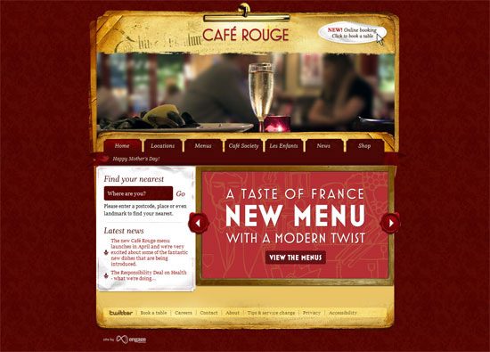
Café Rouge
The red website of Café Rouge below works well as the site is food-related, and as stated earlier, red has been credited with being able to increase appetite. The darker red also creates a sense of luxuriousness, passion and quality.
Carrot Media
Sharp lines and creative angles make the Carrot Media web design more intense. The strong intensity of these features complements the bright red used throughout the majority of the design. 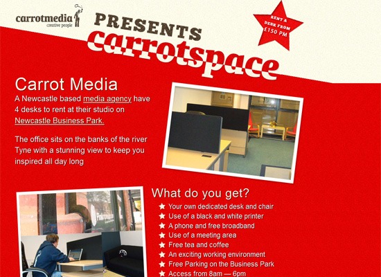
LBi
Using red may make users more actionable as highlighted in the LBi web design.
The bright color creates strong emotions and the type of heightened feeling that can make users move. This design is for a marketing and technology company that focuses much of their content around “powerful” marketing methods and highlighting case studies indicating strong change in their client’s lives. 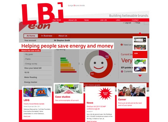
codebutton.com
The darker red of the design below isn’t quite as intense as some of the ones above, although it’s still powerful.
A set of productivity tools for developers are featured in the design; since red can indicate action, this site’s usage of red symbolically is effective. 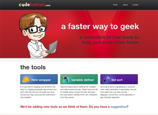
RedWeb
RedWeb is a design agency that provides practical design solutions. The company focuses on what a design needs for efficiency and usability.
Red for their design works well for the company’s straightforward, productive approach to design. 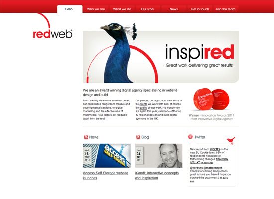
Orange Web Designs
Orange is like a muted form of red, giving energy but not at such an intense level. Orange is great for creative designs, or designs that need to give off a very positive and active energy.
Orange is often seen in web designs that attract a younger audience. It’s also great for portraying any emotion in design that require energy, as well as alertness and happiness. You may notice that many productivity apps use orange as an accent color.
Copimaj Interactive
The Copimaj Interactive design is very energetic, and uses orange to help convey that theme.
Another thing to note is that the brand surrounds technology, and would thus do well if they appealed to a youthful audience. 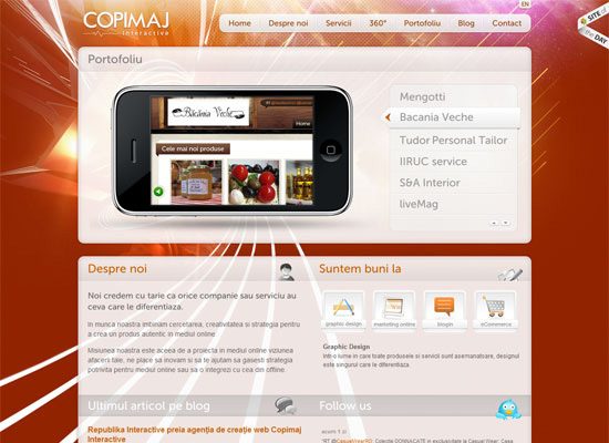
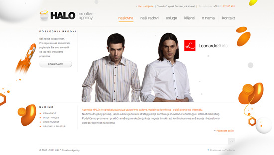
HALO Creative Agency
This website uses hints of orange to help create a sense of motion and energy. The orange compliments the young, energetic, and creative feel the company is going for.
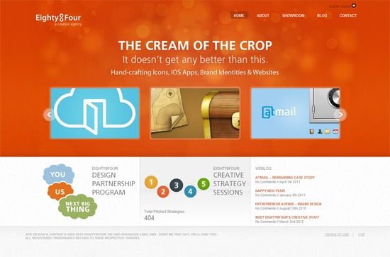
Eighty 8 Four
Eighty 8 Four is another creative agency using the same principles to attract the right kind of clients. Their work is targeted at clients who want fresh, innovative, energetic and useful designs. The darker orange gives a more professional feel while still maintaining the playfulness.
Rufus
Being such a bright color, orange works great as a contrasting color with a dark color like black, as can be seen on this website. This company site also tries to focus mostly on creative and innovative methods — something orange is great at representing. 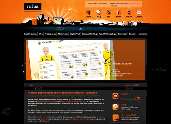
Citrus SEO
“Citrus SEO” was branded around the theme of bright and energetic feelings, and the Citrus SEO website uses orange to enhance that point.
We often think of orange when thinking of the word citrus, so the website color matches the brand well. 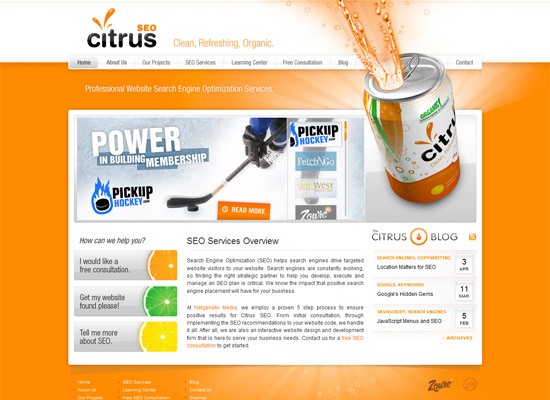
Yellow Web Designs
As we move to yellow, we can see that because the color is still close to orange, at a psychological level, it retains many of the same properties. Yellow can mean energetic and youthfulness.
Yellow is a happy color, and creates feelings of energy without stress or alertness. Like orange, yellow can be used in designs that require a positive energetic feeling.
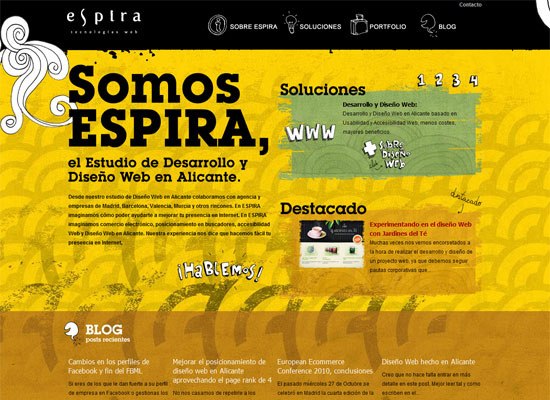
ESPIRA
Below, on the ESPIRA website, yellow is used for a creative portfolio, and gives off the impression that working with this designer would be a pleasant experience. There’s a lot of happy and positive energy in this web design.
Strange Native
Yellow can be a very bright and bold color, but the Strange Native website design uses a pastel yellow for a very happy and carefree feel without being too intense. The feel of the color works well with the minimalist approach to the layout as well. 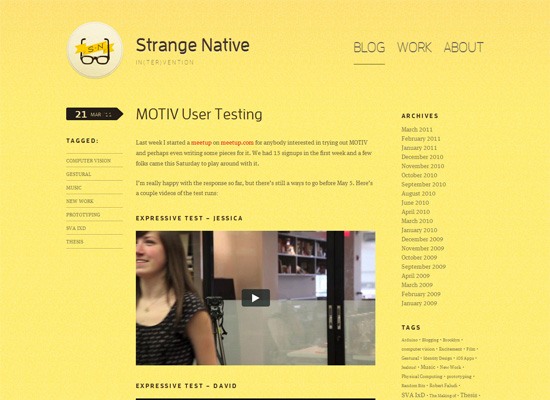
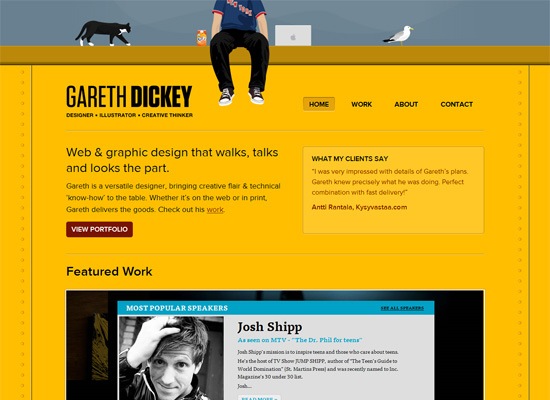
Gareth Dickey
Like orange, yellow makes black or dark colors stand out well as shown on this site.
It can even make colors of other hues and intensities more vibrant. The content is really focused in this design and gains more attention by simply being placed against a yellow background. Also, the design gives off a great impression for this designer — youthful (innovative), creative, and happy (easy/pleasant to work with).
Showcase of Undergraduate Research
On this subsection of the University of Central Florida site, the yellow in the middle of this page brings attention right to that point, and helps the text and imagery in the middle of it stand out more. Hints of yellow throughout the site provide the overall design with a unique feel, while still maintaining professionalism and a light and innovative feeling. 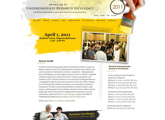
BeerCamp
Youthful and bold — exactly the impression BeerCamp needs to make.
The play on different shades of yellow creates a lot of good contrast in the design as well, and while it may all be yellow, the various shapes and shades make it interesting. 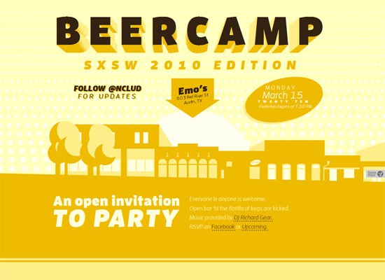
Green Web Design
Green in design is a safety net of colors. Because it’s so closely tied to nature, it’s very calming and relaxing.
Nature-inspired websites have been a trend in recent years, and while there are many colors that can come from nature — earth tones — green is the most popular. Green in almost any shade can be calming — even in the brightest shades. Brighter shades act like yellow — happy and playfully energetic.
Green can also convey energy, yet in a more calming way than yellow. Some great types of websites that would benefit from a green color palette are websites that relate to health, the environment, self-improvement or growth.
Acupuncture Wellness Solutions
Note that this website is related to health, and nature is very closely related to health. Also, acupuncture is an alternative healing method, that is also more natural than modern healing methods.
The website above gives off a calming sense of wellbeing and encourages self-growth. 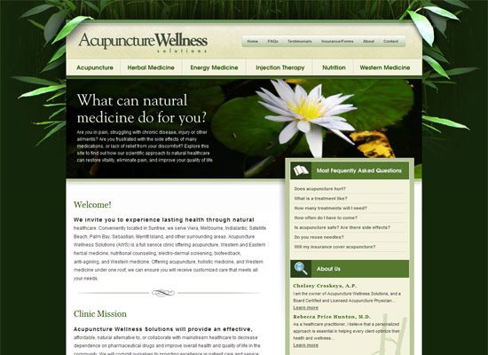
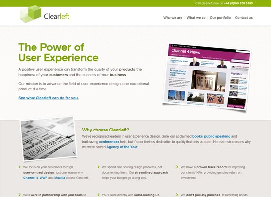
Clear Left
Clear Left uses a bright green to create an energetic and forward-thinking appeal. The energetic green color helps create that tone, while using such a bright shade implies positivity and creativity.
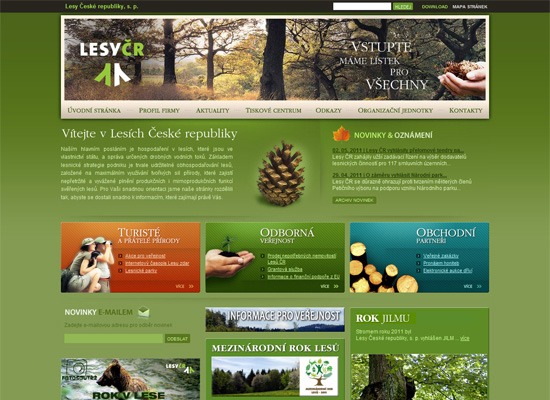
Lesy ?R
A nature-inspired site works well with green, like in this example. Specifically, this design hones in on a forest theme. Using green can bring out this nature-inspired theme and can create a soothing effect.
Milestone Solutions
The dark green used in this website makes the design appear professional and reliable, while the hue creates a soothing effect the reassures potential clients. 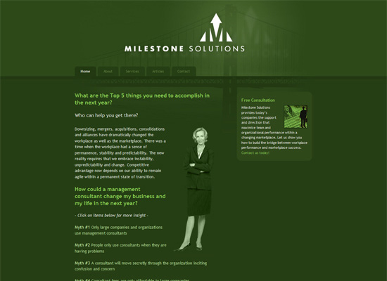
MORE
The brightest green in our showcase makes this website appeal to a creative and energetic audience. This company combines design and marketing services for businesses.
The bright green works well with the minimalist design. 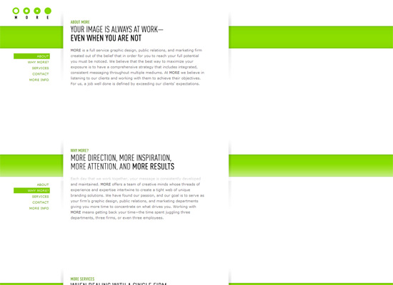
Blue Web Designs
Blue is one of the most stable, structural, and dependent colors available at our disposal. Brighter shades can give off a more creative feeling, while darker shades give off a feeling of a stronger, yet calm presence.
Many websites that need to portray quality and stability will use blue for their website and branding material. Large corporate sites, like IBM for example, win over customers because a dark blue is a trustworthy and quality-related color. However, many other websites use light blue for a lighter feel, with many of the same calming and confidence-boosting benefits of blue.
Jar Design
Using blue in a portfolio website may make clients feel more comfortable hiring this freelancer, because blue is a stable color.
There is less risk involved, and blue creates a calm decision-making process. The lighter shade in this design also takes on a less serious approach. 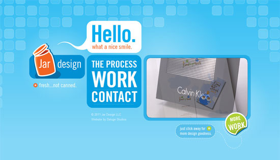
Adventure Drop
Blue can also be a very nature-inspired color, as we can see from it representing the water in this web design.
Bright hues of blue create an energetic feeling. 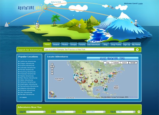
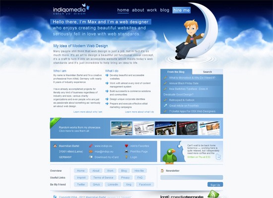
indiqo.media
A theme of a night sky is perfect with blue hues. As this designer is also offering creative services, blue also creates a sense of stability.
Agência P4
Look at how they have combined blue, which can be nature-inspired, with similar nature-inspired hues (green and brown). While the web design itself is not nature-themed, it creates a similar effect. 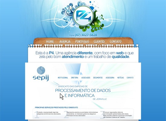
Ballpark
Clean lines and a beautiful interface are not the only things that make this design look so professional.
The deep and rich blue also helps create the effect. A brighter blue also helps establish a visual hierarchy. 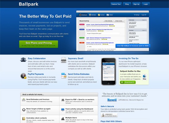
Purple Web Designs
Purple is often associated with royalty.
As such, it’s often used to convey luxuriousness. This color can also mean independence.
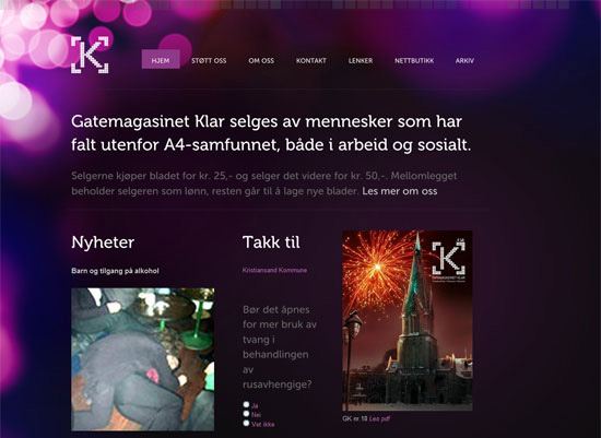
KLAR
This design is purposeful, valuable and rich. Purple gives off the feeling of wealth and value over other colors.
Woman to Woman Gynecology
Culturally, purple is a very womanly color, so it works well with the nature of this site. 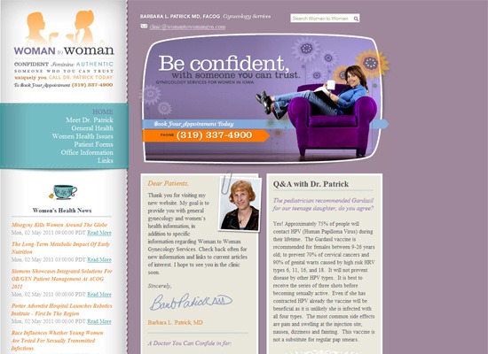
Celtica
Celtica combines purple with blue hues to create a very professional design. 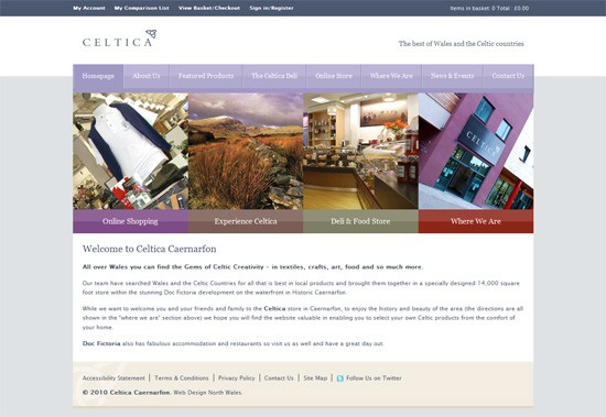
KentCov.org
This design mixes purple with blue masterfully.
Using deeper colors and blending the color in gradients create a mysterious theme. 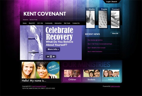
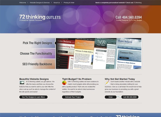
72 thinking
For this design, blue almost takes over, yet the purple is at a prime visual location and therefore makes a large impact. This design implies a company that is creative, yet also reliable, valuable and strong.
White Web Designs
White is often used in design for functional purposes (it’s a safe color to use as a background). Being the lightest color, it gives off the most refreshing and cleanest feeling. Designs that want to portray concepts of cleanliness, order and purity may best be served with white.
Cynosura
This web design puts a lot of emphasis on beautiful type and other delicate design elements.
A sense of cleanliness and a positive tone emanates from this design. 
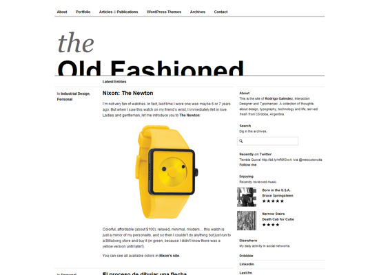
The Old Fashioned
Using mostly white on this blog makes the visuals stand out. A more creative composition of typography and layout can be used on a white background because the color is unobtrusive and doesn’t clash with a lot of colors.
Made by Sofa
Made by Sofa has always been one of the best examples of minimalism in web design, and the use of plenty of white space makes for a very open and airy design. 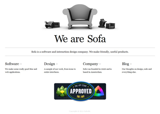
Airportbags Plus
Using white gives opportunities for using colors with great contrasts between them while still maintaining a design that looks clean and sleek as can be seen in this example. 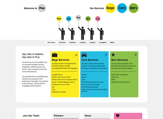
the MARTINI SHAKER
A simple design and color scheme make this design clear and to-the-point.
A plain white background works well in this instance. 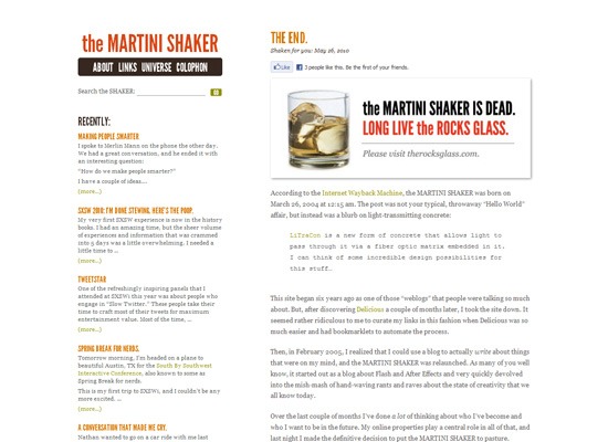
Black Web Designs
Black can have a very heavy feel emotionally, and may be used in design when strong emotions are needed to be portrayed. Black is a powerful and mysterious color.
While black can have negative connotations in some cultures, it’s also great for website designs that need a sleek, professional, and powerful tone.
Anderbose
This design uses black and darker shades of color to make a sleek and profound impact. Because it’s a portfolio site, the dark color also helps reinforce the colorful portfolio pieces. 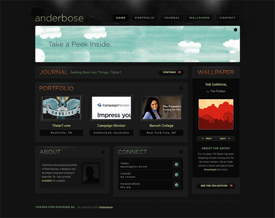
The Old State
A darker background mixed with strong typography and graphic details make this design look old and modern at the same time.
Elegance is the feeling the designer was going for here. 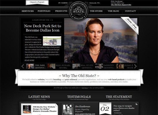
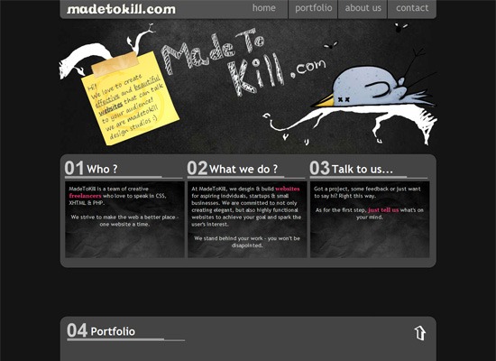
MadeToKill
A dark and comical theme is created for this site, with a dark background enforcing the dark theme. A more literal theme is also used here, using a dark background to act as a blackboard along with the typography and illustration.
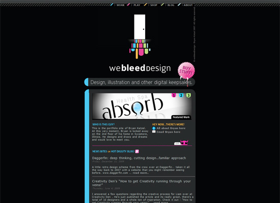
Bryan Katzel
The use of black in this example creates a very sleek and professional feel. Using bright colors to contrast the dark colors is good for readability. The bright colors invoke feelings of creativity and variety, while the darker colors create a feeling of stability.
Vyniknite.sk
The illustration is unique and creative, and the design overall is very well organized. The dark background helps foreground design elements stand out. 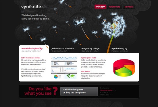
Mixing Colors
Many websites have a primary color that is used, based on the color’s meaning and what the website needs to accomplish.
However, many designers prefer to use multiple colors. Below we’ll look into three ways multiple colors can be used in a web design.
Color Accents
If you use a strong color as a primary color in a design, using hints of another contrasting color will help highlight important areas. Links, active navigation, and calls-to-action are often the elements you may wish to make distinguished.
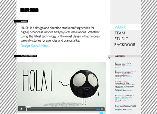
Hush Studios, Inc.
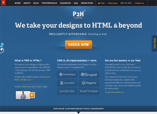
PSD2HTML
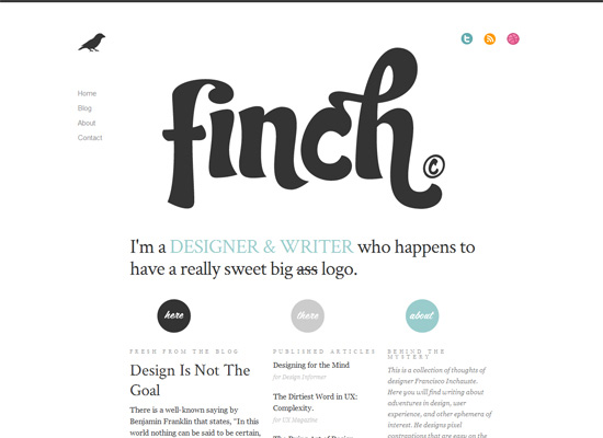
FINCH
Simple Combinations
Two or more colors can be used in such a way that no single color dominates over the other.
Instead, they play together to create a visually interesting and harmonious design.
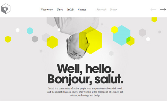
InCub
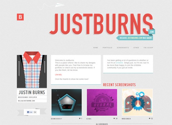
Justin Burns
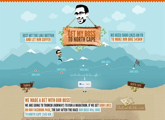
Get my boss to North Cape
Many Colors
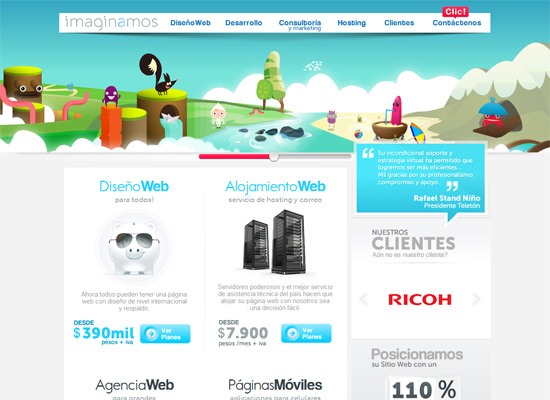
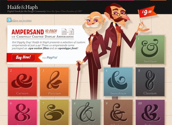
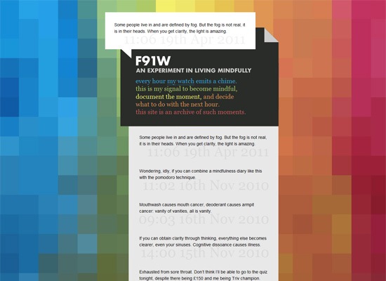
Other designs may use a wide range of colors. This can create a very vivid look; using a mix of colors can create a very energetic, active, and busy design.
imaginamos
Haäfe & Haph
F91W
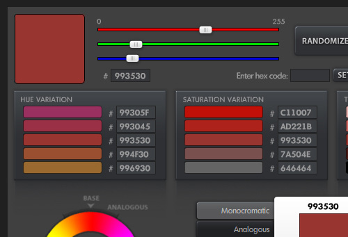
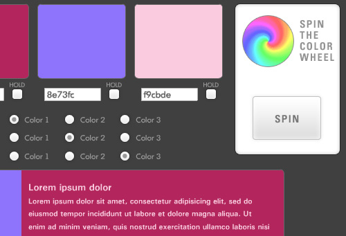
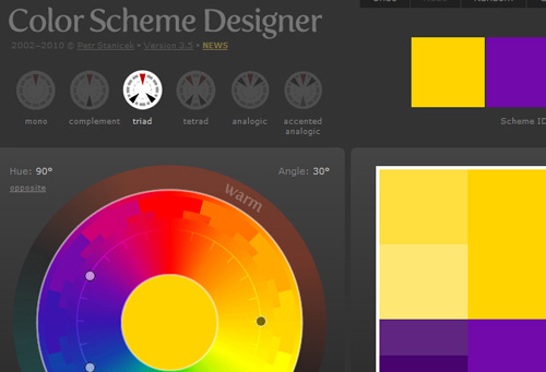
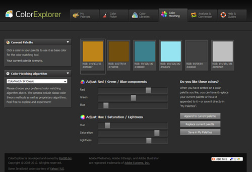
Resources and Tools
Here are some color tools to help you generate color palettes for your next web design.
Toucan
Color Wizard
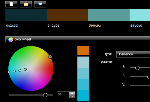
Color Wheel
Color Scheme Designer
Color Explorer
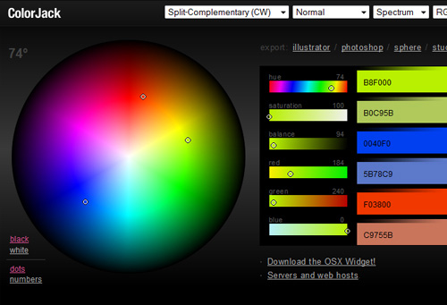
Color Jack
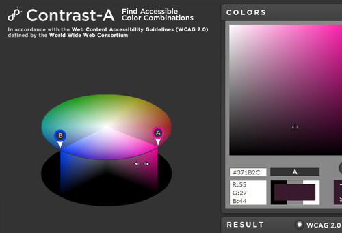
Contrast-A
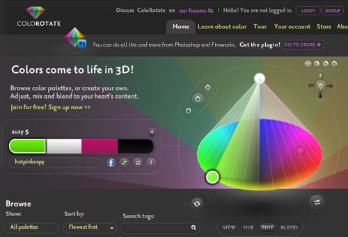
Color Rotate
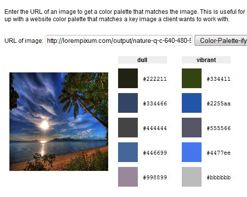
Color Palette Generator
Web 2.0 Color Palette
Conclusion
Color can have a profound impact on design. Always consider color carefully.
Choosing which colors to use are just as important as choosing not to use a certain color. Color is one of the most powerful design concepts and it can greatly influence how a web design is perceived.
Related Content
-
 President of WebFX. Bill has over 25 years of experience in the Internet marketing industry specializing in SEO, UX, information architecture, marketing automation and more. William’s background in scientific computing and education from Shippensburg and MIT provided the foundation for MarketingCloudFX and other key research and development projects at WebFX.
 -

WebFX is a full-service marketing agency with 1,100+ client reviews and a 4.9-star rating on Clutch! Find out how our expert team and revenue-accelerating tech can drive results for you! Learn more
Make estimating web design costs easy
Website design costs can be tricky to nail down. Get an instant estimate for a custom web design with our free website design cost calculator!
Try Our Free Web Design Cost Calculator
Share this article


Web Design Calculator
Use our free tool to get a free, instant quote in under 60 seconds.
View Web Design CalculatorMake estimating web design costs easy
Website design costs can be tricky to nail down. Get an instant estimate for a custom web design with our free website design cost calculator!
Try Our Free Web Design Cost Calculator


