
 Web designers don’t have much time to impress website visitors and persuade them to stay on the websites we craft. They want to find things quickly, and we should design sites to aid them do just that. One of the most important ways to do this is with focal points.
A focal point is a prominent section on a web page that we want to guide the user’s attention to. The focal point is the eye-catching centerpiece of the page; it stands out and is distinct than other components. Here’s the rationale: By designing such an area of interest, we’re able to emphasize the most significant aspect(s) of the web page and convey the main purpose of the website.
The Basics
It’s best to have a single focal point. Find the most important thing on the page, and then accentuate it. The focal point should relate directly to the goals and priorities of the website and to the website owner’s expectations.
It’s possible to have more than one focal point, but I recommend focusing on one main call-to-action. Having many focal points on a page is the same as having none at all because, then, users won’t be able to discern which one’s the most important. If you must have more than one focal point, they should be distinguishable.
Create a visual hierarchy to denote which focal point is more important. Differentiate them from one another with variety in size, color, position, visual weight and other distinction techniques.
Where to Put Focal Points
Most users see the home page first, so that’s probably the best page for your focal point.
But creating a focal point only on the home page is a common mistake. All web pages should have a focal point that gives the user quick access to the most important piece of information on the page. On a scrollable page, for example, put the focal point above the fold (the header is a good candidate location).
On a non-scrollable page (i.e. a page that is visible all at once), you have more freedom. Use elements that already exist, but use them well.
Make something simple elaborate; make something ordinary impressive. If you can, imply a narrative. Inform your design work with a story.
How to Create Focal Points
Here are design elements you can tweak for establishing your focal points. I’ve included some real-world examples and counter-examples of each element.
Typography
Textual elements have strong potential to become attention grabbers, but typical websites are crammed with large amounts of text, so particular parts must be emphasized.
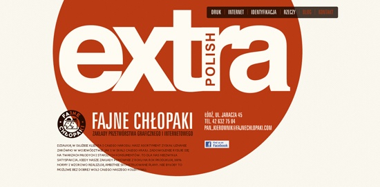
Size, color, spacing (between characters and lines) and typeface are the factors that can be manipulated for increased emphasis of textual elements. Eduardo de la Rocque uses different typefaces and sizes to make three level of visibility. 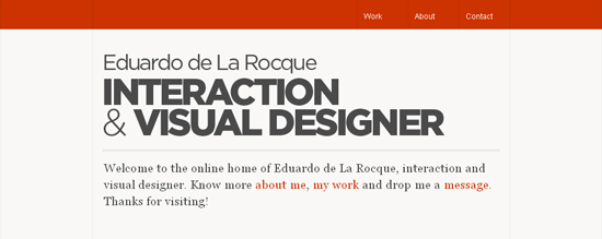 The huge typography on Fajne Chlopaki‘s website catches the eye.
 Music band The Autumn Film announces a special offer with bold type, creating a true focal point.
 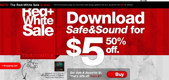 Sandstone shows why good labeling provides a captivating focal point.
 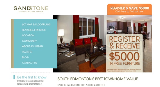 Diversity in font sizes can do a lot, but colors are what really draw the eye.
The header on the website for Flash Gaming Summit 2011 is a good example. 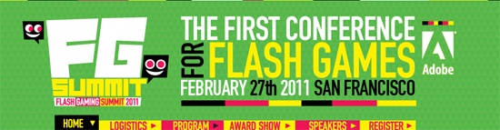
Illustration
Graphical components convey messages quickly and without needing much description. They also work as visual hooks to grab the user’s attention.
It can also be used to show steps in a process, being so vividly descriptive and memorable. Most of the time, graphic elements are silver bullets: save them for the right moment and don’t overuse them. WPCoder has an appropriate and descriptive focal point.
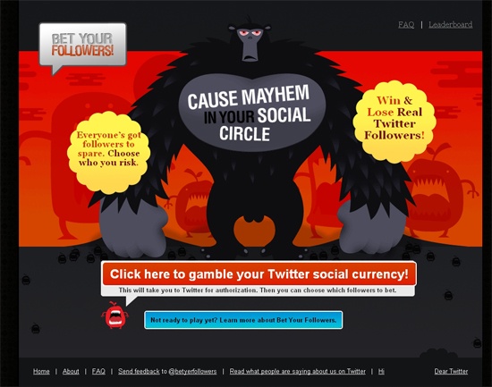
It’s a beauty. 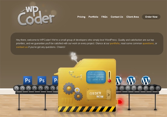 The home page for Bet Your Followers has several focal points, but the main illustration (of the gorilla) is predominant and guides the eye to other points. Notice its arms and the space just below them — a good example of how to handle several focal points.
 Aka-Acid has a beautiful design, but the lack of a particular focal point is a drawback.
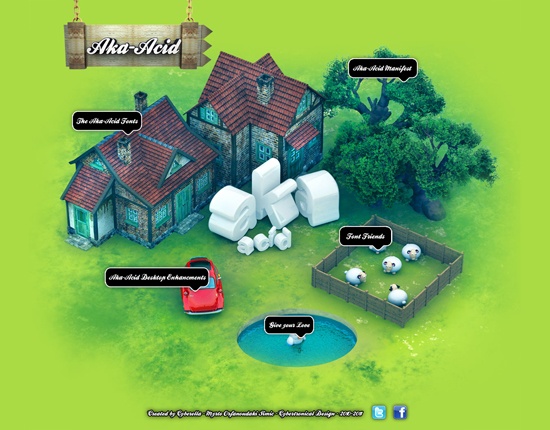
Buttons
One of the most popular elements in web design in recent years is the call-to-action button. Big buttons are on almost every website.
They are effective because of their high visibility (due to their size), familiarity and descriptive labeling. Buttons are attractive elements, but overuse or misuse will detract from their effectiveness. On Fatburgr, two simple buttons catch the user’s attention.
Their size and color are effective. 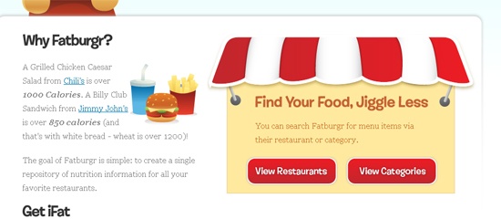 SolidShops uses clear and obvious buttons to create focal points both above and below the fold.
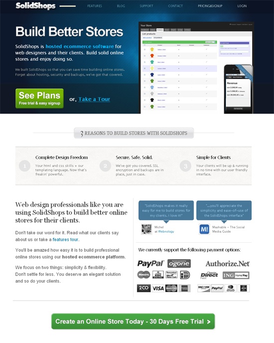
Whitespace
Using whitespace is one of the simplest ways to draw the eye to specific areas of the page without resorting to visible elements.
Apple uses whitespace perfectly to make the featured product obvious. 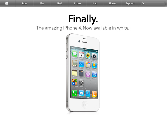 Ask hits the spot by leaving enough whitespace around the search box.
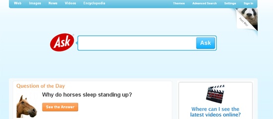
Decoration
A way to distinguish something from its surroundings is to use simple decoration.
Color and positioning go a long way towards creating great effects, and the effectiveness of other elements greatly depends on how well these basic elements are used. On 3rdM, the only thing that immediately attracts attention is the color blue. After that, the eye goes to the largest item in between the blue icons.
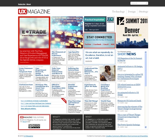
Simple but effective. 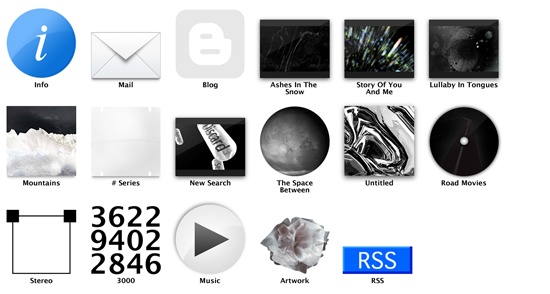 The part of the page that is biggest and has the highest contrast in color usually stands out the most. UX Magazine‘s home page has several focal points on different levels.
 As demonstrated by Train-ee, tag clouds are a good way to arrange focal points by size.
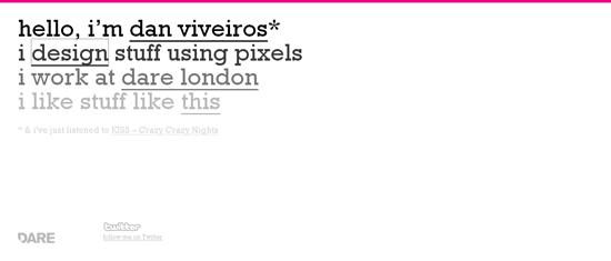
 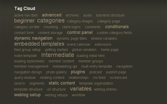 Basic decoration can bring out certain elements in the text. Dan Viveiros’ website is minimalist and elementary, but it works.
 Pages like this one on Post Typography distract users; the eye has nowhere to rest, and, frankly, it’s confusing.
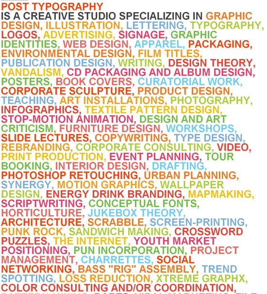
Conclusion
Every web page has to present something useful and attractive to its users. A variety of methods can be used to emphasize certain sections of a web page, and I’ve gone over some of them with you.
Related Content
- Working with Visual Weight in Your Designs
- Designing Websites with Personality
- Craftsmanship in Designing Websites
-
 President of WebFX. Bill has over 25 years of experience in the Internet marketing industry specializing in SEO, UX, information architecture, marketing automation and more. William’s background in scientific computing and education from Shippensburg and MIT provided the foundation for MarketingCloudFX and other key research and development projects at WebFX.
 -

WebFX is a full-service marketing agency with 1,100+ client reviews and a 4.9-star rating on Clutch! Find out how our expert team and revenue-accelerating tech can drive results for you! Learn more
Make estimating web design costs easy
Website design costs can be tricky to nail down. Get an instant estimate for a custom web design with our free website design cost calculator!
Try Our Free Web Design Cost Calculator
Share this article


Web Design Calculator
Use our free tool to get a free, instant quote in under 60 seconds.
View Web Design CalculatorMake estimating web design costs easy
Website design costs can be tricky to nail down. Get an instant estimate for a custom web design with our free website design cost calculator!
Try Our Free Web Design Cost Calculator


