
Having a web-based portfolio is crucial for displaying your online and/or offline work. The key to an effective portfolio design is how you to set up the content. In this article, we are going to cover various ways designers and artists set up their portfolio site.
We’re also going to look at some well-designed examples from each style.
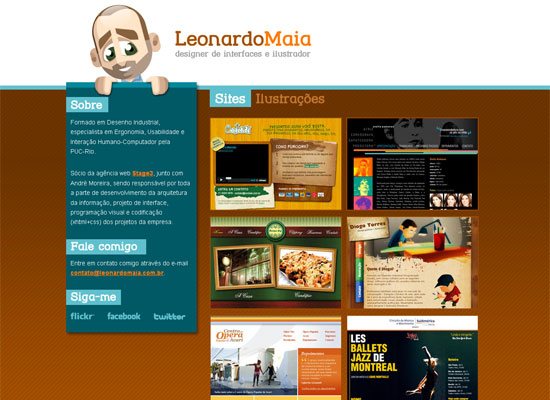
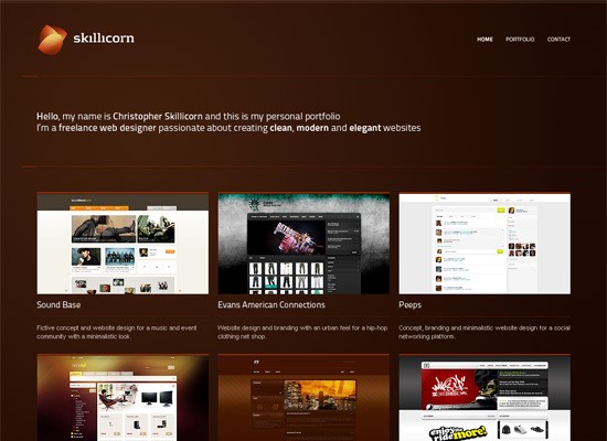
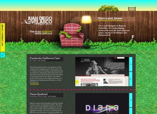
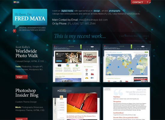
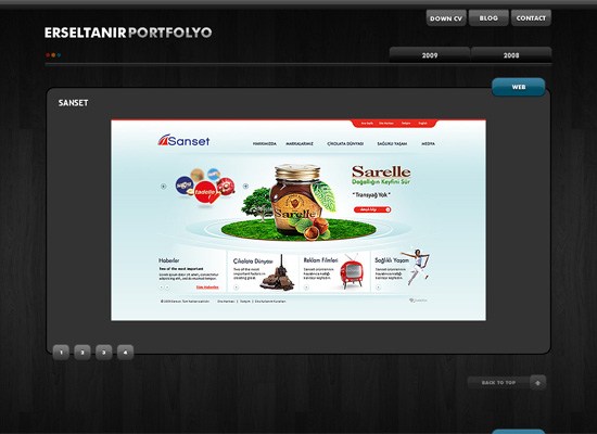
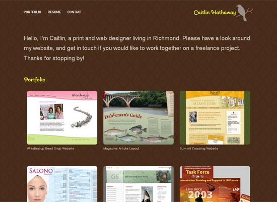
1. Portfolio as the main focus
These portfolio websites are usually pretty simple, having some basic information on the front page. All the focus is geared towards the design work.
Leonardo Maia
skillicorn
Juan Diego Velasco
Fred Maya
Ersel TANIR
Caitlin Hathaway
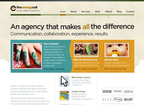
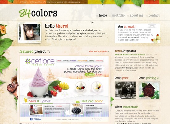
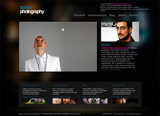
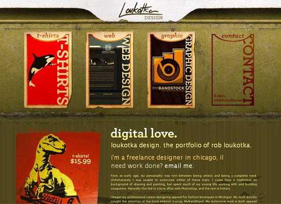
2. Featured Work/Navigation as the main focus
This variety of portfolios usually consists of the designer displaying their design projects in a “featured” section on the web page. In addition, the designer can use their design/art – in combination with visual design elements – to set their home page as the jumping point to get to the rest of the site’s content.
CamiloHolguin.com

theenergycell
84colors
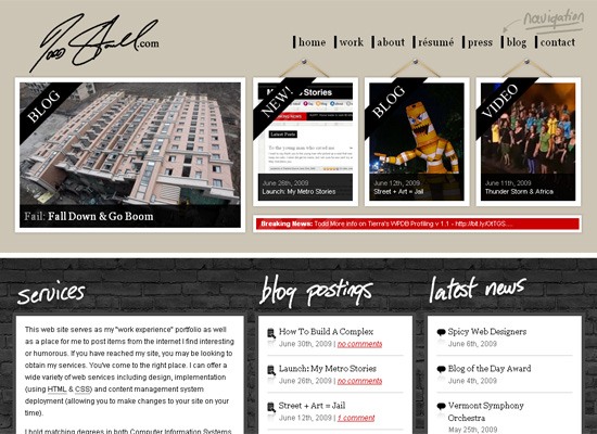
Todd Stowell
Trevor Clark Photography

Bohoe
Loukotka Design
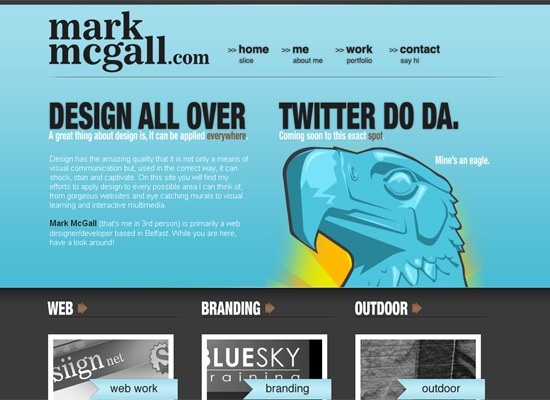
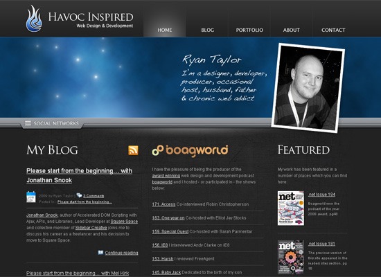
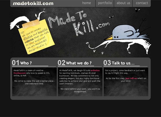
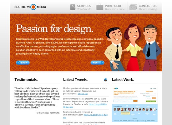
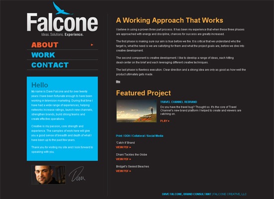
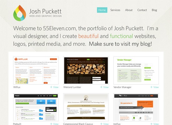
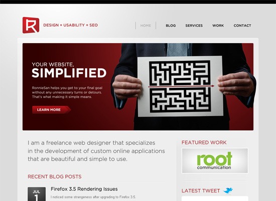
3. Services/”About us” as the main focus
This portfolio design style typically has a short paragraph/blurb about the site owner’s services and/or a description of who they are. These descriptions are built either into the header, or just below it. These websites may have a weblog or a showcase of their work below the header, but the main goal is to center on what the designer does.
mark mcgall
Havoc Inspired
gummisig

MadeToKill
Southern Media
Falcone Creative
55Eleven
RonnieSan
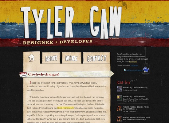
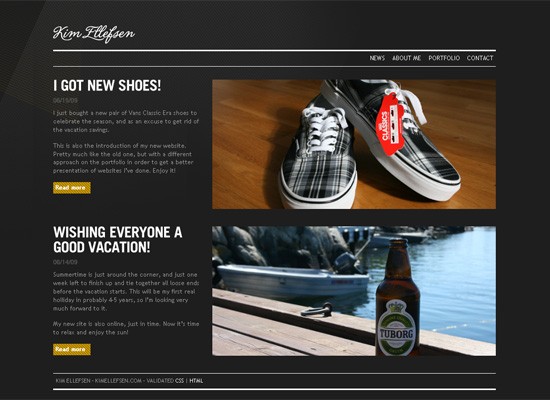
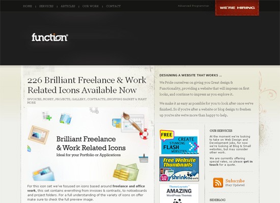
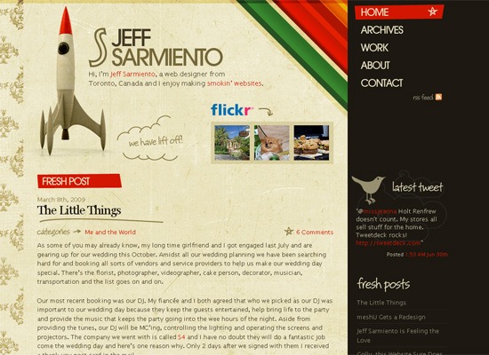
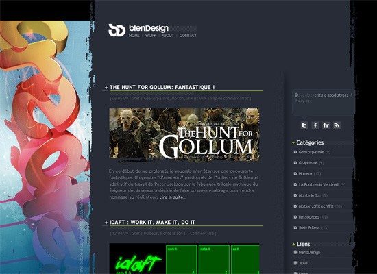
4. Blog as the main focus
This category of portfolio designs puts a weblog as the central attraction to the site, and is meant to show the personal side of the business owner or awards and accomplishment that they have received. New portfolio pieces and recently finished work are sometimes mixed into the blog as posts. It’s a great way to show potential clients their knowledge about the industry, as well as drawing in visitors by way of great content.
Tyler Gaw
Kim Ellefsen
Function
Jeffrey Sarmiento
blenDesign’Blog
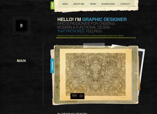
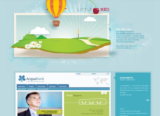
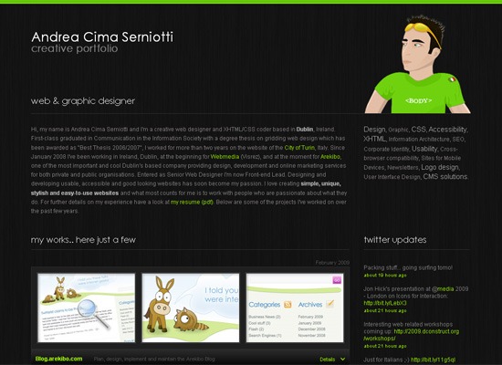
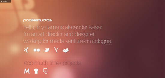
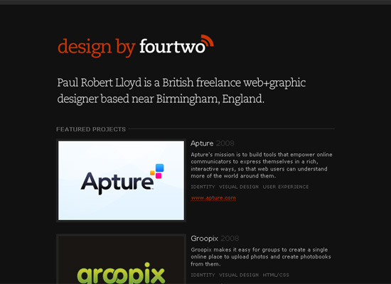
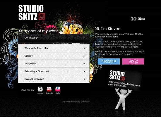
5. The single page portfolio
This type of portfolio design utilizes various coding techniques such as accordion style menus and page scrolling to move the user to different parts of the page.
ftdesigner.net
Little Red
Andrea Cima Serniotti
Alexander Kaiser
fourtwo
Studio Skitz
What’s the best portfolio design style?
Do you have an opinion on which style is the best/most effective/most appealing? Are there other popular design portfolio styles that we didn’t mention?
Share your thoughts in the comments.
Related Content
-
 President of WebFX. Bill has over 25 years of experience in the Internet marketing industry specializing in SEO, UX, information architecture, marketing automation and more. William’s background in scientific computing and education from Shippensburg and MIT provided the foundation for MarketingCloudFX and other key research and development projects at WebFX.
 -

WebFX is a full-service marketing agency with 1,100+ client reviews and a 4.9-star rating on Clutch! Find out how our expert team and revenue-accelerating tech can drive results for you! Learn more
Make estimating web design costs easy
Website design costs can be tricky to nail down. Get an instant estimate for a custom web design with our free website design cost calculator!
Try Our Free Web Design Cost Calculator
Share this article


Web Design Calculator
Use our free tool to get a free, instant quote in under 60 seconds.
View Web Design CalculatorMake estimating web design costs easy
Website design costs can be tricky to nail down. Get an instant estimate for a custom web design with our free website design cost calculator!
Try Our Free Web Design Cost Calculator


