
Retro colors are a great way to give your website an older/vintage feel; it can give your design a little something different from the regular fully saturated colors that you see often in modern-themed designs. This article is both a showcase of retro-colored themes in existing web designs, as well as a tutorial on how to achieve retro colors using Adobe Photoshop (you’ll learn about five different techniques). 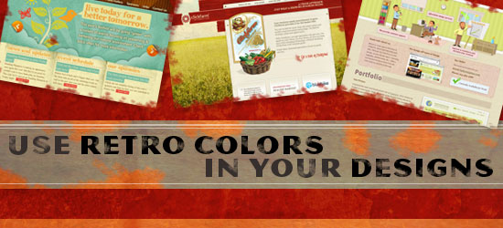
Retro colors in web design
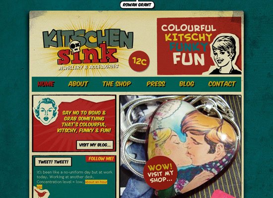
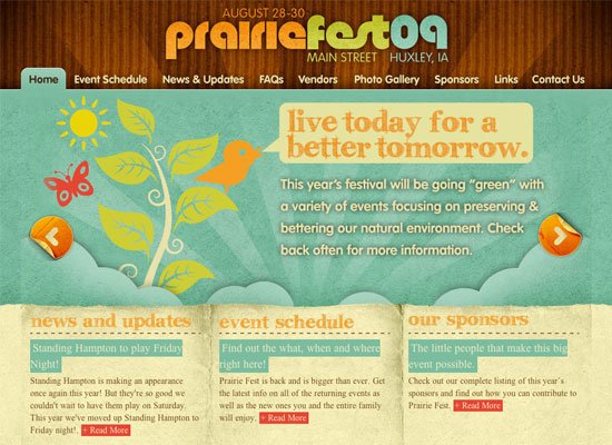
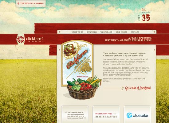
Before we delve into using retro colors, first let’s peek at some existing web designs that use retro/vintage colors really well.
Kitschen Sink
Huxley Prairie Festiva
Clickfarm Interactive
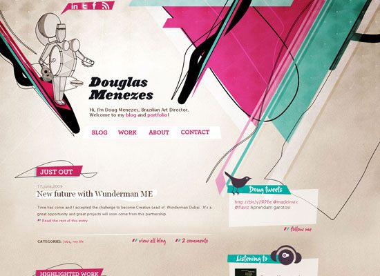
Douglas Menezes
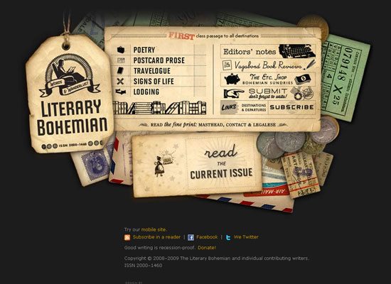
The Literary Bohemian
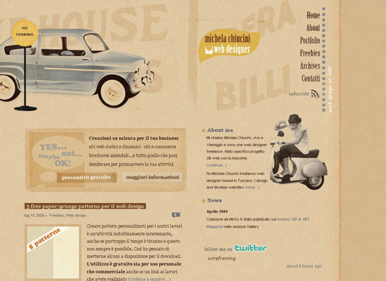
Michela Chiucini
Hope Unlimited

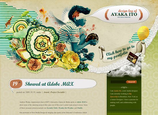
Design Log of Ayaka ito
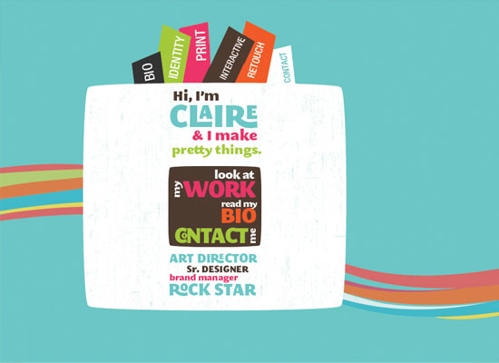
f claire baxter
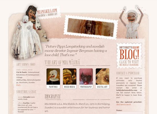
Mia Mäkilä
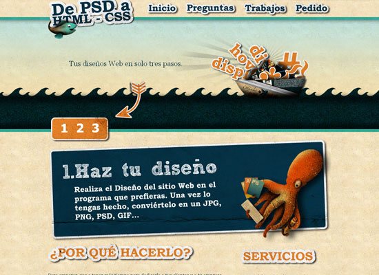
De PSD a HTML
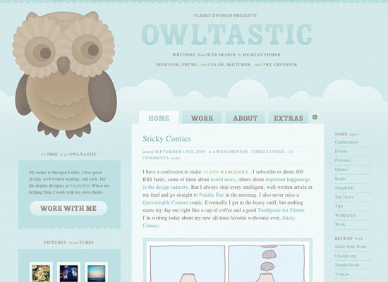
Owltastic
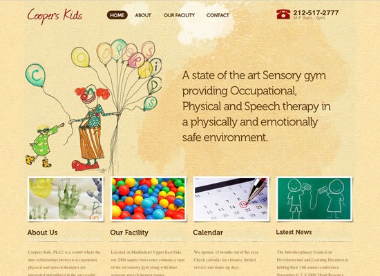
Coopers Kids
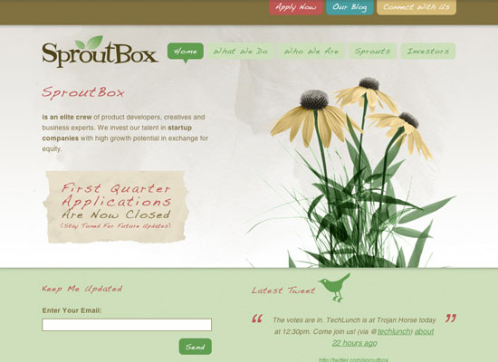
SproutBox
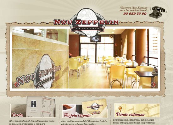
Nou Zeppelin
Kingsford Competition Briquets

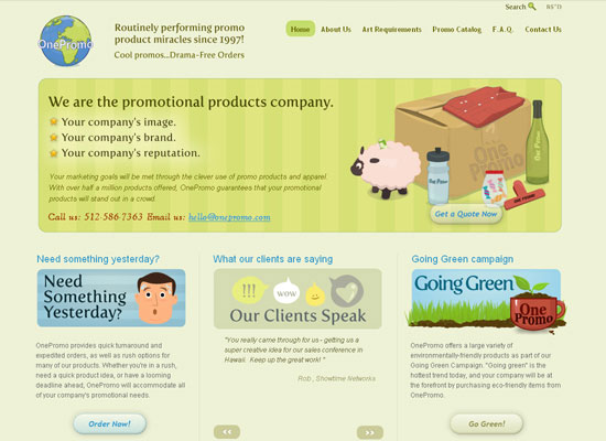
One Promo
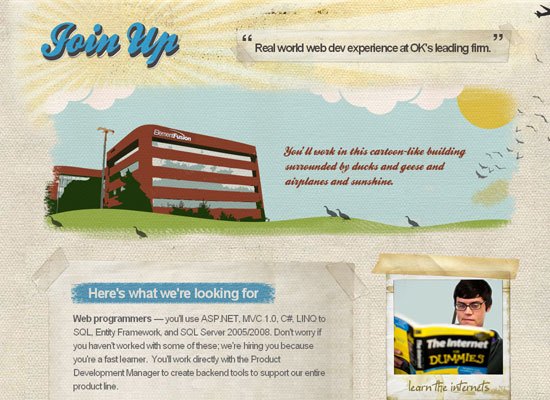
Element Fusion’s Internship Program
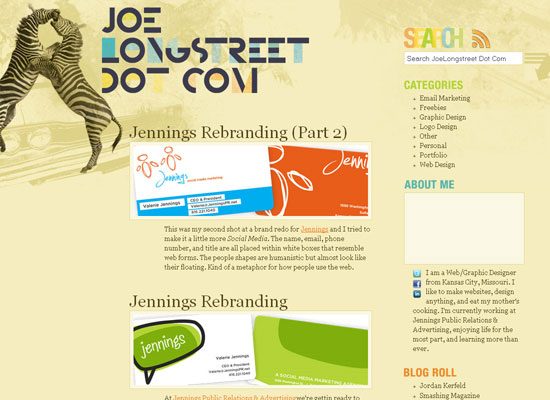
Joe Longstreet
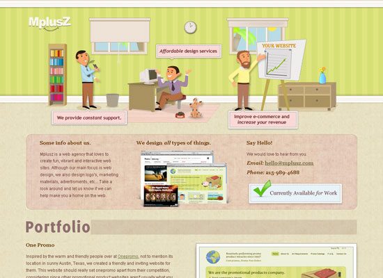
Mplusz
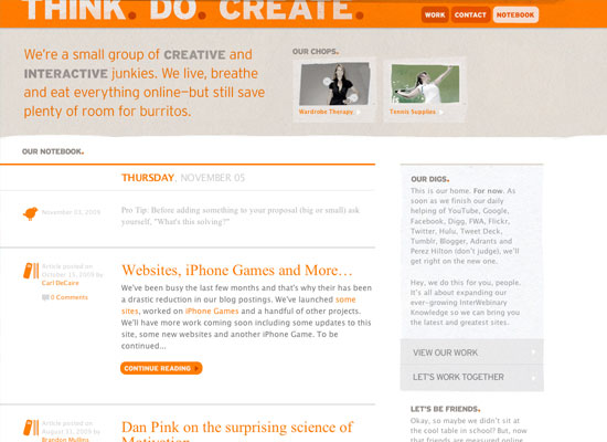
THINK. DO. CREATE.
Hardscapes Etc.

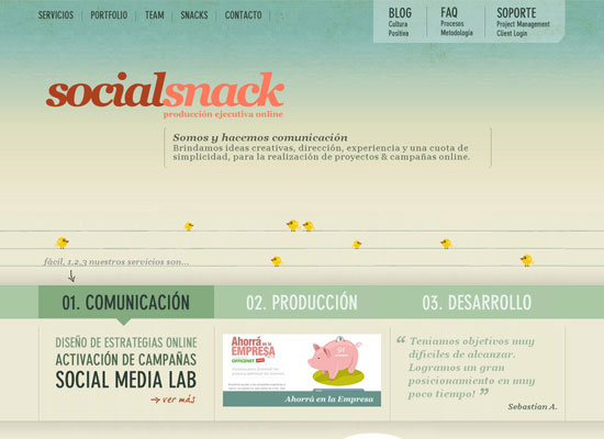
Social Snack
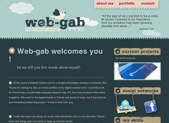
web-gab.com
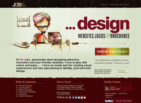
JOBY
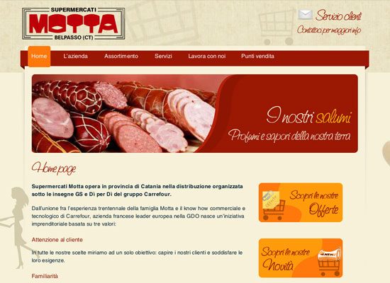
Supermercati Motta
How to use retro colors in your designs using Photoshop
Now that we’ve seen some examples of websites with retro colors, we are going to look at a few ways to create them in Adobe Photoshop.
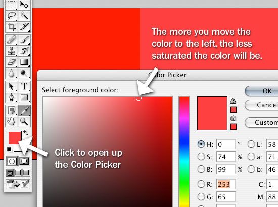
Use the Color Picker to reduce saturation
Click on the Foreground color in your Tools Panel; this will open up the Color Picker Dialog box.
Start with a red color (#FF0000). Now, click directly to the left of the red color you’ve chosen. The more you go towards the left, the more reduced the saturation is.
Drop the layer’s Opacity to reduce saturation
If you drop down your opacity in the Layers Panel, this will also drop down your saturation. The bad (or good) thing about this is that if there is anything behind it, it will show through. 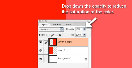
Photo Filter Image Adjustment
In order to reduce saturation by way of the Photo Filter Image Adjustment, we have to first get the inverse of our color; to do this, press Ctrl + I (which is the shortcut keystroke for Image > Adjustments > Invert).
Next, choose the Eyedropper Tool in the Tools Panel and click on the inverted color in your canvas to sample it and set it as your Foreground color. Once you have set your color, press Ctrl + I again to revert back to the original color. Now, go to Image > Adjustments > Photo Filter.
Finally, change the color to our inverted color. 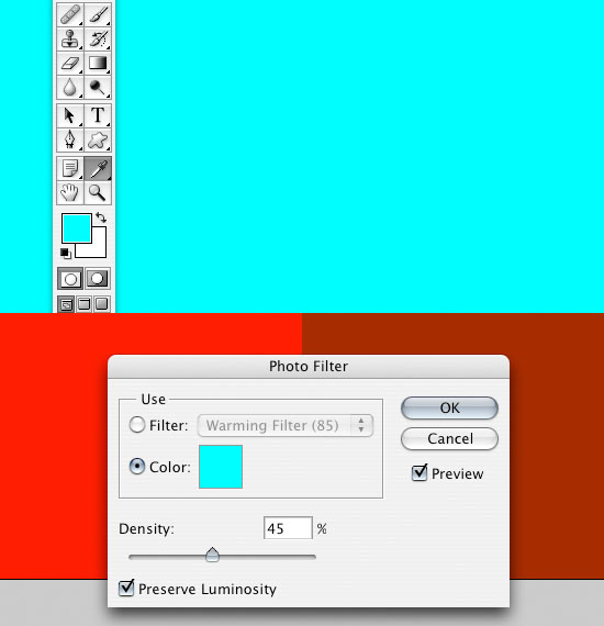
Hue/Saturation Image Adjustment
With this method, we want to go into the Hue/Saturation dialog box by pressing Ctrl + U or going to Image > Adjustments > Hue/Saturation. To lessen the saturation, drag the Saturation option slider to the left.
This is probably the easiest and best way to get your saturation reduced for an entire image. 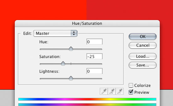
Using Textures
Using a texture is also a good way to give your website a retro/vintage look and feel. Not only does it change the color, but it also gives you a nice, uneven and worn look.
There are a few ways to change your colors with a texture, and here’s one way to do it. First, we are going to grab a texture from Zen Textures. Open up the texture in Photoshop and place it on top of the red square.
Then change its layer’s blend mode to Screen.  Now to make our image less of a peach-colored, drop down the opacity to somewhere around 50%.
  We hope that you enjoyed this little article on using retro/vintage colors.
If you have any tips, tricks, and techniques to share with other readers when using this color theme – please be sure to drop us a note in the comments!
Related Content
-
 President of WebFX. Bill has over 25 years of experience in the Internet marketing industry specializing in SEO, UX, information architecture, marketing automation and more. William’s background in scientific computing and education from Shippensburg and MIT provided the foundation for MarketingCloudFX and other key research and development projects at WebFX.
 -

WebFX is a full-service marketing agency with 1,100+ client reviews and a 4.9-star rating on Clutch! Find out how our expert team and revenue-accelerating tech can drive results for you! Learn more
Make estimating web design costs easy
Website design costs can be tricky to nail down. Get an instant estimate for a custom web design with our free website design cost calculator!
Try Our Free Web Design Cost Calculator
Share this article


Web Design Calculator
Use our free tool to get a free, instant quote in under 60 seconds.
View Web Design CalculatorMake estimating web design costs easy
Website design costs can be tricky to nail down. Get an instant estimate for a custom web design with our free website design cost calculator!
Try Our Free Web Design Cost Calculator


