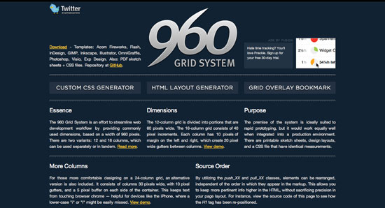


The first time I discovered the 960 Grid System, I was immediately excited about the possibilities of implementing complex layouts so easily. However, since I was fairly new to web design at the time, when I downloaded the files, I quickly became overwhelmed at how complicated the whole thing seemed. With all this code, how could this be the easy way to create a layout?
This article is for web designers and front-end web developers who are interested in grid-based layout systems but are at a loss on how to decipher them. We’ll focus specifically on the 960 Grid System, but after reading this guide, you’ll find that most of the other grid systems out there are similar and will make much more sense after you understand a few basic principles.
Grid-Based Design
Before we get into the specifics of the 960 Grid System, let’s briefly discuss grid-based design in general.
The idea is certainly not something that originated on the Web. In fact, it stems from one of the oldest and most basic design principles: alignment. Our brains like to simplify things to make them readily understandable.
This is why we try to impose order on things that seem chaotic, like seeing a face in the craters on the moon. Naturally, the easier it is to impose order, the quicker our brains can identify a pattern and move on. Grids are so organized and orderly that they require almost no interpretation our part. Consider the two page layouts represented in the image below.
 Though both of these images are simply a gathering of rectangles, the layout at the top seems fundamentally better than the one on the bottom. We can instantly recognize a pattern, accept it, and move on. The image on the bottom, however, is visually unsettling by comparison.
There’s no clear pattern, order, or goal–it’s just looks like a random assortment of shapes. Our eyes have a tendency to frantically search for fractions of a second while we attempt to identify a trend, which increases the time necessary to take in the scene as a whole. It’s interesting to note that random can still be beautiful. Random definitely has its place in nature, art, and even design, but it’s no way to logically organize information.
The point is that grids are among the simplest and strongest ways to create order on a page. They may seem cold and rigid, but remember that they are both extremely efficient and effective, and can even be quite flexible if you don’t let your imagination get bogged down by the necessary structure.
Why Do I Need a Grid System?
The 960 Grid System–and other tools and systems like it–provide a fast and easy way to create grid-based layouts using CSS.
They do this by providing cross-browser-tested and optimized preset column widths for you to set your content into. These grids can help you save on your online marketing budget. Before CSS3, it wasn’t exactly easy to break up a page into columns without getting into tedious math.
For instance, if you have a 1,000-pixel wide container and you want to split it up into three columns, that’s 333 and 1/3 pixel per column (not exactly a nice whole number). Further, columns broken up like this would crash into each other, so a margin must be added on each side. If we add a 10-pixel margin to each side of every column, we must also subtract that 20 pixels from the width of each column.
This gives us 3 columns roughly 313 pixels wide each with a margin of 10 pixels on each side (even then you’re at 999px and not 1,000px). Want 4 columns in a row below that? Then you have to start the process over and subtract 80px of margin from 1,000px for a total of 920px and divide that by 4 to get a column width of 230px.
Finally, if you want to add a sidebar that’s a third of the total width of the page, you have to create a column that’s 750px for the content and one that is 250px for the sidebar, then subtract 40px of margin to get one 730px column and one 230px column. Confused yet? Other web designers were too. It’s not exactly rocket science, but it’s also not something you want to go through again and again for each project that you create.
The solution? Find someone else to figure out all these crazy column widths, throw them into a CSS document, and let you download it free. (That person happens to be Nathan Smith, creator of the 960 Grid System).
The 960 Grid System
 The 960 Grid System is simply a way to lay out websites using a grid that is 960 pixels wide. The reason it’s 960 pixels wide is because the number 960 makes for a lot of clean divisions utilizing whole numbers when factoring in column widths and margins. And it fits nicely on the majority of screens.
The 960 GS comes in two primary variants: a 12-column grid and a 16-column grid (a 24-column version is included as well for those that really need extra control). In the 12-column version, the narrowest column is 60 pixels wide. Each column after that increases by 80 pixels.
So the available column widths are: 60, 140, 220, 300, 380, 460, 540, 620, 700, 780, 860 and 940. 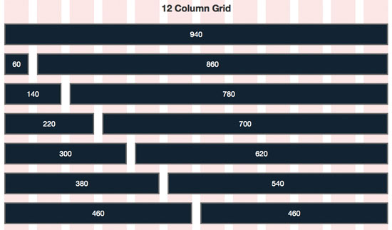 Similarly, in the 16-column version, the narrowest column is 40 pixels wide and each column after that increases by 60 pixels. So the available column widths are: 40, 100, 160, 220, 280, 340, 400, 460, 520, 580, 640, 700, 760, 820, 880 and 940.
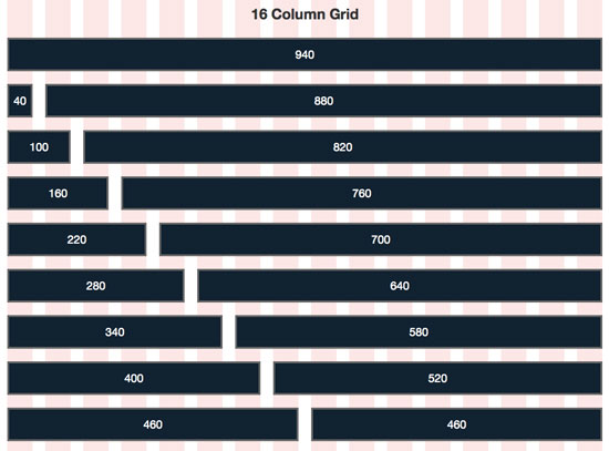
CSS Classes Now in Session
When you look at the diagrams above, consider each of the dark blue horizontal bars as a CSS class in the 960 Grid System. To create an object in your layout that is the width of one of those bars, you simply assign the proper class to your div–that’s it! The classes are conveniently named according to their size with the grid_1 CSS class being the narrowest and grid_12 CSS class being the widest (grid_16 is the widest in the 16-column version).
So to reuse our image from above, take a look at the available columns now, but this time, think about them using their respective CSS classes instead of pixel widths. 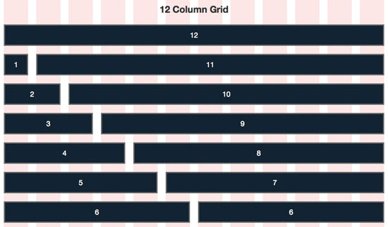 This naming system makes it incredibly easy to hash out complicated layouts in seconds flat. To fill a page’s width, the trick to keep in mind is that the numbers assigned to your selected classes must equal 12 in the 12-column version and 16 in the 16-column version.
For instance, using the 12-column version, if you have 3 divs of text that you want to be displayed side-by-side in a 3-column layout, simply assign the grid_4 class to each one to total 12 (4+4+4=12).  Similarly, assigning the
 grid_4 CSS class in the 16-column version makes it easy to create a 4-column layout (4+4+4+4=16). 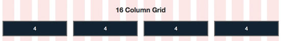 To make sure you’re referring to the proper classes, be sure to place your 12-column elements inside a div with the class
 container_12 and your 16-column classes inside a div with the class called container_16.
If you’ve never worked with the 96 GS before, I hope you’re having your “aha” moment right now regarding just how easy it is to spec out a layout in no time at all using this system.
Push Me, Pull Me
The 960 Grid System allows you to reposition elements independently by pushing or pulling them horizontally along the page. This is accomplished by using the push and pull CSS classes.
For instance, consider the two examples in the image below. The first example is a basic 4-column layout using only the grid_3 class. However, in the second version, I’ve pushed the first column and pulled the last column, resulting in their positions jumping over one column from where they would normally lie in the layout.
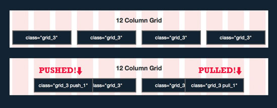 Keep in mind that you can push items as far as you want. If I had wanted to push an element two columns over, I would’ve implemented the class
 push_2, and so on. The push/pull system has major implications for how you lay out a page in your HTML document.
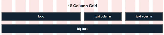
For instance, in the example below, imagine the website’s name is typed out in a logo and placed as the first element on the page. As the most important element on the page, you’d like to keep the logo as the first item in your HTML markup, but visually, you actually want it to appear in the center of the page.
Before pushing/pulling:
 To visually position the logo element in between the two text columns, you would use the following HTML:
<div class="grid_6 push_3"><p>logo</p> </div> <div class="grid_3 pull_6"><p>text column</p> </div> <div class="grid_3"><p>text column</p> </div> <div class="grid_12"><p>big box</p> </div>
This results in the layout shown in the image below.
After pushing/pulling:
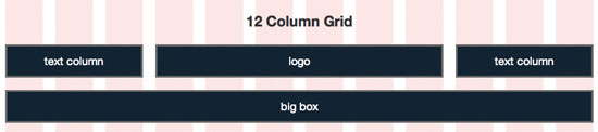 Despite the fact that the logo comes first in our markup, it will be visually positioned in the center of our page.
Wide Open Spaces
You’ll often find that you want to create empty space in a layout (negative space is a good design device). To accomplish this, apply the prefix and suffix classes to your divs. These are implemented very similar to the push and pull classes. For instance, to leave a blank space that is the width of one column before an element, use prefix_1 class, or after an element using suffix_1 class. 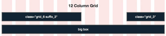 As you can see, the example above uses a
 suffix_3 class to create an empty space the width of three columns after it.
The Beginning and The End
The final bit of knowledge you’ll need to know is that you are provided with the alpha (“first”) and omega (“last”) classes that must be applied to any grid units that are the children of other grids. Obviously, the alpha class will be applied to the first child and the omega class to the last child. Essentially, these classes provide a margin fix so that you can nest grid units inside of other grid units.
Let’s Review
Armed with this newfound knowledge, you should now be a 960 Grid System expert. To review, there are basically only 5 concepts you need to remember:
- Use the
container_12class for the 12-column version and thecontainer_16for the 16-column version. - Use the classes
grid_1,grid_2,grid_3, etc. to set your column widths. If you want to fill a page horizontally, make sure the numbers add up to 12 or 16 (i.e.grid_4+grid_2+grid_6= 12). - Use the
pushandpullclasses to independently position items on the page, regardless of their position in your page’s markup. - Use the
prefixandsuffixclasses to create empty spaces in your layout. - Use the
alphaandomegato fix the margins for any nested grid units.
There is also a CSS reset included with the 960 Grid System. This is a completely optional file based on the ever popular Eric Meyer CSS reset. If you like it, keep it.
If not, trash it!
960 Grid System Resources
Now that you’re an expert on grid-basedd web design and the 960 Grid System, here are a few tools and resources to check out to further your understanding.
Fluid 960 Grid System
An awesome fluid version of 960 GS!
Fluid web layouts readjust the layout to fit the page. This can make for some really complicated code, but using this system means that it will do all the heavy lifting for you. 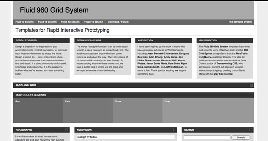
The 1KB CSS Grid
An extremely lightweight grid system that is basic and easy to understand.
It’s highly customizable but defaults to 960px. 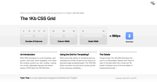
Variable Grid System
A simple and flexible CSS grid builder based on the 960 Grid System. 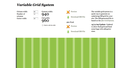
Grid-Based Design Gallery
If you’re skeptical about the 960 Grid System and what grid-based design can offer you as a web designer, check out this design gallery.
As you can see, with a little imagination and ingenuity, the possibilities are endless. 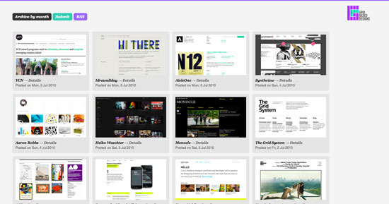
Typogridphy
From the site: “Typogridphy is a CSS framework constructed to allow web designers and front-end developers to quickly code typograhically pleasing grid layouts.” 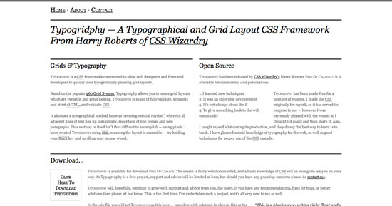
Tiny Fluid Grid
This is a grid-builder for a fluid version of the 1KB Grid System above. 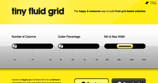
Off the Grid
Admittedly, even with all the possibilities and flexibility provided by a grid system like 960 GS, you’re still being placed under restrictive confines.
No one is suggesting that all websites should be created on a grid–this would definitely lead to a widespread lack of creativity and lack of variation in page layouts. Whether your web designer uses a grid or not is a question you may want to ask before the project starts. Further, as you experiment with 960 GS, you’ll find that there are numerous ways to break the layout that will force you to rethink your designs.
The 960 Grid System–and others like it–merely provide a strong foundation for the numerous times you’ll find yourself building a site that doesn’t break the mold with innovation, but instead needs to convey information clearly and logically in a way that is familiar to a large number of users. These are great to use for large sites such as one for a college.
Your Thoughts on Grid Systems?
Leave a comment below and let us know what grid system you prefer and if the information above helped you in your quest to decipher the 960 Grid System.
What’s good about grid systems? What’s bad about them? Share your thoughts an opinions below.
Related Content
-
 President of WebFX. Bill has over 25 years of experience in the Internet marketing industry specializing in SEO, UX, information architecture, marketing automation and more. William’s background in scientific computing and education from Shippensburg and MIT provided the foundation for MarketingCloudFX and other key research and development projects at WebFX.
 -

WebFX is a full-service marketing agency with 1,100+ client reviews and a 4.9-star rating on Clutch! Find out how our expert team and revenue-accelerating tech can drive results for you! Learn more
Make estimating web design costs easy
Website design costs can be tricky to nail down. Get an instant estimate for a custom web design with our free website design cost calculator!
Try Our Free Web Design Cost Calculator
Share this article


Web Design Calculator
Use our free tool to get a free, instant quote in under 60 seconds.
View Web Design CalculatorMake estimating web design costs easy
Website design costs can be tricky to nail down. Get an instant estimate for a custom web design with our free website design cost calculator!
Try Our Free Web Design Cost Calculator