
One of the hardest tasks we undertake in the user experience field is trying to gain and hold a visitor’s attention in the right way. Distinctive design and the ability to focus eyes where they are needed in our web designs is a tricky task, but is something that we should have a firm grasp of.
Understanding the artistic traits of influence and distinction allow us to balance important details over our regular content and thus gives us the opportunity to have a great impact and influence on our consumers.
This article aims to highlight various factors you should account for when using distinction in your designs.
Distinctive Design
Distractions in a design lead to a breakdown in communication and can confuse users, paralyzing their ability to quickly determine what to focus on or where to go next.
Distinctive design alleviates this by putting forward a few fundamental principles which appeal to the user’s needs. Effectively at their core, it underlines the ideal that highlighting content based on importance rather than its position is beneficial and worthwhile.
 What is distinctive design?
It’s a simple goal to make important information visible.
Principles of distinctive design include:
- Not giving prominence to objects unless it has a real need to attract attention
- Limiting the importance you give to all content within the page to avoid diluting the strength of the important content
- Deemphasizing less important content
- Taking the time to help guide the user’s eyes through the page to ensure content is read in the right order
- Avoiding too much information on the page to reduce the noise
- Ensuring that what you display fits the ideas you wish to convey
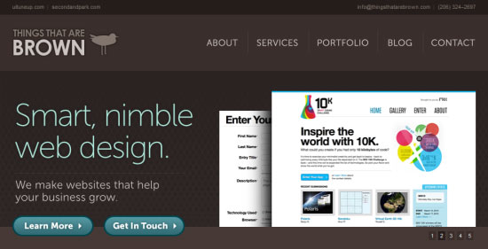
 Distinctive design is important to ensure the end-user can find what they require.
While too much focus being demanded on a page (with violent levels of distinction) can be damaging to the user experience, bland data with no focus or selective highlighting can be equally disruptive.
It can make unassuming content (even well written material) appear dry, dull or even hard to read.
While the majority of your content should be neutrally styled (it should have no emphasize), there will always be content in a site that needs reinforcing. And whether you use images, stylistic effects, color, appearance, animation or something else, appropriate distinction is extremely important.
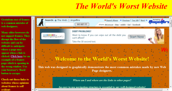
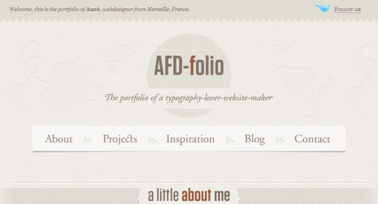
 Plain text documents have no distinctive flourishes and is often hard to read.
Noise Margins
One key principle in maintaining a distinctive design is the function of noise margins. Have you ever visited a website that has far too much going on?
That’s the kind of problem that can make it next to impossible for users to find what they need.
By simply reducing the amount of information that appears within the website design, or by breaking it down further into several pages (or sections using headings), you can increase the way people interact with your work because relevant information will be more contextually visible and easier to locate.
 Noise can distort the overall message of a website in unnaturally large quantities.
Within a user interface, noise can occur in many formats. Anything intended to grab the user’s attention in the design can be a key component of drawing focus away from the content. Ideally, you should have as little of these devices or interface quirks as possible.
 Interface noise can result from too many elements appearing within a website.
Even sites with little in the way of noise-inducing components can have noise pollution problems.
Text content can suffer issues if it’s not laid out effectively. In this case, breaking large clumps of data into tables, bulleted lists, sections and styled content can aid readability.
Images with too much on display can also become like an optical illusion (like a “Where’s Waldo?” book) as the search for any relevant points may be lost, which brings attention to the task of trying to simplify diagrams, graphs and infographics to maintain a level of neutrality and visibility.
 Content isn’t free of noise either!
Huge blocks of text can frustrate end-users.
Spatial Awareness
Another principle tied closely to the aspect of noise is spatial awareness. While it’s important to know how much content will be displayed in a page, the knowledge of how we represent content can help end-users identify their own surroundings.
Whilst designing with an emphasis on simplicity — introducing much needed whitespace within even the most lengthy of documents can allow the user to focus within those sections that hold meaningful content. In addition, complex background images or patterns can reduce the effectiveness of added whitespace.
 Giving a website plenty of breathing room increases the awareness of space.
Organization is the key to any goal, and conventions have evolved within professional web design for just such a reason.
The complexity of any object can be determined by both how easy it is to not only know what function or purpose it has, but also the way it is presented can help that old friend of ours, readability.
Whitespace has a key function in not only breaking sections apart (through space) but also in increasing awareness of how those sections are maintained, thus making the design a more pleasant experience which can help elements meet the impact needs of their environment.
 A well structured and organized site layout will be easy to navigate around.
While the idea of flexible layouts showcase that the amount of visible space may differ drastically for the end-user based on the device they have, small screens have highlighted the way in which a web browser and it’s viewport with scrollbars dictates the cascade and priority information gets.
It’s a well-established and notable fact that information at the top of a website holds more priority than what is at the base of the page (due to the order in which it’s likely to be seen). Therefore ensuring your content is provided in a balanced manner which follows the convention is worth considering.
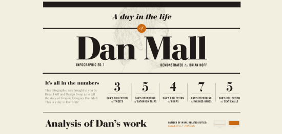 Conventions show that content should be given priority based on importance.
Drawing Focus
One of the key principles of distinctive and attentive design is based on the idea of drawing focus to content and design elements of importance. While making good use of space and reducing noise levels can be beneficial to drawing focus naturally, there are ways to grab the attention of visitors by focusing or drawing the eyes to something onscreen.
While using such elements can be beneficial to the end-user, it’s worth highlighting that if you fail to balance the need for attention with the need for neutrality, you might end up counteracting your efforts to showcase importance.
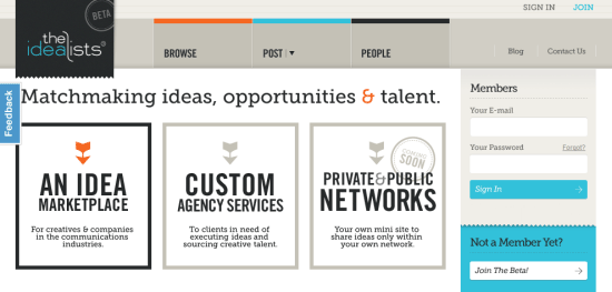
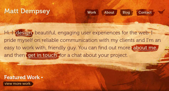
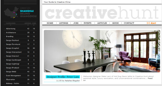
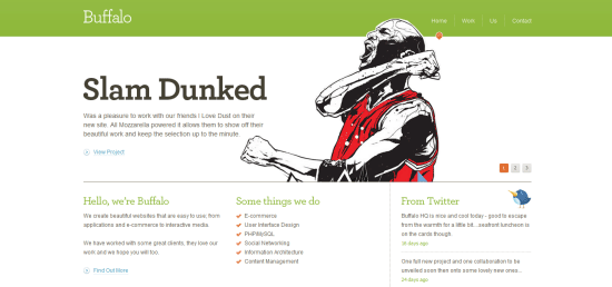
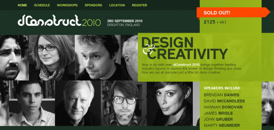 The dConstruct website draws focus towards the famous speakers taking part.
As with many aspects of design, the idea of drawing attention can be achieved through a general understanding of psychology (so getting that book on the subject may pay dividends).
There are a great number of different ways people can be drawn to content.
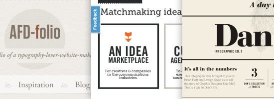
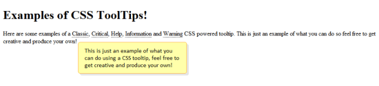
Methods to draw focus are usually based around clever wording (humour is effective), figures (like prices or dates), relevant terms which are easily recognised (like the word contact), pictures denoting what’s being mentioned (infographics), and animation (which naturally focuses to understand an effect).
 By using words that the reader can relate to, you’re more likely to draw interest.
While natural attention can be drawn through psychology and relating data in ways which attract the end-user, visual attention is usually more obvious and easy to snatch focus.
An example of this can be seen through people use Flash animations that naturally blur the relationship between grabbing attention for the content and attracting the attention to the user interface (rather than its content value). While forcing the attention of something through visual effects can be a quick (if not crude) way to ensure a visitor reads something, it should be done with some restraint and care.
 Visual attention-seeking can result from animated effects that result from actions like hovering.
Contrasting Mediums
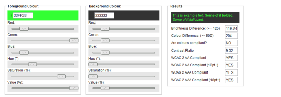
Another key principle of distinctive design is the idea of contrast. Color has become one of the vital components of many website designs and the way in which shades and variants interact with each other can determine not only the visibility of the information, but in worse case scenarios, they could even be an indicator of underlying problems of readability.
One of the simplest ways to measure contrast is to examine how visible the foreground object (like text) is from background content such as a block color or image.
 The most common contrast you’ll encounter is background and foreground colors.
As mentioned, web accessibility plays a common role in contrast as the visibility of information in general can have consequences to who can access the information.
While low contrasting combinations may give the impression of subtlety and softness, if contrast is insufficient, or if two shades which are known to conflict in certain vision conditions like color blindness are used, you may well end up with a negative visibility issue that not only makes text less distinctive but impossible to read. Visibility disorders are the most common conditions that suffer from poor color contrast choices.
 Accessibility is closely tied in with how well content contrasts in its surroundings.
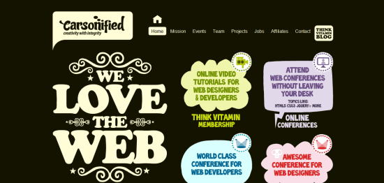
The benefits of contrast and the use of color psychology can draw user attention in some unusual ways. A primary example of this is what is known as color symbolism, where people visit a website rich with certain shades of colors that remind them of certain things and emotions.
This richness which goes unstated can draw their focus.
Depending on the audience type and the culture of the crowd, the interpretations of color may differ, but contrasting and complementing the harmony of your palette will give added emphasis and targeted emotional triggers to make use of.
 Color not only evokes emotion (and attention) but it also can make things distinct.
Highlight for Impact
The final principle I want to highlight (no pun intended) is the idea of manually adding distinctive impact to your website through selective effects.
So far, we have focused on taking away objects of unnecessary value and pulling eyes to a section through emphasis and contrast. This method takes a different approach entirely by taking something that already has a user’s attention (like a block of text) and then boosts certain parts of that content to increase its visibility around elements which surround it. Of course, this is aimed at natural highlighting in context to an existing range of content.
 Just highlighting passages of text can give the content a boost of emphasis.
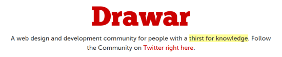
Highlighting a segment of text may seem subtle, but it can be surprisingly effective.
In browsers like Google Chrome, you can actually change the color of highlighted text which may give the manual selection of content a better contrasting (and easier to read) platform to work from.
Of course, apart from using a background color there’s a whole range of ways in CSS to draw attention, such as the use of icons besides text, coloring links of unique segments or simply changing the font, size, color or style (bold, italics, underlines, strength and emphasis) of the information needing added visibility.
 Common stylistic traits that are anything but the default can represent content well.
The use of color in highlighting for impact and giving distinction go through psychology and design with ease and it can be said that only using color selectively will give your work added impact (like how more whitespace gives impact to less content).
However in certain cases (like children’s sites), using a sharp array of bold colors and vibrant shades can actually draw attention well enough for the subtle restriction of color to be a non-issue. While in many sites aimed at adults, it’s better to keep a firm focus on color usage, sites aimed at a younger audience can get away with such vivid use of shading.
 Using an appropriate sharp group of colors can highlight sections uniquely.
Attention to Detail
While there aren’t any strict rules to dictate how much strength you should give content, I find that a good balance is as follows:
- 85% of the design is neutral (with no focus)
- 5% of the design has minimal highlights (like banners)
- 5% of the design is emphasized (such as bold, italics, link colors, and other strength)
- 5% of the design being very important content which requires immediate priority
Though, factors which affect how the distribution balances out should be accounted for, such as its position within the viewport, if the content is “fixed” and the amount of strength given (like size and color).
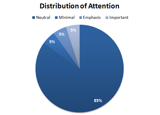 The above graph may help you decide how to breakdown the distinction barrier.
JavaScript and advanced CSS selectors have improved the situation of designing with consideration towards distinction. With the ability to simply hide content (or restrict how much content is visible) at any one time, and the ability to animate or control how information will appear depending on viewport availability or device type, we can put ever increasing efforts into making the most out of the little flourishes we choose to have on display. While such complexity can make us feel like we need to take advantage of it all at once, a controlled approach can simplify our designs.
 Scripting and cool CSS techniques aside, single page designs have boomed in popularity.
The key principle of attention is that of the designers own eye for detail, there is little excuse to make things either bland or boring even when the content arrives in beauty and simplicity.
The modern advances of scalable designs, flexible layouts and minimalistic ethos have laid down some great methodologies for making information easier to access, read and use.
Taking time to consider how each event or effect may be interpreted, your visitors’ ability to read what you produce and assigning yourself the goal of attempting “less is more” (in context) will boost your content’s value.
 Everything in moderation is the best policy as there’s no point wasting effort!
The art of distinction is in the way we portray information and how the important and relevant bits manage to push their way past the flourishes and useful engaging elements which give that content added substance.
While the web evolves (like our tastes and abilities) it’s a fact of life that portraying information effectively will become (as it remains) one of the most important philosophies that the design community has to offer.
In reflection, distinctive design gives your content the best chance of being read, understood and enjoyed in the future — which is fantastic if you want to be noticed!
Related Content
-
 President of WebFX. Bill has over 25 years of experience in the Internet marketing industry specializing in SEO, UX, information architecture, marketing automation and more. William’s background in scientific computing and education from Shippensburg and MIT provided the foundation for MarketingCloudFX and other key research and development projects at WebFX.
 -

WebFX is a full-service marketing agency with 1,100+ client reviews and a 4.9-star rating on Clutch! Find out how our expert team and revenue-accelerating tech can drive results for you! Learn more
Make estimating web design costs easy
Website design costs can be tricky to nail down. Get an instant estimate for a custom web design with our free website design cost calculator!
Try Our Free Web Design Cost Calculator
Share this article


Web Design Calculator
Use our free tool to get a free, instant quote in under 60 seconds.
View Web Design CalculatorMake estimating web design costs easy
Website design costs can be tricky to nail down. Get an instant estimate for a custom web design with our free website design cost calculator!
Try Our Free Web Design Cost Calculator


