
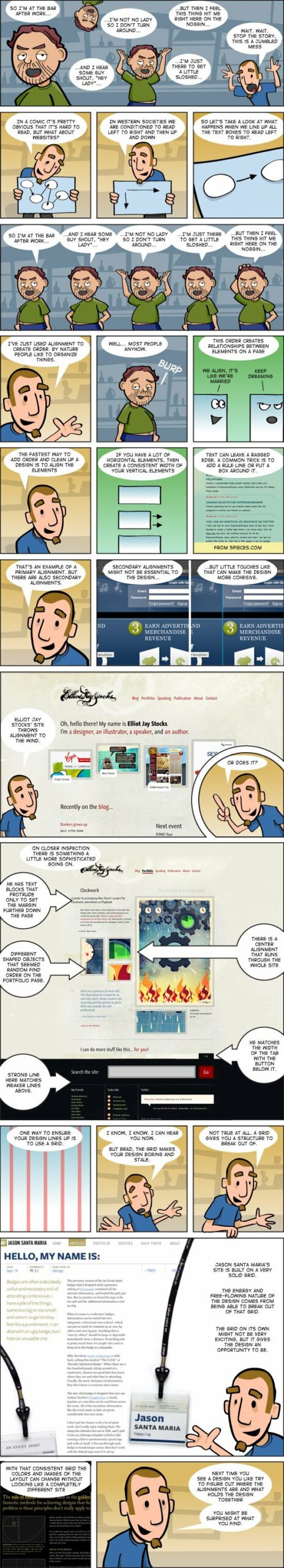
The alignment of elements in a web page is a very important aspect of a good web design. In this info-comic, The Brads illustrate important concepts and best practices for alignment.
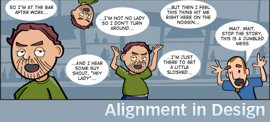
The Bads – Alignment in Design
Links mentioned in the webcomic
Other info-comics by Brad Colbow
About the Illustrator
 Brad Colbow is a freelance graphic and web designer based in Cleveland, Ohio. He’s also the creator of the web comic, The Brads. You can see his work at Brad Colbow Design.
If you’d like to keep up with Brad, follow him on Twitter or connect with him via LinkedIn.
-
 President of WebFX. Bill has over 25 years of experience in the Internet marketing industry specializing in SEO, UX, information architecture, marketing automation and more. William’s background in scientific computing and education from Shippensburg and MIT provided the foundation for MarketingCloudFX and other key research and development projects at WebFX.
 -

WebFX is a full-service marketing agency with 1,100+ client reviews and a 4.9-star rating on Clutch! Find out how our expert team and revenue-accelerating tech can drive results for you! Learn more
Make estimating web design costs easy
Website design costs can be tricky to nail down. Get an instant estimate for a custom web design with our free website design cost calculator!
Try Our Free Web Design Cost Calculator
Share this article


Web Design Calculator
Use our free tool to get a free, instant quote in under 60 seconds.
View Web Design CalculatorMake estimating web design costs easy
Website design costs can be tricky to nail down. Get an instant estimate for a custom web design with our free website design cost calculator!
Try Our Free Web Design Cost Calculator


